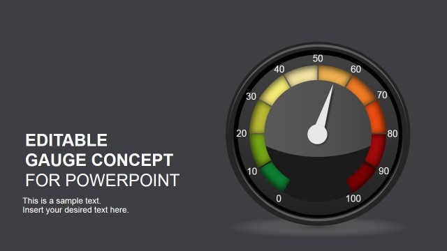
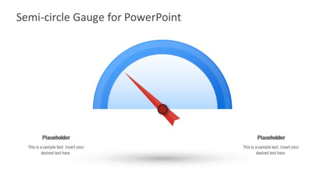
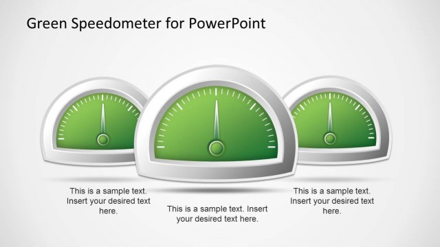
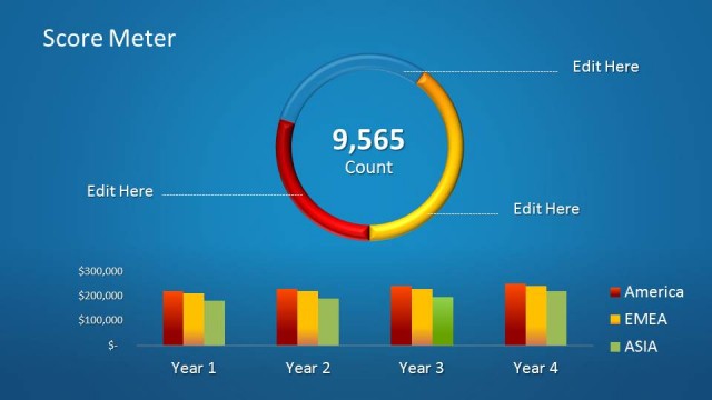
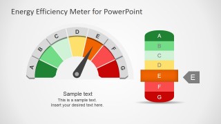
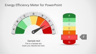
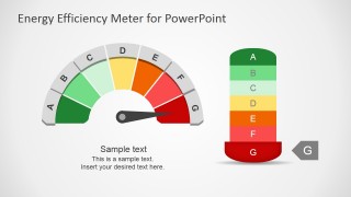
Energy Efficiency Meter Shapes for PowerPoint has a fully-editable gauge design with efficiency indicator graphics that you can use to decorate your presentations on Energy Efficiency or use the shapes in a PowerPoint presentation dashboard. You can easily adjust the needle to any desired position by un-grouping the shapes and using the Rotate tool in PowerPoint.
What’s inside this template
Example presentation scenarios
- An energy manager can use the A-G gauge meter to explain a building efficiency score and show whether the current condition sits in the green, yellow, orange, or red range.
- A sustainability consultant can use the highlighted rating scale and callout badge to summarize audit findings for executives who need a quick performance readout.
- A facilities team can place the meter diagram in a maintenance dashboard to compare one site rating against an internal target or compliance threshold.
- A product manager can use the cover gauge and individual rating slides to explain energy label positioning for appliances, equipment, or service offerings.
Features
- 100% editable presentation template
- Compatible with Microsoft PowerPoint and Google Slides
- 16:9 aspect ratio slides
- Scalable vector shapes, icons and illustrations
- AI-Ready for Microsoft Copilot and Claude
- Instant access and download
Frequently asked questions
Q: How should I communicate an energy rating with this meter template?
A: Start by stating the rating decision in the slide title, then use the needle and highlighted A-G scale as visual proof. Keep the body text short: explain what the selected band means, why the rating changed, and what action is next. The graphic should carry the status message, not compete with dense paragraphs.
Q: Who is this template best suited for?
A: This template fits presenters who need to explain one energy performance level clearly, such as facility managers, sustainability consultants, operations leaders, and product teams. It is best when the audience must understand status at a glance, especially in energy audits, efficiency reviews, building reports, or product rating explanations.
Q: Why does the gauge metaphor work for energy efficiency presentations?
A: The semicircle gauge turns an abstract rating into a familiar status signal, while the A-G scale adds category labels that audiences can interpret quickly. The green-to-red sequence creates visual hierarchy: strong performance appears safe and efficient, while weaker ratings appear urgent. This makes the presenter message easier to prioritize.
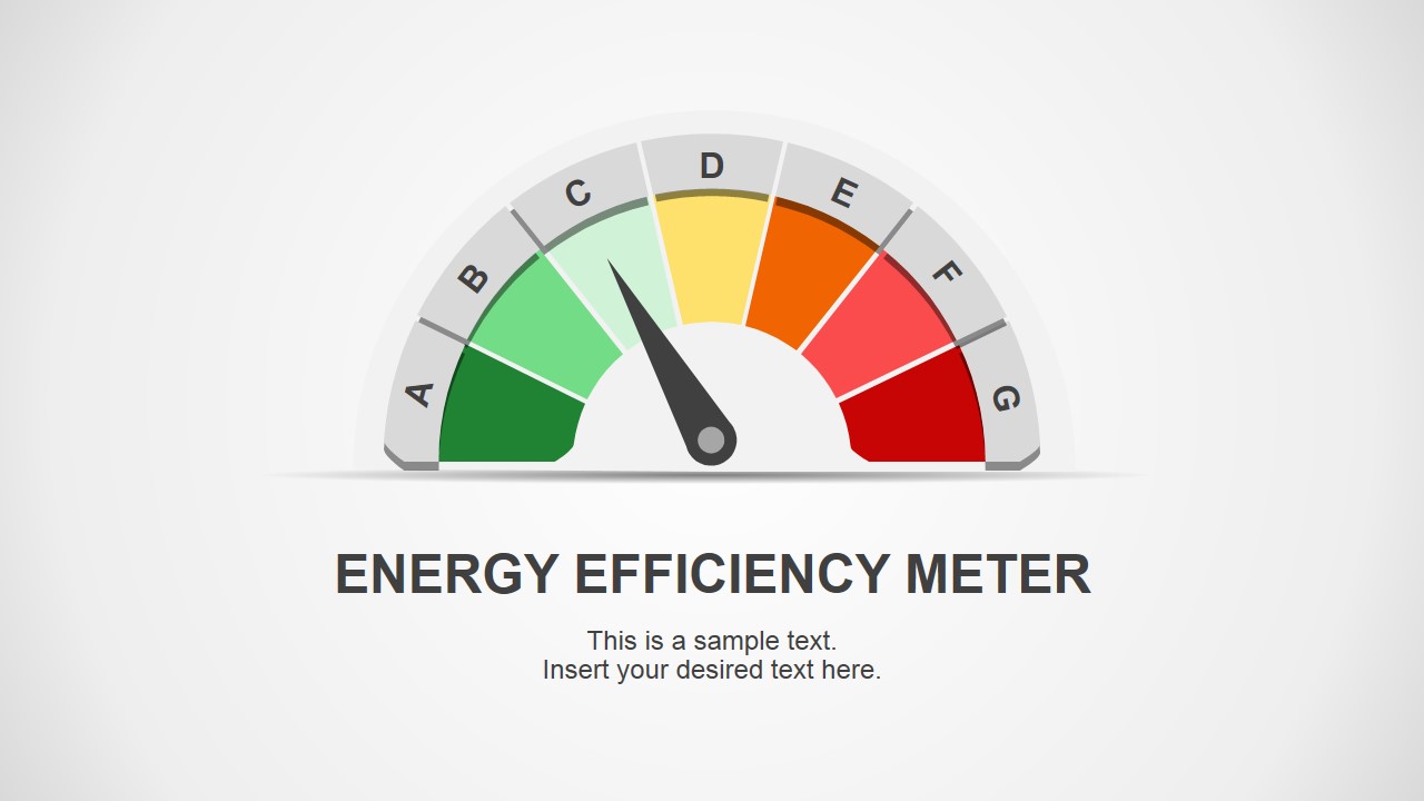
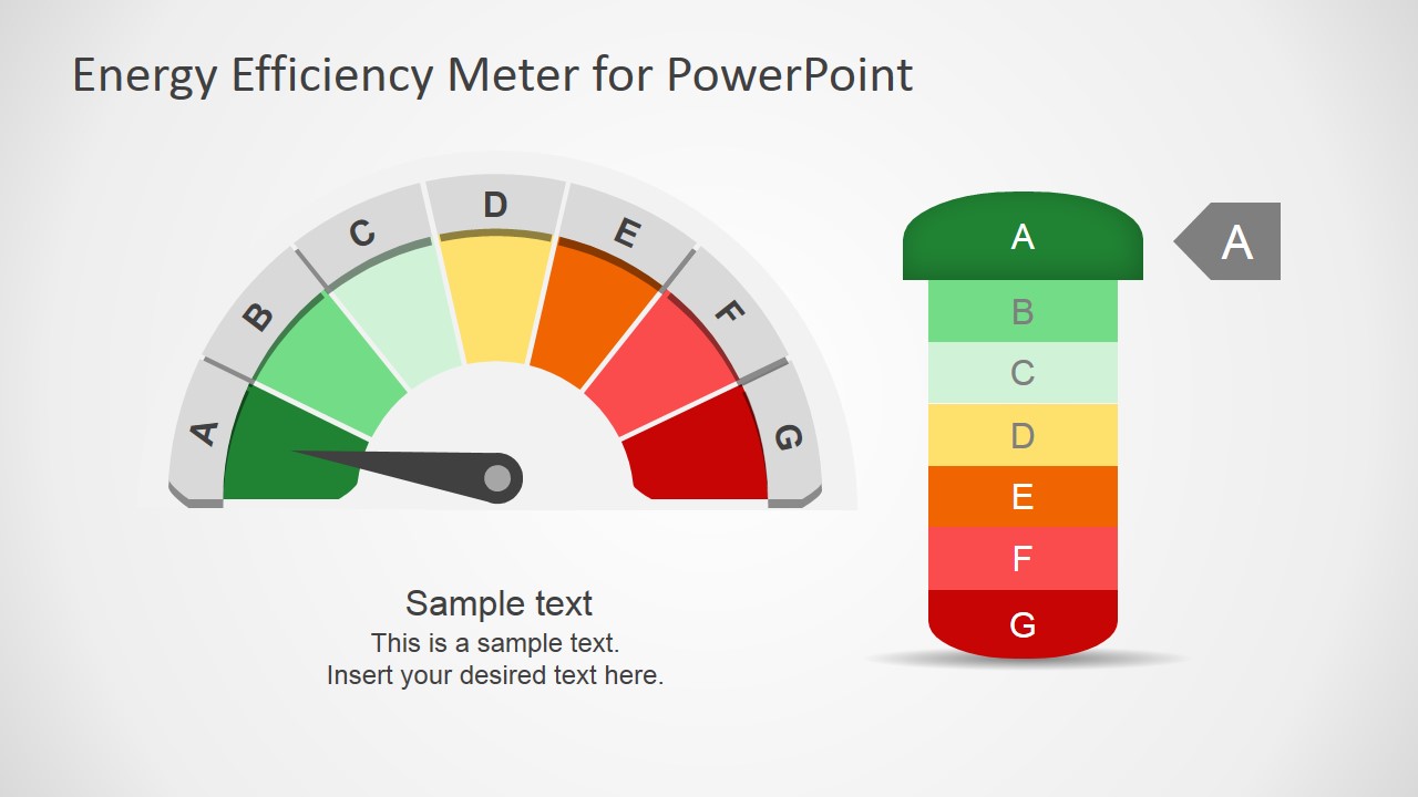
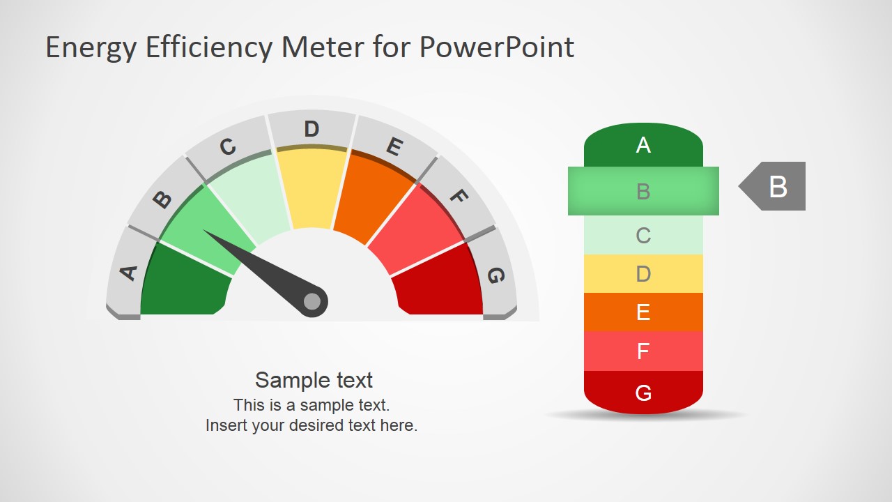


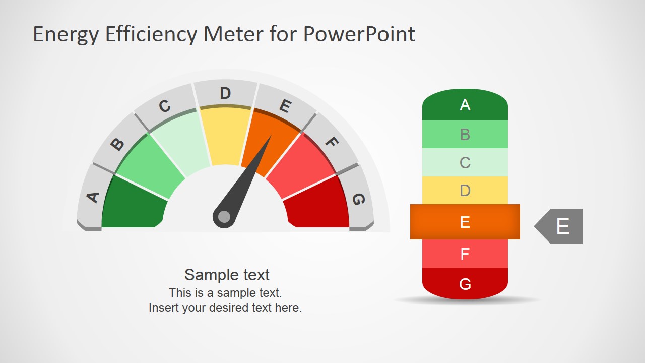


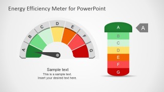
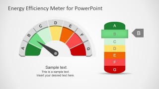
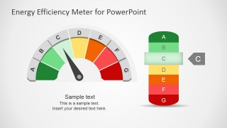
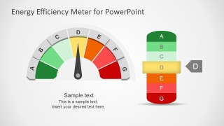
Energy Efficiency Meter Shapes for PowerPoint
8-slide presentation template with energy efficiency gauge meters and A-G rating indicators
Energy Efficiency Meter Shapes for PowerPoint is an 8-slide 16:9 shape template for showing energy performance ratings. It includes a cover gauge, semicircle meter diagrams, A-G vertical rating scales, and highlighted callout badges. The editable vector shapes are designed for energy reports, facility dashboards, and sustainability presentations in Microsoft PowerPoint and Google Slides.
- Category
- Shapes
- Rating


 Loading...
- Aspect ratio
- 16:9
- Item ID
- 6968-01
- Colors
 Microsoft PowerPoint
  Microsoft Copilot
  Claude for PowerPoint
 Other formats supported
Subscribe today and get immediate
access to download our PowerPoint templates.