4 Levels 3D Layered Diagram for PowerPoint
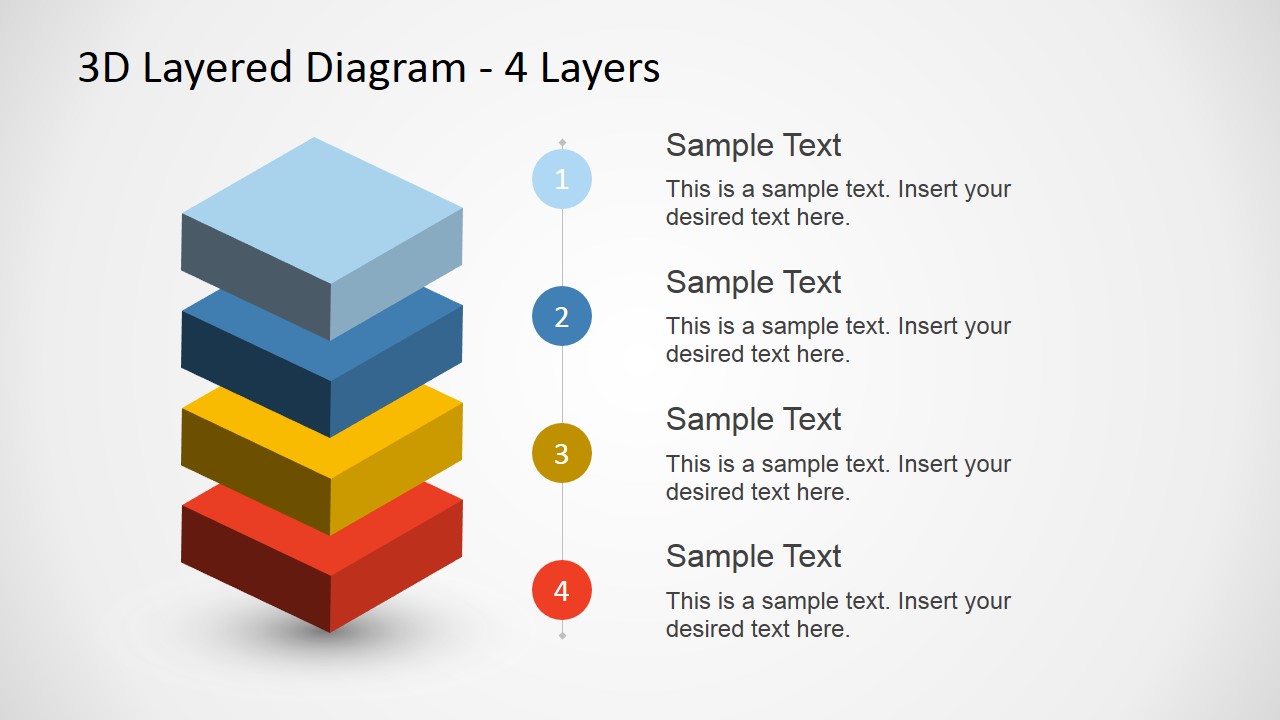
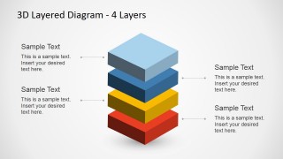
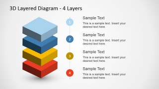
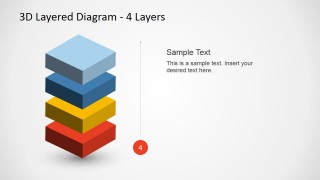
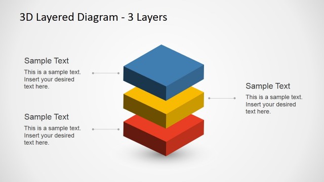
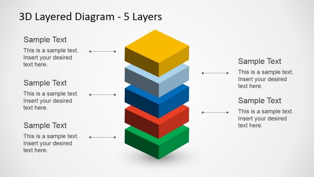
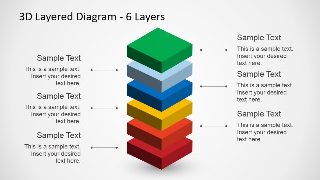
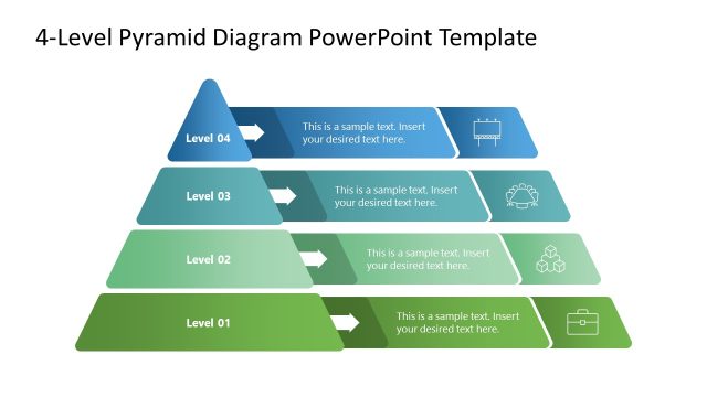
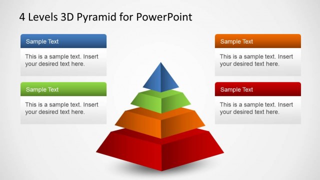
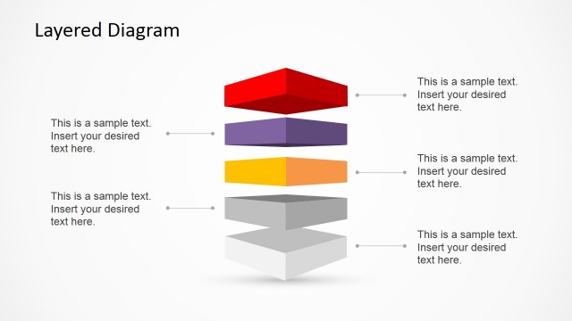
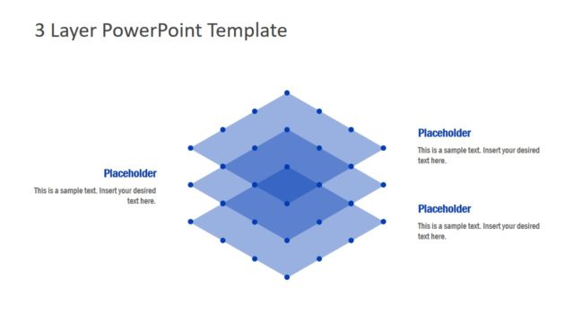
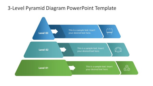
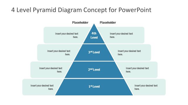
To generate a professional hierarchy presentation, use the 4 Levels 3D Layered Diagram for PowerPoint. The design offers 4 3D blocks for the reporter to make use as categories or levels of a topic. Each layer comes in different colors making it easier for the reader to remember important points.
There are many factors that affect project planning. The diagram can be used to arrange these factors according to importance, giving a hierarchy of workload. It gives a clear and organized approach. This allows the team to prioritize accordingly. As a result, the team becomes efficient in meeting its goal.
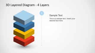
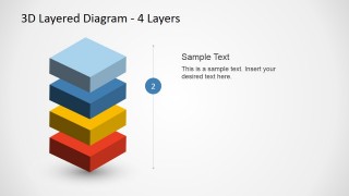
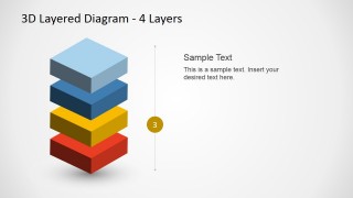
The PowerPoint slides include text holders for each level. The template has nine slides. Individual slides to give attention to each level are available as well. The colors are fully customizable to suit the tone of the report. The user can show different patterns using the diagram. The slide designs also emphasize every keynote.
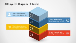
In the first and second PowerPoint slides, icons are included for photographic description. They are found beside every level. The first layer is colored sky blue and has a call center agent icon. It can represent work designation or audience for a project. The second level which has a blue shade can symbolize a target date. It goes with a clock icon. In the third level, the presenter can showcase methodology. It has a yellow color and the cart icon. That level can also include processes that a team can do to achieve its goals. The money icon in the last level can mean financial goals. It can also be a budget that is required to implement the whole plan.
The 4 Levels 3D Layered Diagram for PowerPoint is ideal for hierarchical planning and organizing the needs of a task. It will be of great help to the user in presenting reports in a creative manner. The appeal can provide an easy grasp of concepts for the audience.


