Present the product comparison with clarity in stakeholder meetings using our modern 3-Item Comparison Slide Infographic PowerPoint Template. We created this design to help professionals from multiple domains compare two concepts, ideas, or thoughts. This PPT layout features 100% editable elements that users can modify or replace as needed. Some of the use cases of our 3-item comparison template are:
- Managers can compare the performance of two teams working on the project using this simple layout.
- Before launching a product, users can edit the text in this layout to present the competition analysis report and compare the company’s product design with an already existing product.
- This PPT layout enables corporate trainers to compare two concepts comprehensively in their training sessions.
- HR managers can use this diagram to depict the two talent-acquisition models and how they differ.
- Furthermore, marketers can use our template to illustrate the comparison between two ad creatives in decision-making sessions.
- It is also helpful to compare two product or service tiers within the company and identify which one needs improvement or adjustment.
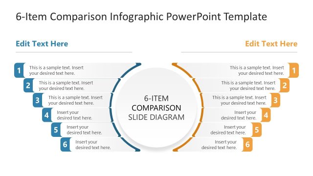
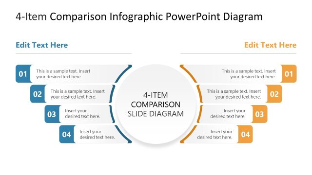
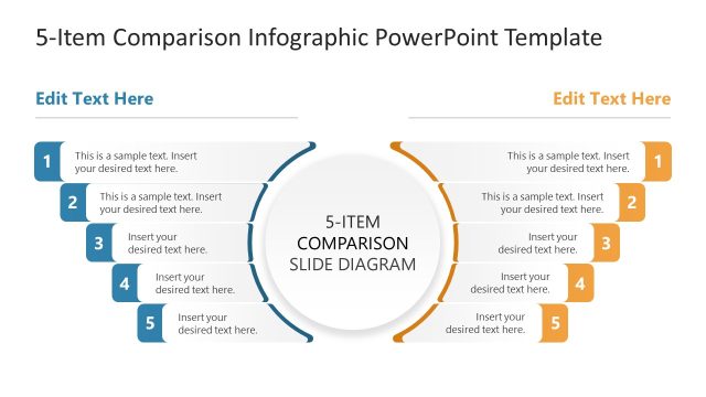
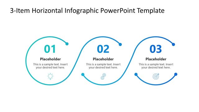
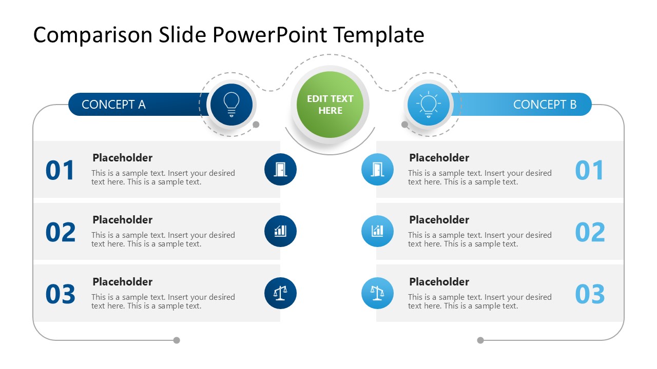
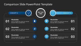
The 3-Item Comparison Slide Infographic PowerPoint Template features two columns with header bars for concepts A and B. In each column, there are three rows with text, numbers, and infographics. At the top center, there is a green circular ball that displays the title text, with a dotted line that makes it visually appealing. Our template has two slides with the same design, but the background color differs between them.
Additionally, you can customize this PPT presentation template with Google Slides. Download the 3-item comparison infographic template for PowerPoint and use it in your academic, education, development, or marketing presentations. Alternatively, you can learn how to present pros & cons in slides, or download other comparison slide PPT templates for PowerPoint, Google Slides and Canva, including Pros & Cons slides, A vs B slides, Before & After slides, and Advantage vs Disadvantage slides.
What’s inside this template
Example presentation scenarios
- A product manager can compare two product concepts before launch, using the A vs B columns and three numbered rows to discuss design, audience fit, and market readiness.
- A marketing lead can present two ad creatives to a decision group, placing each creative's strengths and tradeoffs in the matching three-row comparison structure.
- An HR manager can explain two talent acquisition models, using the concept headers, icon markers, and row text to separate cost, speed, and candidate quality.
- A corporate trainer can teach the difference between two business concepts, using the central title badge to frame the lesson and the parallel rows to reinforce matched criteria.
Features
- 100% editable presentation template
- Compatible with Microsoft PowerPoint and Google Slides
- 16:9 aspect ratio slides
- Scalable vector shapes, icons and illustrations
- AI-Ready for Microsoft Copilot and Claude
- Instant access and download
Frequently asked questions
Q: How should I present the three comparison rows clearly?
A: Start by stating the decision question in the central title badge, then give each row one consistent criterion. Keep Concept A and Concept B parallel: if row 01 discusses cost on the left, row 01 should discuss cost on the right. This keeps the audience focused on differences instead of searching for the comparison logic.
Q: What decision situations fit this 3-item comparison layout best?
A: This template works best when a presenter must compare two alternatives quickly and fairly, such as two product tiers, two campaign options, or two process models. It is strongest for executive updates, training explanations, and stakeholder reviews where three matched criteria are enough to support a discussion or recommendation.
Q: Why does the design use a central badge, icons, and mirrored columns?
A: The mirrored columns create a balanced A vs B reading path, while the center badge acts as the comparison topic. The light bulb icons and dotted connector suggest ideas being evaluated from the same frame of reference. This visual metaphor helps the audience see the slide as one structured comparison, not two separate lists.

3-Item Comparison Slide Infographic PowerPoint Template
2-slide comparison presentation template with A vs B columns, numbered rows, and concept icons
The 3-Item Comparison Slide Infographic PowerPoint Template is a 2-slide comparison diagram for managers, marketers, trainers, and analysts. It includes a two-column A vs B comparison, three numbered rows, central title badge, and icon markers, with light and dark variants for Microsoft PowerPoint and Google Slides.
- Category
- Diagrams
- Rating

 Loading...
- Aspect ratio
- 16:9
- Item ID
- 23438-02
- Colors
 Microsoft PowerPoint
  Microsoft Copilot
  Claude for PowerPoint
 Other formats supported
Subscribe today and get immediate
access to download our PowerPoint templates.