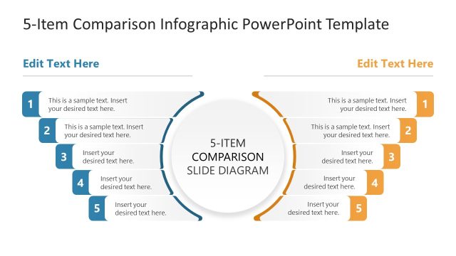
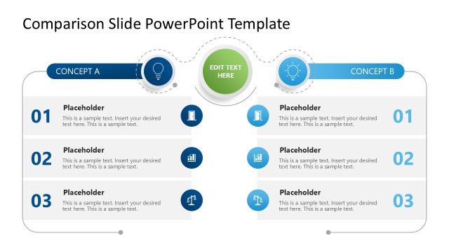
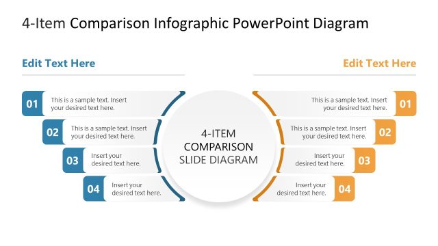
Share a structured analysis in your corporate presentations comprehensively with our 6-Item Comparison Infographic PowerPoint Template. Comparison layouts enable users to present key similarities and differences between two products, services, procedures, or other items. During product strategy presentations, product managers use a two-column layout to compare two products and prioritize releases. Marketing managers, in client meetings, compare and discuss various marketing strategies or campaign types for the upcoming business initiative. The HR directors use the comparison layout to distinguish between two organizational restructuring models in the leadership presentations.
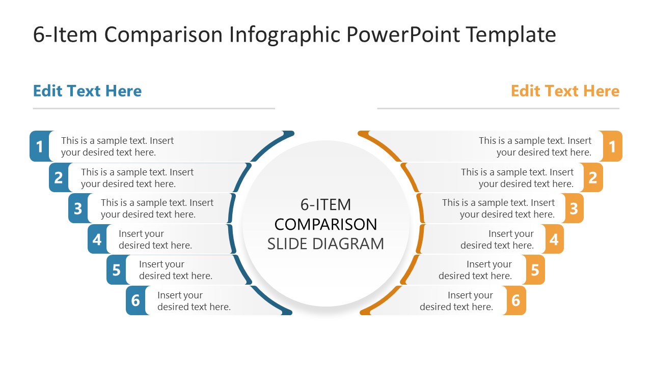
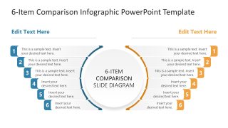
The 6-Item Comparison Infographic PowerPoint Template divides the slide into two mirrored columns. Each column comprises six arcs that curve inward toward the central circular shape, which displays the presentation title. This enables business analysts to measure different KPIs against the same standards. The blue and gold color codes specific to each side make it easier for the audience to follow the presentation points. The six-point layout is ideal for procurement managers to discuss the different aspects of two vendors during steering committee presentations for evaluation. Business development leads in stakeholder presentation compare two partnership models for execution using this 6-point comparison diagram. In academic presentations or career counseling sessions, mentors explain different career pathways to students and effectively compare metrics using our PPT template. The strategy leaders showcase the performance review of two business systems in their executive presentations by editing the 6-item comparison diagram.
Download the 6-item comparison infographic diagram PPT template to visualize side-by-side analysis of two products or business processes. In addition, you can try other comparison templates and select the one you prefer.
What’s inside this template
Example presentation scenarios
- A product manager can compare two product concepts for a roadmap meeting by placing six feature, cost, risk, or customer-value points in the mirrored callout rows.
- A procurement manager can present two vendor options to a steering committee by mapping evaluation criteria to the teal and orange sides of the comparison diagram.
- A marketing manager can explain two campaign approaches to a client by using the numbered rows to contrast channels, audience fit, budget, timing, message, and expected outcome.
- An HR leader can compare two restructuring models for executives by placing workforce impact, reporting changes, cost, timeline, risk, and benefits into the six-item layout.
Features
- 100% editable presentation template
- Compatible with Microsoft PowerPoint and Google Slides
- 16:9 aspect ratio slides
- Scalable vector shapes, icons and illustrations
- AI-Ready for Microsoft Copilot and Claude
- Instant access and download
Frequently asked questions
Q: How should I organize the six comparison points so the audience understands the decision?
A: Keep the same criterion in the same horizontal row on both sides. For example, compare cost to cost, timeline to timeline, and risk to risk. Use the central circle for the decision topic, not a long sentence. This keeps the audience focused on the relationship between the two options rather than reading two separate lists.
Q: Who is this comparison diagram best suited for?
A: This template fits presenters who need to explain two alternatives without building a dense table. Product, procurement, marketing, HR, and strategy teams can use it when the choice depends on a small set of clear criteria. The layout works best for meetings where the presenter will discuss each point rather than show detailed calculations.
Q: Why does the mirrored arc design improve the comparison?
A: The mirrored arcs act as a visual metaphor for two options moving toward the same decision point. The numbered callouts keep each side orderly, while the central circle anchors the topic. Because teal and orange separate the columns, viewers can track each option while still seeing the comparison as one unified analysis.

6-Item Comparison Infographic PowerPoint Template
2-slide comparison infographic presentation template with 6-point side-by-side analysis diagrams.
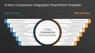
The 6-Item Comparison Infographic PowerPoint Template is a 2-slide diagram set for side-by-side analysis. It includes a two-column comparison infographic, central circular title area, six numbered callouts per side, and light and dark background variants for product, vendor, process, or strategy comparisons in Microsoft PowerPoint and Google Slides.
- Category
- Multi-purpose
- Rating

 Loading...
- Aspect ratio
- 16:9
- Item ID
- 23656-01
- Colors
 Microsoft PowerPoint
  Microsoft Copilot
  Claude for PowerPoint
 Other formats supported
Subscribe today and get immediate
access to download our PowerPoint templates.