Download our 5-Item Comparison Infographic PowerPoint Template to compare two groups across five parameters. Strategy consultants use the comparison infographics to compare the performance of two executive teams in business presentations. Product managers can edit this PPT layout to showcase how their product is better than the competitor’s product to the investors. In academic training, career counselors clearly distinguish between two career options using this 5-item layout.
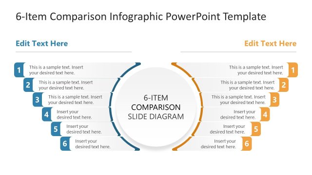
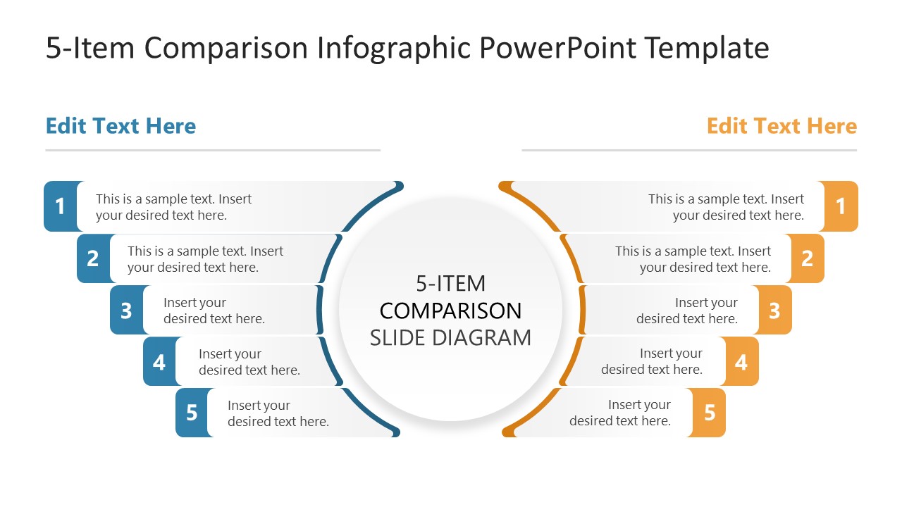
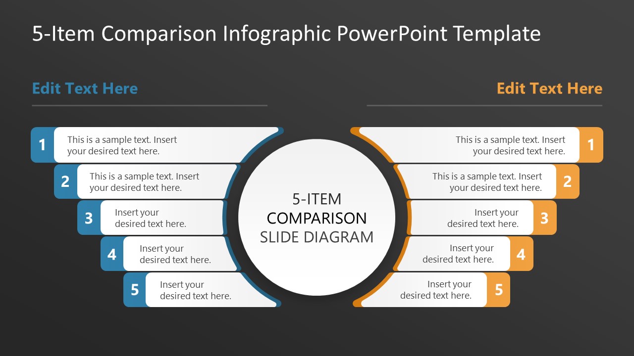
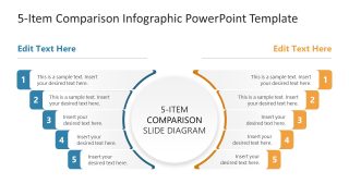
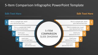
The 5-Item Comparison Infographic PowerPoint Template features a central circular diagram with a title and two arcs flanking it. The one arc is blue on the left and golden yellow on the right. Each arc comprises five numbered boxes that extend outward, forming a mirrored structure for comparing points across different criteria between two groups simultaneously. The audience can quickly understand the key differences regarding each parameter due to the clear visual arrangement. The numbered boxes have enough space for users to outline brief details by adding custom text to the placeholder lines. Digital marketers use the two-column comparison diagram to highlight differences between the best-performing and an underperforming ad. They can use either the dark or the white background slide, depending on the theme or their choice. The marketing team understands the key advantages of the best-performing ad campaign with this clean layout. Further, if you have to visualize six points, you can download and edit the 6-Item Comparison Infographic PowerPoint Template.
Download the 5-item comparison infographic PPT template and display the comparison between two products or scenarios in the product presentations. If you want to try a different theme or pattern layout, then visit our collection of comparison templates to find the most suitable design for your next business presentation.
What’s inside this template
Example presentation scenarios
- A product manager can present a product-versus-competitor comparison by placing feature or benefit differences into the mirrored five-point text boxes.
- A strategy consultant can compare two executive teams, operating models, or initiatives by using the numbered left and right columns to keep criteria aligned.
- A marketing lead can explain a strong campaign against an underperforming campaign by mapping five performance factors into the blue and orange sides.
- A career counselor or trainer can compare two career paths or learning options by using the central title to frame the decision and the numbered boxes to show tradeoffs.
Features
- 100% editable presentation template
- Compatible with Microsoft PowerPoint and Google Slides
- 16:9 aspect ratio slides
- Scalable vector shapes, icons and illustrations
- AI-Ready for Microsoft Copilot and Claude
- Instant access and download
Frequently asked questions
Q: How should a presenter structure the message on this comparison slide?
A: Start with the decision or comparison question in the central circle, then make each numbered pair represent the same criterion on both sides. Keep each text box short and parallel in wording. This lets the audience scan point 1 against point 1, point 2 against point 2, and so on without reading a long table.
Q: Who is this template best suited for in a business presentation?
A: This template fits presenters who need to explain differences between two choices without building a full analytical dashboard. Product managers can compare offerings, consultants can compare operating options, and marketers can compare campaign performance. The five-item limit works best when the goal is clarity around the most important differences.
Q: Why does the mirrored arc layout work well for comparison?
A: The design uses symmetry as the main visual metaphor: two sides face the same central topic, so the audience understands that each side answers the same comparison question. The blue and orange arcs separate the alternatives, while the numbered boxes create order and prevent the slide from becoming a scattered list.
5-Item Comparison Infographic PowerPoint Template
2-slide presentation template with mirrored 5-item comparison diagrams for product and performance analysis
The 5-Item Comparison Infographic PowerPoint Template is a 2-slide comparison slide template for Microsoft PowerPoint and Google Slides. It includes a mirrored 5-item comparison diagram, central circular title area, two-column numbered point lists, and light and dark background versions for product, performance, or option comparisons.
- Category
- Multi-purpose
- Rating

 Loading...
- Aspect ratio
- 16:9
- Item ID
- 23655-01
- Colors
 Microsoft PowerPoint
  Microsoft Copilot
  Claude for PowerPoint
 Other formats supported
Subscribe today and get immediate
access to download our PowerPoint templates.