Software architecture presentations face a challenge that most business decks do not: they must communicate infrastructure decisions to audiences who rarely share the same depth of technical knowledge. A senior engineer can read a cloud topology diagram in seconds; the same diagram leaves most business stakeholders guessing about what each component does and why it was chosen. The solution that engineering and product teams reach for is visual iconography: the official icon sets published by cloud providers like Microsoft Azure, Amazon Web Services, and Google Cloud Platform.
These icon libraries give architects and developers a shared visual vocabulary for representing compute, storage, networking, and AI workloads in diagrams and slides. The practical challenge is not simply finding the assets. It is knowing where to get them, which search terms map to which products, and how to incorporate them into presentations without running into licensing restrictions. For organizations building digital transformation presentations for leadership, a clear tech stack presentation is often one of the first deliverables that technical leads must produce for non-technical decision-makers.
This guide covers where to find official icon sets for the major cloud platforms, how to apply brand guidelines correctly in presentation contexts, and how to structure a tech stack presentation slide that reads clearly for both technical and executive audiences.
Why Visual Icons Matter in Software Architecture Presentations
In technical presentations, icons do something that text labels alone cannot: they convey preloaded meaning to anyone who has worked with these platforms. When a diagram shows the Azure Machine Learning icon, an engineer immediately understands the context. A less-technical stakeholder still recognizes that the symbol belongs to Microsoft’s cloud platform, which establishes the credibility of the technology choice without requiring a paragraph of explanation.
The alternative is text-only architecture slides, which force the presenter to define every term and create a reading experience that competes with listening. Slides dense with service names and connector arrows are harder to absorb than the same architecture represented with recognizable icons and clear labels. Using icons in PowerPoint to boost visual quality is not merely an aesthetic decision; it is a communication choice that directly affects how much an audience retains and how confidently they can engage with questions afterward.
The additional requirement is that the icons be the official ones. Generic cloud illustrations or free icons that loosely suggest a product category do not carry the same signal. Using the actual service icons published by each provider tells a technical audience that the diagram was built with product-level precision. That credibility matters in procurement reviews, technical audits, and board-level technology presentations. Creating beautiful diagrams for presentations that balance visual clarity with technical fidelity is a core skill for any architect or engineering leader presenting to mixed audiences.
Where to Find Official Tech Stack Icons
Each major cloud provider maintains a publicly available icon library designed for architecture documentation and presentations. The access points, file formats, and usage conditions differ across providers, so it is worth knowing the specifics before building a deck.
Microsoft Azure Icons
Microsoft publishes the Azure icon set through the Azure architecture documentation portal, available at the Microsoft Download Center. The library is distributed as a ZIP archive containing SVG and PNG files organized by service category: compute, networking, databases, AI and machine learning, developer tools, and more. These categories align with the structure of Azure’s product pages, which makes it straightforward to locate a specific service without searching by filename.
For professionals working in PowerPoint, inserting SVG icons into PowerPoint slides produces the cleanest results because vector graphics scale without quality loss at any slide size. The Azure icon set maintains a consistent visual language across categories, so architecture diagrams remain coherent even when combining icons from the compute, networking, and AI service groups. The library receives regular updates when Microsoft adds new services, so checking the latest release before starting any new project is a sound habit.
When building slides for AI Agents on Azure (workloads involving orchestration frameworks like Azure AI Agent Service or AutoGen), the relevant icons include Azure AI Foundry, Azure OpenAI Service, and the compute and storage services that support agent orchestration. All are available within the AI and machine learning category of the Azure icon library. Because the agent orchestration pattern spans multiple service tiers, grouping these icons by their role in the workflow, rather than by service family alone, produces a diagram that stakeholders can follow without deep familiarity with the Azure product catalog.
Amazon Web Services Icons
Amazon Web Services maintains one of the most comprehensive architecture icon libraries among cloud providers. The AWS icon set is available for download from the AWS Architecture Center and covers all major services across compute, storage, security, machine learning, and analytics. AWS organizes its library into two main collections: resource icons, which represent specific physical or logical resources such as S3 buckets or EC2 instances, and service icons, which represent broader service categories.
For presentations focused on LLM training on AWS, pipelines that commonly involve Amazon SageMaker, Amazon Bedrock, and purpose-built training chips like AWS Trainium have dedicated icons in the library for each service. SageMaker has multiple sub-service icons representing its distinct components: SageMaker Studio, SageMaker Training Jobs, and SageMaker Endpoints each have their own icon, which allows architecture diagrams to trace the full training pipeline from data preparation through model deployment with a consistent visual layer.
This granularity is one of the reasons the AWS icon library is particularly useful for AI and machine learning presentations. A single diagram can distinguish between the environment where data scientists build and experiment, the job that runs training at scale, and the endpoint that serves the finished model, all without adding text annotations that would clutter the slide. AWS also publishes reference architecture templates for generative AI and foundation model training patterns, which serve as a reliable starting point for a tech stack deck that centers on AWS infrastructure.
Google Cloud Platform Icons
Google Cloud publishes its icon set through the Google Cloud architecture documentation pages. The library covers all major services, including Compute Engine, Cloud Storage, BigQuery, Vertex AI, and the full suite of networking and security products. Google Cloud icons follow a distinct visual style compared to the angular language of Azure or the two-tone approach of AWS: more rounded forms and Google’s recognizable color palette give diagrams a different visual character that is immediately recognizable to anyone familiar with the Google Cloud console.
For teams building slides around VLM training on Google Cloud, the relevant services include Vertex AI’s training infrastructure, Cloud TPUs or GPU nodes, Cloud Storage for training data and model artifacts, and BigQuery for data preparation. Icons for each of these services are available in SVG and PNG formats through the library. Google also provides stencils formatted for diagramming tools such as draw.io and Lucidchart, which can be exported to image formats compatible with PowerPoint.
One distinction worth noting is that Google Cloud’s icon set treats Vertex AI as the unifying symbol for its managed AI platform, rather than providing separate icons for each sub-capability. This means a single Vertex AI icon often represents the overall ML training environment in architecture slides, with supplementary icons for Cloud TPUs and the data services that feed and store model artifacts. Understanding this structure before building a diagram prevents the common mistake of searching for a dedicated training-job icon that does not exist as a separate asset.
Where to Find Programming Language and Framework Icons
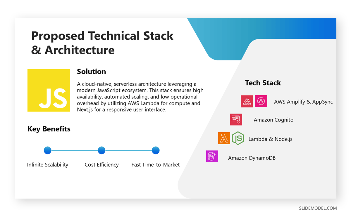
Cloud service icons cover the infrastructure layer of a tech stack, but a complete architecture presentation typically also needs to represent the languages and frameworks running on that infrastructure. Python for machine learning pipelines, JavaScript and React for frontend layers, PHP for server-side logic, SQL databases for persistent storage: these are standard components of architecture diagrams that require their own icon vocabulary.
Unlike cloud provider icons, which are controlled by corporate brand teams with specific redistribution policies, most programming language and framework icons come from open-source libraries that operate under permissive licenses. This distinction matters for presentation professionals because it changes both where to find the assets and how freely they can be used across different output formats and distribution contexts.
Devicon
Devicon is an open-source icon library hosted on GitHub in the devicons/devicon repository. It contains SVG icons for over 200 programming languages, frameworks, and development tools, including Python, JavaScript, TypeScript, React, Node.js, PHP, Java, Go, Rust, Docker, Kubernetes, PostgreSQL, MySQL, and MongoDB, among many others. All icons in the Devicon’s library are released under the MIT license, which permits use in presentations, technical documentation, and commercial materials without restriction.
The library is actively maintained, with new icons added as frameworks reach significant adoption levels. Each icon in the repository typically comes in multiple variants: a colored version that uses the technology’s recognized brand colors, a plain version for monochrome contexts, and sometimes a wordmark version that combines the icon with the technology name. For architecture slides, the colored variant tends to work best because it helps viewers distinguish between services at a glance, particularly when multiple languages and tools appear on the same diagram. Devicons can be downloaded directly from the GitHub repository or accessed via a CDN for use in web-based diagram tools.
Simple Icons
Simple Icons is a second open-source library available at simpleicons.org, focused on official brand icons for technology companies, platforms, programming languages, and frameworks. Unlike Devicon, Simple Icons uses a consistent monochrome style across all entries, which makes it particularly useful for presentations with a strict color scheme that requires icons that can be uniformly tinted to match it. The library covers SQL-adjacent tools, including SQLite and common database engines, as well as application frameworks, cloud services, and version control platforms.
Each icon in Simple Icons is accompanied by the brand’s official hex color, so presenters who want to use the technology’s recognized color while maintaining stylistic control have a reference point. The library is also available through the Iconify ecosystem, which aggregates multiple open-source icon sets into a single searchable interface, making it straightforward to browse Devicons, Simple Icons, and other collections from one location.
SlideModel Icons
If you’re looking for a resource that contains both tech stack icons as well as tailored PowerPoint icons for any step diagram or slide requirement, here’s the library to browse. Available for all SlideModel subscribers, you need to browse the navigation bar for the term you’re looking for.
For instance, if you’re creating a frontend development presentation deck to update your team on the latest revisions, you can browse for JavaScript SVG icons and find a wide variety of designs, in color or black and white, that can be added to any presentation slide.
Just store your downloaded PPT icons in a folder for easier access, and you can reuse them as many times as required. They’re fully scalable for any presentation design.
Using Programming Language Icons in PowerPoint
For presentations built in PowerPoint, downloading SVG files from sites like Devicon or SlideModel and inserting them as icons allows the graphics to scale without loss of quality at any slide size. Both libraries organize files by project name, so locating a specific technology is straightforward once you know the library’s canonical name (for example, “js” for JavaScript or “postgresql” for PostgreSQL).
When combining programming language icons with cloud service icons in a single architecture diagram, visual consistency between the two layers is important. Cloud provider icons use their respective brand colors, while Devicon can be used in either a colored or plain form, depending on the overall slide design. Keeping all icons at a consistent size and applying a uniform background shape or container creates a diagram in which both the infrastructure and application layers read as a coherent whole rather than a collection of elements from different sources. For complex stacks with many components, a comparison slide approach organized by layer (frontend, backend, data, infrastructure) gives the audience a structured view that is faster to read than an undifferentiated icon grid.
Brand Guidelines and Permitted Use
Downloading an official icon library does not provide unlimited permission to use those assets in every context. Each cloud provider publishes brand guidelines that define acceptable uses for their icons and logos. The general principle across Azure, AWS, and Google Cloud is that the use of official icons to represent their services in technical documentation and architecture diagrams is permitted. Using those icons in commercial materials to imply partnership, endorsement, or affiliation with the provider does not.
For presentation professionals, the distinction that matters is between visually representing an Azure service in an architecture diagram and incorporating Azure branding into marketing materials, which can signal an official commercial relationship. This is precisely why presentation template platforms cannot include cloud provider logos and service icons in their galleries: redistributing those assets falls outside the guidelines governing personal and technical use.
The icons remain fully available for legitimate professional use in technical presentations. When applying visual treatments to maintain design consistency, for example, applying a drop shadow effect to PowerPoint icons to align with a deck’s visual theme, the icons should function as representations of their respective services rather than altered versions of the provider’s brand mark. It is recommended to review each provider’s brand guidelines before publishing a tech stack deck externally, particularly for consulting firms and agencies producing client-facing materials.
How to Present a Tech Stack in PowerPoint
The structure of a tech stack presentation depends on its audience. A purely technical audience may need only a detailed architecture diagram with labeled services. A mixed audience that includes business stakeholders typically requires multiple layers: a conceptual overview of what the system does, a service map showing how components connect, and optionally a dedicated slide for each major functional layer.
The most effective way to present tech stack information to a general audience is to open with the problem the architecture addresses, then introduce the technical components. This is the same principle that guides strong architecture project presentations. Leading with business context makes the technical decisions legible to the full room. The services, platforms, and icons then appear as answers to stated requirements rather than as a catalog of tools. For organizations planning infrastructure evolution over time, pairing the current architecture view with a technology roadmap built in PowerPoint provides stakeholders with visibility into both the present state and the planned investment direction.
The Tech Stack Presentation Slide
A tech stack presentation slide, at its most functional, answers two questions for the viewer: what services are running, and how they connect. Service categories, including compute, storage, AI, and networking components, should be grouped spatially so that the viewer can scan the architecture by layer rather than parse individual service labels sequentially.
The data flow diagram approach applies directly to tech stack slides: tracing how data moves through a system is more informative than listing its components in isolation. A slide that shows where data enters a pipeline, which services process it, where it is stored, and how outputs are delivered gives a complete picture that a static service inventory cannot. For architectures with many interdependencies, an entity-relationship diagram format, alongside the main architecture view, documents service relationships in a way that supports technical review, stakeholder discussion, and audit documentation simultaneously.
A tech stack deck intended for executive audiences should separate the architecture visual from the decision rationale slides. The architecture communicates what has been built or planned; separate slides covering cost, scalability, and vendor considerations explain why those decisions were made.
Presenting AI Workloads: Azure, AWS, and Google Cloud
The growth of AI infrastructure has introduced a prominent category of icons across all three major cloud providers. Teams presenting AI Agents on Azure will find icons for Azure AI Foundry, Azure OpenAI Service, and Azure Machine Learning, along with the networking and storage services that support autonomous agent orchestration, all available in Microsoft’s icon library. These components together represent the infrastructure required to deploy, monitor, and scale agent-based systems.
For LLM training on AWS, the relevant icon set spans Amazon SageMaker, Amazon Bedrock, AWS Trainium, Amazon S3, and AWS Glue, arranged to show the path from data ingestion through model deployment. A dashboard presentation is particularly useful for the operational metrics slides that accompany training pipeline presentations, where throughput, cost per training run, and iteration speed need to be communicated alongside the architecture diagram.
VLM training on Google Cloud typically involves Vertex AI, Cloud TPUs, Google Kubernetes Engine, Cloud Storage, and BigQuery. Google’s Vertex AI icon has become widely recognized in enterprise AI presentations due to the volume of foundation and multimodal model work running on Google Cloud infrastructure. Using the correct Vertex AI icon, rather than a generic AI illustration, signals to reviewers that the architecture reflects the actual managed ML platform and not a conceptual representation.
FAQs
Where can I download official Azure icons for my presentations?
Microsoft publishes the Azure icon library at the Microsoft Download Center. It is updated regularly and provided as a ZIP archive with SVG and PNG files organized by service category.
Are AWS architecture icons free to use in technical presentations?
Yes. AWS makes its architecture icons available for download from the AWS Architecture Center. They are designed for use in technical documentation and diagrams that represent AWS services.
Where do I find Google Cloud icons for my slides?
Google Cloud publishes its icon library through the Google Cloud architecture documentation pages, with icons in SVG and PNG formats covering all major services, plus stencils for common diagramming tools.
Can I include cloud provider logos in a client-facing deck?
Using official service icons to represent services in architecture diagrams is generally permitted. Using provider logos to imply commercial partnership requires authorization. Review each provider’s brand guidelines before external publication.
What file format should I use for cloud icons in PowerPoint?
SVG is preferred because vector graphics scale without loss of quality. If SVG import is unavailable, high-resolution PNG files work well for standard slide dimensions.
How do I structure a tech stack presentation for a non-technical audience?
Open with the business problem the architecture addresses before introducing technical components. Group icons by function, use labels that describe what each service does, and minimize jargon on slides visible to the full room.
How often are the official cloud icon libraries updated?
Each provider updates its library when new services launch or existing icons are redesigned. Checking for the latest release at the start of any project ensures your diagrams reflect current products.
Can I apply visual effects such as shadows or color overlays to cloud service icons?
Resizing and repositioning icons is acceptable. Altering core icon shapes or colors, or creating composite symbols by merging icons, typically falls outside the permitted use defined in each provider’s brand guidelines.
How many cloud service icons can one slide display before becoming unreadable?
Architecture slides with more than 12-15 icons become difficult to parse in a live presentation. For complex architectures, dividing the diagram across slides by functional layer is more readable than fitting everything onto a single canvas.
What is the difference between a tech stack slide and a tech stack deck?
A tech stack slide is a single visual that represents architectural components and their connections. A tech stack deck is a full presentation covering the architecture and the rationale for technology.
What is the recommended slide count for a tech stack presentation?
For an internal technical review, a focused tech stack presentation typically runs 8 to 15 slides, depending on the complexity of the architecture. Executive-facing decks are most effective with 6 to 10 slides, with detailed appendices for audiences that require deeper technical context.
Final Words
Building a software architecture presentation that reads clearly for both technical and non-technical audiences requires more than sourcing the right cloud service icons. The icons provide a shared visual vocabulary, but the structure of the tech stack deck, including how layers are organized, how AI workloads on Azure, AWS, and Google Cloud are framed, and how the architecture connects to business goals, determines whether the audience leaves with a genuine understanding or a collection of unfamiliar service names.
Using official icon libraries from each provider and observing their brand guidelines keeps presentations accurate and compliant. A considered slide structure ensures the architecture is legible to the whole room.