
Sit in enough presentations, and a pattern becomes obvious. Some slides are packed with text, multiple charts, and stray commentary crammed into the margins. Others carry a single, clear idea and nothing else. The difference in how each type lands with an audience is not subtle.
The principle behind the more effective slide is straightforward: one topic per slide. Each slide addresses exactly one idea, one argument, or one data point. The presenter moves on when the point is made, not when the slide runs out of room.
This approach changes how audiences receive a presentation. Rather than scanning a dense canvas to identify what matters, they follow a logical sequence in which each frame builds on the last. For anyone presenting to corporate stakeholders, academic panels, or prospective clients, that distinction carries real consequences. The slides that work are almost always the ones that respect the audience’s attention.
This article examines why the one-topic rule holds up under scrutiny, where presenters most commonly violate it, and how to apply it across different types of content, including material that initially seems too dense to break apart.
Why the One-Idea Principle Works
The explanation is grounded in how the brain processes information under time pressure. When someone sits in a presentation, they are simultaneously listening to the speaker, reading the screen, and making sense of the relationship between the two. That combination places a significant demand on working memory. Research in cognitive psychology describes this as cognitive load, meaning the mental effort required to process incoming information. When a slide introduces multiple ideas at once, it increases that load beyond what comprehension can keep up with. Cognitive biases further compound the problem: audiences under cognitive stress tend to anchor on the first or most visually prominent element of a slide, which may not be the one the presenter considers most important.
Garr Reynolds, author of Presentation Zen, frames the issue as a signal-to-noise problem. Every element on a slide that does not serve the key message is noise. The more noise present, the harder the signal is to detect. He argues that restraint in slide design is not about aesthetics but about communication efficiency. A slide stripped to its essential idea gives the audience one clear decision: whether they understand it. That is a fundamentally different cognitive task from sorting through five competing claims to identify which one the presenter considers most important.
John Medina, in Brain Rules, adds a related observation about split attention. Audiences asked to read a detailed text cannot simultaneously process what a speaker is saying. The two tasks compete for the same cognitive resources. A slide that presents one clear point, supported by a visual rather than paragraphs of text, removes that competition. The presenter’s voice carries the explanation; the slide reinforces the concept. That division of labor is what focused slides are built for.
What Breaks the Rule
The violations of this principle are common enough that they have acquired names in presentation design circles. The most recognized is the slideument, a hybrid between a slide and a document that tries to serve both purposes at once. Slideuments appear when presenters use their deck as a leave-behind or substitute for a written report. The result is text-heavy slides that communicate nothing efficiently in either format. As a visual aid, they ask too much of the audience. As a reference document, they are too shallow. They fail at both.
Another common failure mode is the overloaded summary slide. In an attempt to demonstrate thoroughness, presenters place every supporting argument, every sub-point, and every qualifying note on a single frame. Instead of reading as comprehensive, these slides read as unfiltered. The audience cannot tell which idea the presenter considers most important because all of them receive equal visual weight. The argument’s hierarchy collapses, and the presenter ends up verbally explaining what the slide should have conveyed on its own.
Process diagrams and data visualizations are particularly vulnerable to this problem. A chart that tries to show five variables, their relationships, and a trend over time has asked the audience to do too much interpretive work at once. Even technically sophisticated audiences struggle to extract meaning quickly from overloaded visuals. The instinct to show the full picture in one frame usually produces the opposite effect: the audience processes less, not more.
The underlying cause of all these failures is the same: a reluctance to commit to one message per slide. Presenters add more content because they are uncertain what the audience will retain, or because they associate density with thoroughness. Neither assumption holds. An audience that leaves with a clear understanding of ten ideas, one per slide, retains more than one that sat through slides carrying ten ideas each and understood none of them with confidence.
Applying the Principle in Practice
Start with the Single Takeaway
Before designing any slide, the first question to answer is: if someone in this room forgets everything else, what is the one thing they should remember from this slide? The answer to that question is the slide’s content. Any supporting evidence or visuals should serve that answer without extending it into new territory.
In practice, this means building slides backward from conclusions. Rather than accumulating information and letting the content determine the structure, the presenter identifies the key point first and then selects the evidence that makes it most legible. Slide titles become especially useful in this approach. A title that states the conclusion, such as “Revenue grew 22% in Q3” rather than “Q3 Revenue Update“, gives the audience an anchor before the chart even registers. Descriptive, assertive titles act as signposts that confirm the audience is following the argument correctly.
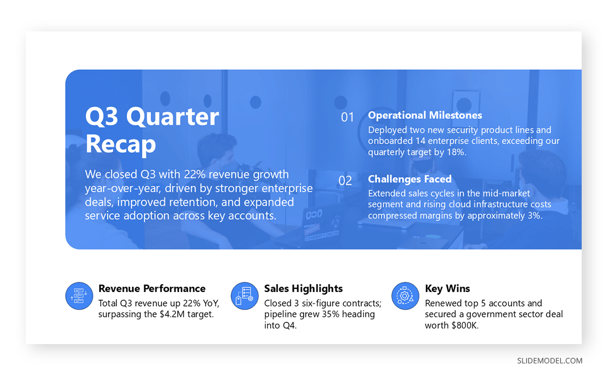
For presenters who find this approach counterintuitive, a useful test is the five-second check. Show the slide to someone unfamiliar with the content for five seconds, then ask them to describe what they understood. If they cannot identify the main point, the slide has too many competing elements. If they can describe it accurately without hesitation, the slide is working.
Break Sub-Points into Separate Slides
A natural resistance to this principle comes from the assumption that more slides means a longer presentation. That assumption confuses screen time with substance. A deck of twenty focused slides supporting a ten-minute presentation is not excessive; it reflects appropriate pacing. The audience experiences a series of clear transitions rather than extended time on a single cluttered frame.

When a topic has multiple sub-points that each deserve attention, each earns its own slide. This keeps the audience’s focus on one idea at a time and allows the presenter to address questions point by point rather than having to navigate back through a cluttered single slide when someone asks for clarification. Subdivision also improves the deck’s overall logical structure. When slides map one-to-one with ideas, the deck functions as an outline of the argument. Reviewing it before or after the session gives the audience a clear record of the reasoning, not just a sequence of images.
Use Speaker Notes for Supporting Detail
One of the more practical objections to the one-topic principle is that it seems to leave out important information. The assumption is that anything not on the slide will be missed. In reality, the presenter’s delivery is a more reliable vehicle for nuance, context, and qualifications than a slide covered in fine print. Speaker notes in PowerPoint exist precisely for this purpose. Detailed statistics, secondary sources, methodological notes, and background context belong in the notes rather than on the slide. They remain available during the session and can be included in a handout distributed afterward, without compromising what appears on screen.
This division is worth making deliberate. The slide states the claim, the presenter develops the reasoning in real time, and the notes hold the supporting detail that would otherwise clutter the screen. When each layer of the presentation does the job it is suited for, the audience receives information in the order and format that makes it easiest to absorb.
Handling Dense or Technical Content
The most common objection to the one-topic rule comes from presenters working with genuinely complex material: financial models, research findings, multi-stage processes, or comparative data sets. The instinct is to show everything in a single frame to present the full picture. That instinct usually produces the worst outcome, a slide so dense that the audience either ignores it or spends the entire section trying to decode it rather than listening to the presenter’s interpretation. When details genuinely cannot be covered in the session, a prepared handout for your presentation resolves the tension without compromising the slides. Reference data, technical appendices, and supporting research can travel with the audience and be reviewed at their own pace. The slides stay clean; the content stays accessible.
Progressive disclosure is one of the more effective alternatives for visual complexity. Using animation or a deliberate slide sequence, the presenter reveals one element of a complex diagram at a time. The audience follows the logic at the pace the presenter controls, rather than jumping ahead or falling behind. This approach works particularly well for process flows and system architectures where the relationships between components matter as much as the components themselves. Revealing a six-step process incrementally is not slower than showing all six steps at once; it is almost always clearer.
Micro-slides serve a similar function for data-heavy content. Instead of comparing six metrics on a single chart, the presenter dedicates one slide to each metric, builds the audience’s understanding incrementally, and returns to a summary visual at the end. By that point, the audience has already processed each data point individually and can read the summary with context they would not have had if the comparison had been presented all at once. The apparent inefficiency of using more slides to cover the same data pays off in retention and comprehension.
Where the Rule Has the Most Impact
The benefits of focused slides are not uniform across all presentation contexts. In corporate settings, where stakeholders are evaluating performance data or making resource decisions, a slide that highlights one KPI is more useful than one that lists eight. The audience absorbs the number, hears the explanation, and moves to the next point. Questions arise at natural transitions rather than mid-explanation. In client pitches, one benefit per slide keeps the argument building steadily, without giving the audience an opportunity to dispute one point while the presenter is still explaining another. Audience engagement across all these contexts tends to improve when the slide transition rate is higher. Frequent changes maintain attention in a way that extended exposure to a single complex slide cannot.
Technical presentations benefit from the rule at a different level of detail. Restricting each slide to a single algorithm, component, or process step allows the audience to ask clarifying questions at natural transition points. Questions about one component do not derail the explanation of another. This separation also makes the presentation easier to navigate when questions require the presenter to return to a specific slide. A focused deck is far easier to move through than one where multiple ideas share a single frame.
For academic presentations, where peer review and structured question periods follow the session, the one-topic principle also improves the quality of discussion. When each slide addresses one claim, respondents can reference specific points precisely. The conversation becomes more substantive. Building that kind of logical, sequential structure into a deck is part of what effective presentation storytelling looks like in practice: a series of contained, connected arguments rather than a collection of dense reference slides.
Two Myths Worth Addressing
Two beliefs about presentation design run counter to the one-topic principle and are worth examining directly. The first is the assumption that fewer slides signal a better presentation. This confuses economy with clarity. A ten-slide deck, with each slide overloaded with content, is not shorter or more efficient than a thirty-slide deck, where each slide carries one clear idea. The audience’s experience of the two is entirely different. The former requires sustained effort to parse; the latter creates a steady, legible narrative. How many slides a presentation should have depends not on convention but on how many distinct ideas are being communicated. Slide count is a product of content, not a target.
The second myth is that everything must appear on the slide for the presentation to be complete. This misunderstands the relationship between the presenter and the visual aid. Slides are not transcripts. They are support material for a spoken argument. The presenter is the primary channel of information; the slide is the secondary one. When the slide tries to replace the presenter by containing every statement they plan to make, the presenter becomes redundant. The audience reads rather than listens, and the dynamic that makes presentations worth attending disappears.
Treating slides as partial by design, built to present rather than to document, frees the presenter to make better decisions about what goes on screen. The question is not whether an element belongs to the slide’s topic, but whether it helps the audience understand the one idea the slide is conveying. That is a harder standard to meet and a more useful one. Slides that meet it communicate without needing to be talked through or explained after the fact.
FAQs
Does one topic per slide mean one sentence per slide?
Not necessarily. A single topic can be supported by a relevant visual, a brief explanatory phrase, and a data point, provided each element serves the same idea. The constraint is on the number of distinct ideas, not the number of elements on screen. A well-designed slide might include an image, a short label, and a title that together communicate one complete thought, with none of them introducing a separate argument.
How does this rule apply to virtual presentations?
It applies with more force online, where audience attention is easier to lose and harder to recover. In virtual settings, the slide is often the primary visual anchor, and when that anchor is overloaded, participants disengage more quickly than they would in person. Keeping each slide focused on one idea also makes screen-recorded versions of the presentation easier to follow without a live presenter guiding the sequence.
What if my organization expects detailed slide decks?
The expectation for dense slides often reflects habit rather than genuine communication need. A practical approach is to separate the presentation deck from the reference document. One file is used during the meeting; another is distributed afterward with full supporting detail. The presentation follows the one-topic principle; the reference document carries the remaining information, without either file compromising its function.
Does this principle apply to the title slide and agenda slide?
Those slides serve navigational and contextual purposes rather than argumentative ones, so different standards apply. An agenda slide can legitimately list several items because its function is to orient the audience, not to communicate a single claim. The one-topic principle applies specifically to content slides in which the presenter is building a case or conveying information the audience needs to understand and retain.
How do I apply this rule when presenting data?
Start by identifying the single insight the data should communicate. Then build the chart around that insight, selecting the variables, time ranges, and chart type that make it visible. If the data contains multiple insights worth presenting separately, each earns its own slide. A chart that supports a single conclusion is more persuasive than one that presents several and leaves the audience to decide which matters most.
How do I handle content that seems too interconnected to separate?
Interconnected content is often better addressed through a sequence of slides that builds toward a synthesis, rather than a single slide that tries to show all the connections at once. Present the individual components before showing how they connect, and withhold the synthesis until the audience has the context to receive it. The audience concludes having already processed the parts, making the connection more meaningful than if everything had been presented simultaneously.
Final Words
The one-topic-per-slide rule is not a design preference. It is a communication principle rooted in how audiences actually process information in real time. Slides that respect it create a presentation that is clearer to follow, more reliably retained, and more responsive to the presenter’s control throughout the session. Slides that ignore it place the burden of comprehension on the audience, and audiences under that burden tend to give up.
The objection that this approach requires more slides is accurate and beside the point. Slide count is not a measure of quality. The measure is whether the audience leaves with a clear understanding of what was presented. That outcome is consistently more likely when each slide carries one idea, stated plainly, supported by exactly the evidence it needs and nothing added beyond that.
Start with the next deck you build. Before adding a second idea to any slide, ask whether it could stand on its own. In most cases, it can. And a presentation made up of slides that each stand on their own is one where the audience never has to wonder what they were supposed to take away.