Data Analysis
How to Present a Win and Loss Analysis
A practical guide to structuring, designing, and presenting a win/loss analysis so sales, product, and leadership act on it.
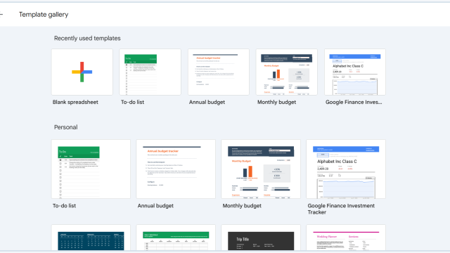
How to Use Google Sheets (Quick Guide)
One of the most commonly used Microsoft Excel alternatives is Google Sheets. Google Sheets is available through a web browser and on mobile devices, with offline access also available when configured. In this guide, we will explain how to use Google Sheets from the ground up, starting with creating a spreadsheet and entering data before […]
How to Convert Excel Data to PowerPoint Slides
Master the process of turning complex Excel datasets into polished PowerPoint slides with these efficient techniques.
How to Convert Power BI to PowerPoint
Discover how quickly is to convert Power BI to PowerPoint with this step-by-step tutorial. Multiple methods and live dashboards included.
Understanding Data Presentations (Guide + Examples)
Elevate the quality of your message by learning how to work in data presentations effectively. Insights, examples, and PPT templates here.
How to Make a Presentation Graph
Detailed step-by-step instructions to master the art of how to make a presentation graph in PowerPoint and Google Slides. Check it out!
Data Flow Diagram Demystified: What They Are and How to Use Them
Master the art of Data Flow Diagrams with our in-depth guide! Discover the steps to create, interpret, and leverage DFDs to optimize processes.

A Quick Guide to Buyer Personas Analysis
Personalization. Every marketer today understands that personalized messages hit the mark way more frequently than generic pitches. In fact, every dollar invested in advanced personalization generates twenty dollars in return.
Present Your Tableau Analysis in PowerPoint
Presenting complex data in simple and understandable ways is one of the challenges presenters face when building their own Presentation Dashboards. That’s why, one of the many reasons why PowerPoint is as popular as it is, and that sets PowerPoint apart from its competitors, is the sheer availability of data visualization options that exist within […]