Presenting complex data in simple and understandable ways is one of the challenges presenters face when building their own Presentation Dashboards. That’s why, one of the many reasons why PowerPoint is as popular as it is, and that sets PowerPoint apart from its competitors, is the sheer availability of data visualization options that exist within the software. It has revolutionized the way we communicate, and shifted focus to bring in more graphical representations of complicated data and information.
But PowerPoint is not the end-all be-all solution for today’s data communication needs. Especially in the pandemic, where online communication has become important, having interesting and effective visualizations is key to a successful meeting, conference or presentation. And this is where Tableau comes in, the perfect solution for building data visualizations and dashboards.
What is Tableau?
According to Tableau Software, the definition of Tableau is this:
“Tableau is a visual analytics platform transforming the way we use data to solve problems—empowering people and organizations to make the most of their data.”
While reflecting a larger idea of Tableau, the software is primarily a data visualization and business intelligence tool. The idea for Tableau emerged out of a desire to make data accessible to people through visualizations – democratizing the process of understanding and analyzing statistics and data for everyone.
Tableau provides simple and complex data visualization options, and allows for users to make dynamic, interactive and customizable visuals, as opposed to static visualizations provided by PowerPoint. With Tableau, users can create smart data visualizations (data viz) more easily. These visualizations exist on a “dashboard”, which is the main workspace of the software. The biggest utility of using Tableau, perhaps, is due to the mobility provided by its dashboard workspace. It can be embedded, linked and otherwise referred to on various mediums, all the while allowing for changes and modifications to happen in the dashboard itself. Tableau is truly considered one of the leaders for data visualization these days, and can be the perfect tool for enriching your presentations with data and graphics.
Embedding Tableau to your PowerPoint presentation
One of the key benefits of using Tableau to present your analysis is the vast array of options available to you in terms of data visualization tools. The interface is simple and intuitive, and allows for the creation of interactive visuals that can handle a huge amount of data.
In most PowerPoint presentations, in-built data visualization options can be limiting and are often static. However, embedding a Tableau visual within your presentation can bring data to life, providing an interesting and engaging visual to go along with all your information. Tableau allows you to perform simple data analytics and calculations from within the software itself, but it is also R compatible as you can import your R model results in Tableau to get data visualization options for it.
Since Tableau is embedded within the presentation, it will also reflect any and all changes made in the original dashboard, with data being updated on the PowerPoint when it is updated on the Tableau dashboard.
In this day and age, having infographics that can simplify complex information, making data analysis such as trends, areas of interest, improvements and other related ideas accessible to all, is key to a successful presentation.
How to embed and show Tableau visualizations in PowerPoint
There are a few methods to import visualizations from Tableau to PowerPoint. Some are simpler than others, with varying degrees of utility and interactivity and can be chosen according to the purpose of the presentation and/or visualization.
Note – These are all methods that work with Microsoft PowerPoint only.
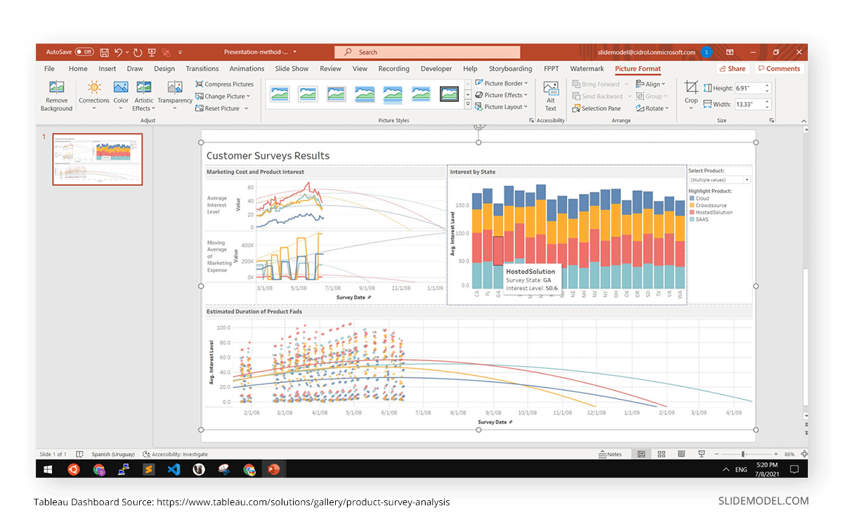
Method 1 – Embed Tableau visualizations as a static image
This is perhaps the easiest method as it involves converting a Tableau visualization into an image and importing it into PowerPoint as a picture.
Step 1
Open your Tableau dashboard with the visual.
Step 2
Hit Print Screen Key on your keyboard and save the image, or Screenshot depending on your device.

Step 3
Open MS-PowerPoint. Go to the Insert tab.
Step 4
Select Pictures > This Device.
Step 5
Select your screenshot from the explorer window. Your slide should now show the image of the visualization.
Step 6
Resize, edit, crop or add text accordingly.
Method 2 – Export a Tableau dashboard as a PowerPoint file
In this method, you can export and save your entire workspace as a PowerPoint file (.pptx), including all your visualizations. However, the visualizations will still import as static images, with no interactivity or customizations. The presentation will retain all the titles and text present in the dashboard.
Step 1
Open your Tableau workbook.
Step 2
Go to File > Export as PowerPoint

Step 3
Open your exported PowerPoint presentation to check for errors, sizing and information.
Method 3 – Embed Live Tableau Visualization with Interactivity from Tableau Server or Tableau Public
This method essentially brings your Tableau visualization dashboard onto the presentation, retaining all its interactivity and allowing the presenter to use the features provided by Tableau from within PowerPoint to communicate better. This method works great if you have to provide detailed data analysis that requires multiple features from within Tableau itself.
Step 1
Open MS-PowerPoint.
Step 2
Go to Insert tab > Get Add-ins. Search for Web Viewer by Microsoft Corp in the window that opens up.
Step 3
Install Web Viewer. It should now reflect in the My Add-ins menu.

Step 4
Select Web Viewer from My Add-ins. A window should open up with a box for inputting links.
Step 5
Paste the URL of your Tableau dashboard in the box provided. The visualization should now be embedded in the slide. Check if all the interactions are functioning.
Step 6
Press on the arrow next to the Insert button and select Insert and Link from the dropdown menu.
Step 7
Check for accuracy in the image now embedded on the slide.
Final Words
While Tableau has a range of options that can allow for amazing data visualisations, Microsoft PowerPoints remain the industry-standard for presentations and corporate communication. And as companies are relying more and more on data analytics and data-based decision making, making difficult and vast data accessible is one of the biggest challenges for executives and professionals when making their presentations.
But it doesn’t have to be a dichotomy between Tableau and PowerPoint. Both are indispensable tools that data scientists (and other professionals, for that matter) use to ensure they analyze their data effectively and communicate it to those unfamiliar with it in a manner that is engaging and interesting.
The methods listed above are highly compatible with presentation templates, seamlessly incorporating your presentation with Tableau visualizations. Thus, you can easily present your Tableau analysis in your presentations, making the best of both the tools available to engage in effective and interactive data communication.