
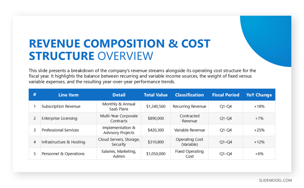
Tables are one of the oldest and most reliable structures for organizing information. They display relationships precisely, making them indispensable when accuracy matters. Yet their strength is also their weakness: tables are dense. Without guidance, audiences struggle to navigate them, especially when they are placed on slides, where attention spans shrink. A table on a screen behaves differently from a table in a report. In a presentation setting, it must be shaped, interpreted, and sequenced so that it becomes a tool for understanding rather than a test of patience.
The presenter’s role is not to show a table, but to direct attention to it. Data arranged in rows and columns needs hierarchy, pacing, and explanation; otherwise, viewers see a block of competing information. Even the best-designed tables require narration that clarifies what matters. This guide explains how to present tables effectively in PowerPoint and business presentations so they reinforce clarity, improve comprehension, and support decision-making presentations. You will learn how to work with visual hierarchy in tables, how to turn dense layouts into accessible stories, and how to adapt tables for different audiences.
What is the Purpose of a Table in a Presentation?
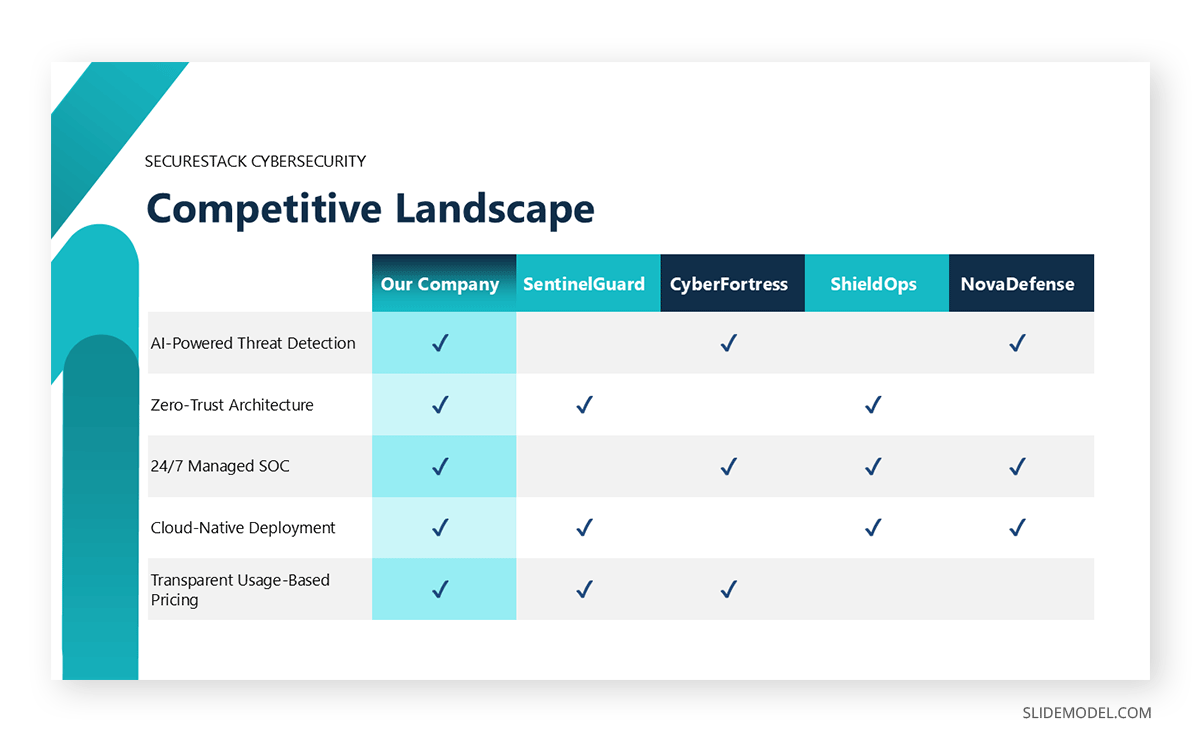
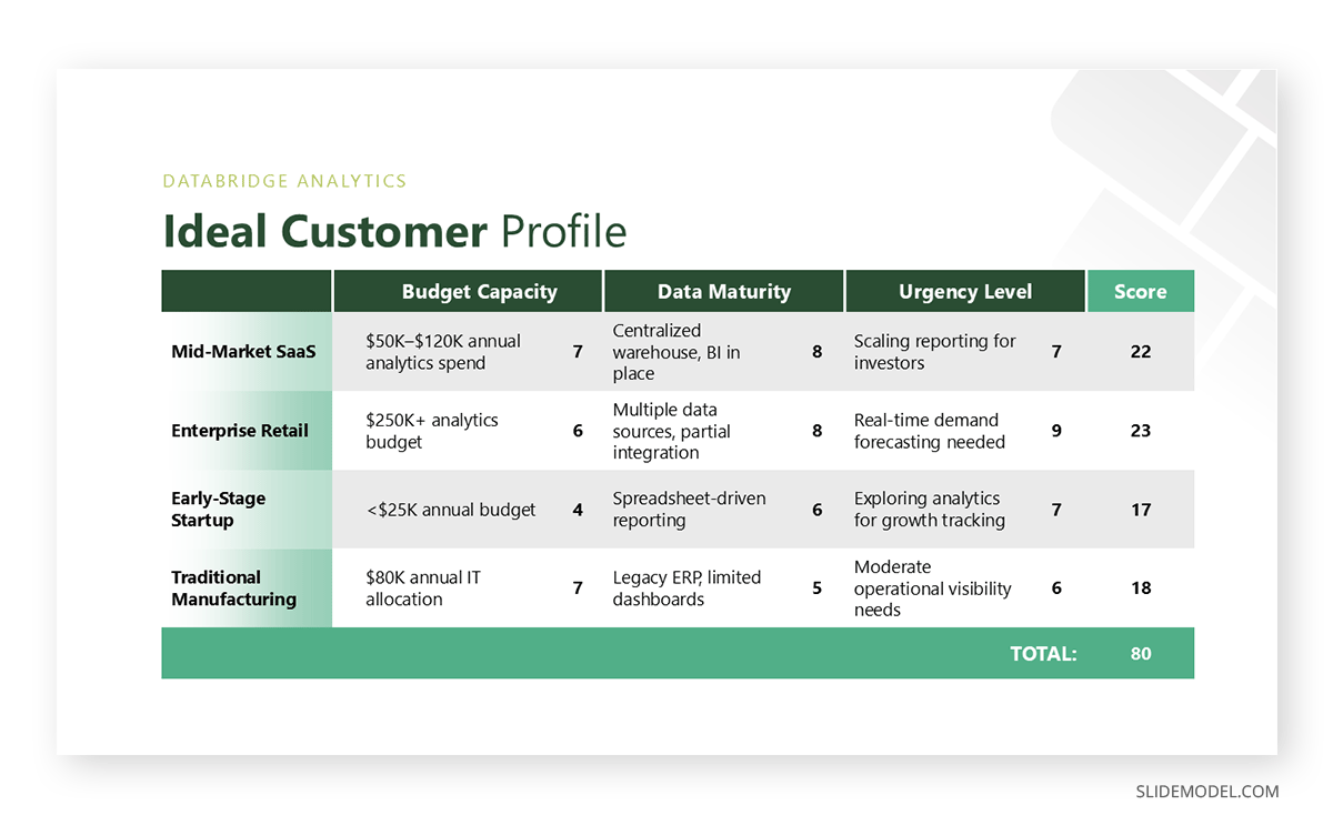
Tables serve a specific function: they preserve exact values and allow comparisons that wouldn’t be possible with a chart. This precision makes them ideal for financial presentations, inventories, schedules, benchmarks, and any dataset where the audience benefits from seeing raw numbers. However, presenters should not assume that any dataset deserves a tabular format. The question always begins with intent: Why is this table on the slide, and what will the audience learn from it?
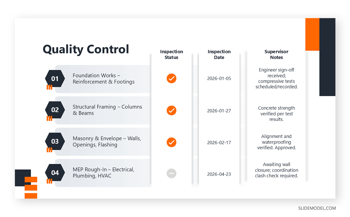
In presentations, tables typically fulfill one of four roles. They display a summary of values that must remain intact, such as quarterly revenue broken down by region. They provide a structured view that supports a decision, such as comparing vendors or pricing tiers. They function as evidence, verifying claims that require traceability. Finally, they act as reference points while a broader narrative unfolds. Each role implies a different degree of simplification and emphasis.
Relevance is the filter that eliminates unnecessary complexity. A table designed for reading a printed report often contains far more detail than a live audience can process. Removing columns that do not support the message or collapsing rows into grouped categories makes the output more suitable for real-time communication. The goal is not to compress data until it loses meaning but to preserve only the parts essential for the takeaway.
Recommended lecture: How to Present Complex Concepts
Structuring a Narrative Around Tables
Audiences rarely remember a table as a whole. They remember a relationship or a contrast that emerged from it. For this reason, table-driven presentations require narrative sequencing. A table should appear at the moment it resolves a question, not simply because it exists in the report. Its effect depends on the timing and the path that leads the audience to it.
Effective sequencing begins with orientation. Before the table appears, the audience needs to understand what domain it covers, which values it compares, and why the comparison matters. This removes the cognitive load of decoding structure and frees attention for interpretation. Once the table appears on the screen, the presenter can guide the viewer through its layout in a logical order: top to bottom, left to right, or category by category.
Narrative structure benefits from tension and resolution. The “tension” is the question or challenge the table clarifies: a discrepancy, a trend break, a performance gap, or a pattern that needs verification. The “resolution” is the interpretation of the table that explains how the pattern emerged and what consequences it implies. This is not storytelling for entertainment; it is structuring information to reflect how human reasoning progresses.
Recommended lecture: Data Storytelling
PowerPoint transitions are essential in table-heavy presentations. After a cluster of values has been examined, the presenter should close the segment with a line that prepares the next step in the reasoning. These bridges reduce the feeling of abrupt shifts between dense sections and help the audience maintain orientation.
Hierarchy within the narrative ensures the table does not overwhelm. Presenters should decide what the audience must see first. That initial focal point frames how the rest of the data will be understood. Additional segments of the table gain meaning only in proximity to this anchor.
How to Design Tables for Presentation Slides
Traditional table layouts do not translate effortlessly into slides. Presentation environments demand clarity at a distance and immediate comprehension. Poorly designed tables collapse into visual noise. To avoid this, presenters can rely on design fundamentals that transform dense grids into readable structures.
One foundational principle is visual hierarchy. The audience should identify the most important row or column within seconds. Scale, contrast, shading, and spacing help establish this order. Header rows often benefit from bold text or subtle background shading. Key values may be highlighted with a slightly darker font color. Avoid relying solely on color; spacing and typography often deliver cleaner results.

Another necessity is reducing cognitive load. Tables rival spreadsheets in density, but slides do not afford the luxury of prolonged reading. Rows should be consolidated when possible, redundant labels removed, and unnecessary decimals eliminated. Large tables that cannot be simplified should be divided across multiple slides or animated row by row. What matters is that each viewing moment presents a manageable amount of information. All in all, think about how to simplify tables for slides, rather than aiming to explain every aspect.
Color use must be deliberate. Color should create meaning, not ornamentation. Accent colors work best when they highlight anomalies, wins, losses, or groupings. Overly bright contrasts hinder readability, especially in brightly lit rooms. Tables should maintain high legibility under imperfect projection conditions, which means soft backgrounds, high text contrast, and minimal texture or gradients.
Recommended lecture: Color Theory for Presentations
Grid lines require discipline. Heavy borders create visual clutter, while the absence of borders can make tables collapse into undifferentiated text. The balanced approach is to use faint grid lines strategically: supportive enough to guide the eye, yet subtle enough to remain in the background.
Font choice should prioritize clarity. Sans-serif fonts generally display better at a distance. Consistent use of alignment, left for text, right for numbers, improves scanning. Uniform column widths should be avoided when they force cramped numbers or awkward spacing; structure serves content, not the other way around.
Recommended lecture: Fonts for Presentations
Visual Consistency and Cognitive Clarity in Table Presentations
Tables are most effective when they behave predictably. Visual inconsistency forces the audience to re-learn the structure on each slide, consuming mental resources that should be directed toward the message. When consistency holds, tables become intuitive, and comprehension accelerates.
Consistency begins with table formatting for presentations. Decimal precision must remain stable. If percentages appear rounded in one slide and detailed in another, the viewer might interpret the inconsistency as meaningful. Currency must follow the same notation: symbols, placement, separators, and abbreviations. Even variations in capitalization or hyphenation across labels subtly disrupt rhythm.
Color systems should follow a defined pattern. For example, choose one color for positive movement, another for negative movement, and a neutral color for baseline values. Once these associations are established, they should remain unchanged across the entire deck. Audiences internalize these meanings quickly, and any deviation becomes a distraction.
Structural consistency is equally important. If header rows use a certain style on one slide, they should reappear the same way elsewhere. Row spacing, column alignment, and text sizing should remain predictable. This continuity allows the audience to scan new tables in PowerPoint without having to decipher a new visual language.
Additionally, table presentations must be honest in scale. When presenting comparative data across multiple tables, the units and categories should remain aligned. If revenue is shown by quarter in one table, switching to monthly without acknowledgment can confuse interpretation. Inconsistencies in the timeframe or category structure distort conclusions.
Clarity depends not only on structure but on restraint. Avoid decorative patterns, heavy shading, or distracting icons. While these elements may seem attractive at first glance, they complicate perception. Clean tables project discipline and precision.
Context and Interpretation of Table Slides
Tables show what, but audiences need to know why. Raw numbers, even when beautifully formatted, lack interpretation. Presenters must supply context so viewers understand the significance of the values and how they relate to the overall message.
Context begins by defining the baseline. A table of quarterly figures means little until viewers know what constitutes a good quarter, what the targets were, and how these numbers compare to industry norms or past performance. Without an anchor, data floats without meaning.
Interpretation involves guiding the audience toward the insight the table reveals. This does not require restating each number. Instead, presenters identify patterns: the highest deviation, stability within a category, an unexpected decline, or an outlier that changes the narrative. Interpretation distills the table into conclusions.
Avoid over-extrapolation. Tables may appear authoritative, but they still require methodological honesty. A table with a limited sample size, irregular time intervals, or missing rows must be presented transparently. Acknowledging uncertainty strengthens credibility.
Misinterpretation should be anticipated. If two values could be logically connected but are independent, clarify that relationship explicitly. Likewise, if an increase in one column automatically influences another, state the dependency to prevent incorrect assumptions.
Interpretation is incomplete without practical implications. What does the table suggest about performance, risk, efficiency, or opportunity? How does the insight influence the next decision? By connecting data to action, the presenter reinforces the value of including the table.
Tables do not explain themselves. Interpretation gives them purpose.
When to Use Tables vs Charts in Presentations
Choosing between a table and a chart depends on what the audience needs to understand at that specific moment. The decision is less about visual preference and more about cognitive intent: precision versus pattern recognition.
PowerPoint tables are appropriate when exact values matter. If the audience needs to compare specific figures, verify numbers, or reference detailed data points, tables preserve accuracy without abstraction. Financial breakdowns, pricing comparisons, schedules, and performance summaries often benefit from tabular formats because they allow viewers to read values directly. Tables are also useful when the audience may want to revisit a slide later for reference, especially in decision-making or review contexts.
PowerPoint charts, by contrast, are better suited for revealing patterns, trends, and relationships. When the goal is to show growth over time, distribution, proportions, or contrasts at a glance, charts reduce cognitive effort by translating numbers into visual shapes. They sacrifice numerical precision in favor of speed and intuition. This makes them effective for storytelling, high-level overviews, and moments where the audience needs to grasp direction rather than detail.
In practice, the strongest presentations often combine both. A chart can introduce the insight, while a table can support it with precise data. The key is not to ask which format looks better, but which one answers the audience’s question faster and more reliably.
Delivering Table Slides with Confidence
Confidence begins with mastery. Presenters should know not only the values but the structure: how the table was built, how the figures were derived, and why certain rows or columns were included or excluded. This knowledge allows fluid movement across the table without hesitation.
Pacing is essential. Rushing through a dense table overwhelms the audience, while moving too slowly diminishes momentum. Effective pacing relies on pausing at critical values, using silence to allow the audience to process information. Numerical delivery should be clear, intentional, and evenly paced.
Gestural alignment strengthens clarity. When pointing to a value, the gesture should occur exactly when the value is mentioned. Mismatched timing confuses viewers. A laser pointer or digital highlight tool can help maintain precision.
Transitions between segments of the table signal structure. After addressing one section, presenters should summarize before shifting focus: “These values describe the historical trend; now let’s examine the drivers behind it.” These anchoring statements create a rhythm that supports comprehension.
Body language supports authority. A stable posture, controlled gestures, and measured tone communicate confidence. An overly animated delivery detracts from the seriousness of tabular data. Conversely, monotone delivery reduces engagement.
Adapting Tables for Different Audiences
Tables do not communicate uniformly across audiences. Their structure and density must reflect the needs, familiarity, and expectations of the people in the room. Adaptation is not optional; it is integral to effective table presentation.
When addressing decision-makers, such as presenting to executives or board members, business presentation tables should emphasize conclusions rather than granular detail. Simplified layouts, reduced columns, and highlighted key values help them scan quickly. Supporting detail can be included in appendices or backup slides, allowing depth without cluttering the main narrative.
Technical audiences, on the other hand, require completeness. Tables for analysts, engineers, or researchers should retain the necessary granularity for validation. Additional metadata, units, methods, samples, and constraints may be necessary for credibility. While these tables may be dense, clarity still governs: alignment, spacing, and consistent notation are non-negotiable.
Non-technical audiences benefit from translation. Complex tables can be restructured to emphasize patterns rather than precision. Rounded values, descriptive column headers, and simplified categories make tables more approachable. When abstraction is inevitable, verbal analogies help bridge the cognitive gap.
Cultural context also affects interpretation. Colors that typically mean “warning” in one region may signal “progress” in another. Numeric notation varies globally; decimal separators and currency symbols must align with audience expectations. Presenters delivering internationally should perform a quick visual audit of their tables to ensure they remain intuitive.
Accessibility considerations play a role. Tables should be legible to color-blind viewers, screen reader-friendly when provided as documents, and readable from the back of a room without effort. Accessibility in presentations is not merely about compliance; it improves comprehension for everyone.
Recommended lecture: Accessibility in PowerPoint
Common Mistakes When Presenting Tables
Certain errors recur across presentations and consistently damage clarity. Being aware of them reduces the risk of overwhelming or confusing the audience.
A frequent mistake is overcrowding. Trying to fit an entire spreadsheet on a slide collapses the structure. Even if every value seems important, the audience cannot process dozens of rows at presentation speed. Simplification and segmentation should always precede display.
Another mistake is a lack of context. Presenters sometimes place a table on a slide without explaining its origin or relevance. Without a timeframe, source, or intent, the audience cannot interpret values correctly. Context must accompany the table either visually or verbally.
Inconsistent formatting undermines trust. Mixing currencies, altering decimal precision, or changing terminology mid-presentation gives the impression of careless preparation. Tables are perceived as objective; inconsistency damages that credibility.
Reliance on table structure alone is also a problem. Some presenters assume the audience will naturally find the important values. Without guidance, tables become static grids of uniform weight. Highlighting, pacing, and narration reveal meaning; without them, insight remains buried.
Finally, over-styling creates distraction. Heavy borders, excessive color coding, shadows, and gradients make tables harder to read. Clean design fosters comprehension; decoration obscures it.
FAQs
How much data should a table contain in a presentation?
Include only the values essential for the audience to understand your point. If a table has more than 12–15 visible rows or many columns, consider dividing it or simplifying it. Presentation tables must prioritize clarity over completeness.
Should I round numbers in tables?
Yes, when precision is not central to the interpretation. Rounding reduces visual clutter and speeds comprehension. However, for financial or scientific audiences, retain the necessary level of detail.
What is the best alignment for numbers and text?
Align text to the left and numbers to the right. This layout improves readability and facilitates comparison within each column.
Is it acceptable to animate tables?
Moderate animation can guide attention. Reveal rows or columns gradually when dealing with dense information. Avoid complex effects, as they distract from the data.
How do I highlight key values without overwhelming the table?
Use subtle contrast: bold text, gentle shading, or a restrained accent color. Highlight sparingly to maintain impact.
What if my table contains negative results?
Do not hide them. Provide context and explain causes and implications. Transparent handling of negative values enhances credibility.
Should tables include benchmarks or targets?
Yes. Benchmarks provide essential context and allow audiences to interpret performance effectively.
How can I make large tables readable from the back of a room?
Increase font size, remove unnecessary decimals, widen spacing, and reduce density. Never shrink text to fit content; instead, restructure the table.
What is the best font size for tables in presentations?
Aim for a minimum of 18-20 pt depending on screen size. Smaller text often becomes illegible in large rooms.
When should I replace a table with a chart?
Use a chart when the audience needs a pattern more than precise numbers. Use a table when exact values matter or when comparisons require detail.
Final Words
Tables are precision instruments. They allow presenters to share exact values, support decisions, and preserve traceability. But precision does not guarantee understanding. To work effectively, tables must be shaped into a visual and narrative experience that aligns with the audience’s cognitive needs. This means defining purpose before design, guiding the viewer through structure, providing context, and delivering content with confidence.
When handled thoughtfully, tables become more than containers for data; they become clarifying tools that reveal relationships, support arguments, and help audiences draw conclusions.