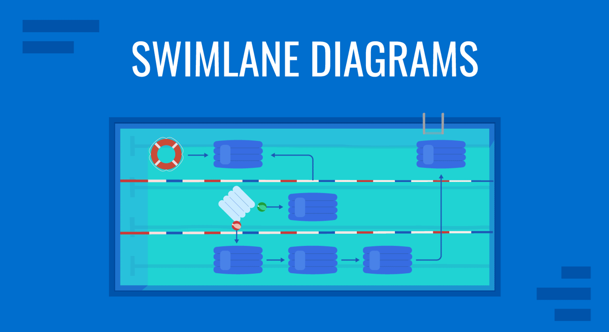
Swimlane diagrams are essential visual tools for mapping processes, roles, and workflows in a clear and organized manner. Often referred to as a swimlane flowchart or swimlane process map, these diagrams use lanes to assign tasks to specific participants or departments, making them ideal for presentations that aim to clarify responsibilities, optimize processes, or drive strategic decisions.
By incorporating a process flow diagram with swimlanes, presenters can transform complex workflows into accessible visuals that enhance understanding and collaboration. This article explores what a swimlane diagram is, its strategic applications, and practical steps for creating effective diagrams using tools like PowerPoint and Visio.
Table of Contents
- What Is a Swimlane Diagram?
- Why Use Swimlane Diagrams?
- What Are Common Uses of Swimlane Diagrams?
- How Do Swimlane Diagrams Drive Business Value
- How to Create a Swimlane Diagram
- What Are the Challenges of Using Swimlane Diagrams?
- Recommended Swimlane Diagram PowerPoint Templates
- FAQs
- Conclusion
What Is a Swimlane Diagram?
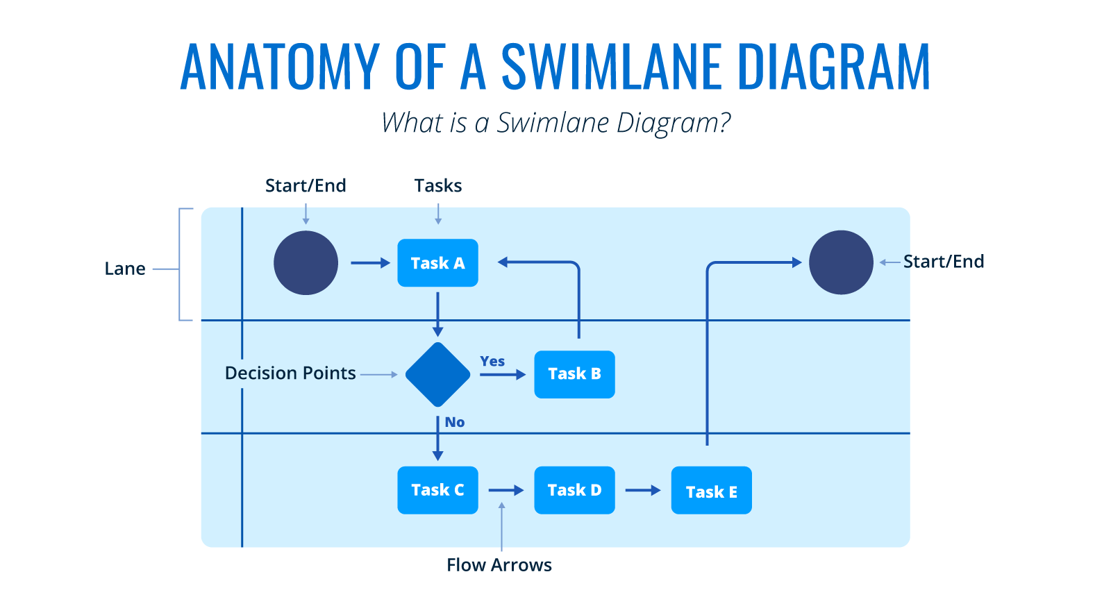
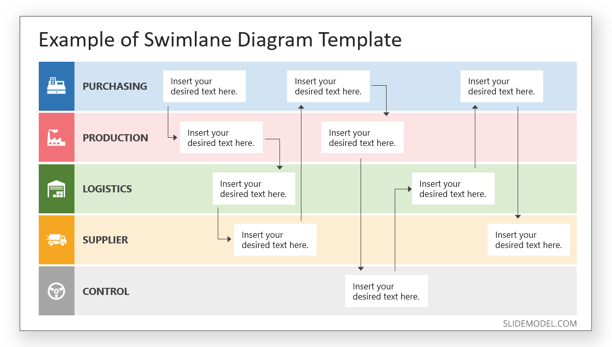
A swimlane diagram, also known as a swimlane flowchart or swim lane process flow, is a type of flowchart diagram that organizes tasks into distinct lanes, each representing a specific role, team, or department. These lanes, typically arranged horizontally or vertically, contain swimlane diagram symbols like rectangles for tasks, diamonds for decisions, and arrows for flow, illustrating the sequence and interaction of activities. A swim lane process map clearly shows who is responsible for what, making communicating complex processes in presentations easier.
Key components of a swimlane diagram include:
- Lanes: Assigned to individuals or teams, defining ownership.
- Tasks: Represented by shapes, outlining specific actions.
- Flow Arrows: Indicating process direction.
- Decision Points: Showing choices that impact the workflow.
- Start/End Points: Marking the process’s beginning and end.
Why Use Swimlane Diagrams?
As a visual tool, swimlane diagrams help us transform abstract ideas into clear narratives. They simplify understanding, regardless of the audience’s technical level, and we can highlight the following four reasons why it is a good idea to use swimlane diagrams:
- Simplifies Complex Processes: Swimlane diagrams break down intricate workflows into digestible visuals. For instance, a diagram mapping a supply chain process helps audiences quickly grasp how tasks flow between departments.
- Enhances Clarity: These diagrams eliminate confusion by distinguishing responsibilities through lanes. A presenter can show exactly who handles each step, reducing miscommunication.
- Improves Engagement: Swimlane diagrams’ visual nature captures attention, making presentations more dynamic. Audiences stay focused when processes are illustrated rather than described in text.
These diagrams are particularly valuable for identifying inefficiencies, such as bottlenecks in production or redundant steps, which can lead to faster cycles or resource savings. A sample swimlane diagram in a presentation can highlight how tasks flow between departments, enabling stakeholders to make informed decisions or collaborate more effectively.
What Are Common Uses of Swimlane Diagrams?
Swimlane diagrams are versatile tools applied across various domains to map and improve processes. Their structured format makes them adaptable to diverse business needs, from operational workflows to customer interactions. Here are five common uses, expanded to provide deeper insight into their practical applications:
Business Process Management (BPM)
Swimlane diagrams are widely used to document and refine workflows, such as order processing, employee onboarding, or invoice approvals.
For example, a logistics company might create a swimlane diagram to map its delivery process, with lanes for warehouse staff, drivers, and customer service. By visualizing tasks like “Pack Order” and “Confirm Delivery,” the diagram reveals delays in inventory checks, prompting automation that reduces delivery times by 20%. This clarity helps BPM teams standardize processes, eliminate redundancies, and enhance operational efficiency across departments.
Project Management
These diagrams clarify tasks and responsibilities in cross-functional projects, ensuring alignment. In a construction proposal presentation, a swimlane diagram might include lanes for architects, contractors, and inspectors, as well as mapping tasks like “Draft Plans,” “Build Foundation,” and “Approve Safety Checks.” This visual ensures all stakeholders understand their roles and dependencies, preventing miscommunication. For instance, a project manager might identify overlapping inspections, consolidating them to save a week in the timeline, demonstrating how swimlane diagrams drive timely project delivery.
Software Development
In Agile or DevOps environments, swimlane diagrams distribute tasks among developers, testers, and product managers. A diagram for a software sprint might show lanes for coding, testing, and deployment, with tasks like “Write Code” and “Run QA Tests.” If excessive iterations between coding and testing emerge, the team can adjust workflows, reducing release cycles by days. This application supports faster development and better resource allocation, which is critical in tech-driven industries.
Customer Journey Mapping
Swimlane diagrams visualize how customers interact with business areas, such as sales, support, and billing. For a retail company, a diagram might map a customer’s purchase journey, with lanes for online store, customer support, and logistics. Tasks like “Browse Products,” “Resolve Query,” and “Ship Order” highlight friction points, such as slow support responses. The company boosts satisfaction and retention by addressing these, showing how swimlane diagrams enhance customer-centric strategies.
Recommended lecture: How to make a customer journey map in PowerPoint
Compliance and Risk Management
In regulated industries like finance or healthcare, swimlane diagrams ensure accountability by assigning tasks like “Conduct Audits,” “Review Policies,” or “Report Incidents” to specific roles. A bank might use a diagram to map its anti-money laundering process, with lanes for compliance officers, analysts, and auditors. This clarity ensures no step is overlooked, reducing regulatory risks. For example, identifying unassigned tasks in a diagram led one firm to assign clear ownership, avoiding potential fines and strengthening governance.
Beyond these, swimlane diagrams are used in change management presentations to map transitions, such as adopting new software, where lanes for IT, HR, and end-users clarify training and implementation steps. In manufacturing, they optimize assembly lines by assigning tasks to machines and operators, reducing downtime. Institutions map student enrollment processes in education, ensuring smooth coordination between admissions, finance, and academic teams.
Recommended lecture: Change Management Models
How Do Swimlane Diagrams Drive Business Value
Strategic Decisions
Swimlane diagrams are powerful in presentations aimed at decision-makers. A process flow diagram with swimlanes can illustrate how a proposed workflow distributes tasks across teams, highlighting resource needs or risks.
For example, a manufacturing firm might use a swimlane diagram to present a new production process, with lanes for procurement, assembly, and logistics. By showing delays in material sourcing, the diagram prompts a decision to invest in supplier automation, saving costs and time.
Production Processes
For presentations focused on efficiency, swimlane flowcharts excel at pinpointing areas for improvement. A swim lane process map can map current workflows, exposing redundancies or delays. This is critical to reducing production costs related to material waste (scraps), bottlenecks in lanes that delay the proper production flow, or slow processes to optimize for energy-saving purposes (e.g., optimizing maintenance downtime).
IoT technology in manufacturing often implements this kind of visualization, as it allows not only operators but also stakeholders to evaluate the situation in real time and change priorities.
Fostering Collaboration
Swimlane diagrams align cross-functional teams by visually defining roles. For example, a diagram with lanes for marketing, sales, and engineering for a product launch clarifies tasks like “Create Campaign” and “Test Prototype.” This shared view reduces misunderstandings, ensures smoother execution across departments, and reduces high expectations or task overload for a certain team.
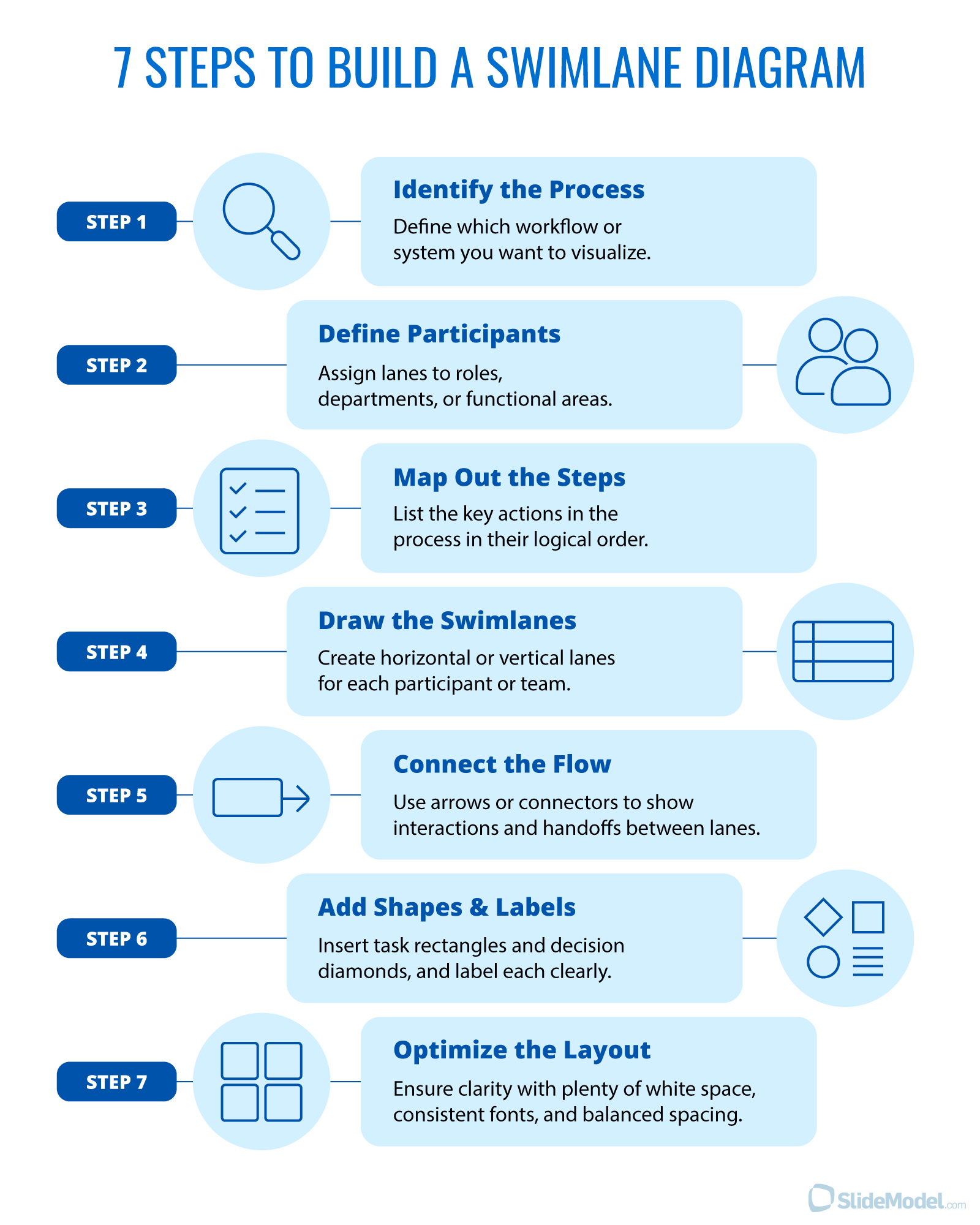
How to Create a Swimlane Diagram
Once we understand the reasoning behind swimlane diagrams, it’s quite easy to map one. In our detailed guide on how to insert a swimlane in PowerPoint, we cover the step-by-step process of creating a PPT swimlane diagram. Alternatively, tools like Microsoft Visio create polished swimlane diagrams with advanced features.
How to Create a Swimlane Diagram for a Presentation
- Identify the Process: Define what workflow or system you want to visualize.
- Define Participants: Assign roles, departments, or functional areas.
- Map Out the Steps: List the key actions in the process.
- Draw the Swimlanes: Create horizontal or vertical lanes for each participant.
- Connect the Flow: Use arrows or connectors to show interactions between lanes.
- Add shapes & labels: Insert task rectangles and decision diamons, and label each clearly.
- Optimize the Layout: Keep it clean and structured to ensure readability.
To summarize this easy 7-step process to build swimlane diagrams, we have created this visual infographic detailed the steps.
Good Practices for Designing Swimlane Diagrams
Check the following points to ensure clear understanding of your swimlane diagrams:
- Scope Narrowly: Focus on one process, like “Customer Support,” to avoid clutter.
- Use Standard Symbols: Employ rectangles for tasks and diamonds for decisions.
- Label Clearly: Use concise terms like “Process Order” instead of vague phrases.
- Highlight Insights: Use color sparingly to emphasize bottlenecks.
- Test Readability: Ensure text and layout are clear on screens.
How to Import a Swimlane Diagram from Visio
Swimlane diagrams can be easily created in Microsoft Visio, which, as part of the Microsoft Office suite, is fully compatible with importing the diagram into a PowerPoint slide. You can bring a swimlane diagram from Visio in four ways.
Copy and Paste
- Open your Visio diagram (.vsd or .vsdx file).
- Select the diagram or specific shapes (use Ctrl+A to select all).
- Copy (Ctrl+C).
- Open PowerPoint and paste (Ctrl+V) into a slide.
- Depending on your Visio and PowerPoint versions, the diagram is embedded as an editable Visio object or as a static image. If it’s an object, you can double-click to edit.
Insert as an Object
- In PowerPoint, go to Insert > Object > Create from File.
- Browse and select your Visio file (.vsd or .vsdx).
- Click OK. This embeds the Visio diagram, which can be resized or edited by double-clicking (requires Visio installed).
Export from Visio and Import to PowerPoint
- In Visio, save your diagram as an image (e.g., PNG, JPEG) via File > Save As > choose image format.
- In PowerPoint, insert the image via Insert > Pictures > select the saved file.
- This creates a static image that is not editable as a Visio diagram.
Link to Visio File
- Use Insert > Object > Create from File in PowerPoint, select the Visio file, and check Link before inserting.
- This links to the original Visio file, so updates in Visio reflect in PowerPoint (access to the Visio file is required).
What Are the Challenges of Using Swimlane Diagrams?
While powerful, if not addressed, swimlane diagrams can present challenges that undermine their effectiveness. Below are detailed pitfalls and their implications.
Overcomplication
Including too many lanes, tasks, or decision points can overwhelm audiences. For example, a diagram with 10 lanes and 50 tasks for a supply chain process may confuse rather than clarify, causing audiences to disengage. This is especially problematic in time-constrained presentations where simplicity is critical.
Lack of Context
Presenting a swimlane diagram without explaining its purpose or relevance risks misunderstanding. For instance, showing a diagram for a procurement process without stating the goal (e.g., reducing delays) leaves audiences unsure of its significance, diminishing its impact.
Inaccuracy or Outdated Information
Misrepresenting processes or using outdated data undermines credibility. If a diagram inaccurately assigns tasks (e.g., assuming Sales handles billing when Finance does), stakeholders may question the presenter’s expertise, eroding trust.
Poor Visual Design
Cluttered layouts, small text, or inconsistent symbols reduce readability. A diagram with overlapping arrows or illegible labels on a projected screen frustrates audiences, especially in large rooms or virtual settings. Opt for swimlane PowerPoint templates to simplify design decisions and avoid these pitfalls.
Insufficient Stakeholder Input
Failing to involve process owners during diagram creation can lead to oversights. For example, omitting a critical step in a manufacturing process because the production team wasn’t consulted can skew analysis and proposed solutions.
Overreliance on the Diagram
Treating the diagram as the sole focus of a presentation, without supporting narrative or data, limits its persuasive power. Audiences may struggle to connect the visual to broader business goals, such as cost savings or strategic alignment.
Recommended Swimlane Diagram PowerPoint Templates
In this section, we can find a variety of swimlane diagram Google Slides and PowerPoint templates, which are entirely customizable, to speed up your presentation design process. Alternatively, you can browse for process flow templates to enhance your presentation.
1. 6-Step Swimlane PowerPoint Template
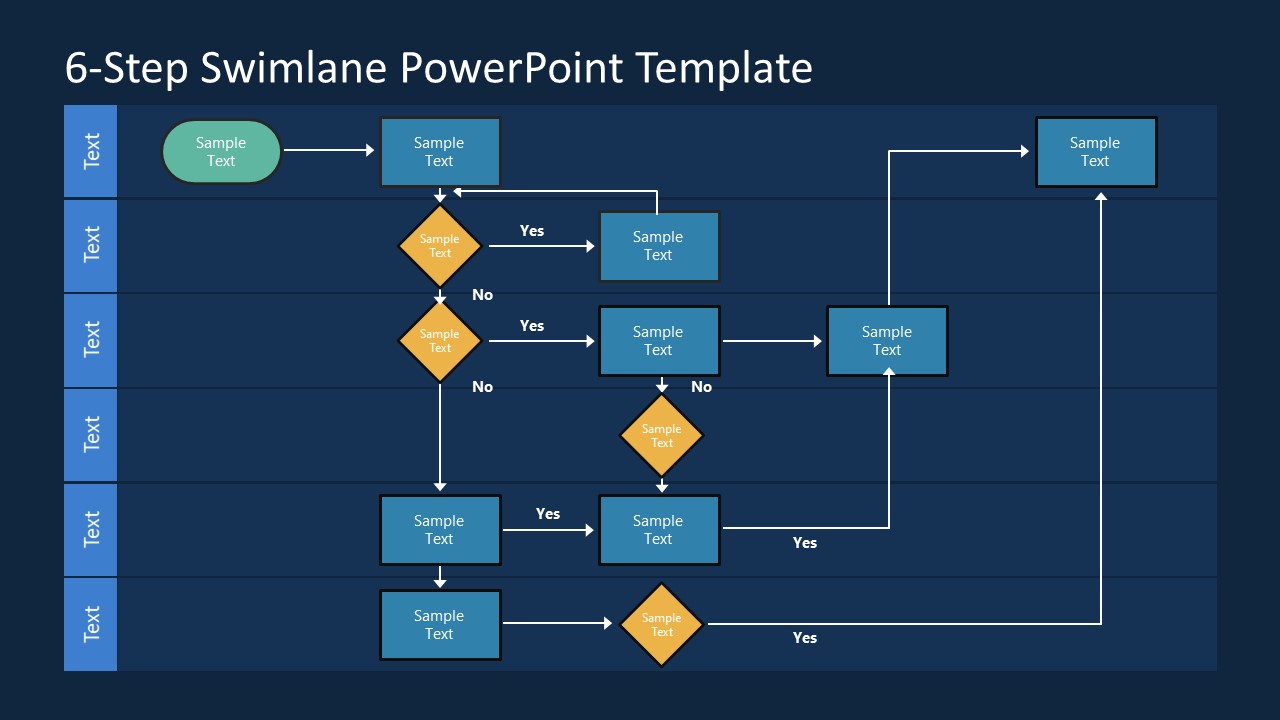
Discover the 6-Step Swimlane PowerPoint Template, a versatile tool for crafting clear, professional swimlane diagrams. Ideal for visualizing complex processes, this editable template highlights roles and phases across six rows, perfect for customer service, manufacturing, or management presentations. Customize shapes, text, and arrows effortlessly in PowerPoint, Google Slides, or Keynote. Choose between light or dark themes to suit your style. With yes/no placeholders and connected arrowheads, mapping workflows is easy. Download now to elevate your presentations, or explore our 4-Step and 3-Step Swimlane Templates for smaller processes.
2. Simple Swimlane PowerPoint Template
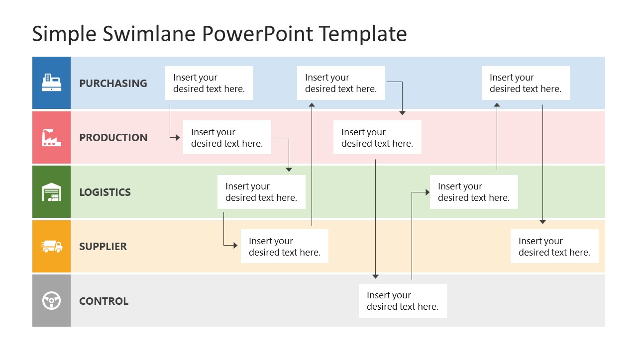
Elevate your presentations with our Simple Swimlane PowerPoint Template, designed for clear, engaging process visualization. This 100% editable swimlane slide template features five colorful rows with clipart icons, which is ideal for mapping roles in business, education, or marketing processes like purchasing or logistics. Customize text boxes, icons, and stages effortlessly using PowerPoint, Google Slides, or Keynote. Choose between two vibrant color variants to match your style. With vertically connected rows and flexible placeholders, create professional swimlane diagrams easily. Download now to enhance your workflow presentations and captivate your audience with clarity and creativity!
3. Customer Service Swimlane Chart Template for PowerPoint
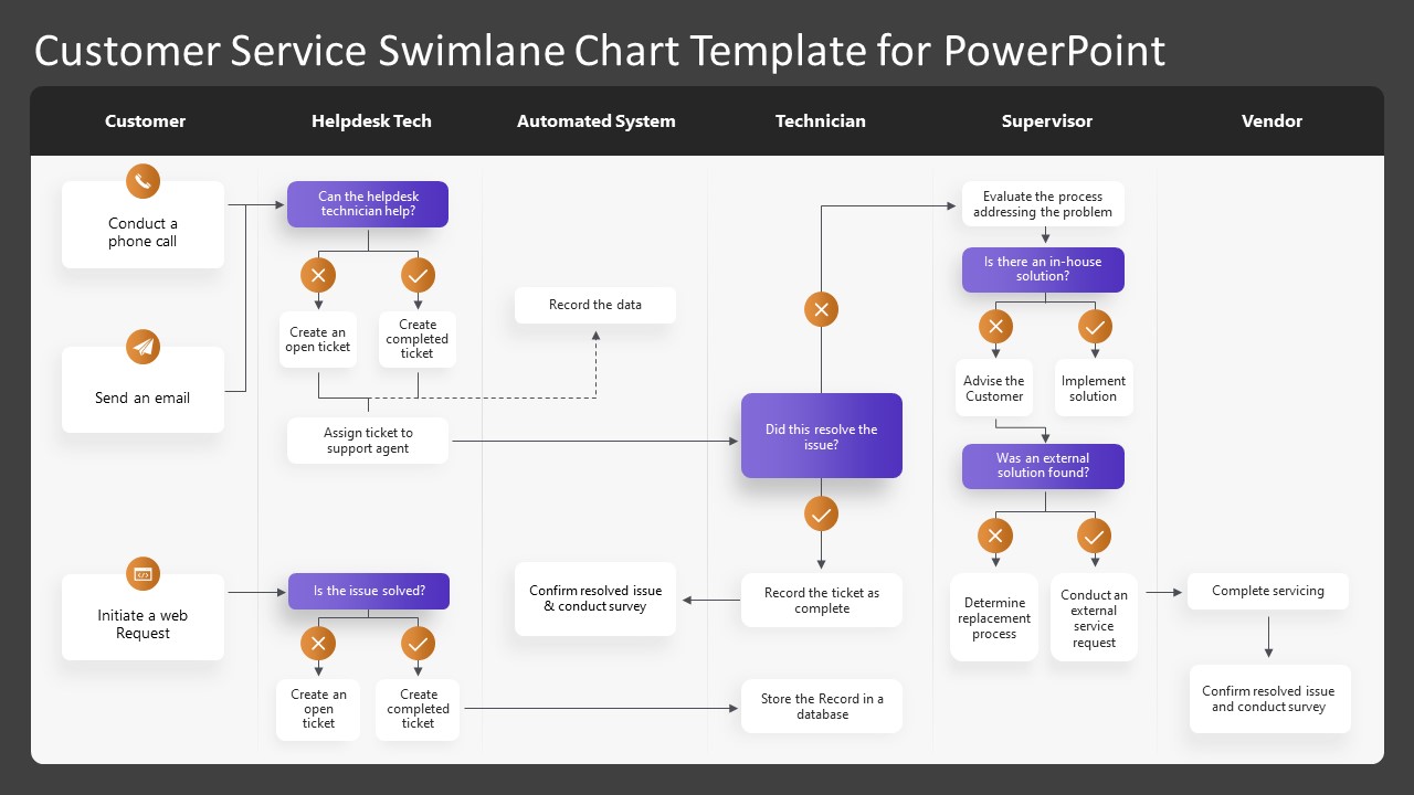
Get to know our Customer Service Swimlane Chart Template for PowerPoint, a dynamic one-page tool to visualize helpdesk workflows. This editable swimlane template features six vertical columns, each labeled with roles like customer, technician, or supervisor, and is customizable to your needs. Horizontal rows with flowchart shapes and clipart icons illustrate the sequential flow of information, perfect for training staff or presenting to stakeholders. Available in two background color variants, it’s compatible with PowerPoint, Google Slides, and Keynote. Adjust text, colors, and styles effortlessly to create engaging, clear presentations for business meetings or process discussions. Download now to enhance your customer service visuals!
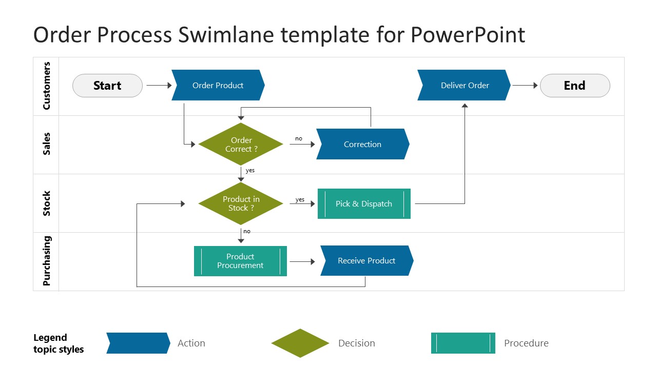
4. Order Process Swimlane Template for PowerPoint
Optimize order fulfillment performance in your organization with our Order Process Swimlane Template for PowerPoint, a clear, editable flowchart designed to map e-commerce workflows. This four-step swimlane diagram slide highlights key departments—customers, sales, stock, and purchase—showcasing their roles in processing orders from placement to delivery. Ideal for training e-commerce teams or briefing managers, it uses customizable PowerPoint shapes and arrowheads to depict decision points and actions. Available in light and dark background variants, this template is compatible with PowerPoint, Google Slides, and Keynote. Adjust text, colors, and shapes to create compelling, professional presentations. Download now to clarify your order process!
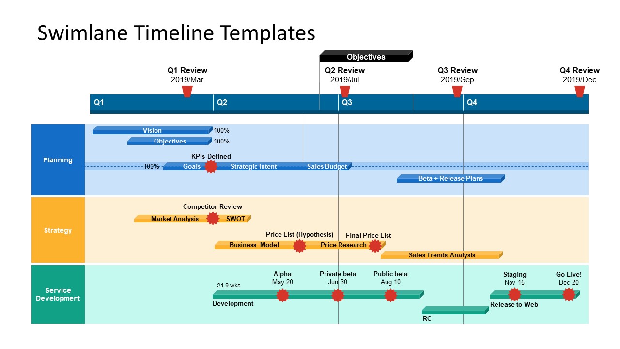
5. Swimlane Timeline Templates for PowerPoint
Transform project updates with our Swimlane Timeline Templates for PowerPoint, a vibrant, editable diagram crafted to display project activities across a timeline. This swimlane PPT template organizes tasks, milestones, and resources into four phases—delivery, operations, risk, and quality—across five yearly quarters, adaptable to any project. Colorful PowerPoint shapes highlight progress and process stages, making assessing resource allocation and optimizing workflows easy. Available in two design variants, it’s compatible with PowerPoint, Google Slides, and Keynote. This best PPT template simplifies complex roadmaps into a clear, engaging slide, perfect for presenting to clients or executives. Download now to showcase your project’s journey!
6. Editable Swim Lane Diagram for PowerPoint
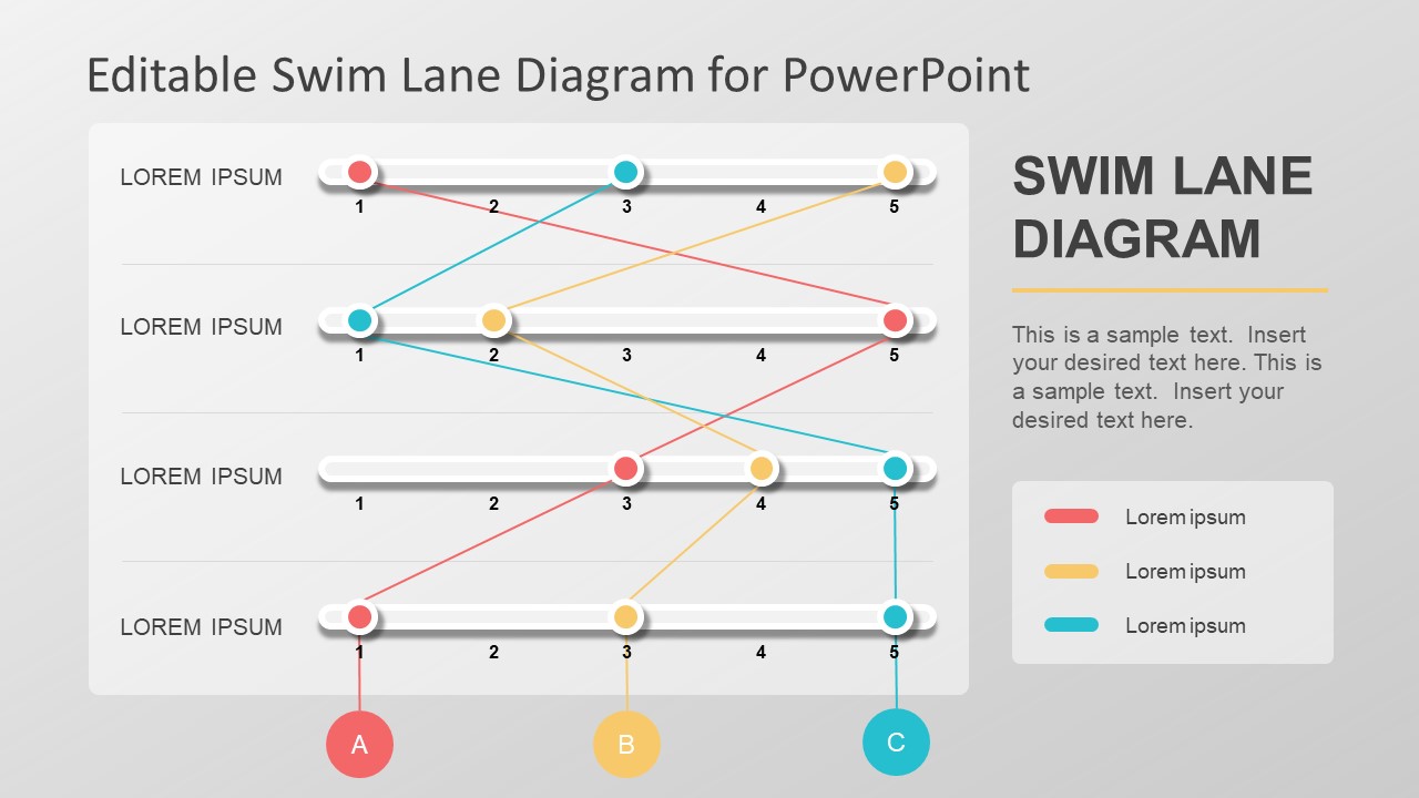
Unlock clear process visualization with our Editable Swim Lane Diagram for PowerPoint, a modern, vibrant swimlane template redefining traditional flowcharts. This cross-functional diagram organizes tasks across departments or roles into distinct lanes, using colorful ball-bearing string shapes for easy identification. Fully customizable, it features editable sliders and PowerPoint shapes, allowing seamless additions or tweaks to fit your needs. A dedicated text section displays titles and workflow details. Ideal for training staff, clarifying responsibilities, or presenting to stakeholders, this versatile template works across industries and is compatible with PowerPoint and Google Slides. Download now to simplify complex workflows with engaging clarity!
FAQs
How do swimlane diagrams improve audience understanding?
Dividing tasks into labeled lanes provides a structured view of processes, reducing confusion and helping audiences quickly grasp roles and task sequences.
How should I introduce a swimlane diagram in a presentation?
To introduce a swimlane diagram in a presentation, start with a brief context, e.g., “This diagram maps our order process to identify delays,” to frame the visual’s purpose before displaying it.
What colors should I use in a swimlane diagram for presentations?
Use 2–3 muted colors to differentiate lanes or highlight key tasks, avoiding bright or clashing hues that distract on slides.
How do I ensure a swimlane diagram is readable in a presentation?
To make your swimlane diagrams readable in a presentation, use at least a 14-point font, avoid overlapping elements, and test the diagram on a projector or shared screen to confirm clear text and shapes.
What symbols should I use in a swimlane diagram for presentations?
Stick to standards: rectangles for tasks, diamonds for decisions, circles for start/end points, and arrows for flow, ensuring consistency and familiarity.
Conclusion
Swimlane diagrams are transformative for presentations, offering a clear way to communicate processes and responsibilities. They deliver tangible business value by informing decisions, optimizing workflows, and fostering collaboration. Invest in clear design and data-backed insights to maximize impact, whether using a workflow process template, a simple Swimlane diagram created in PowerPoint, or a Visio diagram. Start leveraging swimlane diagrams to turn complex processes into actionable, persuasive visuals that drive meaningful change.