Presentations have become essential for sharing information, pitching ideas, and inspiring audiences. We’ve all sat through our fair share of presentations from boardrooms to classrooms. Yet, how many times have we found ourselves glancing at our phones, feeling sleepy, or simply disengaged from what the presenter is saying?
Our expertise tells us that many presentations fall short of their intended impact, and this goes beyond identifying bad PowerPoint slides. Such a situation can be linked to eight clearly identifiable factors we’ll address in this article to boost our performance.
Table of Contents
- The Importance of Crafting and Delivering High-Quality Presentations
- Reason #1 – Poor Slide Design
- Reason #2 – Lack of a Clear Objective
- Reason #3 – Lack of Presentation Skills
- Reason #4 – Not Tailoring the Presentation to the Audience
- Reason #5 – Lack of Interest in the Topic
- Reason #6 – Neglecting Body Language
- Reason #7 – Ignoring the Power of Storytelling
- Reason #8 – Technical Issues
- Additional Reasons that May Affect Your Presentation’s Performance
- FAQs
- Conclusion
The Importance of Crafting and Delivering High-Quality Presentations
Working our way to create compelling presentations and taking extra care in their delivery are among the core responsibilities speakers face these days. How people consume mass media has changed the game in terms of attention span rate and how speakers and their audience interact. Therefore, we summarize here the six main reasons why we consider it vital to aim for high-quality presentations.

Establishing Credibility
A well-crafted presentation showcases your knowledge and expertise, establishing you as a credible and reliable source of information and boosting the exposure of either your brand or organization.
Engaging the Audience
High-quality presentations capture the audience’s attention and connect them, making the message more impactful and memorable.
Clear Communication
A well-structured presentation ensures your message is communicated clearly and effectively, preventing misunderstandings and confusion. Depending on the niche of your presentation, this point is critical to building trust, securing deals, or making an impact in the local or international community. Hence, the importance of mastering the concepts behind visual communication.
Taking Action Through Persuasion
A persuasive presentation, where the speaker gathers knowledge about their viewers’ interests and pain points beforehand, can influence the audience’s perceptions and encourage them to take the desired action or adopt a particular viewpoint.
Enhancing Professional Image
Delivering a top-notch presentation enhances your professional image and can contribute to your success in the business world. Remember, presentations are often repurposed to other media outlets, like YouTube videos, so your image can reach audiences far beyond your original goal.
Promotes Learning and Understanding
High-quality presentations often include visual aids, examples, and stories that can help facilitate learning and deepen the audience’s understanding of the topic. This is particularly important in the academic world, where teachers and professors should connect with their students so the imparted knowledge can sink in.
Let’s say you’re a person who “never understood maths” – perhaps what happened was that the teachers and professors you had didn’t resonate with your learning method (which can be kinesthetic, technology-based, group learning, or several other options). Learning methods are affected by the way presenters articulate their speech, how they interact with the audience’s questions, and the usage of visual aids and examples. This was thoroughly studied due to new learning modalities induced by the COVID-19 pandemic.
Reason #1 – Poor Slide Design
Overcrowded Slides
One of the most common examples of bad PowerPoint slides is overcrowding slides with too much information. This often stems from a presenter’s desire to share as much knowledge as possible, fearing that leaving out details might dilute the message. However, this approach usually has the opposite effect, meaning a bad presentation.

Overcrowded slides can overwhelm the audience, making it difficult for them to focus on the key message. When a slide is filled with dense paragraphs, multiple graphs, and numerous bullet points, the audience’s attention is divided, and the main point gets lost in the clutter. As a side effect, bad slides examples affect the performance of the speech since the presenter may feel tempted to jump between points as everything is placed under the same slide.
Experience tells us it’s best to stick to simpler models, for example, the “one concept per slide,” or even use well-accepted presentation frameworks such as the 10-20-30 Rule of PowerPoint Presentations.
Inconsistent Fonts and Colors
Have you ever looked at a banner and wondered what was happening in the “designer” mind? That kind of feeling can be elicited when graphic mediums like banners, posters, and slides are created by using a sort of mix-and-match with any typeface + color you can imagine. And yes, by that, we mean pairing Comic Sans with a script typeface in neon colors.

Consistency in design helps to create a cohesive and professional look, whereas opting for inconsistent font/color combinations speaks of amateurish skills and disjointed work to craft the presentation. Although fonts can vary from slide to slide, the golden rule of working with fonts in presentations is to stick to a maximum of 3 typeface families, and if working with only one, apply font variations (meaning altering the font weight or style, i.e., using italics).

Regarding color usage, you can apply multiple professional color combinations depending on the mood you wish to convey in your presentation. We invite you to check our guide on color theory for presentations to get the most out of color for your work.
Lack of Visual Aids
Visual aids are a crucial component of effective presentations, as they can help to clarify complex ideas, emphasize key points, and engage the audience’s attention. A lack of visual aids can result in some of the worst PowerPoint slides you have seen – a presentation that is dry, monotonous, and difficult for the audience to follow. Without visuals, the audience is left to rely solely on the presenter’s words, which can be challenging, especially for complex or abstract topics (i.e., discussing KPI data without a graph).

Working with graphic resources can be a powerful tool for emphasizing key points, making them more memorable for the audience. When used effectively, visual aids can enhance the presenter’s message, making it more impactful and easier for the audience to understand and remember.

To incorporate visual aids effectively, presenters should consider the message they are trying to convey and select visuals that complement and enhance that message. Among the options, we include graphs, charts, images, or videos, depending on the topic and audience. As always, we should stick to a cohesive message, meaning that the visual tools used should boast the same color palette and fonts used in the presentation – unless it’s an external resource and should be specified.
Reason #2 – Lack of a Clear Objective
Importance of a Defined Goal
Every action we take should be backed up by a well-defined goal to pursue, and presentations are no strangers to this statement. Clear goals serve as the guiding star that shapes the presentation’s content, structure, and delivery. A clear objective helps the presenter stay focused and ensures that every presentation element is aligned with the intended outcome. It also provides a framework for the audience to understand the purpose of the presentation and what they can expect to gain from it.
Since we aim to share a sense of direction and purpose through our presentations, we are also building credibility in the same step, which helps build trust with the audience. It’s a sort of ongoing cycle showcasing the effort and dedication put into your work, as a presenter who counts with a defined goal and carefully plans to structure the presentation. A quick application of goal setting for presenters would be implementing the SMART goal criteria to elevate the quality of your presentations.
Consequences of a Rambling Presentation
A presentation without a clear objective often results in a meandering and unfocused delivery that can leave the audience confused and disengaged. When a presentation lacks direction, it can seem like the presenter is simply rambling, jumping from one point to another without any clear connection or purpose. This lack of focus can make it difficult for the audience to follow the presentation and understand the key message. It can also lead to losing interest as the audience struggles to see the information’s relevance.
A second consequence of a rambling presentation is that it can undermine the presenter’s credibility. It can give the impression that the presenter is unprepared or lacks a deep understanding of the topic. This situation can damage the presenter’s reputation and make building trust with the audience difficult.
Finally, a presentation that doesn’t have a well-defined goal will experience a hard time determining the time required to deliver it. Since the presenter isn’t in touch with what to achieve out of the presentation, the speech can be too long, too short, or unclear to the audience. This is the typical case scenario of a bad PowerPoint presentation example.
Reason #3 – Lack of Presentation Skills
Importance of Public Speaking Skills
Public speaking skills encompass a range of abilities, from clear and articulate speech to engaging storytelling and effective non-verbal communication. These skills are crucial in capturing and maintaining the audience’s attention, conveying the message clearly, and creating a lasting impact.
Good public speaking skills also enhance the presenter’s credibility and authority on the subject matter, building trust with the audience. Furthermore, strong public speaking abilities allow the presenter to adapt to the audience’s reactions and adjust the presentation accordingly. This flexibility is essential in creating a dynamic, interactive presentation that resonates with the audience.
Additionally, public speaking skills are vital in managing presentation nerves and delivering a confident and poised performance. This confidence can be contagious, inspiring the audience and leaving a positive impression.
Common Public Speaking Pitfalls
A proven recipe for the worst presentation ever is speaking too fast, making it difficult for the audience to follow along and absorb the information, especially if there are non-native speakers present in the audience. Using jargon or complex language that is not easily understood by the audience falls in this same category. This can create confusion and make the presentation less accessible.
Relying too heavily on notes or slides can make the presentation feel scripted and impersonal as if reading a teleprompter rather than trying to deliver the presentation.
Many presenters fail to make eye contact with the audience, which can create a barrier between the presenter and the audience and make the presentation feel disconnected. We will talk more in detail about the impact of body language in the section below.
Reason #4 – Not Tailoring the Presentation to the Audience
Importance of Understanding the Audience
The audience’s needs, interests, and background should shape the presentation’s content, tone, and structure. A deep understanding of the audience allows the presenter to connect with them more personally, making a lasting impression and ensuring action from the audience (acquiring a product, securing a business deal, signing up for a mentorship, etc.). It also enables the presenter to anticipate and address any questions or concerns the audience may have, enhancing the presentation’s effectiveness.
Understanding the audience helps the presenter tailor the language and examples used in the presentation, ensuring that they are relevant and relatable. Gaining a deep knowledge of the target audience helps to adjust the presentation’s content to the audience’s education level, not underestimating their capacity or not going beyond what’s advisable for the presentation’s objective.
Examples of Audience-Specific Adjustments
Returning to our previous example of learning maths, a teacher can tailor the content of a new topic if the students lack the foundational knowledge required to understand it. How so? By using visual aids, going over those required concepts and explaining them followed by the new topic, or simply taking time to address questions.
In industrial-based presentations, the usage of jargon is a commonality, as presenters assume their target audience is knowledgeable about the language used and the concepts associated with it. Yet, as it poses as a typical bad PowerPoint example, it wouldn’t damage to clarify some of the jargon used in case people from other areas attend the presentation.
Storytelling may have a word about adjusting the speech, as the fables crafted won’t be the same for an audience in their 50s to a group of teenagers. The language will differ, the cultural references won’t be equal, and so on.
Reason #5 – Lack of Interest in the Topic
How Presenter’s Interest Affects Audience Engagement
When a presenter is genuinely interested in the subject matter, it is evident in their delivery, body language, and overall demeanor. This enthusiasm can be contagious, capturing the audience’s attention and making the presentation more enjoyable and memorable. Fine examples of this are TED talks, Mindvalley talks, Apple’s product releases, etc.
On the other hand, if the presenter lacks interest in the topic, it can result in a lackluster and uninspiring presentation. The lack of enthusiasm can be evident in the presenter’s voice, body language, and overall delivery, making the presentation feel flat and unengaging. If you wish to associate this situation with an experience, remember the last time you attended a presentation where the tone sounded dull, the presenter only read slides, and you were glancing at your watch, begging for the presentation to end ASAP.
Reason #6 – Neglecting Body Language
Role of Non-Verbal Communication in Presentations
Non-verbal communication, or body language, covers a broad range of elements, including facial expressions, gestures, posture, and eye contact, all contributing to the overall impact of the message being delivered. Body language can reinforce the spoken message, emphasizing and clarifying the presenter’s words. It can also convey the presenter’s confidence, enthusiasm, and credibility, building a stronger connection with the audience.
Body language can be used to gauge the audience’s reaction and adjust the presentation accordingly. For example, if the audience appears disengaged, the presenter can use more dynamic gestures and facial expressions to recapture their attention. If, in turn, the audience appears confused, the presenter can use more deliberate and clear gestures to emphasize key points.
Common Body Language Mistakes
Presentation nerves can affect body language; without us considering it, the feeling of not considering ourselves adequate for a presentation is so easily transmitted through our body language.
Poor posture is the number 1 mistake in body language, as it can convey a lack of confidence and professionalism. This is closely followed by a lack of eye contact, which can create a barrier between the presenter and the audience, making the presentation feel impersonal and disconnected. We understand some shy people may experience symptoms similar to social anxiety when asked to deliver a presentation. A good measure to counteract that habit is to focus on a blank point in the audience, not particularly looking at anyone during the presentation’s first 3-4 minutes. That simple practice can help you build momentum and continue with the course of the presentation without fear of failure.

Using excessive or inappropriate gestures can distract the audience from the message. Conversely, some presenters use too few gestures, resulting in a stiff and robotic presentation.
Another common mistake is using filler words and nervous habits, such as fidgeting, pacing, or playing with hair, which can project nervousness and debunk the presenter’s credibility. Finally, take a good look at your facial gestures, as delivering a speech with a poker face is not considered among the best practices in presentation skills.
Reason #7 – Ignoring the Power of Storytelling
Benefits of Incorporating Stories
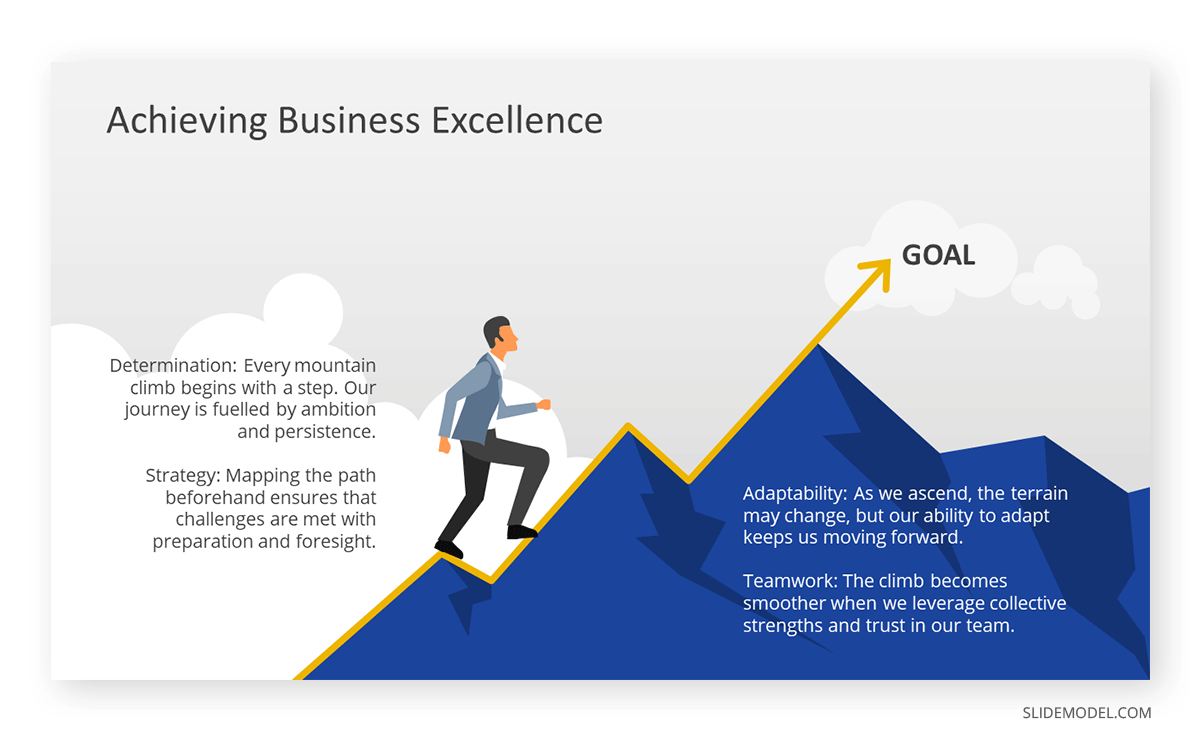
Storytelling is a powerful tool in presentations, as it can captivate the audience’s attention, make complex ideas more relatable, and create a memorable experience. One of the primary benefits of incorporating stories is that they can help to humanize the presenter, making them more relatable and building a stronger connection with the audience. They can also evoke emotions, helping to increase the retention rate of the content you share and even building a need from the audience to get more information about your work (that being a product or a service).
We’ve created a detailed guide on the concepts every speaker should master to successfully use storytelling in presentations. Another valuable asset we invite you to discover is our metaphor PPT templates, which are ideal for expressing complex ideas in simpler terms or building your narrative with powerful graphics.
Reason #8 – Technical Issues
Common Technical Problems During Presentations
Technical problems are common during presentations and can significantly disrupt the flow and impact of the presentation. Some of the most common technical problems include:
- Projector or Screen Issues: The projector may not connect properly to the computer, or the screen may not display the presentation correctly. This can result in delays and disrupt the presentation’s flow. In most complex cases, the driver of the computer’s graphics card may crash or conflict, not allowing us to stream the presentation.
- Audio Problems: The microphone may not work properly, or the speakers may not be loud enough for the audience to hear the presenter. Interference, usually due to low-quality microphones, is another factor to consider.
- Software Glitches: The presentation software may crash or freeze, causing delays and disrupting the presentation flow.
- Video or Animation Issues: Videos or animations may not play correctly, detracting from the presentation’s impact. This usually happens when presenters craft their presentations using the latest PowerPoint releases and then ought to use legacy versions or Google Slides to deliver the presentation at the location venue.
- Remote Control Problems: The remote control may not work properly, making it difficult for the presenter to navigate the slides.
These technical problems can be frustrating for the presenter and the audience and can detract from the presentation’s overall impact. They can also make the presenter appear unprepared or unprofessional. To avoid these problems, presenters should thoroughly test all equipment and software before the presentation and have a backup plan in case of technical difficulties.
Importance of a Backup Plan
A relaxed presenter covers all bases with a good backup plan. These are some suggestions we have to prevent common technical inconveniences:
- Having a Printed Copy: In case of projector or screen issues, having a printed copy of the presentation allows the presenter to continue without relying on visual aids. If your presentation relies heavily on graphs, ask the organization if they have a whiteboard you can use to recreate the graph manually from your notes.
- Testing Equipment: Thoroughly testing all equipment and software before the presentation can help identify and fix any potential problems. This should be done 10-15 minutes before the presentation.
- Bringing Spare Equipment: Bringing spare equipment, such as a backup laptop or remote control, can provide a quick solution in case of equipment failure.
- Preparing for Audio Problems: Having a backup plan for audio problems, such as bringing a portable speaker or having a printed copy of the presentation, can help ensure that the audience can still engage with the presentation. If the microphone isn’t working as required, you may be forced to raise your voice, so keep a jar with water nearby to avoid extra strain on your throat.
- Practicing Without Visual Aids: Practicing the presentation without relying on visual aids can help the presenter to continue confidently in case of technical problems.
Additional Reasons that May Affect Your Presentation’s Performance
Inadequate Time Management
Nothing says more about disrespect than exceeding your allocated time during an event. Organizers often cut presentations that go beyond the time limit, leaving some points up in the air as your presentation abruptly ends. Consider this as the epitome of examples of bad PowerPoints, as you never get to reach your presentation’s conclusion.
Inadequate time management can significantly undermine the effectiveness of a presentation. When a presenter fails to allocate time properly, they may rush through important points or, conversely, dwell too long on less significant details. This can result in an amateurish presentation that will destroy all your hard work done during the previous minutes.
To avoid this common pitfall, consider the total time allowed for the presentation and create your speech with a time limit of 3-5 minutes before that time mark. This not only gives you room for a Q&A session, but it also shows your respect for fellow presenters.
Failure to Engage the Audience
A presenter’s failure to engage the audience can significantly detract from the presentation’s expected impact. Engagement can be achieved by asking questions, encouraging audience participation, or using interactive elements like polls or quizzes. Additionally, the presenter can use storytelling, humor, or relatable anecdotes to connect with the audience and make the presentation more enjoyable.
The presenter should be mindful of their body language, tone of voice, and overall demeanor, as these non-verbal cues can significantly affect the audience’s engagement.
Not Addressing the Audience’s Needs and Questions
Linked to a previously-mentioned topic, ignoring the fact the audience may have questions about your presentation is a common mistake. This leaves a sour taste in the audience, as they feel a secondary asset to the presentation as if their opinion isn’t valuable.
Conduct well-done research about the topics that drive interest out of your audience, and predict potential questions that can arise after your speech. Then, allocate the required time to answer them or offer a contact medium (email, LinkedIn) when debating how to end a presentation. Staying some minutes after your presentation concludes to answer questions in coffee breaks is a sign of respect for your audience.
FAQs
How does reading directly from slides affect audience engagement?
Reciting text directly from slides can lose audience interest, implying insufficient preparation and limiting direct engagement through eye contact.
What is the impact of not providing handouts or supplementary materials?
Omitting handouts can make it difficult for the audience to retain information and revisit essential points afterward.
Why is avoiding eye contact a presentation mistake?
Avoiding eye contact can make the presenter seem untrustworthy or unprepared, weakening their connection with the audience.
What are the effects of not having a strong opening?
A weak opening fails to capture attention, making it difficult to engage the audience from the start.
Why should a presentation avoid complex jargon?
Complex language alienates audiences unfamiliar with the terminology, leading to disengagement and misunderstanding.
What’s the impact of ignoring storytelling in presentations?
Storytelling creates emotional connections and makes content memorable; without it, presentations can feel dull and unengaging.
Conclusion
Multiple factors can end up ranking our hard work as bad examples of PowerPoint presentations, and we can be totally oblivious to them because we focus so much on the content rather than the delivery. The time to act is now. Assess your presentation skills and identify the areas that need improvement.
Embrace the power of visual aids, storytelling, and effective body language to elevate your presentation. Be proactive in addressing technical issues and always have a backup plan. Remember, the goal is to deliver a presentation that informs, engages, and resonates with your audience. Take the necessary steps to hone your skills, and you will undoubtedly see a marked improvement in your future presentations. The path to delivering an impactful and memorable presentation is in your hands. Seize the opportunity and make your next presentation your best one yet.
