Planning a presentation from scratch involves dozens of small decisions, and missing any one of them can affect the final result. Whether preparing for a board meeting, a sales pitch, or an academic conference, the quality of a presentation depends on what happens before opening the software, while building the slides, and during the final technical checks.
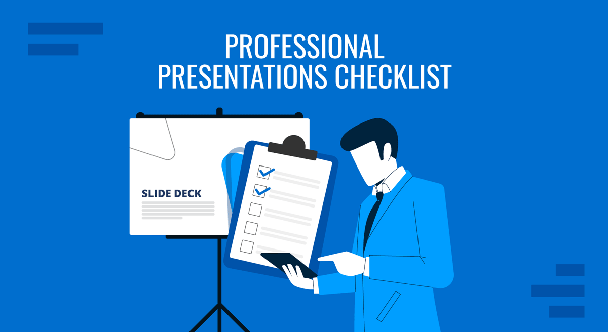
A presentation checklist turns this process into a repeatable system. Rather than relying on memory or discovering problems at the last minute, a structured checklist covers every aspect of preparation, from objective setting to file compatibility. This article covers 20 must-have items for any professional presentation checklist, organized by phase to fit naturally into the workflow. For teams that want to manage this process efficiently, a PowerPoint checklist template provides a consistent structure that can be customized for each project, reducing the risk of missing a critical step when time is short.
Phase 1: Pre-Production Planning
Before opening your presentation software, four planning tasks determine the quality of everything that follows. Skipping this phase accounts for most of the structural problems that surface later, and no amount of design work compensates for a presentation that lacks a clear purpose or misreads its audience.
1. Write a single-sentence presentation objective
Every effective presentation begins with a precise statement of what it needs to accomplish. This objective should describe a specific outcome: what the audience will understand or do after the presentation ends. A vague objective such as ‘present quarterly results’ offers no guidance when deciding which slides to include and which to cut. A precise one such as ‘convince the leadership team to allocate budget for platform migration by Q3’ shapes every subsequent decision. If this sentence cannot be articulated before building the slides, the presentation is not ready to be built.
2. Profile your audience’s decision-making authority and knowledge baseline
Knowing who will be in the room changes the depth of explanation required, the vocabulary appropriate for technical concepts, and the level of strategic context needed. A presentation designed for operational managers requires different framing than the same content delivered to the C-suite. Before building the deck, document what the audience already knows, what they are likely to question, and what authority they have to act on the recommendations presented.
3. Audit the presentation context
The physical and logistical setting of a presentation matters as much as its content. Will you be presenting on a large screen in a conference room or sharing your screen in a video call? How much time has been allocated? Are there branding requirements or formatting norms to follow? These factors affect slide density, font size, color choices, and the pacing of the narrative. Understanding the context before designing prevents costly changes later.
4. Determine the appropriate slide count based on pacing, not content volume
A common mistake is adding slides to accommodate more information. Slide count should be driven by how the presentation flows, not by how much material exists. A practical benchmark used by many professional presenters is one slide per minute of allocated time for content-heavy decks, though some slides may require more when carrying complex visuals or data. Defining this ceiling early forces more discipline in content selection and prevents the deck from expanding beyond what an audience can absorb.
Phase 2: Content Architecture and Narrative
With the context defined, the next phase covers how the content is organized and communicated. Presentation structure is one of the most consequential factors in whether an audience follows an argument or loses track partway through. These five items ensure the content has a logical flow that supports comprehension and decision-making.
5. Structure your content as a problem-insight-resolution sequence
Random ordering of information is one of the most common structural failures in business presentations. A problem-insight-resolution framework requires the presenter to establish why the audience should care, what the data or analysis reveals, and what should happen next. This sequence works across presentation types: sales decks, strategy reviews, project updates, and operational reports. How to make a presentation that holds attention begins with this kind of deliberate sequencing from the first slide.
6. Apply the one-message-per-slide rule without exceptions
Each slide should communicate one clear idea. When slides carry multiple messages, audiences cannot determine which is primary, and presenters tend to rush through context that deserves more time. If a slide headline contains the word ‘and,’ that is a reliable sign the slide needs to be split into two. This rule also disciplines the visual layout: a single, clear idea requires far less text, making individual slides easier to read and more useful as standalone reference material after the meeting.
7. Source and cite every data point directly on the slide
Any statistic, benchmark, or research finding used in a presentation should carry a visible source reference on the same slide where it appears. This applies whether presenting to internal teams or external audiences. Citing sources builds credibility, protects the presenter during Q&A, and ensures that slide decks shared as standalone documents retain their evidentiary value after the meeting ends.
8. Design a strong opening sequence
How to start a presentation with impact requires deliberate planning. The first 60 seconds determine whether the audience pays attention. Rather than opening with an agenda slide or a company introduction, consider beginning with the core problem, a striking data point, or a scenario that frames the discussion’s stakes. The opening sequence sets expectations for everything that follows, and a weak start is difficult to recover from.
9. Build a closing sequence with a defined next step
The final slides should not simply recap what was covered. How to end a presentation effectively means defining what happens after the meeting: a specific decision the audience is asked to make, a timeline for follow-up, or a recommendation that requires a response. A vague closing leaves audiences without direction. A defined closing sequence converts a presentation from a report into a decision-enabling tool.
Phase 3: Visual Design Standards
Design quality affects how credible and comprehensible a presentation feels. Visual communication research shows that audiences form judgments about content quality partly based on how a presentation looks. These five items cover the design decisions that most affect professional perception.
10. Select a consistent visual theme and apply it globally
A presentation that mixes fonts, colors, icon styles, or layout patterns reads as unpolished, regardless of content quality. Select a visual theme at the start of the project, including a color palette and consistent font pairing, and apply it to every slide without exception. If working within a team, use a shared checklist template for PowerPoint, so all contributors work within the same visual framework, minimizing inconsistencies when slides are assembled from different sources.
11. Establish a clear typographic hierarchy
Slide titles, body text, captions, and callout text should each have a distinct size and weight. When all elements look similar, readers cannot scan a slide efficiently. A workable system uses a prominent title and readable body text, with smaller supporting text reserved for labels or footnotes. Once defined, this hierarchy should remain consistent throughout the deck, including any slides contributed by different team members.
12. Check color contrast for accessibility compliance
Insufficient contrast between text and background creates reading difficulties for a significant portion of any audience, particularly in bright rooms or on projected screens. The Web Content Accessibility Guidelines recommend a contrast ratio of at least 4.5:1 for normal-sized text. Most design tools include built-in contrast checkers. Running this check before finalizing the deck prevents legibility problems that are easy to overlook when reviewing slides on a backlit monitor in a dim office.
13. Replace text-heavy slides with visual summaries
Long paragraphs on slides force audiences to choose between reading and listening. When a concept can be represented as a diagram, flowchart, or table, the visual version communicates more quickly and is easier to retain. Visual aids in presentations carry a different cognitive load than spoken explanation. Slides handle the spatial and structural information; the presenter handles the narrative that connects it.
14. Confirm all images are high-resolution and properly licensed
Low-resolution images degrade visibly when projected on large screens, signaling that the presentation was assembled without care. Images sourced from the web are frequently subject to copyright restrictions. Before finalizing the deck, verify that all images are either original, licensed through a stock platform, or explicitly cleared for the intended use.
Phase 4: Technical and Logistics Readiness
Technical failures during a presentation are visible to everyone in the room and are nearly always preventable. This phase addresses the checks that prevent those failures. Teams that skip these steps frequently encounter problems on the day of the presentation, leaving no time to resolve them.
15. Test all embedded media, animations, and hyperlinks
Video files embedded in presentations frequently fail to play on computers other than the one used to build the deck. Animations may behave differently in presentation mode than in edit mode, and hyperlinks can break if the destination URL changes or the network connection is unavailable. Run through the complete deck in presentation mode on the actual presenting device, checking every interactive element before the day arrives.
16. Verify cross-platform file compatibility
A presentation built in PowerPoint may not render identically in Google Slides or Keynote, and custom fonts not installed on the presenting device will be substituted with system defaults, often disrupting the layout. PowerPoint templates built on widely available fonts and standard formatting reduce this risk. When presenting on an unfamiliar device, export a PDF as a backup to ensure the layout is preserved regardless of the software available.
17. Confirm the aspect ratio matches the display environment
Most modern presentations are designed for 16:9 widescreen format, but some conference rooms still use older 4:3 projectors. Presenting a 16:9 deck on a 4:3 display produces black bars or distorted proportions. Confirm the display format in advance so any necessary adjustments can be made before the day of the presentation, not during it.
18. Create speaker notes for slides requiring additional context
Speaker notes are not a script to be read aloud. They serve as reference material for slides that require precise language, such as those carrying financial figures, legal language, or technical specifications. Well-written speaker notes also make a shared deck useful for colleagues who were not present and need to understand the content without the presenter’s verbal explanation.
19. Conduct a full technical run-through
This means running the complete presentation in the actual environment where it will be delivered, using the same equipment, connection, and display setup. For virtual presentations, this includes testing screen share, audio levels, and camera framing. Public speaking preparation extends beyond the verbal delivery. The technical environment is part of the presentation, and surprises in that environment are avoidable with a thorough run-through.
20. Prepare a leave-behind document or supplementary materials
A well-structured presentation rarely contains every detail the audience might need after the meeting ends. Preparing a one-page summary, a PDF version of the deck, or a data appendix extends the presentation’s value beyond the session. For complex technical or financial presentations, a structured leave-behind reduces the volume of follow-up questions and helps ensure the audience retains accurate information after the meeting.
Final Thoughts
A presentation checklist delivers the most value when it functions as a consistent system rather than a document pulled out occasionally. When the same checklist governs every presentation in a team or organization, it creates predictable quality across contexts and reduces the time spent on ad-hoc decisions before each meeting. The 20 items above address the full scope of what a professional presentation requires: a clear objective, deliberate content structure, disciplined design, and thorough technical preparation.
For teams looking to make this process more efficient, the Google Slides templates and PowerPoint templates available through SlideModel provide starting points that already meet several of the design and formatting criteria on this checklist. The planning, content, and preparation decisions remain the presenter’s responsibility, but working from a professionally designed foundation shortens the distance between a completed checklist and a presentation that delivers results.