Thesis writers finish months of data collection and analysis with a findings and discussion chapter that can run thirty or more pages. Defending that work in front of a committee or presenting it at a conference means the same argument has to survive translation into ten or twelve slides. Many capable researchers stumble here, not because their analysis is weak, but because an academic presentation asks for something the written chapter never had to provide: an argument an audience can follow in real time, without footnotes or the option to reread a dense paragraph before moving on.
This article works through how to move from a written findings chapter to a presentation that keeps the underlying argument intact, how to make interpretation visible rather than displaying data on its own, and how that approach shifts across quantitative, qualitative, and mixed-methods research. It closes with a full thesis defense presentation structure that adapts to conference talks and internal research briefings.
From Thesis Chapter to Presentation: Closing the Translation Gap
A findings and discussion chapter is written to be reread. It carries citations and qualifying clauses inside paragraphs that build an argument slowly enough for a reader to pause, flip back to a table, and confirm a claim before moving on. A presentation slide offers none of that patience. The audience sees each slide once, for however long the presenter stays on it, and content that took several dense paragraphs to argue in writing has to become a defensible claim an audience can absorb in fifteen or twenty seconds. In our experience, writing a clear and effective results section makes a related point about the written chapter itself: findings need to be separated from interpretation even on the page, which is exactly the distinction a presentation has to make visually.
This mismatch is why so many defense presentations either collapse the findings into a string of unlabeled data points or retain so much of the original prose that the slides read like a script the presenter reads aloud. Neither transfers the argument. A results table copied straight from the dissertation tells an audience what the numbers are, not what they mean, and a slide dense with sentences competes with the presenter’s own voice for attention.
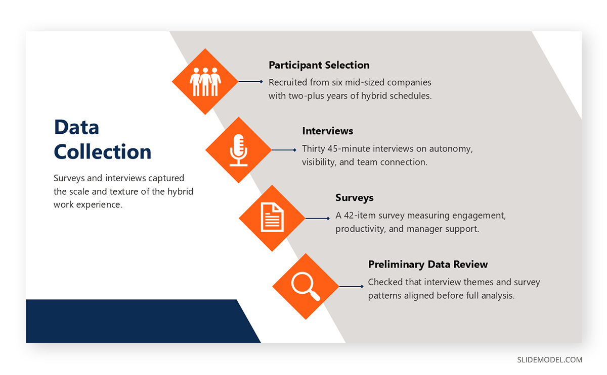
The way through this gap is not to compress the chapter, but to rebuild its logic with a different set of tools. A written chapter guides a reader through interpretation using transitional language; a slide deck has to do the same interpretive work through visual scaffolding: a clear visual hierarchy built from placement, contrast, sequence, and annotation that makes reasoning visible without a full paragraph to state it. The rest of this guide works through building that scaffolding, starting with mapping the chapter itself onto a slide sequence.
A Framework for Mapping Chapter to Slide Deck
One useful starting point is to treat each component of a findings and discussion chapter as having a direct slide equivalent. Rather than deciding slide by slide what to include, a presenter can work through the chapter section by section and ask what the visual counterpart of each part should be.
| Thesis Chapter Component | Slide Equivalent |
| Research question and context | Opening slides (1 to 2 slides) |
| Methods overview | Methods slide(s), shown as a visual summary |
| Findings presentation | Data slides with tables or charts and interpretation |
| Interpretation of significance | A dedicated “what this means” slide stating the key takeaway |
| Comparison to literature | A “contribution” slide showing where the work fits |
| Theoretical implications | A “why it matters” slide addressing broader implications |
| Limitations and future work | Closing slide(s) |
This mapping prevents two common failures. It discourages presenters from over-allocating slides to methods at the expense of interpretation, and it dismisses the interpretation of significance as something that can be silently folded into the data slide, where it is easy for an audience to miss. Treating “what this means” as its own slide, distinct from the chart or table that produced it, forces the presenter to state the interpretation explicitly rather than assuming the audience will draw the same conclusion. A research presentation built around this structure reads as a sequence of claims and supporting evidence, closer to how the written chapter actually argued its case than a slide-by-slide list of every result would be; much like an executive summary slide, it states a key takeaway before the audience works through supporting detail.
Making Interpretation Visual
Moving from description to analysis is the discipline that separates a strong presentation of findings from a weak one: slides should not simply state what happened; they should say what it means. That distinction is easy to state and harder to build into an actual slide, since the instinct when working from a results table is to reproduce it as closely as possible. Three slide formats handle this translation reliably.
Findings and Interpretation in the Same Slide
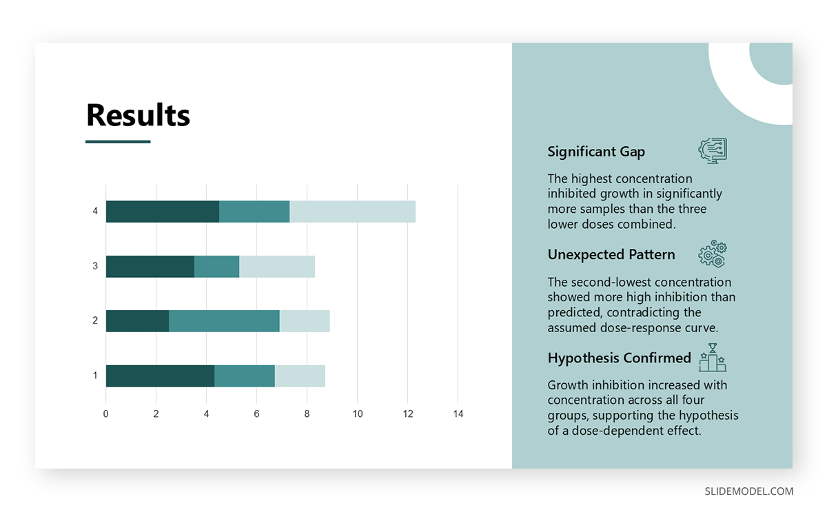
The most direct way to keep description and analysis together is to place them on the same slide rather than separating data from commentary. A chart or table occupies one portion of the slide, usually on one side, while a short block of interpretive text sits alongside it, explaining what the visual shows and why it matters to the research question. This differs from captioning, which typically just labels axes or restates a chart title. The interpretive text should make claims about which comparison is significant, which trend contradicts expectations, and which relationship supports the hypothesis. A data slide built this way avoids the common mistake of presenting raw numbers and trusting the audience to draw the intended conclusion on its own, which often does not happen when an audience is evaluating unfamiliar material under time pressure.
Comparison to Prior Literature
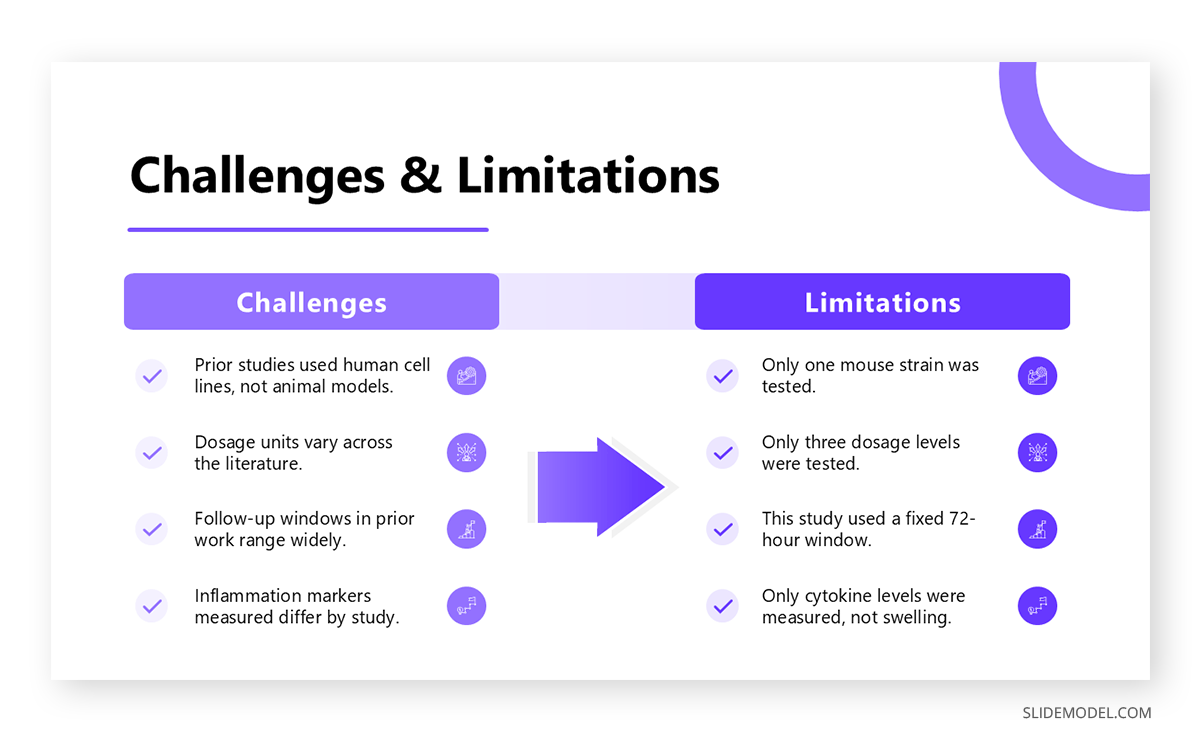
A second slide format, sometimes built as a dedicated comparison slide, is designed for situating a finding within existing research rather than presenting it in isolation. The current finding sits at the center of the slide, a brief note on what prior research established sits to one side, and a short statement of how the present work extends or challenges that prior work sits to the other. A small visual cue near the bottom, noting where the study fills a gap in the literature, gives the audience a plain-language anchor for the comparison before the presenter elaborates verbally. This format solves a problem common in academic presentations: findings that are technically accurate but presented without reference to the field they contribute to, leaving the audience to supply a connection to prior work they are rarely positioned to draw as effectively as the researcher.
Theoretical Connection
The third format applies when a finding needs to connect back to a theoretical framework rather than a body of empirical results. The theory being tested sits at the top of the slide, the study’s results sit in the middle, and a statement of how those results refine or challenge the theory sits at the bottom. A simple diagram, rather than a paragraph of text, usually communicates this relationship more efficiently, particularly when the theoretical model involves several interacting variables. Diagrams work well here because a theoretical claim is often about a relationship between concepts rather than a single number, and a chart built to display one trend line rarely represents that kind of structural relationship well. A simple concept map built directly in the slide software, rather than imported as an image, keeps the diagram editable if the argument shifts during rehearsal.
Correcting the Most Common Research Findings Presentation Mistakes
The pitfalls that most often show up in findings and discussion chapters carry over directly into presentations, and, in slide form, they tend to be more visible to an audience than to a reader working through a paragraph. Four mistakes recur most often, each with a straightforward correction once it is named.
Presenting Raw Data Without Interpretation
A table or chart placed on a slide by itself asks the audience to do interpretive work that the presenter should be doing. Even a well-designed table rarely gets worked out on its own by an audience under time pressure. The fix is not removing the table, but pairing it with a short text box stating the interpretation directly, something as concise as “this variation suggests engagement dropped sharply after week three.” That single sentence turns a data display into an argument, and it costs almost nothing in preparation time relative to how much more of the point actually lands with the audience.
Flooding a Slide With Visuals
Presenters under time pressure sometimes try to save time by placing several charts on a single slide. The result is close to the opposite of what is intended: rather than absorbing more information faster, audience engagement drops as attention gets spent deciding where to look first, and the interpretive point of any individual chart gets lost. A single chart per slide, paired with a focused interpretive statement, transfers more of the argument than five charts ever will, even though it takes more slides. Slide count is not a meaningful constraint on its own; what matters is how much of the argument survives contact with the audience.
Skipping Contradictory or Unexpected Results
Findings that do not match the original hypothesis are sometimes quietly dropped from a presentation, even when they were addressed directly in the written chapter. This creates a credibility problem when a committee member has read the full dissertation and notices the omission. A dedicated slide addressing the surprising result directly, framed along the lines of “this finding contradicts our initial hypothesis, and here are the possible explanations,” demonstrates the kind of critical thinking a defense or conference talk is meant to showcase, and signals that the researcher understands the data rather than simply reporting whatever confirmed the starting assumption.
Leaving Findings Disconnected From the Literature
A finding presented without reference to prior work reads as though it exists in a vacuum, which undercuts the contribution the research is meant to make. A slide that briefly states how a result compares to earlier studies gives the audience context to judge its significance. This does not require restating a literature review mid-presentation; a single sentence noting agreement or divergence from a specific prior finding is usually enough to reestablish the connection the written chapter spent a full section building.
Adjusting the Approach by Research Type
The slide formats above apply across most research, but how findings are visualized still depends on the kind of data that produced them. Quantitative, qualitative, and mixed-methods studies each pose distinct visualization challenges, and treating them identically tends to produce slides that fit the data poorly.
Quantitative Research
Quantitative findings usually center on statistical tests, and the temptation is to reproduce the statistical software’s output table directly onto a slide. That output was built for a reader working alongside a full methods section, not an audience seeing the numbers for the first time with no chance to pause. A more effective approach converts the test result into a visual, such as an annotated chart showing means or medians across groups, with color reserved specifically for the statistically significant comparison. The same principle applies when presenting survey results or other numeric summaries that did not come from a formal significance test. Reserving color this way, rather than applying it decoratively across the chart, gives the audience an immediate cue for where to focus, which matters more in a live presentation than on a page a reader can study at their own pace. A results table can still appear as a supporting slide, but the main data slide should carry the visual translation of what that table established.
Qualitative Research
Qualitative findings are organized around themes rather than statistics, and themes translate poorly into chart formats built for numerical comparison. An infographic-style summary works better, giving each theme a distinct visual treatment such as an icon, a short label, and a supporting detail, mirroring how the findings were likely organized during coding. Direct quotes from interview participants are among the strongest tools available in a qualitative presentation, but a quote alone is descriptive rather than analytical. Pairing the quote with a short interpretive line beneath it, connecting it back to the broader theme it illustrates, keeps the slide consistent with the interpretation-first principle covered earlier. A carefully chosen visual metaphor can also reinforce a theme; one that maps cleanly onto the theme’s content tends to stick with an audience longer than a label alone.

Mixed-Methods Research
Mixed-methods findings create a layout problem before an interpretation problem, since quantitative and qualitative data rarely belong on the same chart. The more reliable approach separates the two data types into distinct sections of the presentation, or into distinct halves of a single slide, rather than forcing them into a single integrated visual. The interpretive work that follows should focus on how the qualitative material illuminates or complicates the quantitative pattern, since that relationship is usually the actual contribution of a mixed-methods design. A slide showing a statistical trend on one side and a supporting or complicating quote on the other, with a short statement connecting them, demonstrates the integration mixed-methods research is meant to achieve.
A Complete Thesis Defense Presentation Structure
Assembling the frameworks above into a full presentation follows the same underlying presentation structure that works for most thesis defenses and adapts to conference talks with fewer allotted minutes. The outline below assumes three research questions or major findings; presenters with fewer or more should adjust the findings sections while keeping the surrounding slides intact. Numbering refers to sections rather than individual slides, since some sections may need more than one slide depending on how much data each question produces.
- Introduction (1 slide): the research question and why it matters
- Literature review summary (1 slide): where the gap in existing research sits
- Methods (1 to 2 slides): the study design shown visually rather than described in full paragraphs
- Findings section 1 (2 to 3 slides): data and interpretation for the first research question
- Findings section 2 (2 to 3 slides): data and interpretation for the second research question
- Findings section 3 (2 to 3 slides): data and interpretation for a third research question, if applicable
- Discussion (2 slides): theoretical implications and connection to the literature
- Limitations (1 slide): a transparent account of the study’s weaknesses
- Future work (1 slide): where the research leads from here
- Conclusion (1 slide): why the findings matter, stated plainly
This structure keeps interpretation distributed throughout the presentation rather than concentrated entirely in a discussion section near the end, mirroring how the narrative of the written chapter actually unfolds. A committee or conference audience that sees interpretation attached to each finding as it is presented, rather than deferred to a summary slide at the close, tends to retain the argument’s logic more completely than one that receives a wall of data followed by a single explanatory section.
FAQs
What’s the difference between presenting research findings and simply reporting data?
Reporting data shows what a table or test produced. Presenting findings states what those numbers mean for the research question, in a form an audience can absorb without rereading. A findings slide pairs the two: the visual carries the data, and a short adjacent statement carries the interpretation.
How many slides does a thesis defense presentation typically need?
Most defenses run on ten to twelve core sections, though individual sections often expand into two or three slides depending on the data. The structure in this guide usually produces fifteen to twenty slides once methods, findings, and discussion sections are fully built out.
How should I present a result that is not statistically significant?
Give it its own slide rather than dropping it or burying it in a footnote. State the result plainly and note that it did not reach statistical significance, then offer a brief interpretation, such as that a small sample size limited the study’s power to detect a real effect.
What’s the best way to show qualitative themes on a slide?
An infographic-style layout, giving each theme a distinct visual marker with a short label and supporting detail, generally works better than a bulleted list of theme names. It mirrors how themes were likely organized during coding and provides the audience with a visual anchor for each theme.
How do I handle a finding that contradicts my original hypothesis?
Give it a dedicated slide instead of folding it into a broader summary. State the contradiction directly, then walk through possible explanations, whether that points to a design limitation, an unexpected variable, or a genuine challenge to the starting assumption.
Should raw data tables ever appear on a slide?
They can, but usually as a supporting or appendix slide rather than the main data slide for a finding. The primary slide should carry a visual translation of the table, such as an annotated chart, paired with an interpretive statement.
How long should a thesis defense presentation run?
Most institutions expect a presentation of 20-45 minutes, followed by a separate question period. Checking with an advisor or the graduate office early is worth it, since the answer directly determines how many findings sections the deck can hold.
How do I connect my findings to existing literature without repeating my full literature review?
A single sentence noting where a specific finding agrees with or diverges from a specific prior study is usually enough. This works best as its own slide element, positioned next to the finding itself, rather than as a separate slide that reviews the literature again.
What actually distinguishes a findings slide from a discussion slide?
A findings slide shows what happened: the data, the test result, the pattern. A discussion slide addresses why it matters: theoretical implications and connections to prior work. Keeping the two separated, even when adjacent in the deck, keeps interpretation visible rather than folded silently into the data.
How should mixed-methods research be organized across slides?
Keep quantitative and qualitative data in separate sections or in separate halves of a slide, rather than combining them into a single visual. The interpretive work should then focus on how the qualitative material explains or complicates the quantitative pattern, since that relationship is the design’s actual contribution.
What visual format works best for showing statistical significance?
An annotated bar or column chart with color reserved for the comparison that reached significance tends to work better than a full statistical output table. Reserving color this way gives an audience an immediate cue for where to focus during a live presentation.
How should the limitations slide be structured?
One slide is usually enough: state the two or three most consequential limitations plainly rather than listing every methodological caveat from the chapter. Framing each limitation alongside its practical effect on interpretation, rather than as an abstract caveat, helps the audience gauge how much weight the findings can bear.
Can I use direct quotes from interview participants on a slide?
Yes, and they are among the strongest tools available in a qualitative presentation. A quote works best paired with a short interpretive line beneath it that connects it back to the broader theme it illustrates, rather than left to stand alone.
What belongs on the opening slide of a research presentation?
The research question itself, stated plainly, with a brief note on why it matters to the field or the audience in the room. Detailed background belongs on the slide that follows, not the opening slide, which works best when focused on a single question.
How do I avoid overwhelming the audience with too many visuals?
Limit each slide to one chart or table, paired with a focused interpretive statement, rather than combining several visuals to save slide count. What matters is how much of the argument the audience can actually follow, not how few slides the deck contains.
Final Words
A findings and discussion chapter and a thesis defense presentation answer the same research questions, but they are not the same document translated into a different format. The chapter argues through prose built for a reader who can pause and reread; the presentation has to argue through layout, sequence, and brief interpretive statements built for an audience that sees each slide once. The framework and slide formats covered here, mapping chapter components onto slide equivalents and pairing every data visual with interpretation, help in the process of turning your thesis into a presentation, rather than a diluted summary of it.