In our experience, a common error when preparing a conference presentation is using designs that heavily rely on bullet points and massive chunks of text. A potential reason behind this slide design mistake is aiming to include as much information as possible in just one slide. In the end, slides become a sort of teleprompter for the speaker, and the audience recalls boredom instead of an informative experience.
As part of our mission to help presenters deliver their message effectively, we have summarized what makes a good conference presentation slide, as well as tips on how to design a successful conference slide.
Table of Contents
- What is a conference presentation
- Common mistakes presenters make when creating conference presentation slides
- How can a well-crafted conference presentation help your professional life
- How to start a conference presentation
- How to end a conference presentation
- Tailoring Your Message to Different Audiences
- Visualizing Data Effectively
- Engaging with Your Audience
- Designing for Impact
- Mastering Slide Transitions and Animation
- Handling Time Constraints
- Incorporating Multimedia Elements
- Post-Presentation Engagement
- Crisis Management during Presentations
- Sustainability and Green Presentations
- Measuring Presentation Success
- 13 Tips to create stellar conference presentations
- Final thoughts
What is a conference presentation
The Britannica Dictionary defines conferences as
A formal meeting in which many people gather in order to talk about ideas or problems related to a particular topic (such as medicine or business), usually for several days.
We can then define conference presentations as the combination of a speaker, a slide deck, and the required hardware to introduce an idea or topic in a conference setting. Some characteristics differentiate conference presentations from other formats.
Time-restricted
Conference presentations are bounded by a 15-30 minute time limit, which the event’s moderators establish. These restrictions are applied to allow a crowded agenda to be met on time, and it is common to count with over 10 speakers on the same day.
To that time limit, we have to add the time required for switching between speakers, which implies loading a new slide deck to the streaming platform, microphone testing, lighting effects, etc. Say it is around 10-15 minutes extra, so depending on the number of speakers per day during the event, the time available to deliver a presentation, plus the questions & answers time.
Delivery format
Conferences can be delivered in live event format or via webinars. Since this article is mainly intended to live event conferences, we will only mention that the requirements for webinars are as follows:
- Voice-over or, best, speaker layover the presentation slides so the speaker interacts with the audience.
- Quality graphics.
- Not abusing the amount of information to introduce per slide.
On the other hand, live event conferences will differ depending on the category under which they fall. Academic conferences have a structure in which there’s a previous poster session; then speakers start delivering their talks, then after 4-5 speakers, we have a coffee break. Those pauses help the AV crew to check the equipment, and they also become an opportunity for researchers to expand their network contacts.
Business conferences are usually more dynamic. Some presenters opt not to use slide decks, giving a powerful speech instead, as they feel much more comfortable that way. Other speakers at business conferences adopt videos to summarize their ideas and then proceed to speak.
Overall, the format guidelines are sent to speakers before the event. Adapt your presentation style to meet the requirements of moderators so you can maximize the effect of your message.
The audience
Unlike other presentation settings, conferences gather a knowledgeable audience on the discussed topics. It is imperative to consider this, as tone, delivery format, information to include, and more depend on this sole factor. Moreover, the audience will participate in your presentation at the last minute, as it is a common practice to hold a Q&A session.
Common mistakes presenters make when creating conference presentation slides
Mistake #1 – Massive chunks of text
Do you intend your audience to read your slides instead of being seduced by your presentation? Presenters often add large amounts of text to each slide since they need help deciding which data to exclude. Another excuse for this practice is so the audience remembers the content exposed.
Research indicates images are much better retained than words, a phenomenon known as the Picture Superiority Effect; therefore, opt to avoid this tendency and work into creating compelling graphics.
Mistake #2 – Not creating contrast between data and graphics
Have you tried to read a slide from 4 rows behind the presenter and not get a single number? This can happen if the presenter is not careful to work with the appropriate contrast between the color of the typeface and the background. Particularly if serif fonts are used.
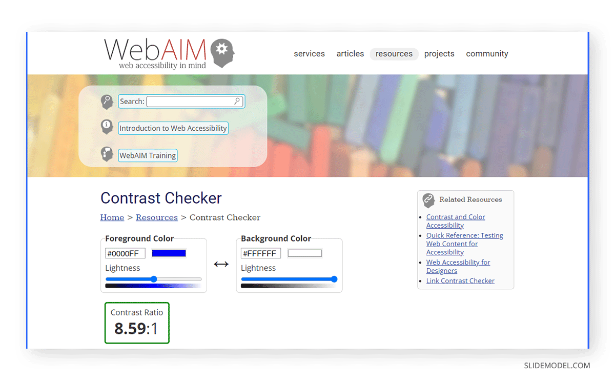
Use online tools such as WebAIM’s Contrast Checker to make your slides legible for your audience. Creating an overlay with a white or black transparent tint can also help when you place text above images.
Mistake #3 – Not rehearsing the presentation
This is a sin in conference presentations, as when you don’t practice the content you intend to deliver, you don’t have a measure of how much time it is actually going to take.
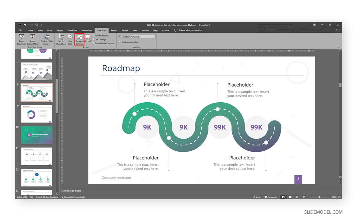
PowerPoint’s rehearse timing feature can help greatly, as you can record yourself practicing the presentation and observe areas for improvement. Remember, conference presentations are time-limited, don’t disrespect fellow speakers by overlapping their scheduled slot or, worse, have moderators trim your presentation after several warnings.
Mistake #4 – Lacking hierarchy for the presented content
Looking at a slide and not knowing where the main point is discouraging for the audience, especially if you introduce several pieces of content under the same slide. Instead, opt to create a hierarchy that comprehends both text and images. It helps to arrange the content according to your narrative, and we’ll see more on this later on.
How can a well-crafted conference presentation help your professional life
Consider your conference presentation as your introduction card in the professional world. Maybe you have a broad network of colleagues, but be certain there are plenty of people out there that have yet to learn about who you are and the work you produce.
Conferences help businesspeople and academics alike to introduce the results of months of research on a specific topic in front of a knowledgeable audience. It is different from a product launch as you don’t need to present a “completed product” but rather your views or advances, in other words, your contribution with valuable insights to the field.
Putting dedication into your conference presentation, from the slide deck design to presentation skills, is definitely worth the effort. The audience can get valuable references from the quality of work you are able to produce, often leading to potential partnerships. In business conferences, securing an investor deal can happen after a powerful presentation that drives the audience to perceive your work as the very best thing that’s about to be launched. It is all about how your body language reflects your intent, how well-explained the concepts are, and the emotional impact you can drive from it.
How to start a conference presentation
There are multiple ways on how to start a presentation for a conference, but overall, we can recap a good approach as follows.
Present a fact
Nothing grabs the interest of an audience quicker than introducing an interesting fact during the first 30 seconds of your presentation. The said fact has to be pivotal to the content your conference presentation will discuss later on, but as an ice-breaker, it is a strategy worth applying from time to time.
Ask a question
The main point when starting a conference presentation is to make an impact on the audience. We cannot think of a better way to engage with the audience than to ask them a question relevant to your work or research. It grabs the viewer’s interest for the potential feedback you shall give to those answers received.
Use powerful graphics
The value of visual presentations cannot be neglected in conferences. Sometimes an image makes a bigger impact than a lengthy speech, hence why you should consider starting your conference presentation with a photo or visual element that speaks for itself.
For more tips and insights on how to start a presentation, we invite you to check this article.
How to end a conference presentation
Just as important as starting the presentation, the closure you give to your conference presentation matters a lot. This is the opportunity in which you can add your personal experience on the topic and reflect upon it with the audience or smoothly transition between the presentation and your Q&A session.
Below are some quick tips on how to end a presentation for a conference event.
End the presentation with a quote
Give your audience something to ruminate about with the help of a quote tailored to the topic you were discussing. There are plenty of resources for finding suitable quotes, and a great method for this is to design your penultimate slide with an image or black background plus a quote. Follow this with a final “thank you” slide.
Consider a video
If we say a video whose length is shorter than 1 minute, this is a fantastic resource to summarize the intent of your conference presentation.
Don’t rush
If you get the two-minute warning and you feel far off from finishing your presentation, first, don’t fret. Try to give a good closure when presenting in a conference without rushing information, as the audience wouldn’t get any concept clear that way. Mention that the information you presented will be available for further reading at the event’s platform site or your company’s digital business card, and proceed to your closure phase for the presentation.
It is better to miss some of the components of the conference than to get kicked out after several warnings for exceeding the allotted time.
Tailoring Your Message to Different Audiences
Tailoring your conference presentation to suit your audience is crucial to delivering an impactful talk. Different audiences have varying levels of expertise, interests, and expectations. By customizing your content, tone, and examples, you can enhance the relevance and engagement of your presentation.
Understanding Audience Backgrounds and Expectations
Before crafting your presentation, research your audience’s backgrounds and interests. Are they professionals in your field, students, or a mix of both? Are they familiar with the topic, or must you provide more context? Understanding these factors will help you pitch your content correctly and avoid overwhelming or boring your audience.
Adapting Language and Tone for Relevance
Use language that resonates with your audience. Avoid jargon or technical terms that might confuse those unfamiliar with your field. Conversely, don’t oversimplify if your audience consists of experts. Adjust your tone to match the event’s formality and your listeners’ preferences.
Customizing Examples and Case Studies
Incorporate case studies, examples, and anecdotes that your audience can relate to. If you’re speaking to professionals, use real-world scenarios from their industry. For a more general audience, choose examples that are universally relatable. This personal touch makes your content relatable and memorable.
Visualizing Data Effectively
Effectively presenting data is essential for conveying complex information to your audience. Visualizations can help simplify intricate concepts and make your points more digestible.
Choosing the Right Data Representation
Select the appropriate type of graph or chart to illustrate your data. Bar graphs, pie charts, line charts, and scatter plots each serve specific purposes. Choose the one that best supports your message and ensures clarity.
Designing Graphs and Charts for Clarity
Ensure your graphs and charts are easily read. Use clear labels, appropriate color contrasts, and consistent scales. Avoid clutter and simplify the design to highlight the most important data points.
Incorporating Annotations and Explanations
Add annotations or callouts to your graphs to emphasize key findings. Explain the significance of each data point to guide your audience’s understanding. Utilize visual cues, such as arrows and labels, to direct attention.
Engaging with Your Audience
Engaging your audience is a fundamental skill for a successful presentation for conference. Captivate their attention, encourage participation, and foster a positive connection.
Establishing Eye Contact and Body Language
Maintain eye contact with different audience parts to create a sense of connection. Effective body language, such as confident posture and expressive gestures, enhances your presence on stage.
Encouraging Participation and Interaction
Involve your audience through questions, polls, or interactive activities. Encourage them to share their thoughts or experiences related to your topic. This engagement fosters a more dynamic and memorable presentation.
Using Humor and Engaging Stories
Incorporate humor and relatable anecdotes to make your presentation more enjoyable. Well-timed jokes or personal stories can create a rapport with your audience and make your content more memorable.
Designing for Impact
The design of your conference presentation slides plays a crucial role in capturing and retaining your audience’s attention. Thoughtful design can amplify your message and reinforce key points. Take a look at these suggestions to boost the performance of your conference presentation slides, or create an entire slide deck in minutes by using SlideModel’s AI Presentation Maker from text.
Creating Memorable Opening Slides
Craft an opening slide that piques the audience’s curiosity and sets the tone for your presentation. Use an engaging visual, thought-provoking quote, or intriguing question to grab their attention from the start.
Using Visual Hierarchy for Emphasis
Employ visual hierarchy to guide your audience’s focus. Highlight key points with larger fonts, bold colors, or strategic placement. Organize information logically to enhance comprehension.
Designing a Powerful Closing Slide
End your presentation with a compelling closing slide that reinforces your main message. Summarize your key points, offer a memorable takeaway, or invite the audience to take action. Use visuals that resonate and leave a lasting impression.
Mastering Slide Transitions and Animation
Slide transitions and animations can enhance the flow of your presentation and emphasize important content. However, their use requires careful consideration to avoid distractions or confusion.
Enhancing Flow with Transitions
Select slide transitions that smoothly guide the audience from one point to the next. Avoid overly flashy transitions that detract from your content. Choose options that enhance, rather than disrupt, the presentation’s rhythm.
Using Animation to Highlight Points
Animate elements on your slides to draw attention to specific information. Animate text, images, or graphs to appear as you discuss them, helping the audience follow your narrative more effectively.
Avoiding Overuse of Effects
While animation can be engaging, avoid excessive use that might overwhelm or distract the audience. Maintain a balance between animated elements and static content for a polished presentation.
Handling Time Constraints
Effective time management is crucial for delivering a concise and impactful conference presentation within the allocated time frame.
Structuring for Short vs. Long Presentations
Adapt your content and pacing based on the duration of your presentation. Clearly outline the main points for shorter talks, and delve into more depth for longer sessions. Ensure your message aligns with the time available.
Prioritizing Key Information
Identify the core information you want your audience to take away. Focus on conveying these essential points, and be prepared to trim or elaborate on supporting details based on the available time.
Practicing Time Management
Rehearse your presentation while timing yourself to ensure you stay within the allocated time. Adjust your delivery speed to match your time limit, allowing for smooth transitions and adequate Q&A time.
Incorporating Multimedia Elements
Multimedia elements, such as videos, audio clips, and live demonstrations, can enrich your presentation and provide a dynamic experience for your audience.
Integrating Videos and Audio Clips
Use videos and audio clips strategically to reinforce your points or provide real-world examples. Ensure that the multimedia content is of high quality and directly supports your narrative.
Showcasing Live Demonstrations
Live demonstrations can engage the audience by showcasing practical applications of your topic. Practice the demonstration beforehand to ensure it runs smoothly and aligns with your message.
Using Hyperlinks for Additional Resources
Incorporate hyperlinks into your presentation to direct the audience to additional resources, references, or related content. This allows interested attendees to explore the topic further after the presentation.
Post-Presentation Engagement
Engaging with your audience after your presentation can extend the impact of your talk and foster valuable connections.
Leveraging Post-Presentation Materials
Make your presentation slides and related materials available to attendees after the event. Share them through email, a website, or a conference platform, allowing interested individuals to review the content.
Sharing Slides and Handouts
Provide downloadable versions of your slides and any handouts you used during the presentation. This helps attendees revisit key points and share the information with colleagues.
Networking and Following Up
Utilize networking opportunities during and after the conference to connect with attendees who are interested in your topic. Exchange contact information and follow up with personalized messages to continue the conversation.
Crisis Management during Presentations
Preparing for unexpected challenges during your presenting at a conference can help you maintain professionalism and composure, ensuring a seamless delivery.
Dealing with Technical Glitches
Technical issues can occur, from projector malfunctions to software crashes. Stay calm and have a backup plan, such as having your slides available on multiple devices or using printed handouts.
Handling Unexpected Interruptions
Interruptions, such as questions from the audience or unforeseen disruptions, are a normal part of live presentations. Address them politely, stay adaptable, and seamlessly return to your prepared content.
Staying Calm and Professional
Maintain a composed demeanor regardless of unexpected situations. Your ability to handle challenges gracefully reflects your professionalism and dedication to delivering a successful presentation.
Sustainability and Green Presentations
Creating environmentally friendly presentations demonstrates your commitment to sustainability and responsible practices.
Designing Eco-Friendly Slides
Minimize the use of resources by designing slides with efficient layouts, avoiding unnecessary graphics or animations, and using eco-friendly color schemes.
Reducing Paper and Material Waste
Promote a paperless approach by encouraging attendees to access digital materials rather than printing handouts. If print materials are necessary, consider using recycled paper.
Promoting Sustainable Practices
Advocate for sustainability during your presentation by discussing relevant initiatives, practices, or innovations that align with environmentally conscious values.
Measuring Presentation Success
Measuring the success of your conference presentation goes beyond the applause and immediate feedback. It involves assessing the impact of your presentation on your audience, goals, and growth as a presenter.
Collecting Audience Feedback
After presenting at a conference, gather feedback from attendees. Provide feedback forms or online surveys to capture their thoughts on the content, delivery, and visuals. Analyzing their feedback can reveal areas for improvement and give insights into audience preferences.
Evaluating Key Performance Metrics
Consider objective metrics such as audience engagement, participation, and post-presentation interactions. Did attendees ask questions? Did your content spark discussions? Tracking these metrics can help you gauge the effectiveness of your presentation in conveying your message.
Continuous Improvement Strategies
Use the feedback and insights gathered to enhance your future presentations. Identify strengths to build upon and weaknesses to address. Continuously refine your presentation skills, design choices, and content to create even more impactful presentations in the future.
13 Tips to create stellar conference presentations
Tip #1 – Exhibit a single idea per slide
Just one slide per concept, avoiding large text blocks. If you can compile the idea with an image, it’s better that way.
Research shows that people’s attention span is limited; therefore, redirect your efforts in what concerns presentation slides so your ideas become crystal clear for the spectators.
Tip #2 – Avoid jargon whenever possible
Using complex terms does not directly imply you fully understand the concept you are about to discuss. In spite of your work being presented to a knowledgeable audience, avoid jargon as much as possible because you run the risk of people not understanding what you are saying.
Instead, opt to rehearse your presentation in front of a not-knowledgeable audience to measure the jargon volume you are adding to it. Technical terms are obviously expected in a conference situation, but archaic terms or purely jargon can be easily trimmed this way.
Tip #3 – Replace bulleted listings with structured layouts or diagrams
Bullet points are attention grabbers for the audience. People tend to instantly check what’s written in them, in contrast to waiting for you to introduce the point itself.
Using bullet points as a way to expose elements of your presentation should be restricted. Opt for limiting the bullet points to non-avoidable facts to list or crucial information.
Tip #4 – Customize presentation templates
Using presentation templates is a great idea to save time in design decisions. These pre-made slide decks are entirely customizable; however, many users fall into using them as they come, exposing themselves to design inconsistencies (especially with images) or that another presenter had the same idea (it is extremely rare, but it can happen).
Learning how to properly change color themes in PowerPoint is an advantageous asset. We also recommend you use your own images or royalty-free images selected by you rather than sticking to the ones included in a template.
Tip #5 – Displaying charts
Graphs and charts comprise around 80% of the information in most business and academic conferences. Since data visualization is important, avoid common pitfalls such as using 3D effects in bar charts. Depending on the audience’s point of view, those 3D effects can make the data hard to read or get an accurate interpretation of what it represents.

Tip #6 – Using images in the background
Use some of the images you were planning to expose as background for the slides – again, not all of them but relevant slides.
Be careful when placing text above the slides if they have a background image, as accessibility problems may arise due to contrast. Instead, apply an extra color layer above the image with reduced opacity – black or white, depending on the image and text requirements. This makes the text more legible for the audience, and you can use your images without any inconvenience.
Tip #7 – Embrace negative space
Negative space is a concept seen in design situations. If we consider positive space as the designed area, meaning the objects, shapes, etc., that are “your design,” negative space can be defined as the surrounding area. If we work on a white canvas, negative space is the remaining white area surrounding your design.
The main advantage of using negative space appropriately is to let your designs breathe. Stuffing charts, images and text makes it hard to get a proper understanding of what’s going on in the slide. Apply the “less is more” motto to your conference presentation slides, and embrace negative space as your new design asset.
Tip #8 – Use correct grammar, spelling, and punctuation
You would be surprised to see how many typos can be seen in slides at professional gatherings. Whereas typos can often pass by as a humor-relief moment, grammatical or awful spelling mistakes make you look unprofessional.
Take 5 extra minutes before submitting your slide deck to proofread the grammar, spelling, and punctuation. If in doubt, browse dictionaries for complex technical words.
Tip #10 – Use an appropriate presentation style
The format of the conference will undoubtedly require its own presentation style. By this we mean that it is different from delivering a conference presentation in front of a live audience as a webinar conference. The interaction with the audience is different, the demands for the Q&A session will be different, and also during webinars the audience is closely looking at your slides.
Tip #11 – Control your speaking tone
Another huge mistake when delivering a conference presentation is to speak with a monotonous tone. The message you transmit to your attendees is that you simply do not care about your work. If you believe you fall into this category, get feedback from others: try pitching to them, and afterward, consider how you talk.
Practicing breathing exercises can help to articulate your speech skills, especially if anxiety hinders your presentation performance.
Tip #12 – On eye contact and note reading
In order to connect with your audience, it is imperative to make eye contact. Not stare, but look at your spectators from time to time as the talk is directed at them.
If you struggle on this point, a good tip we can provide is to act like you’re looking at your viewers. Pick a good point a few centimeters above your viewer and direct your speech there. They will believe you are communicating directly with them. Shift your head slightly on the upcoming slide or bullet and choose a new location.
Regarding note reading, while it is an acceptable practice to check your notes, do not make the entire talk a lecture in which you simply read your notes to the audience. This goes hand-by-hand with the speaking tone in terms of demonstrating interest in the work you do. Practice as often as you need before the event to avoid constantly reading your notes. Reading a paragraph or two is okay, but not the entire presentation.
Tip #13 – Be ready for the Q&A session
Despite it being a requirement in most conference events, not all presenters get ready for the Q&A session. It is a part of the conference presentation itself, so you should pace your speech to give enough time for the audience to ask 1-3 questions and get a proper answer.

Don’t be lengthy or overbearing in replying to each question, as you may run out of time. It is preferable to give a general opinion and then reach the interested person with your contact information to discuss the topic in detail.
Final thoughts
Observing what others do at conference events is good practice for learning a tip or two for improving your own work. As we have seen throughout this article, conference presentation slides have specific requirements to become a tool in your presentation rather than a mixture of information without order.
Employ these tips and suggestions to craft your upcoming conference presentation without any hurdles. Best of luck!