A title slide sets the conditions for how the audience will receive everything that follows. It is not only the first visual but also the moment when listeners decide the level of attention, trust, and openness they will extend to the presentation. Before you speak, the slide has already communicated a message about preparation, structure, and intention. A strong title slide stabilizes the room and gives you at least a 50-percent answer on how to start a presentation. A weak one does the opposite, introducing doubt before ideas even begin to unfold.
Although the first slide of a presentation may appear simple, designing it demands discipline. Minimal information does not mean minimal thinking. Each element on the slide affects the tone: typography sets formality, layout signals order, color suggests emotional direction, and spacing speaks to whether you approach communication with clarity or clutter. The audience may not consciously analyze each element, but they react to it intuitively. Those first few seconds are where perception is formed, either helping or hindering the presenter.
This article explores how to design and use title slides with intention. Through examples, principles, and narrative reasoning, we will analyze what makes a title slide effective and how presenters can shape the opening moment of their talk. The goal is to understand the mechanics behind first impressions and how a title slide becomes the starting point of the story you are about to tell.
Table of Contents
- The Purpose of a Title Slide in a Presentation
- Structure of an Effective PowerPoint Title Slide
- PowerPoint Title Slide Examples and Their Functions
- Design Principles for Strong Title Slide Construction
- Common Mistakes in PowerPoint Title Slide Design
- FAQs
- Final Words
The Purpose of a Title Slide in a Presentation
Clarifying Scope and Intent
A title slide provides orientation. Before details arise, the audience needs a concise sense of what the session covers and what it does not. A clear title reduces interpretative noise. Ambiguous or clever phrasing often forces the audience to guess, which creates unnecessary friction. Presenters benefit from precision because it preconditions attention. When the audience understands the domain from the outset, the transition into content becomes smoother and more controlled.
This clarity extends to supporting information. While title slides often include a subtitle, date, or presenter name, their purpose is not identification alone. These elements serve as boundaries that contextualize the topic. The date communicates relevance. The presenter’s role clarifies perspective. A subtitle defines the angle through which the topic will be approached. Each item helps narrow the interpretative field, which in turn helps the audience understand what to expect.
Setting the Emotional Tone
Audiences respond to presentation structure. A clean title slide conveys order, and order creates a sense of security. When a presentation begins with a slide that feels considered, the audience perceives the presenter as prepared and methodical. This initial trust is invaluable. It allows upcoming ideas to land without resistance. On the other hand, a disorganized slide can set the opposite tone. Even with strong content later in the deck, the audience may carry early skepticism, which forces unnecessary persuasive labor.
Color, typography, and alignment all contribute to this first emotional impression. A restrained PowerPoint color palette suggests control. Consistent spacing communicates attention to detail. Well-chosen typography implies professionalism. None of these features are decorative; they formulate an unspoken contract with the audience. They indicate how you intend to guide them and what level of rigor they can expect.
Structure of an Effective PowerPoint Title Slide
Title
The title itself is the central element. It must be concise, descriptive, and legible at a distance. Complex phrasing, metaphors, or wordplay reduce clarity. The title should reveal the subject without forcing interpretation. This does not mean it has to be simplistic; rather, it must be functional. A good title summarizes the presentation’s domain and guides the audience’s cognitive readiness.
Placement also matters. Titles positioned too close to screen edges create tension, while those placed too low imply imbalance. A centered title creates symmetry but may appear rigid in corporate contexts. Left alignment aligns with reading patterns and feels structured. Selecting placement is not an aesthetic decision alone. It follows the logic of how you want the audience to engage visually.
Subtitles
Subtitles can refine the scope or highlight the angle of discussion. They help narrow the field so that expectations align with what will be delivered. For instance, a title like “Market Trends 2026” gains specificity if the subtitle clarifies, “A Review of Consumer Behavior in Q1 and Q2.” Subtitles also help signal whether the session is analytical, strategic, or instructional. When used correctly, they prevent misalignment between the presenter and audience.
Subtitles must always play a supporting role. When they become too long, the slide loses balance. Their function is to clarify, not to overwhelm. The relationship between title and subtitle should feel hierarchical. Legibility must remain intact even in large rooms.
Presenter Identity and Contextual Information
Including the presenter’s name and role is not a formality. It prepares the audience to understand the perspective behind the content. Titles that lack presenter context often feel anonymous, reducing the sense of ownership and accountability. When the audience knows who is speaking and in what capacity, interpretation becomes more grounded.
Dates, event names, or client references can also reinforce context. They indicate relevance and define the environment in which the presentation occurs. These components should appear subtle, typically with reduced font size or lower contrast. Their role is supportive, not prominent.
The only context in which a specific presenter’s name can be skipped is when a group presentation is being held internally. In such cases, it’s recommended to use the department’s name to refer to authorship.
Images
Some title slides incorporate imagery to establish tone. Photographs, illustrations, or geometries can create an atmosphere or signal the domain of the talk. Imagery must always carry meaning. Decorative visuals dilute focus and complicate cognitive processing. When used, images should reinforce the message rather than compete with it.
Take extra care with contrast, scale, and clarity. Busy background textures or images with high saturation can compromise readability. You can create background images for your slides with AI tools such as Midjourney, work with royalty-free images, or use your own photos relevant to the event.
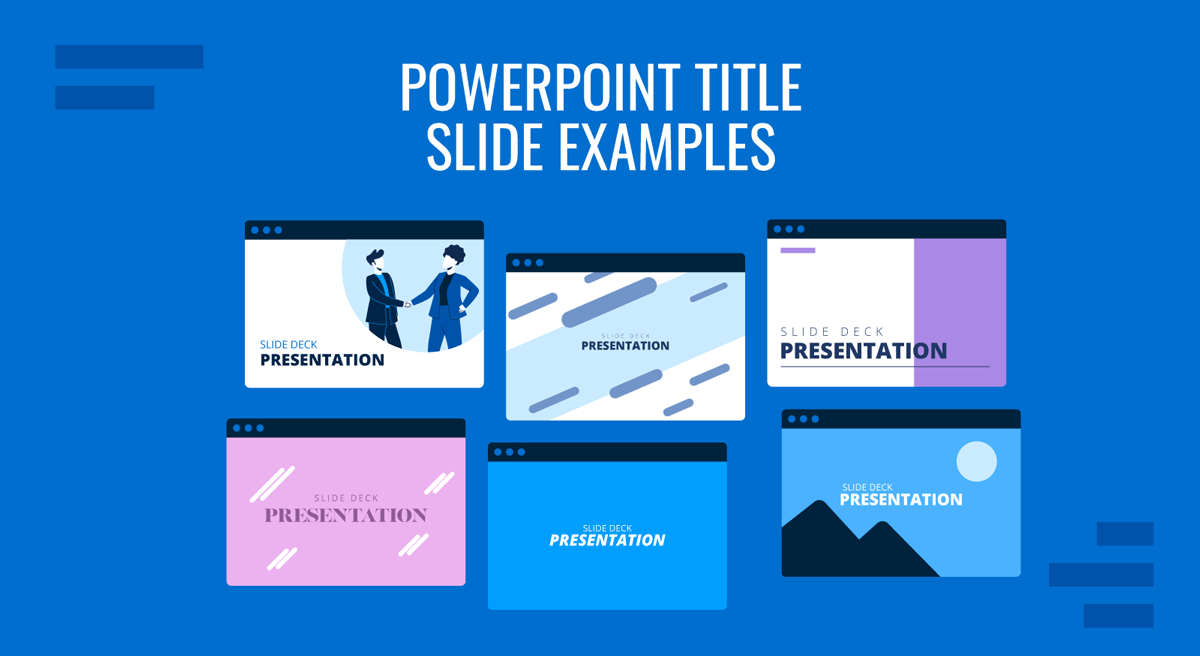
PowerPoint Title Slide Examples and Their Functions
The Minimalist PowerPoint Title Slide
Minimalist title slides rely on restraint to produce clarity. A simple title, a short subtitle, and a small identification block are arranged on large amounts of negative space. This structure signals control. It communicates that the message is streamlined and well-organized.

Minimalist slides are effective in professional environments, especially analytical or executive presentations, where unnecessary decoration can be seen as a lack of focus. They reduce cognitive noise and direct attention to the conceptual weight of the presentation.
The strength of minimalist slides lies in proportion. When spacing is carefully balanced, the slide feels intentional. When spacing is accidental, the slide feels empty. Minimalism requires precision to avoid the impression of incompleteness.
Image-Based PowerPoint Title Slides for Creative Presentations
Image-driven designs are common in marketing, design, architecture, and product presentations. A full-bleed photograph can introduce atmosphere before the presenter speaks. This approach is effective when the audience benefits from visual immersion, such as in creative reviews or experiential proposals.

The challenge lies in maintaining legibility. Image-based slides require overlays, color blocks, or transparent backgrounds to ensure text is legible. Fonts should contrast with the image without resorting to harsh color choices. The best examples balance visual richness with informational clarity.
Images must connect to the theme. Irrelevant visuals weaken narrative integrity. When aligned with purpose, however, they enrich the opening moment and support the presenter’s message.
Corporate PowerPoint Title Slides
Organizations with established visual systems often use branded title slides. These include structured layouts, defined color palettes, and standardized typographic rules. Branded slides convey alignment with brand identity guidelines and instantly communicate professionalism. They create consistency across presentations, easing recognition for frequent stakeholders.

The effectiveness of a branded title slide depends on how the presenter applies the system. Even within a PowerPoint template, choices of scale, alignment, and spacing affect clarity. A strong branded slide maintains balance and respects hierarchy. A poorly applied one feels rigid or overloaded.
Branded slides also help establish continuity across sessions within the same organization or project sequence. They communicate stability and reinforce the sense that the presentation belongs to a larger framework.
Geometric or Abstract PowerPoint Title Slides
Some presentations use geometric shapes, patterns, or subtle motifs to create a visual identity. This approach works well in design, technology, consulting presentations, and innovation-driven fields, where abstraction can suggest structure, systems, or conceptual thinking.

Geometric title slides must use repetition and proportion carefully. Excessive shapes create visual noise. Minimal, strategic placement maintains balance. The purpose of geometry is not ornamentation but guidance. It directs the eye and frames the text, helping the audience settle into the content.
Dark Background PowerPoint Title Slides
Dark backgrounds can create strong contrast for titles and generate a sense of depth. They work effectively in keynote-style presentations, product reveals, or sessions meant to feel cinematic. Dark slides give prominence to text and emphasize the gravity of the topic.

The risk lies in projector environments. Dark slides often appear faded in bright rooms. They also exaggerate color inconsistencies. Presenters using dark title slides must test lighting conditions beforehand. When used correctly, they make a strong first impression and command attention.
Design Principles for Strong Title Slide Construction
Visual Hierarchy and Readability
Hierarchy determines how quickly the audience interprets information. Titles should be visually dominant. Subtitles should appear secondary. Supporting details should be small and unobtrusive. When hierarchy is inverted, the slide becomes confusing before the content begins.
Recommended lecture: Visual Communication in Presentations
Readability dictates choices in font size, weight, and spacing. Title slides must withstand distance. If the back of the room struggles to read the title, the slide is failing its basic function. Presenters benefit from testing readability on large displays to ensure clarity.
Consistency Across the Slide Deck
A title slide introduces the presentation’s visual language. Every subsequent slide should reflect the same typographic rules, margins, color choices, and spacing patterns. Inconsistency disrupts rhythm and makes the audience feel as if multiple decks were stitched together.
The title slide should not appear as a standalone artwork. It must behave as the opening page of a system. When consistency is maintained, the deck feels coherent. Coherence strengthens credibility and reinforces the story.
Color Strategy
Color establishes tone. Neutral palettes convey professionalism. Warm palettes suggest approachability. Cool palettes indicate analytical content. A well-constructed title slide uses color deliberately, not decoratively.
Recommended lecture: Color Theory for Presentations
Accessibility considerations matter. Low contrast affects readability, especially in rooms with varying brightness. Overly saturated colors distract. The goal is not to impress with color but to support clarity.
Typography and Alignment
Typography signals personality. Serif fonts suggest tradition or editorial depth. Sans-serif fonts signal modernity and structure. The choice must align with context. Misaligned typography creates dissonance that the audience senses, even if they cannot articulate it.
Recommended lecture: Best Fonts for PowerPoint Presentations
Alignment affects stability. Left alignment follows natural reading patterns. Center alignment creates symmetry. Right alignment is rarely necessary but can support specific layouts. Alignment must remain consistent throughout the deck.
Common Mistakes in PowerPoint Title Slide Design
Treating the Title Slide as a Formality
A frequent but rarely acknowledged mistake is designing the title slide as a procedural requirement rather than a communicative moment. When the slide is treated as something to “get out of the way,” it often lacks intention. This signals to the audience that the presentation has not been shaped from the beginning, forcing the presenter to compensate verbally for a weak opening frame.
Misaligning the Title with the Actual Narrative
Another subtle issue arises when the title describes the topic in general terms while the presentation itself follows a narrower or different angle. This misalignment creates friction. The audience forms expectations based on the title, and when the content diverges, even slightly, it introduces a sense of incoherence that is difficult to correct later.
Ignoring the Spoken Opening
A title slide should work in tandem with the first spoken sentences, not independently of them. When the slide introduces ideas the presenter does not immediately address, or lags behind what is being said, it disrupts the opening rhythm. The most effective title slides anticipate how the presentation will begin verbally and align with that pacing.
Generic or Vague Titles
Titles that say little beyond broad themes introduce ambiguity. Phrases that sound polished but lack specificity force the audience to guess the presentation’s purpose. A strong title slide reduces uncertainty by clearly stating the talk’s domain and angle from the outset.
Poor Contrast and Readability
Low contrast between text and background is a persistent issue, especially when images or dark backgrounds are used. If the title is not legible from the back of the room, the slide fails its primary function. Readability must be tested in real presentation conditions, not just on a personal screen.
FAQs
How much information should a title slide contain?
Only what supports clarity. The title, a concise subtitle if needed, the presenter’s name, role, and date are usually sufficient. Additional elements should appear only if they improve context.
Should the title slide include a logo?
Yes, if branding is relevant to the context. Logos should be small and placed in a consistent location. Oversized logos distract from the title itself.
Are animations appropriate on title slides?
They can be used sparingly to pace attention, but a title slide must function without motion. If animation is essential to readability, the design needs revision.
Where should the title be placed on a slide?
Placement depends on tone. Left alignment feels structured. Center alignment feels formal. The key is maintaining balance and stable margins.
Can I use textured backgrounds in PowerPoint title slides?
Textures must remain subtle. Busy textures interfere with text clarity and distract the audience. Flat or lightly patterned backgrounds are safer choices.
Should title slides include a presentation agenda?
No. Agendas belong on a separate slide. The title slide must stay focused on introducing the theme, not the structure.
How do I choose fonts for my PowerPoint title slide?
Select fonts based on context, readability, and coherence with the deck. Avoid using more than two font families. Consistency matters more than stylistic variety.
What makes a title slide look unprofessional?
Weak hierarchy, inconsistent spacing, excessive decoration, illegible text, and poor contrast are common issues. A title slide should feel deliberate.
Can color alone establish tone?
Color helps, but cannot compensate for poor structure. Tone emerges from the combination of layout, spacing, color, typography, and clarity.
How do I test whether my title slide works?
Display it at full screen and take a few steps back. If the title remains legible and the composition feels balanced, it is likely functioning correctly.
Final Words
A title slide shapes the beginning of the presentation long before the presenter speaks. It establishes tone, communicates intention, and prepares the audience for the structure that follows. The best title slides do not call attention to themselves; they remove ambiguity, support the presenter, and create a frame that enhances comprehension.
When presenters approach title slides with intention, they set conditions that benefit every part of the session. The audience enters with clarity, the presenter begins with confidence, and the entire presentation proceeds from a stable foundation.