Line chart examples are essential tools for professionals seeking to present data trends clearly and effectively. Whether tracking project milestones, visualizing budget progression, or analyzing performance metrics, line charts provide a straightforward way to showcase changes over time. For project managers and business professionals, these charts are invaluable in summarizing complex datasets into an easily digestible format for stakeholders.
This article will explore various line chart examples that can be used across professional settings, offering ideas tailored to project management and business analysis. From tracking sales performance to visualizing resource allocation, each example demonstrates the versatility of line charts. Additionally, we’ll guide you through creating a line chart and introduce customizable templates from SlideModel. By leveraging these practical insights, you can enhance your ability to communicate data-driven stories with clarity and precision.
Table of Contents
- What is a Line Chart?
- Typical Applications of Line Charts in Data Visualization
- Benefits of Line Charts Presentations for Project Managers
- How to Create a Line Chart Step-by-Step
- 4 Line Chart Examples Worth Checking
- FAQs
- Final Words
What is a Line Chart?
A line chart presentation is a visual tool that displays data trends over a continuous interval, typically time, using a series of connected data points represented by lines. In project management and business analysis, line chart presentations are commonly used to illustrate the relationship between variables, showing how a metric or performance indicator changes over a defined period or in response to different variables.
In a line chart presentation, data points are plotted on a two-dimensional graph with an X-axis (horizontal axis) and a Y-axis (vertical axis). The X-axis often represents time intervals (e.g., days, months, quarters), while the Y-axis shows the measured variable (e.g., sales revenue, project costs, task completion percentage). Connecting these points with a line makes observing trends, fluctuations, and patterns easy.
Typical Applications of Line Charts in Data Visualization
Line charts are widely used in data presentations to illustrate trends, changes, and relationships over a continuous period. Their straightforward design makes them ideal for presenting time-series data or comparing multiple data sets. Here are some of the most common examples of a line chart we can find:
- Time-Series Analysis: Line charts are frequently used to track changes over time, such as monthly sales, daily website traffic, or annual growth rates. They provide a clear visual representation of patterns, peaks, and troughs.
- Trend Identification: Businesses and researchers rely on line charts to identify trends, such as increasing customer engagement or declining performance. By connecting data points, trends become apparent, aiding in forecasting and strategy formulation.
- Performance Monitoring: Project managers use line charts to monitor progress against milestones, budget adherence, or resource allocation. They help highlight deviations and areas requiring intervention.
- Comparative Analysis: With multiple lines, line charts enable side-by-side comparisons, such as tracking performance across different departments, regions, or campaigns.
- Risk and Resource Allocation: Risk levels or resource usage can be tracked over project phases to ensure effective planning.
Their versatility makes line charts a go-to tool for presenting insights in project management, business analytics, and scientific research.
Benefits of Line Charts Presentations for Project Managers
Despite being able to fit into various industries, project managers are often regarded as the most proficient users of line chart ideas. As visualization tools, line charts allow them to condense complex datasets into visual representations. This is particularly important in dynamic project environments where people from different technical backgrounds must make decisions based on reliable data.
Therefore, let’s explore some benefits of using line charts in project management.
Clear Progress Tracking
Line charts enable project managers to accurately track ongoing progress against planned milestones. For instance, managers can monitor task completion rates or compare actual timelines against baseline schedules, making delays or accelerations immediately visible.
Resource Management
Line charts help visualize resource allocation trends over a project lifecycle. They provide insight into team workloads, resource utilization, and phase-specific demands, enabling managers to optimize resource distribution and avoid overburdening staff.
Budget Oversight
Line charts simplify monitoring project budgets over time. Managers can clearly see spending fluctuations, compare them against forecasts, and identify periods with cost overruns, helping maintain financial control.
Risk Trend Monitoring
Projects inherently carry risks. A line chart can track the frequency and severity of risks over time, helping managers identify recurring issues or emerging patterns that require proactive mitigation strategies.
Stakeholder Engagement
Line charts simplify complex data, making it easier for stakeholders to grasp key insights during updates or decision-making sessions, particularly during the requirements-gathering phase. Customizations, such as trendlines or annotations, further improve communication.
How to Create a Line Chart Step-by-Step
Creating a line chart is straightforward, but following a step-by-step approach ensures accuracy and clarity. Here’s a guide to help you create an effective line chart. Remember, you can expand the information presented here with our article on how to make a presentation graph.
Step 1 – Identify the Data to Display
Start by gathering relevant data depending on your presentation’s objectives. For instance, you can track monthly sales, ranking positions in SEO, weekly progress in project tasks, etc.
Step 2 – Choose Your Data Representation Tool
Many tools offer an answer for how to make a line chart, including Microsoft Excel, Google Sheets, and Microsoft PowerPoint, which include built-in features for creating line charts that can be further edited for custom presentations.
If your presentation dataset isn’t big enough, PowerPoint can be a fast, secure method to create a highly visual presentation. On the other hand, complex datasets, such as Power BI reports, should be processed directly in tools intended for data processing, like Microsoft Excel, and Google Sheets may lack advanced features in this regard. Once the data is processed, you can integrate it into a PowerPoint slide.
Step 3 – Organizing Data
Format the data in a table, ensuring labels for each time interval. For example, columns could represent months, and rows could represent sales figures. Ensure the data processing format is consistent across the organization; otherwise, data inconsistencies can occur between data series.
Step 4 – Creating the Chart
Here’s how you can proceed depending on your preferred tool for the task.
In Excel:
- Highlight your data.
- Go to the “Insert” tab.
- Select “Line Chart” from the chart options.
In PowerPoint:
- Go to the “Insert” tab and select “Chart.”
- Choose the “Line” option and input your data manually.
Customize elements such as colors, labels, and legends to create a personalized slide that aligns with your brand identity. In terms of readability, opt for a minimum of 14 points of text; 16 points is better. More information about this can be found in our guide on the rules of PowerPoint presentations.
4 Line Chart Examples Worth Checking
When we think about the applications of line chart ideas, we can go beyond the typical timeline templates used to depict historical periods. The four examples shown below tackle different uses of the line chart as a visualization tool in multiple industries.
Creating a Blue Ocean Strategy Canvas for the Healthcare Industry
BlueDot, a healthcare provider, is seeking to expand its operations and address a neglected remote market. The line chart in a Blue Ocean Strategy Canvas visually illustrates the differences between traditional healthcare providers and remote healthcare providers. By plotting key features like cost, accessibility, and service availability, the chart highlights gaps in existing solutions and opportunities for innovation. It allows stakeholders to compare performance across multiple dimensions, identifying where BlueDot can eliminate, reduce, raise, or create value.
Key Points to Analyze:
- Focus Area
- Address gaps in accessibility, cost, and quality for remote and underserved regions.
- Provide innovative solutions through telemedicine and other digital healthcare models.
- Comparison Factors
- Compare traditional healthcare providers (e.g., hospitals, clinics) with the new remote-focused provider.
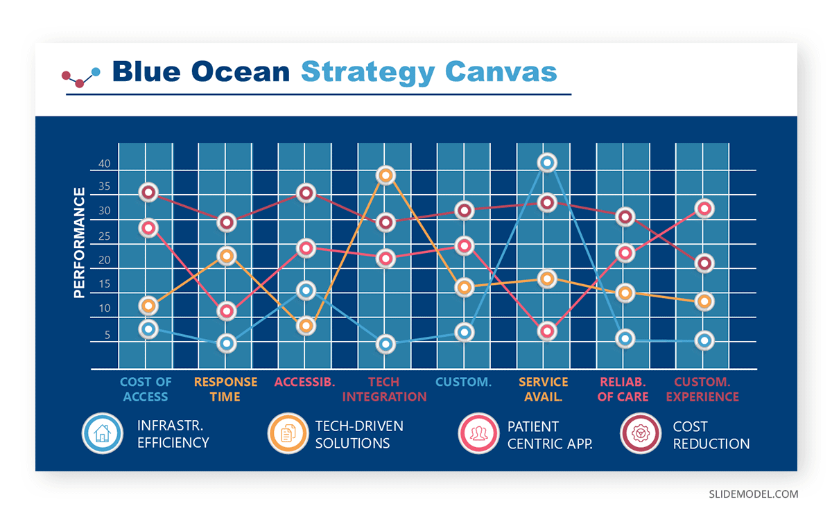
Based on the data gathered in previous stages, BlueDot can define the following features for their Blue Ocean Strategy Canvas:
- Cost of Access: The cost patients incur to access services (transportation, consultations, etc.).
- Response Time: Time taken to provide consultations or diagnoses.
- Accessibility: The ability of remote patients to connect with healthcare providers.
- Technology Integration: Use digital platforms for consultations, record-keeping, and follow-ups.
- Customization: Ability to provide personalized treatment or services.
- Service Availability: Whether the services are available 24/7 or during limited hours.
- Reliability of Care: Quality and consistency of care delivered remotely.
- Customer Experience: The overall ease and satisfaction of engaging with the provider.
Using a Line Chart to Enhance Sales Performance Insights
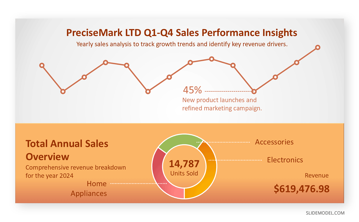
A mid-sized company specializing in consumer electronics needed help tracking and interpreting its monthly sales data. The sales team needed a precise visual tool to present data trends to the executive team and highlight key performance metrics, such as seasonal fluctuations, regional sales comparisons, and overall growth. A line chart was chosen to consolidate these insights into a single, easy-to-read format.
Objective
The goal was to utilize a line chart to:
- Track monthly sales performance over one year.
- Identify seasonal trends and performance dips.
- Provide actionable insights for improving sales strategy.
Implementation
The sales team plotted the company’s monthly revenue data (Y-axis) over time (X-axis) on a line chart.
The chart was integrated into a sales presentation, supported by annotations to emphasize significant insights such as seasonal peaks (e.g., holiday shopping season) and underperforming months.
Insights from the Line Chart
- Seasonal Trends: The line chart revealed a significant spike in sales during November and December, likely driven by holiday promotions. Conversely, sales consistently dipped in February and March. This insight prompted the team to plan for targeted marketing campaigns in underperforming months.
- Regional Performance: By comparing multiple regions on the same chart, the team identified that the North region consistently outperformed others while the West lagged. This spurred a deeper analysis of regional sales tactics and resource allocation.
- Goal Achievement: Overlaying target sales data revealed that monthly targets were missed during the first quarter while overall revenue grew. This highlighted a need to refine early-year strategies.
- Growth Trajectory: The line’s overall upward trajectory indicated sustained growth year over year, boosting stakeholder confidence in the team’s long-term strategy.
Leveraging Line Charts in Manufacturing Dashboards
A leading manufacturing company implemented a dashboard system to monitor two critical metrics: Lifetime Value (LTV) and Churn Rate. While these metrics are often associated with subscription businesses, their relevance to manufacturing lies in understanding product lifecycle profitability and client retention trends. Line charts were used to visualize these key performance indicators (KPIs) over time, offering clear insights to management.
Objective
To demonstrate the value of line charts in:
- Tracking customer lifetime profitability (LTV) trends to prioritize high-value clients.
- Monitoring churn rate (loss of customers or contracts) to identify retention challenges.
- Enabling proactive decision-making based on data patterns and trends.
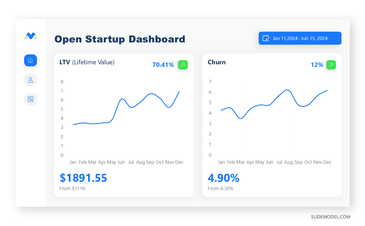
Line Chart Analysis
Lifetime Value (LTV): The left line chart shows monthly LTV trends, which could represent revenue generated from long-term clients or contracts. The chart helps the company see fluctuations, with notable peaks and troughs that suggest seasonality or project completions.
For example, an increase in LTV (70.41% in the chart) indicates improved client retention strategies or higher sales volumes for specific products.
Churn Rate: The right line chart tracks the churn rate, which is critical in understanding customer retention. A decrease in churn (4.90%, down from a previous 4.30%) signals successful client retention efforts. Spikes in churn could correlate with delays, quality issues, or competitive pressures.
The chart allows manufacturing managers to pinpoint high-churn months and investigate underlying causes, such as delivery failures or subpar product performance.
Gradual Increase in Scholarship Applications
Pacific West University is conducting an expenditure performance analysis, and they have observed a steady growth in the number of scholarship applications over the past four years. To showcase the effectiveness of their outreach programs and highlight the steps leading to this success, the admissions team created a visual representation of their progress using a success step slide PowerPoint template.
Objective
The slide illustrates the milestones achieved in increasing scholarship applications and demonstrates the strategic approach that led to sustained growth.
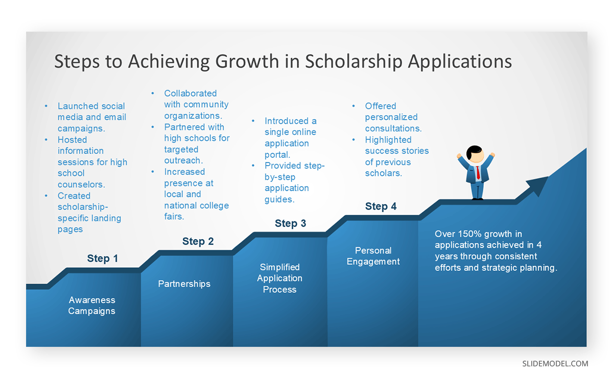
Line Chart Data Interpretation
- Tracking Application Growth Over Time: A line chart plotting the number of scholarship applications submitted each year (Y-axis) against a four-year timeline (X-axis) provides a clear view of overall growth. A consistent upward trend confirms the effectiveness of the university’s initiatives, such as outreach campaigns and application process improvements. The chart visually communicates the steady growth, with notable spikes after key initiatives like simplifying the application process.
- Understanding Seasonal Trends: Adding monthly data within each year to the line chart allows the university to identify periods of high application activity, such as before admission deadlines. Seasonal dips, such as summer months when students are less engaged, can inform future campaigns to mitigate these troughs.
- Comparative Analysis: If the university collects data on multiple scholarship categories (e.g., merit-based, need-based), the chart can include multiple lines to compare performance. For instance:
- Merit-based applications may show consistent growth.
- Need-based applications might spike during economic downturns, indicating an opportunity to increase funding or outreach.
FAQs
What are some creative line chart ideas for financial reporting?
Ideas include plotting quarterly revenue, comparing actual versus projected budgets, and visualizing expense categories over time.
What’s an excellent example of a line chart for marketing performance?
A line chart showing website traffic trends, social media engagement rates, or campaign ROI over time is ideal for marketing performance analysis.
How do line chart examples help in understanding customer behavior?
Line charts visualize metrics like customer lifetime value (LTV) or churn rate over time, highlighting behavior trends and enabling better decision-making.
How do line chart examples assist in educational analytics?
In education, line charts can visualize student enrollment trends, test scores over semesters, or retention rates across years.
What is an example of a line chart for comparing departments?
A line chart comparing departmental KPIs, such as sales revenue or customer satisfaction scores, over the same period highlights performance differences.
What’s the difference between a line chart and a roadmap presentation?
A line chart is a data visualization tool that plots data points connected by a line to display trends or changes over time, such as sales performance or budget expenditure. In contrast, a roadmap presentation is a strategic tool to outline a planned sequence of actions, milestones, or goals over time, typically represented as a flow of steps or phases. While line charts focus on quantitative data trends, roadmaps focus more on timelines and strategic progression, often lacking numerical data but providing a structured visual plan.
Final Words
Line charts are powerful tools for professionals across industries, clearly visualizing trends, patterns, and performance metrics over time. From tracking sales growth to monitoring project progress, line chart examples demonstrate their versatility and importance in data-driven decision-making. Whether used to compare metrics, forecast trends, or evaluate performance, line charts provide actionable insights in a simple, intuitive format. Combining these with roadmap templates, such as a product roadmap or strategic visual aids, further enhances data storytelling.


