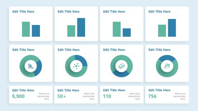
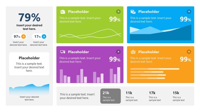
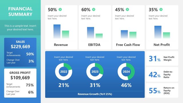
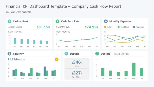
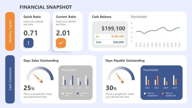
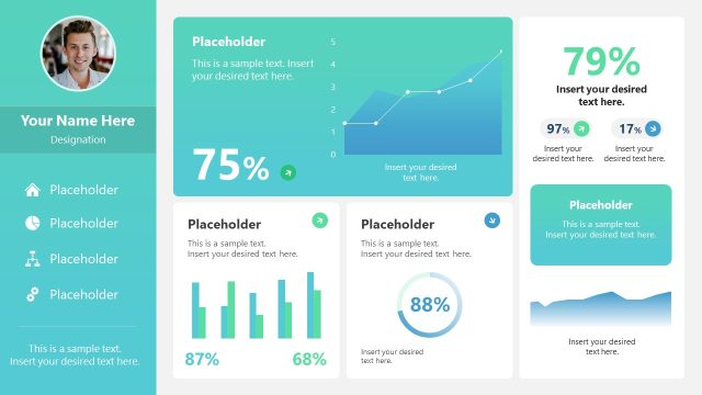
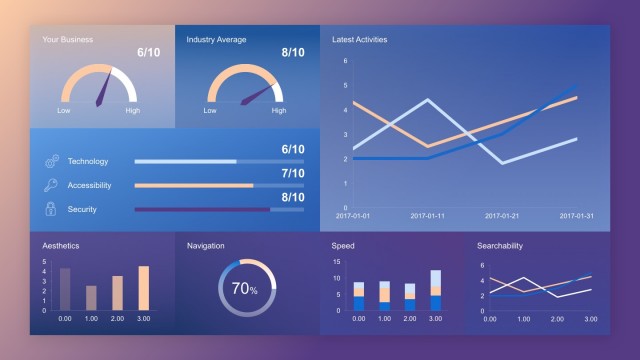
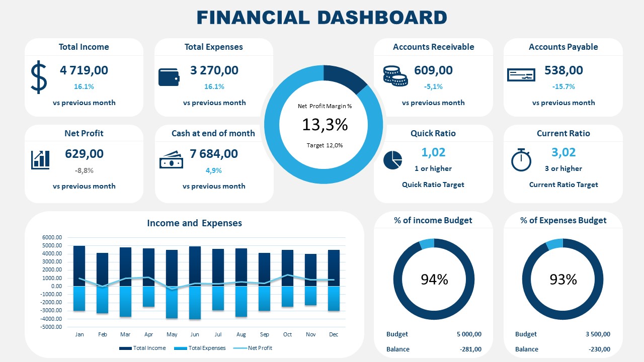
The PowerPoint dashboard template for financial reporting is useful for analysis or decision-making presentations. It fills the gap between analysts and executives in gathering information and making strategic decisions. The financial dashboard PowerPoint templates save presenters time by providing data-driven charts and pre-design graphics to communicate financial reports.
The Financial Dashboard PowerPoint Template is a slide of data-driven charts to present finance KPIs. This slide assists users in discussing cash management, tracking expenses, sales, profits, and performance of financial aspects in any business. It includes custom data driven donut charts, stacked, and line graph. The additional segments of the dashboard include finance-related clipart icons to make information more attractive to the audience. The custom data-driven charts give the advantage of customizing graphics by adding data values to update charts. Users can also change the colors and icons of the financial dashboard template for different management dashboard presentations.
The managers use financial dashboard templates to demonstrate financial data in an organized format that the audience can digest. The graphic elements of the financial dashboard template support decision-making with the help of charts. Boost your executive presentation with a financial dashboard template slide. In a presentation about the cash flow statement of a company, the dashboard template displays all cash inflows from the company’s ongoing operations. Similarly, for the loss and profit statement presentations, the stacked chart of income and expense helps visualize the financial ratios.
A financial dashboard is a method of reporting performance of monetary components in business with the help of visual elements. The graphs, charts, and shapes are used to make dashboards appealing and easy to understand. The effectiveness of the dashboard is more than just a summary of data. It gives an insight and analysis of multiple KPIs as well as the actions that need to be taken.
Alternatively, you can download a free finance dashboard template for PowerPoint & Google Slides presentation, to try it out before subscribing to SlideModel. Or you can access the finance PowerPoint templates and slides for financial presentations.
What’s inside this template
Example presentation scenarios
- A finance manager can use the KPI cards and budget donut charts to brief executives on monthly income, expenses, cash balance, receivables, and payables.
- A financial analyst can use the income and expenses combo chart to compare month-by-month performance and explain where net profit moved during the year.
- A CFO can use the net profit margin donut chart and ratio indicators to summarize liquidity, profitability, and target gaps in a board update.
- A business owner can use the one-page dashboard to align managers around budget consumption, outstanding receivables, and current financial priorities.
Features
- 100% editable presentation template
- Compatible with Microsoft PowerPoint and Google Slides
- 16:9 aspect ratio slides
- Scalable vector shapes, icons and illustrations
- Data-driven charts, editable in Microsoft Excel
- AI-Ready for Microsoft Copilot and Claude
- Instant access and download
Frequently asked questions
Q: How should a presenter walk through this financial dashboard without overwhelming the audience?
A: Start with the central net profit margin donut because it frames the overall financial result. Move next to the top KPI cards for income, expenses, cash, receivables, and payables. Then use the monthly income and expenses chart to explain trend behavior, and close with budget donut charts and ratio indicators to define the next management decision.
Q: Who is this dashboard best suited for in a financial review?
A: This slide is best for finance managers, analysts, CFOs, and business owners who need to summarize financial status in one executive view. It works well when the meeting goal is not to inspect every account, but to compare core KPIs, budget performance, margin, cash position, and operational finance signals.
Q: Why does the slide place a donut chart in the center and KPI cards around it?
A: The central donut chart gives the audience one anchor metric, net profit margin, before they scan supporting details. The surrounding cards create a dashboard pattern that separates income, expenses, cash, and ratios into readable blocks. This design helps executives see status first, then identify which metric requires discussion.
Financial Dashboard PowerPoint Template
1-slide financial dashboard presentation template with KPI cards, donut charts, and income expense reporting
Financial Dashboard PowerPoint Template is a 1-slide data-driven financial reporting dashboard for Microsoft PowerPoint and Google Slides. The 16:9 one-pager combines KPI cards, a net profit margin donut chart, income and expenses combo chart, budget donut charts, and ratio indicators for finance leaders and analysts.
- Category
- Data & Charts
- Rating


 Loading...
- Aspect ratio
- 16:9
- Item ID
- 8419-01
- Colors
 Microsoft PowerPoint
  Microsoft Copilot
  Claude for PowerPoint
 Other formats supported
Subscribe today and get immediate
access to download our PowerPoint templates.