A corporate social responsibility presentation has a clear job: show that the company’s commitments produced measurable change, not just good intentions. Boards, employees, customers, and communities have grown skeptical of polished claims and neatly rounded figures. The person standing in front of the room absorbs that skepticism directly. A PDF rarely gets challenged. A live presenter does.
That gap is what separates a CSR report from a CSR presentation. The report records information. The presentation has to defend it. This guide shows how to build a deck that earns trust slide by slide, with a solid structure, the right charts, a clear line between CSR and ESG, and a plan for the questions that come after the last slide.
Key Takeaways
- A CSR presentation communicates the organization’s social responsibility strategy, programs, and measurable results to stakeholders.
- The strongest decks focus on outcomes (the change produced) rather than outputs such as money donated or volunteer hours logged.
- A reliable structure moves from strategy and priority topics through specific initiatives into an impact dashboard, then closes with goals and a roadmap.
- CSR is the values-based narrative. ESG is the measurable, investor-facing framework. Know which one the audience expects before you build.
- Every number on the slides needs a named owner, a defined method, and a source you can produce on request.
- Preparing for the question period matters as much as designing the slides, because that is where a CSR deck is believed or dismissed.
What Is a CSR Presentation?
A CSR presentation is a slide deck a company uses to share its corporate social responsibility strategy, programs, and measured results with stakeholders. Those stakeholders vary: employees at an all-hands meeting, community partners at a grant review, customers evaluating a supplier, or a board committee reviewing the year’s commitments. The constant is the need to prove the claims.
People often treat “CSR presentation” and “social impact report presentation” as interchangeable, and the practical overlap is large. The useful distinction is emphasis. A CSR presentation covers the full responsibility agenda, including ethics, governance, environment, and community. A social impact report presentation narrows to the measurable change programs created for people, usually over a defined reporting period and usually with a stated measurement method.
CSR content invites two opposite failures. Soften it too far, and the deck reads like a brochure: photography and adjectives with nothing an auditor could check. Harden it too far, and you bury the audience in appendix-level figures nobody can hold in their head. The structure in this guide keeps you between those poles: a narrative spine a general audience can follow, carrying evidence dense enough that a skeptic cannot dismiss it.
CSR vs. ESG vs. Social Impact Report
These three terms appear in the same meetings and get mixed up constantly. Being precise about them keeps you from building the wrong deck for the room.
| Aspect | CSR | ESG | Social Impact Report |
|---|---|---|---|
| Focus | Values, ethics, community, philanthropy | Environmental, social, governance performance | Measured outcomes of programs |
| Nature | Voluntary, largely qualitative | Standardized, quantitative, externally rated | Evidence-based and method-driven |
| Frameworks | SDGs, self-defined pillars | GRI, SASB, ISSB, CSRD | Theory of change, SROI |
| Audience | Employees, community, customers | Investors, regulators, analysts | Funders, boards, program partners |
In one line: an ESG presentation is the measurable, investor-facing evolution of CSR. CSR is the philosophy. ESG is the metrics-and-disclosure framework. The social impact report is the outcomes story. If the audience is investors or regulators asking for standardized data against a named standard, you are building an ESG presentation. If it is employees, customers, or the community hearing the responsibility story, you are building a CSR presentation. Many organizations need both, told to different rooms, drawn from the same underlying data so the two never contradict each other.
Why CSR Presentations Matter
Sustainability reporting is no longer a differentiator among large companies. Governance & Accountability Institute found that 99% of S&P 500 companies published a sustainability report covering 2024, up from roughly a fifth of the index in 2011, alongside 94% of the Russell 1000. When almost everyone reports, the report itself stops being the achievement. What separates companies is whether anyone believes what is in it.
Stakeholders are also acting on this information. PwC’s 2024 Voice of the Consumer Survey, covering more than 20,000 respondents across 31 countries, found consumers say they are willing to pay an average premium of 9.7% for sustainably produced goods, even under cost-of-living pressure. Stated intent is not the same as spend, and PwC says so plainly, but the direction of attention is unambiguous.
Regulation is tightening the evidentiary bar in parallel. The European Union’s changes to the Corporate Sustainability Reporting Directive under the Omnibus package entered into force on 18 March 2026, narrowing scope while keeping in-scope companies subject to standardized, assurable disclosure. If your organization sits inside that perimeter, the numbers in your CSR deck and your regulatory filing need to reconcile, because someone will eventually put them side by side.
A CSR presentation is how you turn reporting into influence: the moment a long document becomes a case that a room full of people can follow, question, and believe. The through-line for the whole deck is simple. Audiences no longer reward activity for its own sake. They reward evidence, which is why the structure below builds toward an impact dashboard rather than a list of good deeds.
The Anatomy of a CSR Presentation, Slide by Slide
Most CSR presentations that land follow a recognizable arc: who you are and what you stand for, what you did, the difference it made, and where you are going. Here is a reliable 12-slide structure. Adapt the emphasis to your audience, but keep the order, because each slide earns the right to the next one.
Title and Purpose
Put the company name, the exact reporting period, and one sentence on why this presentation matters to the people in front of you. Naming the period on the first slide prevents the most common opening question and quietly signals that the deck is a reporting document rather than a promotional one.
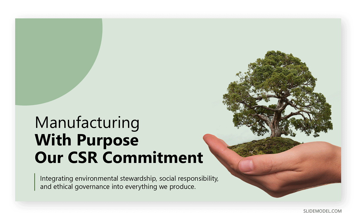
The purpose line is where most presenters waste an opportunity. “Our 2026 CSR Report” describes the file. “How our 2026 community investment changed outcomes in the three regions where we operate” describes the argument. The second version tells the audience what you are about to prove, which makes every subsequent slide easier to follow because they know what to listen for.
CSR Strategy and Pillars
This CSR slide holds your responsibility strategy in a single view, typically four or five pillars such as environment, community, people, ethics, and supply chain. It functions as the map for everything that follows, and every later slide should trace back to one of these pillars without effort.
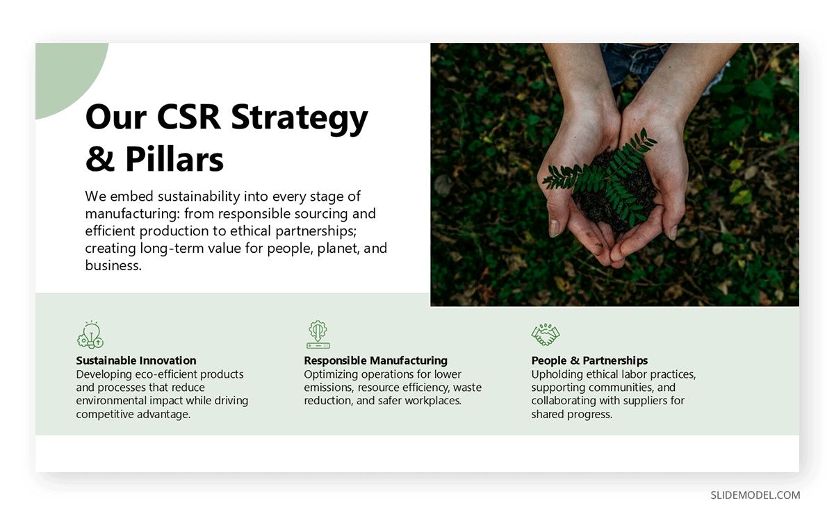
The discipline here is subtractive. Presenters tend to add a pillar for every stakeholder group that has ever asked about something, and the result is a nine-box diagram nobody can hold in memory past the next slide. If a pillar has no dedicated budget, no owner, and no metric attached to it later in the deck, it is a topic rather than a pillar, and it belongs in the appendix. Audiences read the pillar count as a signal of how seriously the strategy is resourced.
Materiality and Focus Areas
Show the issues that matter most to your business and your stakeholders, with a short note on how you determined them. The method matters as much as the conclusion: a stakeholder survey, an industry standard, a risk assessment, or a combination will each produce a defensible answer, while an unexplained list will not.
Displaying your selection process signals rigor rather than scattershot philanthropy, and it preempts the question of why a visible issue is missing from your agenda. That question arrives in almost every external CSR session, usually from someone with a stake in the omitted issue. Having a materiality slide means you answer it by pointing at your reasoning rather than improvising a justification under pressure.
Impact Dashboard
This is the most important slide in the deck, and the next section covers how to build it in detail. The job is to move past outputs such as “$2M donated, 5,000 volunteer hours” toward outcomes such as “1,200 students reached target reading levels in the districts we fund.”
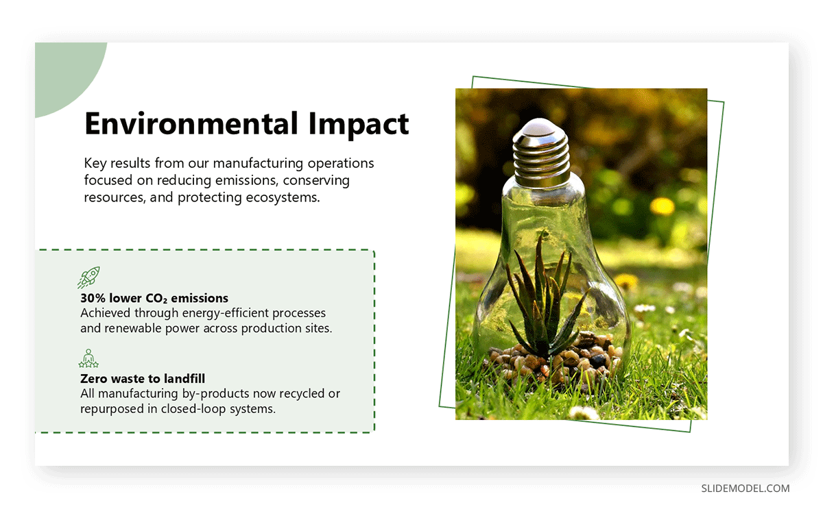
Treat this slide as the destination the whole presentation has been traveling toward. Everything before it establishes why these issues, these programs, and this measurement approach. Everything after it addresses what remains undone. If you have limited preparation time, spend a disproportionate share of it here, because this is the slide your audience will photograph, quote back to you, and use to decide whether the rest of the deck was accurate.
Beneficiary Case Study
Follow the dashboard with one human story that makes the numbers real: a name, a place, a starting situation, and a specific change. A single vivid example does more persuasive work than another chart, which is why borrowing a proper case study structure beats improvising a paragraph of warm description.
Choose a story that is representative rather than exceptional. An outlier success invites the suspicion that you searched for the best case available, while a typical participant with a modest, verifiable improvement reinforces the dashboard instead of straining against it. Secure consent for any identifiable detail, and keep the slide visually restrained, since heavy design on a personal story reads as packaging.
Environmental Metrics
Show emissions, energy, waste, and water as trends against targets rather than raw annual figures. A number without a target is trivia. A number against a target is performance. Include the baseline year on the slide, because an emissions figure means nothing until the audience knows what it is being compared against.
Be explicit about scope and boundary. Scope 1 and 2 emissions with Scope 3 omitted is a defensible position if you say so, and an evasion if you do not. The same applies to any facilities, subsidiaries, or regions excluded from the count. Stating the boundary yourself costs one line of text and removes the most damaging question an informed audience member can ask.
Social and DEI Metrics
Cover representation across levels, community investment, employee engagement, and workplace safety. The critical move is segmentation, because organization-wide averages hide exactly the gaps your audience wants to see. Representation that looks healthy in aggregate often thins dramatically above middle management, and an audience that spots you averaging over that will discount the rest of the section.
Pair each metric with its direction of travel rather than its level alone. A figure that improved from a weak starting point tells a more credible story than a strong number with no history, and it gives you somewhere honest to go when someone asks how the current year compares to the last three.
Governance and Ethics
Explain how responsibility is actually governed: board or committee oversight, ethics reporting channels, supplier standards, audit frequency, and what happens when a standard is breached. This slide converts a values statement into a system, and the governance presentation format goes deeper if the topic carries real weight for your audience.
Remediation is the part presenters skip, and skeptics look for. Naming how many supplier audits were conducted, how many issues were found, and how many were closed does more for your credibility than any commitment language, because it demonstrates that the system produces consequences rather than paperwork.
SDG Alignment
Map your work to the UN Sustainable Development Goals honestly. Claiming eleven of seventeen reads as marketing. Claiming two with specific targets and results underneath reads as strategy. The framework is useful precisely because it is shared, which means an informed audience already knows what each goal involves and can tell when a program has been stretched to fit one.
Where a goal genuinely applies, connect it to the specific target beneath it rather than the headline number. Referencing a defined target under SDG 4 tells a knowledgeable audience that you engaged with the framework rather than borrowing its icons for a slide.
Goals and Roadmap
Present forward-looking targets with dates and named owners. Credibility comes from stating what you have not yet achieved and committing to a timeline, so a visual roadmap beats a bulleted list of aspirations that all seem to live in the same unspecified future.
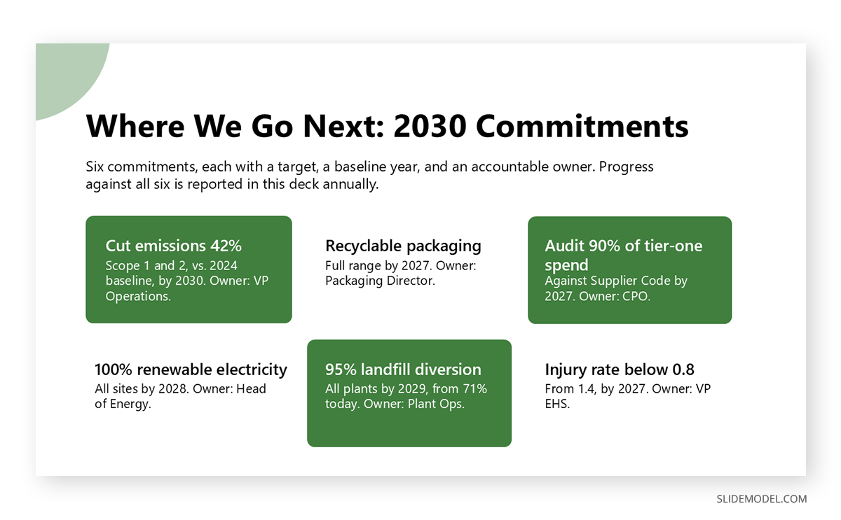
Distinguish between commitments and ambitions, and mark them differently on the slide. A commitment has a date, an owner, and a budget. An ambition has a direction. Both belong in a CSR deck, but presenting an ambition in the visual language of a commitment is one of the fastest ways to lose an audience that has seen this done before.
Call to Action
Close on the specific next step, whether that is funding a program, adopting a supplier policy, joining a partnership, or simply reading the full report. A closing slide with a defined ask turns a briefing into a decision, and its absence is the most common structural flaw in otherwise strong CSR decks.
Match the ask to what the room can actually authorize. Asking a community audience to approve a budget wastes the moment, and asking a board to “learn more” wastes it differently. One clear action, addressed to people who can take it, is worth more than a list of ways to engage.
If your CSR section sits inside a broader year-end deck, resist the urge to rebuild the financials here. Link it to your annual report presentation and keep this deck focused on impact.
Building an Impact Dashboard That Survives Scrutiny
The impact dashboard is the slide people photograph, quote, and challenge. Getting it right is the single highest-leverage thing a presenter can do, and it starts with the distinction between outputs and outcomes. Outputs are what you did: money granted, meals served, trees planted, hours volunteered. Outcomes are what changed as a result: household food insecurity reduced, canopy cover increased in a named district, reading proficiency improved for a defined cohort. Outputs are easy to count and easy to dismiss. Outcomes require method, which is precisely why they persuade.
The method does not need to be elaborate, but it does need to exist. A theory of change lays out the logical chain from activity to outcome so an audience can see your reasoning rather than take your word for it. Social return on investment expresses outcomes in monetary terms, which is powerful with finance-minded audiences and dangerous if the assumptions behind it are not disclosed. Whichever you use, state it on the slide or in a footnote. A presenter who can answer “how did you measure that?” in one sentence closes the credibility gap immediately.
Three details separate a dashboard that holds up from one that collapses under questioning. First, show a baseline, because a result with nothing to compare against is unreadable. Second, be honest about attribution: say “contributed to” when your program was one of several factors, and reserve “caused” for cases where you have the evidence. Third, keep the count low. Six to eight well-chosen figures beat twenty, and a dashboard slide built for legibility will outperform a dense grid every time. If you are unsure which figures deserve the space, the discipline behind selecting key metrics applies directly.
Which Charts and Visuals to Use in CSR Presentations
CSR data is unusually easy to overwhelm an audience with, because the underlying report holds hundreds of data points across unrelated units. Your fix is to match each metric to the visual that communicates it fastest, and to let exactly one message lead each slide.
| Your CSR data shows… | Best visual |
|---|---|
| Progress toward a target over time | Line chart with a visible target line |
| A single headline result | One big number with a short caption |
| Community investment by area | Bar chart or treemap |
| Emissions or workforce composition | 100% stacked bar |
| Program reach across regions | Map or bubble map |
| Outputs converted into outcomes | Paired before-and-after or a funnel |
Two decisions cause most of the damage. Choosing the wrong chart family is the first, and the difference between a chart and a graph is worth settling before you build rather than during rehearsal. Truncating an axis is the second, and in CSR reporting that is worse than a design error, because an exaggerated improvement curve is the visual equivalent of the round numbers your audience already distrusts.
Build these from clean, editable data rather than pasted spreadsheet defaults, so the visuals carry your brand and stay legible from the back of the room. Where a trend matters most, a properly formatted line chart with a target line does more work than any other visual in the deck, and the wider fundamentals of data presentation apply throughout.
Sourcing Numbers You Can Defend
The slowest part of building a CSR deck is not design. It is confirming that every figure is defensible before it goes on a slide. Presenters who skip this step discover the problem in the worst possible setting, when a stakeholder recognizes a number that contradicts something published elsewhere.
Work through a short verification pass on each figure. Identify the person who owns the data and can answer questions about it after the meeting. Record the period it covers and confirm it matches the period on your title slide, because mixed fiscal and calendar years are a frequent and embarrassing source of contradiction. Note whether the figure was assured, internally reviewed, or self-reported, since assured numbers can be stated flatly while self-reported ones deserve a qualifier. Check that it reconciles with the full report, any regulatory filing, and last year’s deck. Then keep a backup slide with the underlying detail, so a challenge becomes a chance to demonstrate depth rather than a moment of improvisation.
Survey-derived figures need extra care, because they are the ones most often stripped of context on the way to a slide. Sample size, methodology, and response rate belong in a footnote whenever you present survey results, particularly employee engagement figures where a low response rate quietly undermines whatever the headline says.
Delivering the Deck and Handling Skeptical Questions
CSR presentations get interrupted more than most corporate decks, because the subject invites people to test whether the speaker actually believes the material. Preparation for that dynamic is part of building the presentation, not an afterthought.
Open by naming the audience’s interest rather than your own. Employees want to know whether the company’s stated values match their daily experience. Community partners want to know whether funding continues. A board wants to know where the reputational and regulatory exposure sits. One sentence acknowledging what the room cares about buys you the attention you need for the next twenty minutes, and mapping that interest in advance through stakeholder-aware framing is time well spent.
Lead with your weakest result rather than hiding it near the end. Volunteering a missed target early does something no design choice can: it establishes that you are reporting rather than selling, and it makes every subsequent claim more believable. The same logic governs your language. Replace “significant progress” with the actual figure, and replace “committed to” with what was done.
Expect a challenge on greenwashing, and prepare a specific answer instead of a defensive one. The strongest response cites a missed target, the reason, and what changed as a result. Plan the question period deliberately, reserving real time for it and deciding in advance who answers what, since a well-run Q&A session is where a CSR deck is either confirmed or quietly discounted. Finally, remember that the single beneficiary story is your most durable asset. Data convinces the analytical part of the room. The story is what people repeat afterward, which is why narrative structure belongs in a data-heavy deck rather than in spite of it.
Common Mistakes to Avoid
The failures below are worth studying individually, because each one is committed by presenters who know better and fall into it anyway under deadline pressure. None of them is a design problem. They are all decisions about what to include, what to compare against, and what to say out loud before someone asks.
Reporting Outputs Instead of Outcomes
“Hours volunteered” is activity. “Graduation rate improved” is impact. This is the most frequent failure in CSR presentations, and it happens because outputs are easy to collect from internal systems while outcomes require you to measure something outside your own organization.
Audiences increasingly discount output-only reporting, and experienced ones will say so during the meeting. If outcome data genuinely does not exist yet for a program, present the output alongside the measurement plan and the date you expect results. That is an honest position. Presenting outputs as though they were outcomes is not, and a single challenged claim tends to cast doubt over every other number in the deck.
Vanity Metrics and Round Numbers
Suspiciously clean figures with no source read as marketing rather than measurement. A precise, awkward-looking number such as 3,847 participants is more believable than “nearly 4,000,” because precision implies someone actually counted.
The related trap is choosing a metric for how large it sounds rather than what it demonstrates. Total impressions on a sustainability campaign, cumulative lifetime donations, and headcount across all volunteer events tend to appear when program-level outcomes are weak. Sophisticated audiences recognize the substitution, and its presence in a deck often draws more scrutiny than the gap it was meant to cover.
Data Overload
A CSR report can hold hundreds of data points across unrelated units and periods. A presentation should carry the handful that prove your case, with everything else in an appendix you can reach if challenged.
The instinct behind overloaded slides is defensive, a belief that including more data makes the argument harder to dispute. In practice it does the opposite, because an audience that cannot find the point of a slide stops trying and starts waiting for the next one. Density also destroys legibility, and a table that was readable on your monitor becomes unusable when projected in a room where the back row is thirty feet from the screen.
Greenwashing by Omission
Showing only wins erodes trust faster than disclosing a shortfall. Audiences arrive expecting some level of selective presentation, so a deck with no setbacks anywhere confirms the suspicion rather than avoiding it.
The omissions that damage credibility most are structural: a metric that appeared last year and vanished this year, a program discussed at length previously and now unmentioned, or a target quietly restated at a lower level without acknowledgment. Anyone who saw the previous presentation will notice, and the discovery will color how they read everything else. Address the gap on your own terms, in your own slide, before someone else raises it in the question period.
No Clear Focus
A deck that touches every cause equally signals that none is a priority. Lead with your material issues, give them the majority of your slide time, and let the remainder sit in the appendix where interested people can find it.
Diffuse focus usually reflects an internal problem rather than a design one, where the presentation has become a place for every department to have its contribution acknowledged. That is understandable, and it produces a weak deck. If the strategy really does spread across eight equally weighted areas, the honest fix is to say so and explain the reasoning, rather than presenting scattered activity as though it were a plan.
Mismatched Framing
Presenting a values narrative to investors who came for standardized data, or a framework-heavy disclosure deck to employees who wanted to know whether their work matters, wastes the meeting regardless of how good the slides are.
This mistake is expensive because it is invisible while it is happening. The room stays polite, the questions are thin, and the presenter leaves believing it went reasonably well. Establish before you build whether the audience wants the CSR narrative or the ESG disclosure, and when a mixed room is unavoidable, lead with the narrative and keep the standardized data ready in an appendix you can turn to on request.
Missing Year-Over-Year Comparison
A single-period figure gives the audience no way to judge whether you are improving. Its absence usually reads as concealment even when it is only an oversight, because the obvious explanation for a missing comparison is that the comparison was unflattering.
Where a genuine break in methodology makes comparison unsound, say that explicitly and show both the old and new basis for the overlapping period. Restating prior figures without flagging the change is worse than showing no trend at all, since it looks like a correction someone hoped nobody would notice.
Photography Carrying the Argument
Community images build warmth but prove nothing on their own. When the visual language outweighs the evidence, the deck reads as a campaign, and the audience adjusts its skepticism accordingly.
A reliable check is to ask what each slide would still communicate with the imagery removed. If the answer is nothing, the slide is decoration rather than reporting. Photography works best in a CSR deck when it is anchored to a specific claim, such as an image of the facility whose emissions you just charted, rather than serving as generic evidence that good things happened somewhere.
CSR Presentation Templates
Presentation templates give you a professional starting point and keep a data-heavy deck consistent from the strategy slide through the impact dashboard. That consistency matters more in CSR than in most formats, because the deck mixes dense metrics, program photography, and forward-looking targets, and inconsistent styling across those elements makes the whole document feel assembled rather than authored.
Rather than build each layout from scratch, start from ready-made CSR and sustainability templates that already include pillar overviews, materiality matrices, impact dashboards, SDG alignment slides, and roadmap layouts, all editable in PowerPoint and Google Slides. Using a pre-built structure also has a quieter benefit: it forces you to fill defined slots, which surfaces the gaps in your evidence while you still have time to close them. If you want to test the format before committing, a free ESG or sustainability slide is a reasonable place to start, and mission-driven organizations reporting to funders may find the nonprofit presentation structure closer to what they need.
1. CSR Business Turnaround PowerPoint Template

Built for turnaround planning, this deck adapts cleanly to a CSR and social impact report. You open with an executive summary, then use the Current Business Challenges layout for your material issues and Root Cause Analysis to explain why they matter. Strategy Overview holds your responsibility pillars, while Expected Outcomes & KPIs gives you a ready-made impact dashboard where results sit beside targets. Stakeholder Communication Plan maps who hears what, the Implementation Roadmap carries your commitments with dates, and Next Steps closes on your ask. Eighteen editable slides for PowerPoint. Download it and start filling in your evidence.
2. Environmental CSR PowerPoint Template

Your CSR report proves the company kept its word, and this template gives that proof somewhere to land. The green, photography-led design signals environmental reporting before you say anything, and the layouts carry you from the issues you chose to address, through the outcomes you delivered, to the commitments you are making next. Stakeholders see where they sit in the story. Your roadmap arrives with dates attached. Your closing slide asks the room for something specific instead of trailing off. Fully editable in PowerPoint, so your figures and photography drop straight in. Download it and give your impact story a home.
3. Corporate Governance Planning PowerPoint Template

When someone asks who actually holds the company to its commitments, this deck answers. It puts your governance framework, board committees, and the sustainability oversight behind them into a single view, so your CSR claims arrive attached to the people accountable for them. A dedicated CSR slide sits alongside stakeholder engagement and a risk framework that shows how issues get caught before they become disclosures. Performance evaluation and succession planning prove the system outlasts the current board. Fully editable in PowerPoint, in a navy and teal palette built for the boardroom. Download it and show your work.
4. CSR Footprints Circular Diagram for PowerPoint
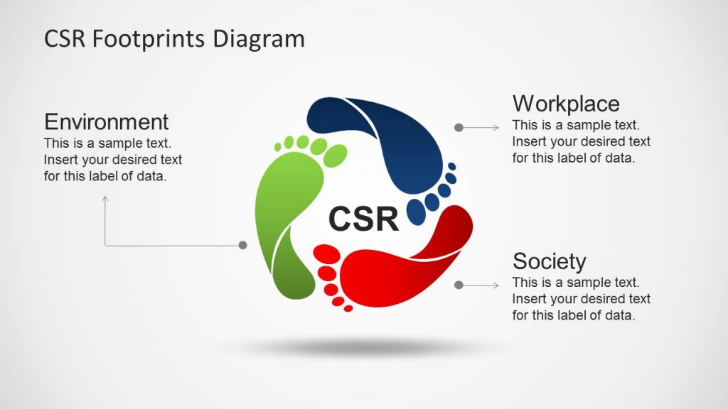
Your CSR strategy needs one slide that holds all of it, and this is that slide. Three footprints for environment, workplace, and society give your pillars a shape people remember long after the numbers fade. The build-out versions then let you walk the room through one pillar at a time, with the other two dimmed, so nobody loses the map while you go deep on a single commitment. A chevron variant carries the same three areas when you want a linear read. Five editable slides for PowerPoint, recolorable to your brand. Download it and give your responsibility story a shape.
FAQs
What is a CSR presentation used for?
Companies use one whenever the published responsibility report needs to become a conversation: an employee all-hands, a community or grant review, a supplier or customer evaluation, a board committee session, or an investor meeting where the social agenda comes up. The deck condenses a long document into an argument the audience can question in real time, which is why it is built around evidence rather than summary.
What should a CSR presentation include?
A strong CSR presentation includes your strategy and pillars, material focus areas, an initiatives showcase, an impact dashboard reporting outcomes rather than outputs, a beneficiary case study, environmental and social metrics, governance and ethics, SDG alignment, and clear goals with a roadmap and named owners.
Is CSR the same as ESG?
No. CSR is a company’s broad, largely voluntary commitment to social responsibility, framed around values and communicated as a narrative. ESG is the measurable, investor-facing framework that scores environmental, social, and governance performance against standards such as GRI and SASB. CSR is the philosophy. ESG is the metrics.
What is a social impact report?
A social impact report is a document or presentation showing the measurable change a company’s programs created, meaning the outcomes for people and communities rather than the money spent or hours volunteered. It uses evidence-based methods such as theory of change or SROI to connect activities to results.
How long should a CSR presentation be?
Most CSR presentations run 12 to 20 slides depending on the audience. An internal or community update can be shorter, while an annual CSR or social impact report presentation is longer. Prioritize a clear impact story over exhaustive data and move detail into an appendix.
What is the difference between an output and an outcome in a CSR presentation?
An output is what your organization did, such as funds granted or volunteer hours logged. An outcome is the change that resulted, such as a measured improvement in literacy or a reduction in community energy costs. Outputs describe effort. Outcomes describe effect, and stakeholders increasingly evaluate CSR decks on the second.
How do you present CSR results when a target was missed?
State the target, the actual result, and the gap on the same slide, then explain the cause and the corrective action with a revised date. Disclosing a miss early in the presentation strengthens everything you say afterward, because it demonstrates that you are reporting rather than promoting.
Who should present the CSR report to stakeholders?
The presenter should be someone who owns the commitments rather than someone who only compiled the slides. A sustainability or CSR lead handles most audiences, while board and investor sessions usually call for an executive sponsor. Whoever presents needs direct access to the data owners so questions get answered in the room.
What data should never appear on a CSR slide?
Avoid unsourced figures, numbers you cannot reconcile with the published report, individually identifiable beneficiary information, and any projection presented in the same visual style as verified results. Keep forward-looking targets visually distinct from achieved outcomes so nobody leaves the room confusing one for the other.
How often should a CSR presentation be updated?
Refresh the impact dashboard on the same cycle as your underlying data collection, typically quarterly or semiannually, and rebuild the full deck annually alongside the published report. Review the roadmap slide whenever a target date passes, since an outdated commitment on a slide is more damaging than no roadmap at all.
Final Words
A CSR presentation succeeds when it does one thing well: it proves impact. Lead with the issues that matter to your business, structure the deck to build toward outcomes rather than activity, show what fell short alongside what worked, and let clean visuals carry the data instead of decorating it.
The part most presenters underestimate is everything that happens after the slides are finished. Knowing where each number came from, who owns it, and how you will answer the hardest question in the room is what separates a deck that gets believed from one that gets politely received. Do that work, and your responsibility story stops sounding like a claim and starts reading like evidence.