Annual report presentations are a core component of corporate communication. They translate a year’s worth of financial, operational, and strategic activity into a format suitable for discussion among high-level stakeholders. While the full annual report is designed primarily for archival and compliance purposes, its presentation counterpart serves a different role: it organizes complex data into a digestible, structured narrative that supports transparency, reinforces accountability, and provides context for future decisions.
This article examines what makes a presentation of this kind effective. It defines the format, explains its audience and purpose, outlines the ideal structure, and breaks down the key content segments. The goal is to provide a framework that prioritizes substance over superficial polish, emphasizing narrative control and informed preparation. Let’s get started.
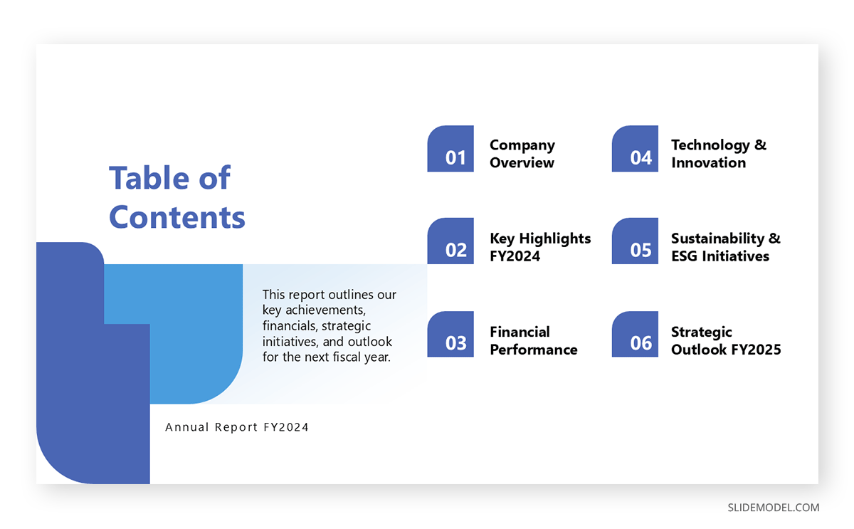
Table of Contents
- What is an Annual Report Presentation?
- Audience and Communication Objectives
- Anatomy of the Perfect Annual Report Presentation
- Key Elements of a Successful Annual Report Presentation
- Common Mistakes in Annual Report Presentations
- Best Practices for Effective Delivery
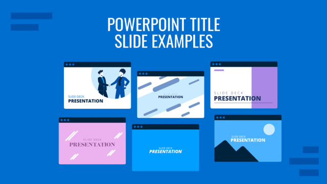
- Recommended Annual Report Presentation PPT Templates
- FAQs
- Final Words
What is an Annual Report Presentation?
An annual report presentation is a formal summary of a company’s financial and operational performance delivered to stakeholders in a meeting format. Unlike the printed or digital annual report, which is static, exhaustive, and typically designed for legal or regulatory compliance, the presentation is meant for live engagement.
Its primary function is to inform shareholders, board members, executives, and other high-level stakeholders about the organization’s progress, setbacks, and plans for the future, using a curated selection of visuals, commentary, and key data points.
Audience and Communication Objectives
Understanding who receives the presentation determines its tone, structure, and depth. For institutional investors, the priority is accuracy, defensibility of performance, and guidance for future expectations. For internal leadership, it’s alignment and accountability. For board members, it’s an assurance of proper governance and risk management. Each audience expects clarity, transparency, and a direct line between past performance and future strategy.
The communication goal isn’t persuasion in the traditional marketing sense. Instead, the presenter must establish trust by demonstrating competence, coherence, and control of the facts. This is not a sales pitch. It’s a structured narrative backed by data and presented with the expectation of critical scrutiny.
Anatomy of the Perfect Annual Report Presentation
Introduction
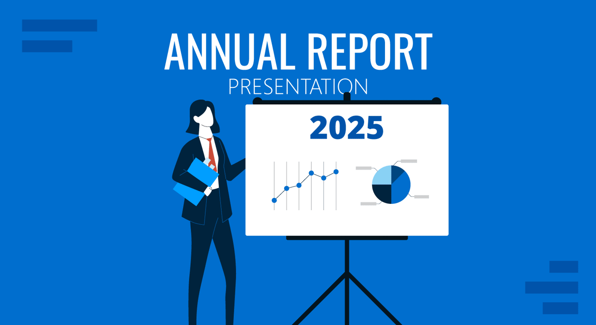
The opening portion sets expectations. It includes a title slide with company branding, fiscal year, and presentation date, followed by a simple agenda slide outlining the main sections to be covered. The speaker should clearly define the purpose of the presentation, whether it’s a financial year-end review, preparation for a strategic pivot, or evaluation of major corporate events.
A brief summary of the company’s macroeconomic environment often helps provide context for the results that follow. This is particularly important in volatile industries or years impacted by external shocks (e.g., economic crises, pandemics, war, major acquisitions).
Executive Message
Most annual report decks include a short segment either delivered by or quoting the CEO or board chair. This message reflects on the year’s major events, setting the tone and framing the audience’s mindset for interpreting financial presentation data. It usually addresses accomplishments, challenges, and high-level direction without diving into operational detail.
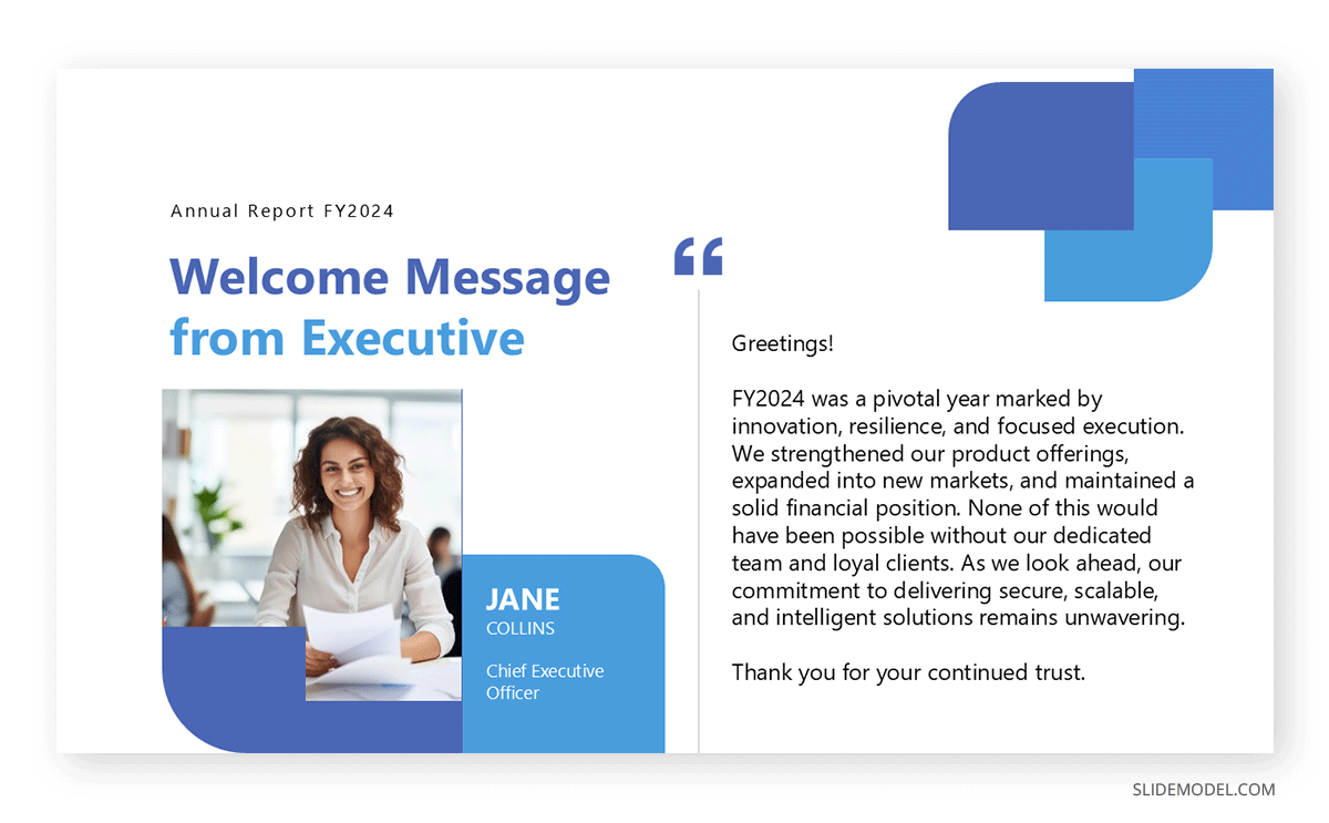
Tone is critical here. An overly polished or euphemistic message can seem evasive. The best executive statements are candid, concise, and forward-looking, anchored in fact rather than fluff.
Recommended lecture: Executive Summary
Financial Highlights
This section condenses the core financial statements into a readable narrative supported by charts and selective tables. Key figures include revenue, gross and net profit, EBITDA, earnings per share (if applicable), cash flow, and debt levels. Comparisons to previous years are necessary to show trends, while deviations from forecasts or guidance should be addressed directly.
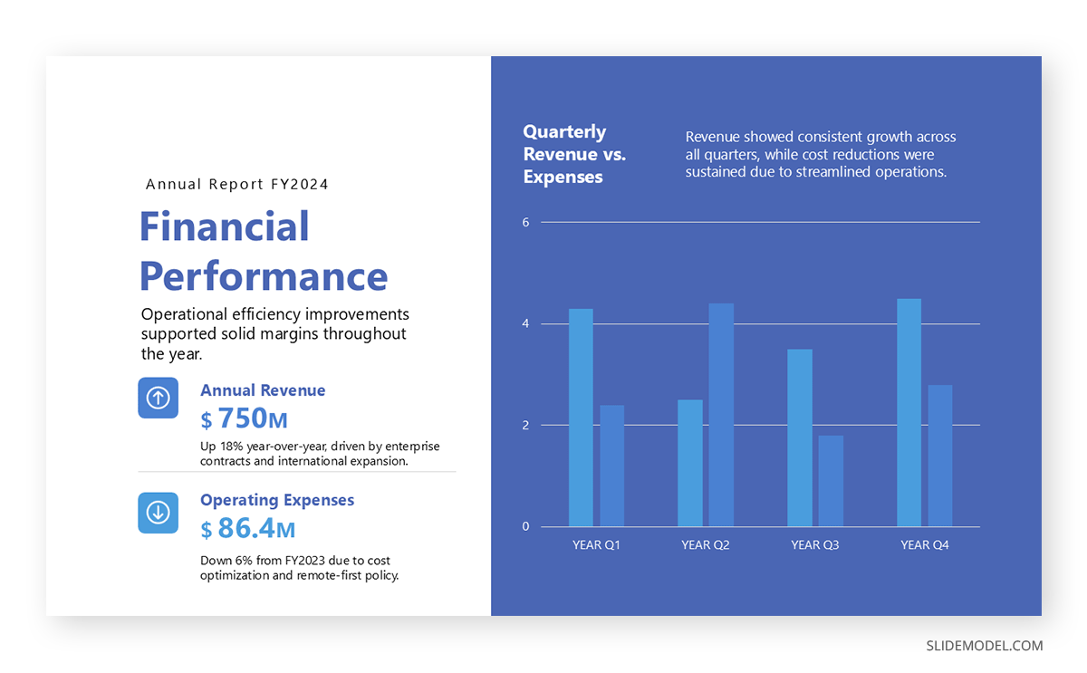
The goal is not to overwhelm the audience with numbers but to walk them through what matters and why. Revenue grew? Explain the driver. Profit margin declined? Attribute it to rising input costs, regulatory impacts, or operational inefficiencies. This is where credibility is earned or lost.
Business Performance and Segment Analysis
Moving beyond raw figures, the annual report slides should highlight operational performance across key business areas. This might include regional breakdowns, divisional contributions, or major product line outcomes. If relevant, include qualitative insights on supply chain resilience, shifts in customer behavior, or operational improvements.
This section often reveals the disconnect between financial results and internal execution, for example, a strong quarter driven by one-time events or cost reductions that mask revenue softness. Transparency here allows stakeholders to make informed judgments.
Governance, Risk, and Compliance
Effective presentations include a segment dedicated to oversight. That consists of any board changes, audit results, executive compensation disclosures, and legal or reputational risks. If the company faces litigation, regulatory inquiries, or compliance violations, these should be acknowledged and contextualized.
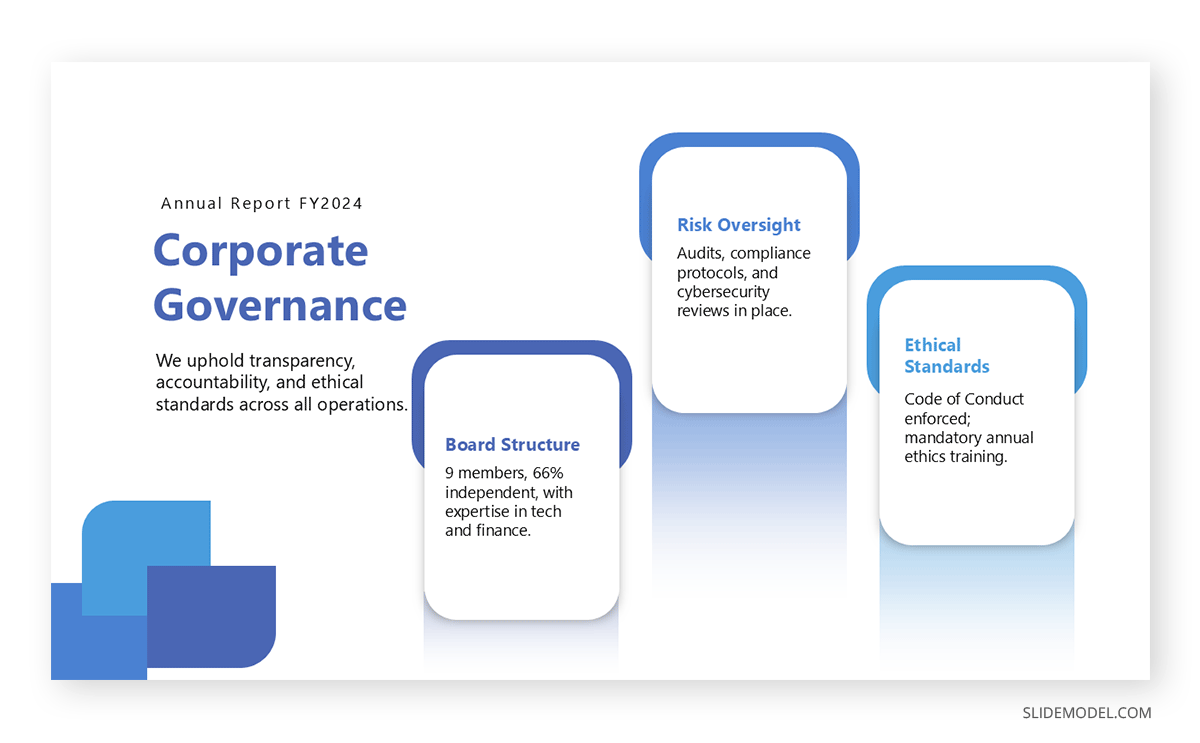
Increasingly, this section also includes ESG (Environmental, Social, and Governance) information. Not every company is required to report on sustainability metrics; however, investors are increasingly expecting it. This includes carbon footprint data, diversity disclosures, ethical sourcing practices, and community engagement initiatives. This data should be specific and measurable, not aspirational.
Recommended lecture: How to Write and Present a Consulting Report
Strategic Outlook
Looking ahead, the presentation should offer a grounded, fact-based preview of the company’s direction. This might include investment priorities, divestitures, R&D spending, or entry into new markets. Avoid vague future projections if you’re stating goals, back them with evidence, not optimism.
This section is also the time to revisit past guidance. Did the company meet, miss, or exceed its targets? If projections for the next year are included, the assumptions behind them must be clearly stated. Stakeholders will hold these projections to account at the next meeting.
Recommended lecture: Stakeholder Mapping
Q&A Preparation and Conclusion
The final section briefly recaps the key takeaways in the format of a presentation summary, then opens the floor to questions. Anticipating likely questions and preparing precise, non-defensive answers is part of the preparation process. Avoid ending on a marketing slide or abstract vision statement. The close should feel resolved, not rehearsed.
Recommended lecture: How to End a Presentation
Key Elements of a Successful Annual Report Presentation
Relevance and Focus
The most effective presentations do not attempt to reproduce the full annual report. Instead, they highlight the information most important to the audience in the current context. This includes topline financials, year-over-year performance, key operational outcomes, and strategic movements, such as acquisitions, divestitures, or leadership changes. Every slide should serve a defined purpose. If a piece of information does not support that purpose, it should be cut.
Consistency Across Content
Consistency is more than visual design. It means that every number matches what appears in official filings, that every chart is scaled accurately, and that narrative sections align with the data they reference. Inconsistencies, whether between slides, between presenters, or between presentation and report, create confusion and lead to doubt. A well-edited deck with a unified voice and verified data reflects preparation and professionalism.
Clarity in Visuals and Language
The audience should not have to interpret visual metaphors or decipher jargon to understand what’s being shown. Charts and diagrams should illustrate a point that is also stated plainly in the speaker’s words. The use of labels, legends, and clean axis formatting is not a stylistic detail; it’s essential for comprehension. Likewise, the language used throughout the presentation should be direct and literal. Avoid idioms, inflated descriptions, or euphemisms. Clarity is the metric.
Common Mistakes in Annual Report Presentations
Even companies with strong financial performance can undercut their message through poor presentation practices. Missteps are rarely about missing data—they’re about how that data is framed, delivered, or avoided. The following are recurring issues that reduce the clarity, credibility, or usefulness of annual report presentations.
Overloading Slides with Data
A frequent mistake is attempting to replicate the full report on slides. Pages packed with small-font tables, overlapping charts, or dense paragraphs force the audience to read instead of listen. Stakeholders should not be deciphering spreadsheets during a presentation. Each slide should serve a focused purpose, conveying a single insight or trend with supporting visuals that require no verbal decoding. The goal is not to display everything but to guide the audience through what matters most.
Avoiding or Obscuring Bad News
Some presenters attempt to soften or bury underperformance, whether through vague language, selective data, or disproportionate emphasis on minor wins. This undermines trust. Investors and board members know that no year is without setbacks. If issues arise, such as missed targets, declining margins, or legal exposure, they should be addressed directly and explained in a factual manner. Evasion invites more scrutiny than candor.
Inconsistent Narrative
An annual report presentation must tell a coherent story. If the message at the start doesn’t align with the data in the middle or the strategy at the end, the audience will notice. This is particularly common when multiple departments contribute slides without a unifying editorial hand. Conflicting figures, misaligned timeframes, or duplicated content are signs of poor coordination. The final deck should convey a single, consistent voice, regardless of the number of contributors.
Misuse of Visuals
Charts that don’t support the verbal message, or worse, contradict it, can derail a presentation. Visualizations should be simple, correctly scaled, and clearly labeled in context. Common pitfalls include cherry-picking timeframes to exaggerate a trend, hiding axes to mask scale, or using 3D effects and gradients that distort perception. When in doubt, clarity takes precedence over style.
Overuse of Jargon or Marketing Language
While some storytelling is expected, turning a report into a brand campaign can alienate a financial audience. Words like “transformative,” “synergistic,” or “game-changing” rarely belong in an investor-facing report unless they are backed by evidence. The same applies to vague claims about culture, innovation, or customer satisfaction. Stakeholders want proof, not positioning.
Poor Timing and Pacing
Rushing through complex topics or dwelling too long on introductory content throws off the balance of the presentation. Audiences begin to disengage when time is spent recapping facts they already know or previewing material that never appears. A well-timed presentation typically devotes more time to interpreting results than to restating them, leaving room for meaningful questions and discussion at the end.
Lack of Preparation for Q&A
The formal slides may be rehearsed, but stakeholders judge presenters more critically during unscripted moments. If the leadership team cannot answer follow-up questions about deviations from budget, changes in capital allocation, or risk exposure, the entire presentation loses credibility. Presenters must prepare by reviewing prior-year guidance, knowing how actuals compare to forecasts, and anticipating difficult questions.
Structured Flow and Logical Transitions
An annual report presentation is not just a collection of data points. It is a story of the organization’s year, told in sequence. That story must move logically from context to performance to outlook. Each section should build on the last without abrupt topic changes or redundant slides. Transitions matter. A clear structure, supported by well-timed pacing, ensures the audience stays oriented and focused throughout.
Best Practices for Effective Delivery
A successful annual report presentation depends not only on content but also on delivery. The tone should be confident, calm, and concise. Presenters must strike a balance between formality and approachability. The goal is not entertainment but engagement through clear articulation and responsive interaction.
Every visual should serve a clear purpose. Charts must illustrate a point that has already been stated or will be immediately clarified. Legends should be easy to read, color schemes accessible, and visual clutter eliminated. PowerPoint animations, if used, must be restrained and purposeful.
Rehearsal matters. This isn’t just for fluency. It’s to test pacing, transitions, and internal consistency across data points. Any discrepancy between slides or between what’s said and what’s shown undermines credibility.
Recommended Annual Report Presentation PPT Templates
In this section, we’ll list down our selected annual report PPT templates, entirely editable in PowerPoint & Google Slides, to speed up your presentation design performance.
1. Nonprofit Annual Report PowerPoint Template

This Nonprofit Annual Report PowerPoint template includes 16 editable slides: cover, contents, intro, mission, financial overview, volunteer & partner recognition, community engagement, programs, and lessons learned. Designed with a clean purple/white palette and subtle animations, it offers data visualizations, infographics, charts, and placeholders for goals, impact, and future objectives.
2. Annual Report PowerPoint Template
Our 14-slide Annual Report PowerPoint template is tailored for year-end corporate presentations. It includes cover, table of contents, executive summary, company overview, financial and operational highlights, market analysis, achievements, challenges, CSR, and future opportunities. Clean layouts, editable charts (including bar, pie, and timeline charts), minimal animations, and cohesive color palettes streamline annual reporting.
3. Annual Report Slides for PowerPoint

This 23-slide Annual Report Slides PowerPoint template suits corporate year-end presentations. It features sections for the CEO’s letter, board overview, corporate history, infographics, financial statements, governance, market review, performance metrics, milestone timelines, SWOT/strategy, and closing summary. Clean layouts, editable charts, and quality visuals enhance transparency and professionalism.
4. One Pager Annual Report PowerPoint Template
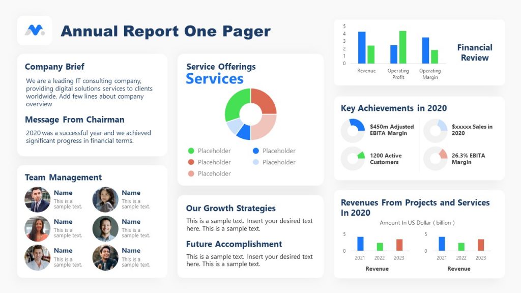
The One Pager Annual Report PowerPoint template allows us to create year-end presentations in two slide options: white or blue grid layouts. It integrates segments for company intro, leadership profiles, service breakdown (via donut chart), KPIs, key achievements, financial summary, growth strategy, and future objectives. Ideal for delivering concise, executive-level insights to stakeholders.
5. Corporate Annual Report Template

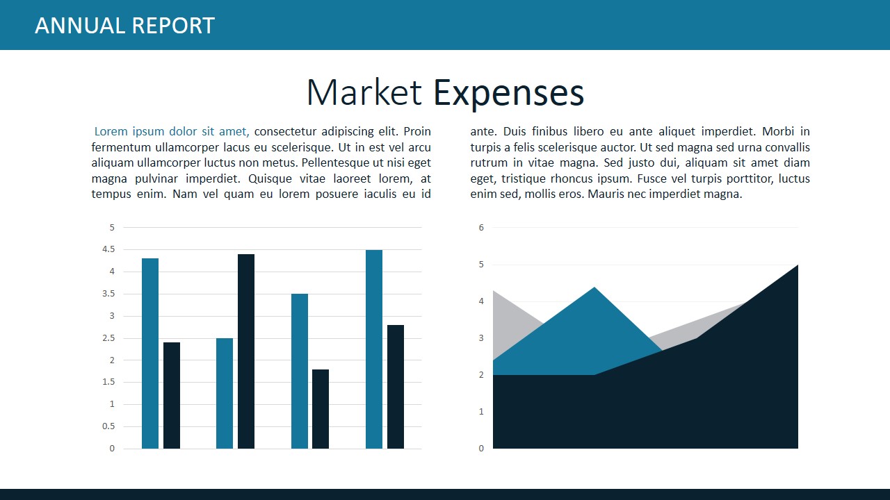
You can create a compelling presentation by using our Corporate Annual Report PowerPoint template. It delivers a 20-slide executive-ready deck, including cover, CEO/director messages, company overview, vision/mission, management team, services, key figures, global footprint, assets, liabilities, market expenses, audit summary, financial tables, and a closing slide. Fully editable layouts and data-driven charts support strategic year-end reporting.
6. Annual Report Presentation Template for PowerPoint & Google Slides
This Annual Report Template is a 27-slide deck for board meetings and shareholder briefings. It covers splash page, executive quotes, agenda, CEO/chair addresses, board and org charts, company overview, mission/vision, key metrics, global reach, financial breakdowns (expenses, assets, liabilities), audit results, and closing slides. Fully editable in any version of PowerPoint, Google Slides, and Keynote.
7. Supply Chain Annual Report PowerPoint Template
If you prefer a minimalist approach, our Corporate Annual Report PowerPoint template provides a professional, data-driven deck across 20 fully editable slides. It includes an opening cover, leadership messages, corporate profile, mission & vision, board and management team, service overview, key metrics, global presence, financial breakdowns (expenses, assets, liabilities), market expense visuals, audit summary, and financial tables, closing with a thank you slide—ideal for stakeholder presentations and strategic year-end briefings.
FAQs
How is an annual report presentation different from the full annual report?
The full report is a regulatory document; the presentation is a distilled, narrative version used in meetings. It emphasizes key data and analysis rather than exhaustive detail.
How long should an annual report presentation be?
Most fall within 20–40 minutes, with additional time reserved for Q&A. Brevity matters; the focus is on delivering insight, not reading slides.
What financial metrics must be included?
Revenue, gross profit, net income, EBITDA, earnings per share (if applicable), cash flow, capital expenditures, and debt position are standard inclusions.
Should the CEO or CFO present it?
Typically, both. The CEO addresses strategic and operational topics, while the CFO covers financial results. Other executives may join if segment-specific insights are needed.
Can bad results be downplayed?
No. Avoiding or softening poor results erodes credibility. Acknowledge setbacks directly and explain causes with relevant data.
Should you include projections for next year?
If the company issues guidance, yes, but only if backed by clear assumptions. Otherwise, speak to strategic priorities without making forward-looking claims that cannot be substantiated.
Can the same annual report deck be used for all audiences?
Not always. A board-level presentation may differ from one tailored to institutional investors. However, the core data and messages should remain consistent.
Final Words
An annual report presentation is a tool of accountability. It allows stakeholders to assess not just what the company has achieved but how it communicates under scrutiny. The best presentations do not rely on flash or jargon. They are disciplined, structured, and unembellished. They reflect a company that respects its audience enough to present facts, answer hard questions, and admit where improvement is needed.
When properly executed, this presentation becomes more than a regulatory obligation. It becomes a mirror through which a company can see itself as others do, clearly, honestly, and with a plan.