Every slide communicates twice. Once through the words on the screen, and again through the visual structure surrounding those words. Before an audience reads a single sentence, the brain has already determined where to look, what registers as important, and what can be skimmed. Visual hierarchy is the design principle that governs this sequence. It determines which elements capture attention first, which serve as supporting context, and which can be deprioritized when time is short.
For professionals preparing presentations in corporate or academic settings, understanding visual hierarchy is a practical concern, not an aesthetic one. An audience facing a slide where every element carries the same visual weight will not process the key message faster; they will process the entire slide more slowly. When competing elements share the same size, color, and position, the message gets lost before the presenter has a chance to deliver it.
This article covers what visual hierarchy means in the context of presentation slides, how reading patterns such as the F-Pattern and Z-Pattern shape audience scanning, and how to apply hierarchy principles at the slide-design level. It also examines the trade-offs of this approach and the most frequent design errors that undermine its effectiveness.
What Is Visual Hierarchy in Presentations
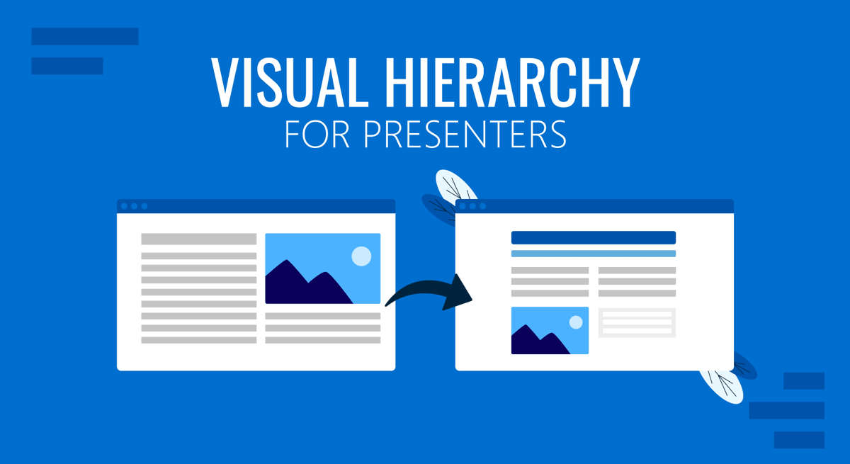
Visual hierarchy refers to the arrangement and presentation of elements in a way that signals their relative importance. In a well-structured slide, the audience’s eye moves through the content in a deliberate sequence, guided by differences in size, color, contrast, positioning, and the space around each element. The result is that critical information registers first, followed by supporting details in a logical order. Understanding the underlying principles of visual communication in presentations makes this easier to apply systematically, particularly across a multi-slide deck where consistency matters as much as individual slide design.
Applying these principles to presentations carries specific constraints. Slides are consumed differently from web pages or printed documents. Audiences divide their attention between the speaker and the screen, which means a slide has a narrower window to deliver its message. The hierarchy must be clear enough to work within seconds, because that is often how long an audience member spends looking at a given slide before refocusing on the speaker.
In presentations specifically, visual hierarchy serves several distinct functions. It helps audiences identify the main message without reading every word on the screen. It signals relationships between ideas, showing which points are primary and which are secondary. It also reduces cognitive load, making it easier for the audience to follow the spoken content while absorbing the visual material.
Size is one of the most direct signals available. Larger elements are perceived as more important, which is why a 36pt headline communicates primacy, and 18pt body text confirms its supporting role. But size alone is insufficient. Color draws attention regardless of element size, so a highlighted keyword or a high-contrast callout can redirect focus even when surrounded by larger neutral text. Contrast between elements and their background, the spacing between components, and position on the slide all contribute to the overall hierarchy. The most effective slides use several of these signals together in a coordinated way.
Reading Patterns: F-Pattern and Z-Pattern
The F-Pattern
Eye-tracking research, extensively documented by the Nielsen Norman Group in studies of web and document reading behavior, has established that people scanning content-heavy pages tend to follow an F-shaped path. They read across the top of the content first, scan horizontally again partway down, and then move their eyes along the left side of the remaining material. This pattern appears consistently across different types of text-heavy material, from articles to reports, and it has direct implications for how audiences process dense presentation slides.
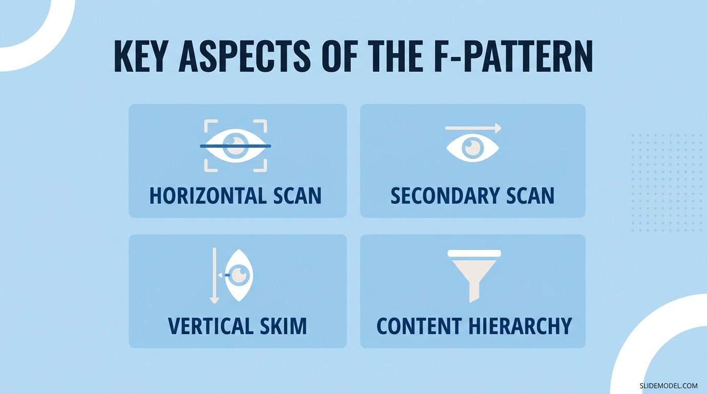
When slides contain multiple paragraphs, structured data tables, or content-heavy bullet points, audiences approach them as they would written documents. The top-left area of the slide receives the most consistent attention, the top horizontal band is reliably read in full, and content in the lower-right section of the slide tends to be skimmed or missed. Presenters who place key conclusions or critical figures in the lower-right corner of a text-heavy slide are likely to find that those elements simply do not register.
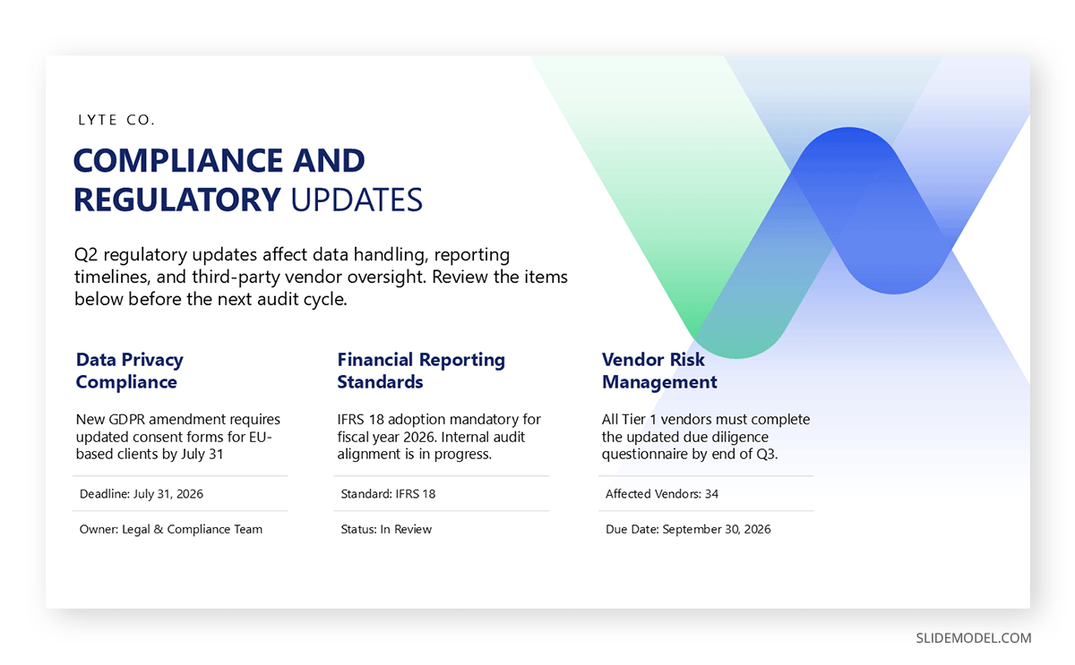
For content-heavy slides, working with the F-Pattern means placing the most important information at the top-left, using bold or contrasting color in the opening line of each content block, and prioritizing the left column of multi-column layouts for primary content. Starting from a solid structural foundation helps considerably; hierarchy-focused slide templates provide a useful starting point for positioning key content within the zones audiences are most likely to absorb during a live presentation.
The Z-Pattern
The Z-Pattern describes a different scanning path that emerges when slides use minimal text and cleaner visual layouts. The eye travels horizontally across the top of the slide, then diagonally down to the lower-left corner, and finally across the bottom. This path creates a natural Z-shaped sequence through the slide that is both fast and predictable, which makes it well-suited to slides designed for quick, high-impact communication.
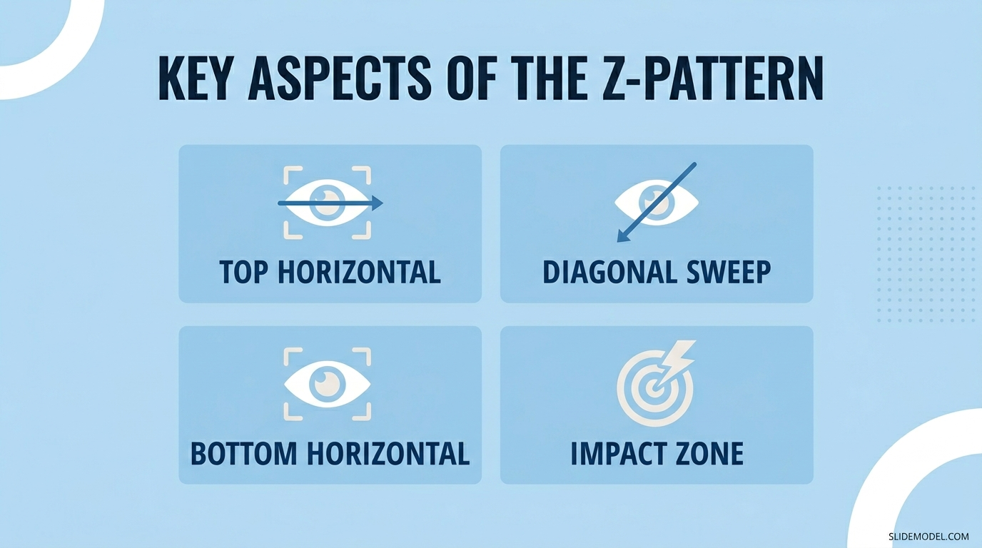
The Z-Pattern is most common in slides built around a single dominant idea: a headline at the top, a central visual element or key statistic in the middle zone, and a supporting detail or action point at the bottom. Because the path moves fluidly through the whole slide without requiring the audience to pause and search, it suits executive audiences or situations where clarity takes priority over content depth. The pattern aligns naturally with minimal design principles, in which each slide carries only the information necessary for that moment in the presentation.
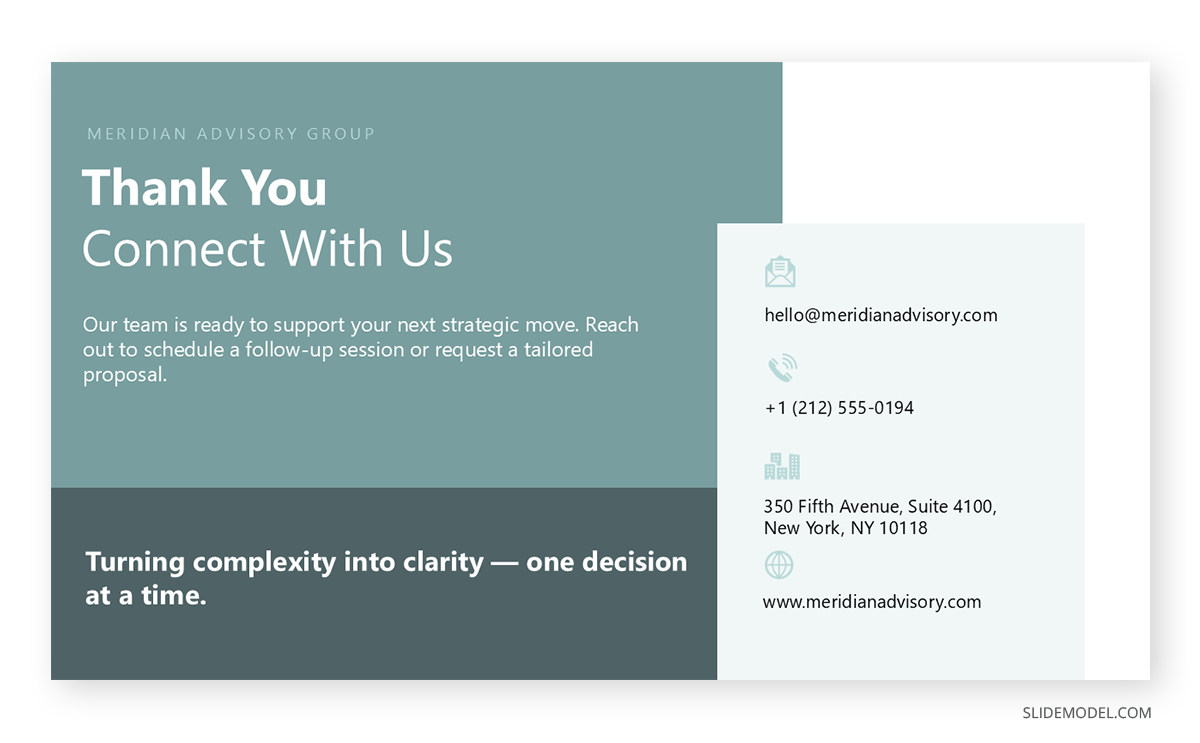
Designing for the Z-Pattern means placing the headline at the top-left, positioning the most compelling visual or data point in the center-to-right zone where the diagonal arc lands, and placing supporting information at the lower-right. The layout guides the eye through a complete sequence without requiring the audience to decide where to look next.
Knowing which pattern applies to a given slide depends primarily on how much content it carries. Slides with substantial amounts of text or structured data trigger F-Pattern behavior by default. Cleaner slides with a single dominant message align naturally with Z-Pattern scanning. Designing intentionally for one or the other, rather than leaving the layout to chance, is one of the more consequential decisions in slide design.
How to Design Slides According to Visual Hierarchy
Typography and Size Relationships
Typography is the most consistent tool for establishing hierarchy on a slide. A clear distinction among headline, subheading, and body text sizes immediately tells the audience how to navigate the content. A slide where the title sits at 32pt, a subheading at 22pt, and body text at 16pt creates an unambiguous reading sequence. When those size levels converge, the signal disappears, and the audience must orient themselves before they can begin processing the actual content. Thoughtful font selection for PowerPoint presentations reinforces the typographic system across the deck and signals that the design is deliberate rather than assembled by default settings.
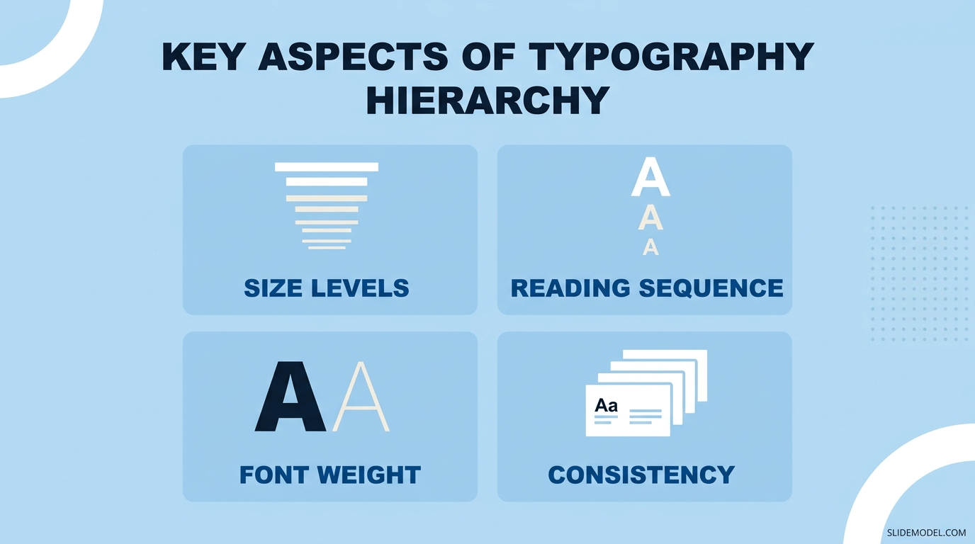
Typeface weight also contributes to hierarchy. Display-weight or bold fonts used for headlines draw the eye more reliably than regular-weight text at the same size. Using a lighter weight for body content allows the headline to maintain visual dominance even when the body text is larger than it would be in a printed document. Keeping the typographic system consistent from slide to slide allows the audience to learn the visual language quickly and apply it automatically as the presentation progresses.
Color and Contrast
Color operates as a priority signal independent of size. When one element uses a saturated or distinctive color and all surrounding elements use neutral tones, the audience’s eye moves to the saturated element first. This is useful for directing attention to a key metric, a critical finding, or a decision point without making that element physically larger than everything else. Defining a custom color palette in PowerPoint before building any slides allows presenters to pre-assign colors to specific levels of the hierarchy, keeping the system consistent and preventing accent colors from appearing arbitrarily across the deck.
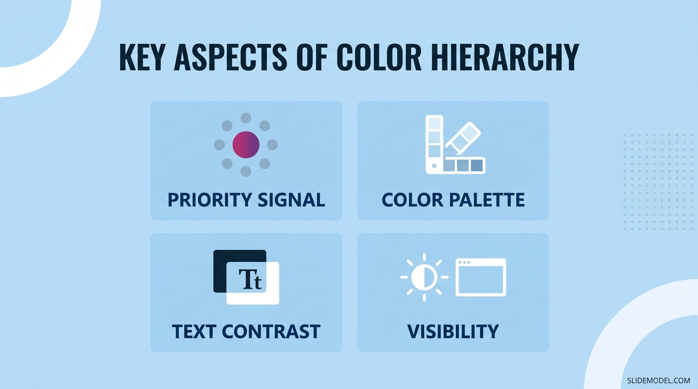
Contrast between text and its background is a related but separate concern. Low-contrast text is harder to read quickly, which slows down the hierarchy regardless of how well the rest of the design is structured. High contrast between the most important element and its background ensures that it registers immediately, even in rooms where projector brightness or screen conditions are less than ideal. This is particularly relevant for slides with dark backgrounds, where text contrast often suffers unless color choices are made deliberately.
Whitespace and Positioning
Whitespace is a functional design element, not unused space. Surrounding a key statistic or headline with whitespace draws more attention to it than adding a border or a colored background fill. Grouping related elements close together while maintaining clear distance from unrelated content signals conceptual relationships without requiring additional labels or connector lines to make those relationships explicit. Slides that look sparse often communicate more efficiently than slides that appear fully packed with content, because the sparse slide has already done the work of filtering.
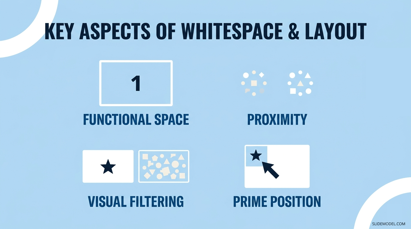
The position of an element on the slide also carries independent weight. The top-left corner receives the most consistent visual attention because it is where the eye lands first, regardless of the reading pattern the audience follows. Primary information placed in this zone is processed before anything else on the slide. Reviewing slide layout options in PowerPoint and selecting layouts that place the dominant element in this zone is a straightforward way to strengthen hierarchy without changing the content.
Advantages and Disadvantages of Applying Visual Hierarchy in Slide Design
Advantages
Visual hierarchy reduces the time it takes an audience to identify the core message of a slide. When the most important element is visually dominant, audience members do not need to read everything to find what matters. This is particularly valuable in presentations where slides advance at a set pace, where some participants are viewing from a distance, or where the audience includes people with varying levels of familiarity with the language being used.
There is also a measurable effect on retention. Research in multimedia learning, including frameworks developed by cognitive psychologist Richard Mayer, consistently shows that audiences retain and understand information more effectively when visual design supports the content’s structure. Slides that guide the eye through the material reduce split-attention effects, where the audience must mentally integrate information from multiple competing sources simultaneously. The result is that well-structured slides allow the spoken content and the visual content to work together rather than against each other.
From a professional standpoint, slides built with deliberate visual hierarchy tend to be received as more credible. Organized design signals organized thinking, and this association matters independently of the content itself in client-facing, investor, or executive presentations where perceptions of preparation and competence shape how the information is received.
Disadvantages
Applying visual hierarchy consistently adds preparation time. Every slide requires a design decision about which element takes priority, how size and color relationships are set up, and whether the layout guides the eye in the intended direction. Presenters without a design background may find it difficult to make these decisions reliably without prebuilt templates or explicit guidelines, and inconsistent application across a deck can produce a hierarchy that feels arbitrary to the audience rather than intentional.
There is also a genuine risk of oversimplification. Making one element visually dominant on every slide imposes a level of prioritization that may not reflect the content’s actual complexity. In academic presentations or detailed technical briefings, a rigid hierarchy can compress nuanced material, leading the audience to focus on what is visually prominent while overlooking qualifications or context that appear in smaller or less prominent text. This is a meaningful limitation in contexts where the secondary information is not truly secondary.
Common Mistakes When Applying Visual Hierarchy
The most widespread error is treating all elements on a slide as equally important. Presenters often add content in the order they think of it, which produces layouts where titles, data points, labels, and body text share the same size, color, and visual weight. Without differentiation, there is no hierarchy, and the audience must decide for themselves what matters most. This is not a decision the audience should have to make on the presenter’s behalf.
Ignoring reading patterns is equally common. Placing the conclusion in the lower-right corner of a content-heavy slide, or centering all elements symmetrically when the content follows a sequential logic, obscures the intended reading order. Reviewing the laws of UX for presentation design provides a useful framework for understanding how visual expectations shape audience interaction with slides from the moment they appear on screen. Many of those expectations are predictable and can be planned for directly.
Over-designing is another frequent problem. Adding decorative gradients, multiple competing accent colors, or complex graphic elements to make slides more visually engaging can erode the hierarchy rather than reinforce it. Each additional design element introduces visual competition. The audience’s attention is a limited resource, and every element that draws the eye for reasons unrelated to content priority reduces the pool of attention available for the element that should be dominant.
Finally, many presentations apply visual hierarchy inconsistently across slides. The opening slides may follow clear design principles while later slides, often added under time pressure, revert to unstructured layouts. This breaks the visual language the audience was learning to interpret and forces them to restart their orientation with each new slide. Consistency across the full deck turns individual design choices into a coherent communication system that becomes easier for the audience to read as the presentation progresses.
FAQs
What is visual hierarchy in presentations?
Visual hierarchy is the arrangement of design elements on a slide to reflect their relative importance. Through controlled differences in size, color, contrast, spacing, and position, it guides the audience’s eye through the content in a deliberate sequence, helping them identify the key message before reading everything on screen.
Why does visual hierarchy matter for slide design?
Slides are processed in seconds while the audience listens to a speaker. When all elements carry equal visual weight, the audience must work to determine what is important. Hierarchy removes that work and makes the core message accessible immediately, which is particularly important in live presentations where slides advance on a fixed schedule.
What is the F-Pattern in presentations?
The F-Pattern describes how audiences scan content-heavy slides. They read across the top first, scan horizontally again partway down, then move their eyes along the left side of the remaining content. Material placed in the lower-right area of a dense slide is often skimmed or missed entirely as a result.
What is the Z-Pattern in presentations?
The Z-Pattern describes eye movement on minimal, less text-heavy slides. The eye travels horizontally across the top, then diagonally to the lower-left, and then across the bottom. It suits clean layouts where a single message, visual element, or key statistic occupies the dominant area of the slide.
What is the difference between the F-Pattern and the Z-Pattern?
The F-Pattern applies to content-heavy slides and concentrates attention on the top horizontal band and the left side of the layout. The Z-Pattern applies to minimal slides and follows a diagonal arc across the entire slide. The choice between them depends on how much content the slide carries and how quickly the information needs to be absorbed.
How do I create visual hierarchy on a slide?
Start by identifying the single most important element and making it visually dominant through size, color, or position. Then apply progressively lower visual weight to supporting elements. Consistent use of typographic levels, a limited color palette, and adequate whitespace reinforces the hierarchy across every slide in the deck.
What role does font size play in visual hierarchy?
Font size is the most direct signal of importance on a text-based slide. A clear distinction between headline, subheading, and body text sizes creates an unambiguous reading order. When those size levels are too similar, the audience cannot easily determine where to focus first and must read more of the slide to orient themselves.
How does color contribute to visual hierarchy?
Color draws attention independently of element size. A saturated or distinctive color applied to one element against a neutral background makes that element the natural focal point. Limiting accent colors to the most critical information prevents multiple elements from competing for the same level of attention on the same slide.
What is the best position for the most important element on a slide?
The top-left corner consistently receives the most visual attention because that is where the eye lands first, regardless of the reading pattern the audience follows. Placing the primary message or headline in this zone ensures it is processed before any other content on the slide.
How much whitespace should a slide have?
There is no fixed rule, but most effective slides carry more whitespace than presenters initially feel comfortable with. Sufficient whitespace prevents elements from competing visually, groups related content naturally, and directs attention to the dominant element by isolating it from surrounding material.
Can visual hierarchy principles be applied in Google Slides?
Yes. The same principles of size, color, contrast, and positioning apply in Google Slides, PowerPoint, and Keynote. The tools for adjusting fonts, color schemes, and layouts differ between platforms, but the underlying design logic is identical across all presentation software.
Does visual hierarchy improve audience retention?
Research in multimedia learning consistently shows that audiences retain information more effectively when visual design supports the content’s structure. Slides that reduce cognitive load by guiding the eye allow audiences to process material with less effort, which tends to improve recall after the presentation.
How do I apply visual hierarchy without a design background?
Starting with pre-built templates that already apply hierarchical principles is the most practical approach for non-designers. From there, focusing on two variables at a time, font size and color, is generally sufficient to establish meaningful hierarchy without requiring advanced design knowledge or specialized software.
What are the most common visual hierarchy mistakes in presentations?
The most frequent errors are treating all elements as equally important, ignoring how reading patterns affect where the audience looks, adding decorative elements that compete with content priority, and applying hierarchy inconsistently across different slides in the same presentation deck.
When should I prioritize the F-Pattern versus the Z-Pattern?
Apply F-Pattern principles when designing slides that carry significant amounts of text, data tables, or structured content. Apply Z-Pattern principles when designing minimal slides for executive audiences or high-impact moments where the goal is immediate clarity rather than detailed information transfer.
Final Words
Visual hierarchy is not a cosmetic concern. It determines how quickly and accurately an audience understands what is on a slide, which in turn determines how much of the presentation’s content actually reaches them. Presenters who design with hierarchy in mind give their audience a faster, clearer path through the material, whether they are working through data-heavy content that calls for F-Pattern awareness or delivering a high-level message suited to Z-Pattern scanning.
The principles involved are not complex, but applying them consistently requires deliberate choices at each stage of slide design. Size, color, contrast, whitespace, and position all contribute to the hierarchy, and the most effective presentations use several of these signals together in a system that stays consistent from the first slide to the last. A deck with a coherent visual language allows the audience to spend less time interpreting the design and more time engaging with the content.
Getting the hierarchy right does not require significant design expertise. It requires clarity about what each slide is trying to communicate and the discipline to let that priority shape every subsequent design decision.