In this post, we are going to show some tips for presenters willing to improve their presentation look and feel by adding PowerPoint Icons. The advice is valid for updating existing presentations or designing new presentations from scratch.
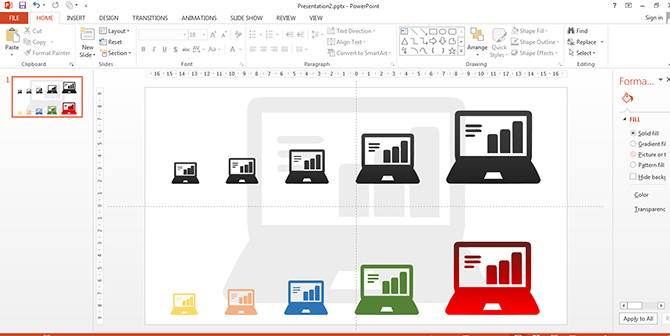
We want to start with the distinction between what is considered a PowerPoint Icon and its difference from a simple Icon image. The main difference is that PowerPoint Icons are created with PowerPoint Shapes, allowing the user to customize all their properties (size, color, position, effects, etc.) This is an important distinction, as PowerPoint Icons do not lose quality after being edited by the user. This main feature allows presenters to manipulate PowerPoint Icons and create visually appealing designs with engaging visual aids. The following images shows how we edited the Notebook Computer Icon in different sizes, colors and effects.
At SlideModel.com we receive several requests from our users to create different sets of PowerPoint Icons Collections. Our Content catalog contains several PowerPoint Icons Collections. For example, in this tutorial we will use the following:
If you are curious don’t hesitate to research our content and navigate through our Icons Collection, or check the free PowerPoint icons here.
Using Icons on Slide Headers to Represent Slide Topics
It is a good design practice to decorate Slide headers with Icons. The design principle to follow is that the Icon selected, needs to be contextually relevant to the Slide content and to the title that complements. This provides a visual association between the content and the Icon that can be exploited across the presentation to communicate through images instead of adding or repeating wording.
The following example shows how we decorated a simple business template with Icons in the header.
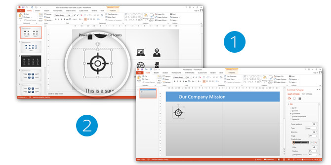
The first step selects the Icon from our PowerPoint Business Theme Icons Template. We select the Icon and Copy it to the Clipboard (Cntrl-C in windows, Command-C in Mac)
Once the Icon is in the Clipboard, the user opens the presentation when it wants to use the icons and just paste it (Ctrl-V in windows, Command-V in Mac)
Once the Icon is in the desired Slide, we can start manipulating it as any PowerPoint Shape. As seen in the image, we have a Blue Background Title, we will leave a space from left-to-right in order to locate the Title Icons. In order to match the title style, we set the background of the icon with the same fill. Just update the Icon fill as any other shape, select it and through the Shape Fill button on the Home Menu.
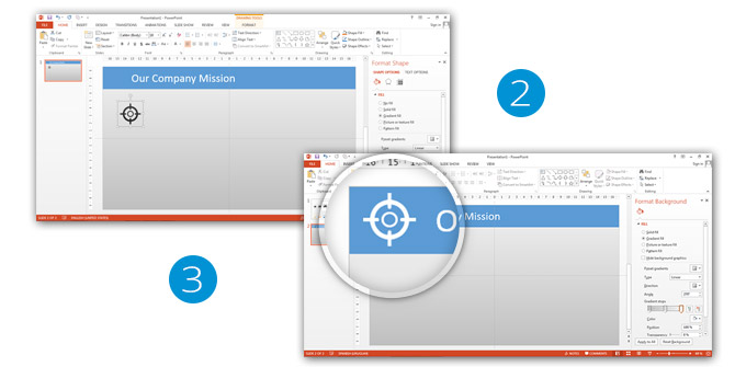
Once we had updated the Icon to our needs, we locate it in the Title and resize it to match the height of the font (just use regular resizing tools or navigate our tutorial blog for assistance). Step 3 shows the final result of the Icon. The reader will note that the quality of the Icon has been unaltered through the process, and the title looks much more professional.
Using Big Sized Icons for Communicating Slide Content Ownership
Often the presenter wants to communicate the slide-related content with a higher impact than a Title and needs to contextualize the slide content visually. In this case, having a watermark Icon as a background image or using a big size Icon can effectively communicate the Slide topic without the need to add a Text or Title.
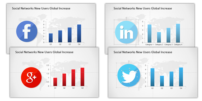
This practice is helpful when the presentation iterates through a topic across different slides. To illustrate this case we will show the example of Social Network Icons. When we create a specific Slide for a specific social network (eg: global usage increase in the year) we can just locate the Social Network Icon that maps to the social network logo, and describe the metrics. The user will know the slide message is related to the specific social network, even though the title refers to usage metrics.
In the following example we pick up 4 Social Icons and use them as reference in the Global Usage Increase Report Slide.
The Following Slide shows how we edited the icons size and pasted it into the report slide. The title remains the same, the data changes without the need of adding references, as the Icon is auto explicatory of whom the data shown belongs to.
Using Icons in Diagrams and Dashboards
Following the previous mentioned idea of generating the visual impact of mapping a concept to a simple graphical icon, PowerPoint Icons are useful for identifying data in a populated dashboard or diagram. The use of icons from an icon collection not only will improve the visual appeal of the presentation, but will also support your content.
Dashboards and Diagrams need to communicate, in a short space, lots of meaningful data. The power of icons for this presentations can be summarized in the following 3 benefits:
- Icons can put content in a nutshell, mapping the content meaning with a metaphor. An extremally used example is the traffic light Icon, and the ticks and cross icons.
- Icons attract attention. Our brain draws attention first to identifiable patterns (shapes) before they start reading, or even seeing words.
- Icons can increase readability. Basically, due to the previous point, interpreting a message faster, will increase our chances to catch all the content as a whole without the need of extensive reading.
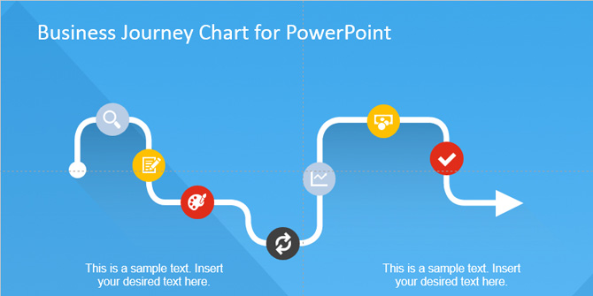
Our first example is the Business Journey Diagram Template. This Slide presents a diagram, where each of the steps is represented with an Icon. Each icon is mapping a metaphor, that is easily understandable by the audience.
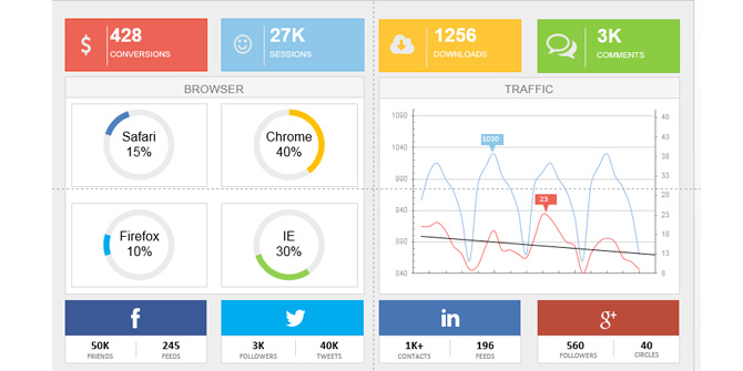
Our next example is our Digital Marketing Dashboard. In this case, Icons are used to relate the metrics with their scope , generating and association with the icon and the idea. Each metric is mapped to an Icon (and Logo) and the audience can easily understand it in a wrasp across the presentation.
Conclusion
As a closing argument for this post, we encourage all our users to start using PowerPoint Icons in their presentations. Slowly acquiring the habit will increase the expertise of idea mapping. Every time you feel the amount of wording is excessive, or that your speech can be summarized in a simple snapshot, that means is a good moment to think in which would be a suitable icon.
Impress your audience creating presentations that appeal to global audiences with the use of SlideModel.com PowerPoint Icons.
