Vintage Weather Dashboard PowerPoint Template
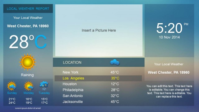
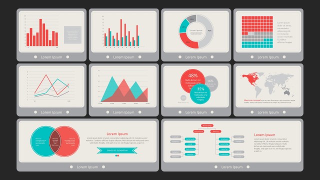
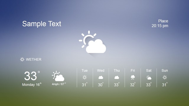
The Vintage Weather Dashboard PowerPoint Template is an engaging PowerPoint template to present various elements of the weather report. The weather report is essential for several departments, such as irrigation, construction, production, agriculture, etc. So, professionals prepare this chart daily, showing data like temperature variations, rain chances, precipitation, and humidity. We have prepared this easy-to-edit vintage weather report layout for professionals to easily create a presentable form for their reports. Users can conveniently download and change the values of data-driven charts and tables according to the collected data. This dashboard template is equally helpful for presentations, seminars, meetings, and for posting on newsletters. The dashboard can be printed on the page and used for several purposes accordingly.
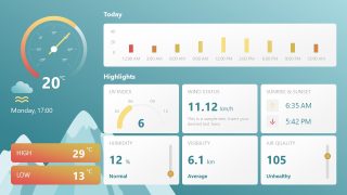
This Vintage Weather Dashboard PowerPoint Template carries two editable slides that vary slightly in design features and color scheme. The dashboard begins with a meter diagram in the top-left corner to display the temperature. Below this meter infographic is the space to mention the date, day, or time. An air symbol is added to the section that can be changed for specific weather conditions such as wind or rain. On the right side of the meter, a horizontal array of bars shows the hourly temperature change of the region. Presenters can also re-purpose this chart to indicate the temperature data of days in a week or month. In the middle of the slide, we have created a six-quadrant diagram to display different weather highlights: UV Index, Wind Status, Sunrise & Sunset, Humidity, Visibility, and Air Quality Index. Professionals can conveniently change the diagram’s values, symbols, and font styles. There are separate boxes to mention the lowest and highest temperature of the day.
The background elements of this Vintage weather dashboard PowerPoint template contain elements that indicate a sky scene. The color has a gradient blue tinge, and the slide shows snowy mountains. In contrast, the text boxes are colored in tones of yellow and orange to make them prominent in the presentation. So, download this creative presentation template and try editing it with all PowerPoint versions, Google Slides, and Keynote. For more information, we have created an article about data presentations.


