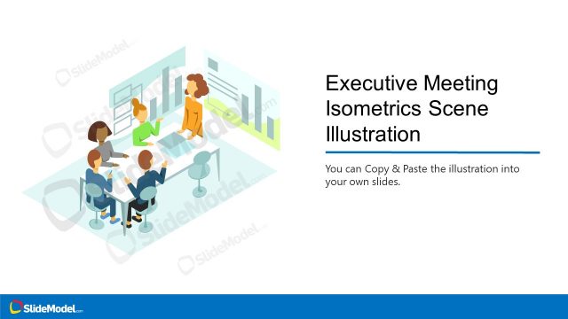
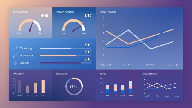
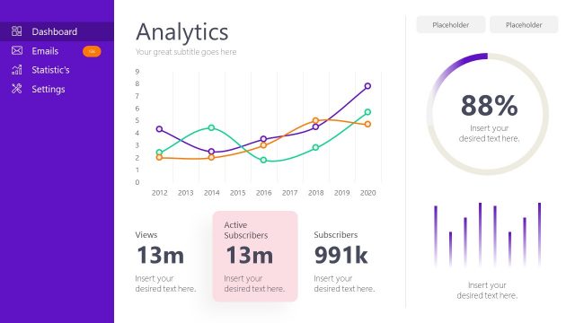
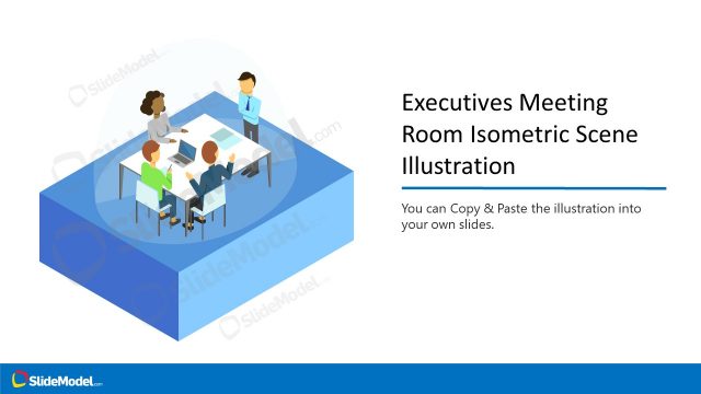
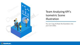
The Team Analyzing KPI’s Isometric Scene Illustration is an editable presentation template for businesses. This template shows cartoon characters of a team reviewing dashboard. An isometric scene gives a modern look to your professional presentation. The dashboard of data charts illustration scene is useful for engaging the audience in sales or financial figures.
What’s inside this template
Example presentation scenarios
- A sales manager can use the isometric KPI dashboard scene to introduce a monthly performance review and frame the discussion around team analysis rather than raw numbers alone.
- A finance analyst can place the illustration at the start of a results update and use the feature callout layout to explain how dashboard visuals connect to the key metrics being discussed.
- A consultant can reuse the copy-paste customization slide when preparing a client deck that needs a business analytics visual without building a new scene from scratch.
- An operations leader can use the team analysis illustration in a dashboard rollout presentation to show managers reviewing performance indicators together.
Features
- 100% editable presentation template
- Compatible with Microsoft PowerPoint and Google Slides
- 16:9 aspect ratio slides
- Scalable vector shapes, icons and illustrations
- AI-Ready for Microsoft Copilot and Claude
- Instant access and download
Frequently asked questions
Q: How should this illustration be used so it supports a KPI story instead of acting as decoration?
A: Place the isometric team scene near the point where the audience needs context for the numbers: an opening KPI review slide, a dashboard introduction, or a transition into analysis. Pair it with one clear headline that states the performance question, then move to detailed charts or tables in following slides.
Q: Who is this template best suited for in a business presentation?
A: It fits presenters who need a people-centered visual for metrics, such as analysts, sales managers, finance teams, and consultants. The illustration is useful when the message is about interpreting performance, aligning a team around dashboard insights, or making a reporting section feel more approachable before detailed KPI data appears.
Q: Why does the isometric dashboard metaphor help communicate performance analysis?
A: The isometric scene shows people standing around a large KPI display, which makes analysis feel collaborative and active. Instead of showing a flat chart alone, the visual metaphor connects data review with team decision-making. The callout slides also make the reusable illustration rules easy to explain.
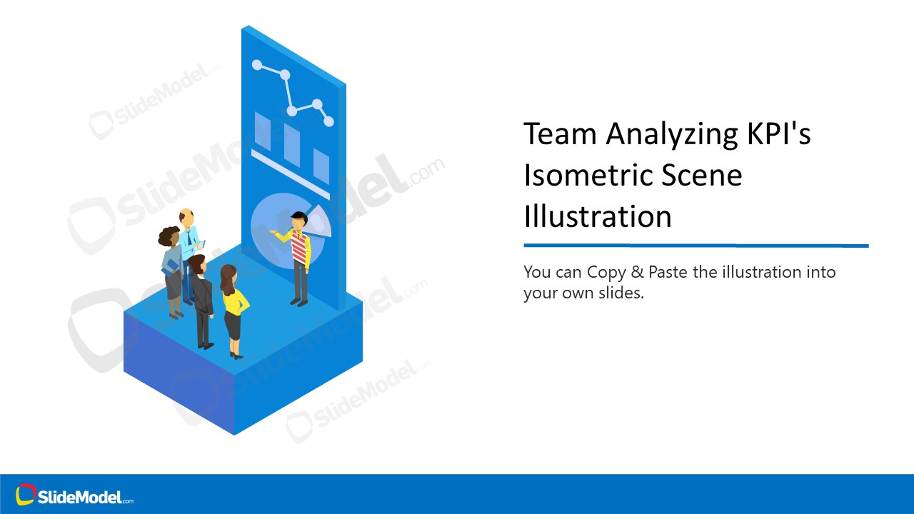


Team Analyzing KPI’s Isometric Scene Illustration
3-slide presentation template with isometric KPI dashboard scene and team analysis illustration
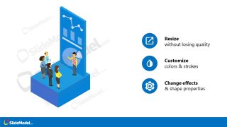
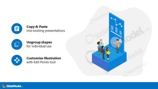
Team Analyzing KPI's Isometric Scene Illustration is a 3-slide editable presentation template for Microsoft PowerPoint and Google Slides. It includes an isometric team reviewing a KPI dashboard, a feature callout layout, and a copy-paste customization layout for business reporting, sales updates, and performance discussions.
- Category
- People & Silhouettes
- Rating

 Loading...
- Aspect ratio
- 16:9
- Item ID
- 970023-01
- Colors
 Microsoft PowerPoint
  Microsoft Copilot
  Claude for PowerPoint
 Other formats supported
Subscribe today and get immediate
access to download our PowerPoint templates.