McKinsey PowerPoint Templates
Download and customize ready-made McKinsey consulting templates for PowerPoint and Google Slides. Get inspiration from templates based on real McKinsey consulting slide decks and create your professional presentation designs. Check our 7S framework model and other useful templates for presentations on consulting and management.
Each one of these McKinsey slide templates is fully editable in all versions of PowerPoint, Google Slides, and Keynote.
Featured Templates
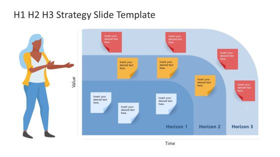
H1 H2 H3 Strategy McKinsey PowerPoint Template

7 Degrees Strategic Freedom PowerPoint Templates
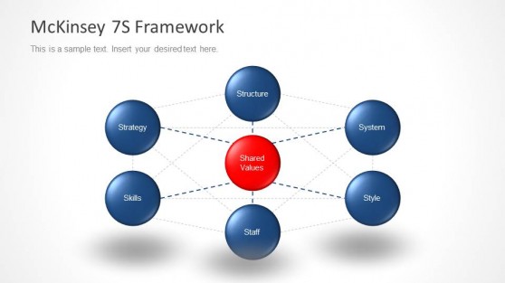
Blue McKinsey 7S Diagram for PowerPoint
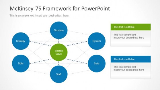
McKinsey 7S Diagram for PowerPoint
Latest Templates
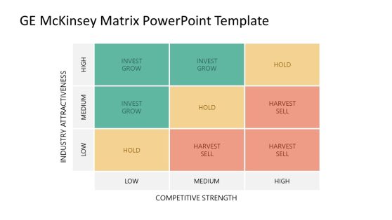
GE Matrix PowerPoint Template
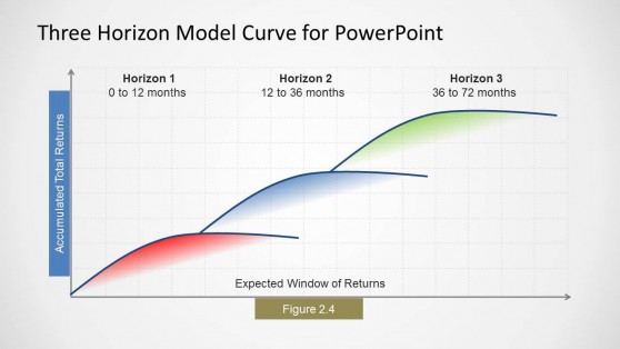
Three Horizons Model Curve for PowerPoint
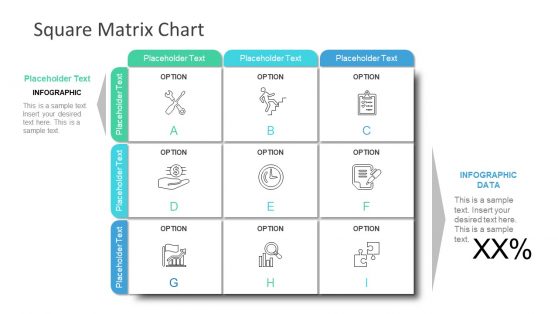
9 Cells Square Matrix PowerPoint Infographic
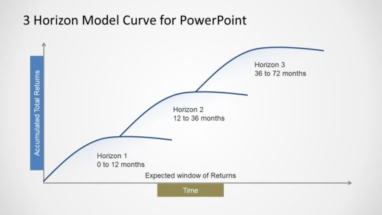
3 Horizon Model Curve Template for PowerPoint
Consulting organizations like McKinsey are well-known for their slide deck styles, filled with insightful tools to deliver high-quality analysis. Based on our experience, we created this selection of McKinsey PowerPoint presentations that fit the criteria required to design a McKinsey deck template.
These McKinsey presentation templates are made out of editable PowerPoint shapes and elements. Presenters can alter any of the designs listed to meet the demands of their projects in terms of design style, branding, and content to be shared.
Work with these slide layouts, graphs, and illustrations created by professional graphic designers and tested by top management consultants. Combine our McKinsey designs with other popular consulting models like BCG templates.
What is a McKinsey PowerPoint template?
McKinsey PowerPoint template is a presentation style that has become synonymous with McKinsey & Company, one of the leading management consulting companies in the world. These templates are trademarked professional and sleek designs to communicate complex business ideas and information. Because of their features, they are visually straightforwardly recognized by the audience.
What are the Key Features of a McKinsey Slide Deck?
These elements are taken into account when designing McKinsey templates:
- Simplicity and Clarity: Straightforward and easy-to-understand slides that avoid over-cluttering with unrequired information.
- Consistent Formatting: Consistent use of fonts, colors, and layout throughout the presentation to maintain a professional look and feel.
- Data Visualization: Effective use of charts, graphs, dashboards, and other visual elements intended to express data.
- Structured Content: Information is often organized logically, with clear headings and bullet points to facilitate easy comprehension.
- Professional Aesthetics: A clean layout design focusing on readability and visual appeal.
- Branding: Incorporation of McKinsey’s branding elements, like specific color schemes and logos, especially in official presentations.
How do you Make Presentations like McKinsey?
Creating a McKinsey presentation involves the following steps:
- Design a clear storyline: Outline the main message and structure of your presentation. Each slide should contribute to the overall narrative and follow a logical flow.
- Keep it simple: Avoid clutter. Work one idea per slide. Use simple language and focus on the main points.
- Consistent design: Use a consistent color theme, font and layout. McKinsey typically uses professional and muted colors, standard fonts like Arial or Helvetica, and a clean, uncluttered layout. This ensures maximum compatibility with any device.
- Effective Data Visualization: Graphs, charts, and diagrams should be clear and easy to interpret. Avoid unnecessary complexity in visuals.
- Use the Pyramid Principle: Start with your main idea, followed by supporting arguments or data. This top-down approach ensures that your key message is delivered first. Check more information about the Pyramid Principle.
How do you make a Consulting PowerPoint?
Like any other presentation, you can create a consulting PowerPoint slide deck by following this step-by-step procedure:
- Understand the audience and define objectives: Tailor your content to the knowledge level, interests, and needs of your audience. Be clear about what you want to achieve with your presentation. Is it to inform, persuade, or make a decision?
- Outline Your Content: This should include an introduction, the main body structured around key points or questions, and a conclusion.
- Select a PowerPoint template: Browse our extensive collection of PPT templates and choose the designs that best align with your preferences and project requirements.
- One Idea per Slide: Follow the 10/20/30 rule for presentations approach and declutter your slides.
- Clear and Concise Text: Use bullet points, short sentences, and avoid jargon or overly complex language.
- Use of Data and Visuals: Use charts, graphs, and diagrams to present data in an easy-to-understand format.
- Storytelling Approach: Present your information in a narrative form. This includes setting up a problem, discussing the analysis, and then providing recommendations. It helps in keeping the audience engaged.
- Use of the Pyramid Principle: Organize your content to start with your main conclusion or recommendation, followed by supporting arguments and data. This structure is effective for consulting presentations as it presents the most critical information first.
- Prepare for Questions: Anticipate questions that might arise from your presentation and be prepared with answers. This includes having backup slides with additional data or analysis if needed.
What Font does McKinsey use in their Slides?
Pre-installed fonts like Arial or Helvetica are preferred in McKinsey slides. The idea is to focus in communication and a simplistic aesthetic.