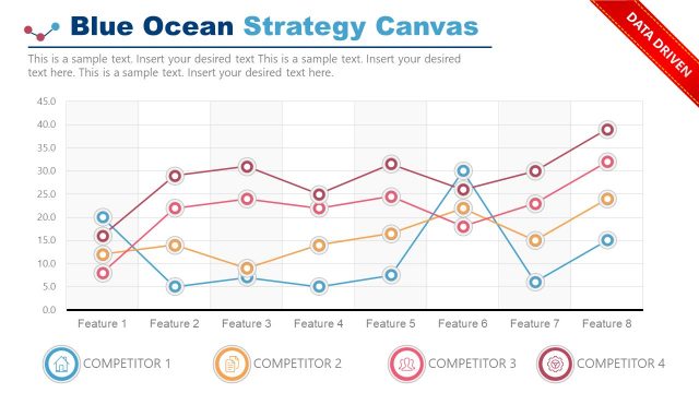
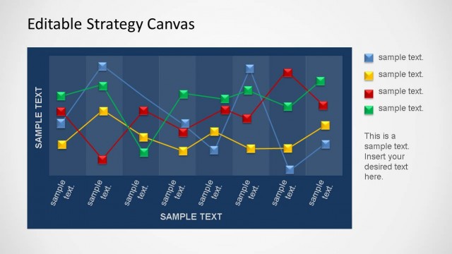
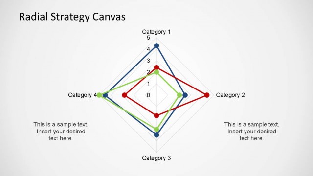
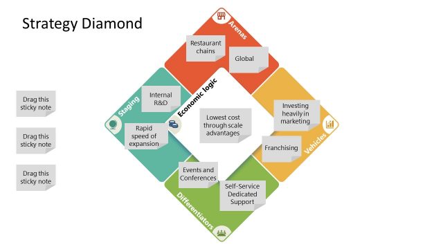
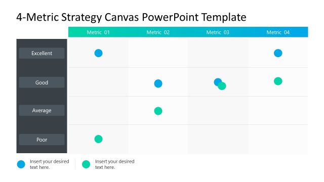
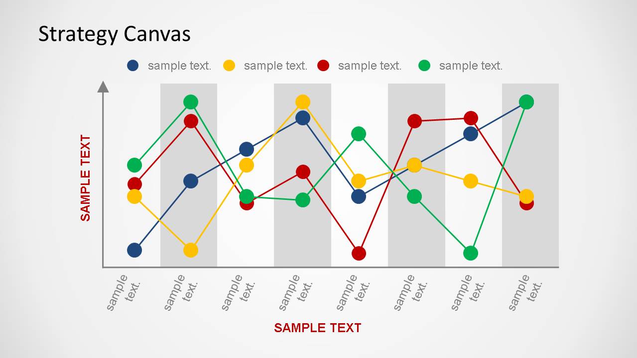
The Simple Strategy Canvas Template for PowerPoint is a professional presentation featuring simple XY axis representations of the Blue Ocean Strategy Canvas. This tool is a central diagnostic and action framework for comparing different value propositions. The analyst can define a set of competitive factors on the X-axis and compare the value perception of the consumer (Offering Level) on the Y-axis for each strategy. It is an extensively used template for Strategy lectures or strategy analysis presentations.
The slides are created using Excel as an integrated tool. This allows the user to edit the chart within Excel, and with a simple tabular dataset. The chart objects are PowerPoint shapes that can be independently customized.
Alternatively, you can download other strategy PowerPoint templates and business slides for your presentations, or check our free PowerPoint templates section to evaluate our product.
What’s inside this template
Example presentation scenarios
- A strategy consultant can use the wide strategy canvas line chart to compare a client offering against competing alternatives during an executive positioning discussion.
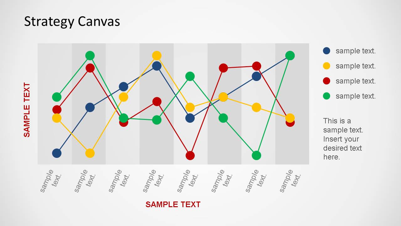
- A product manager can use the chart-with-notes layout to explain which competitive factors should be raised, reduced, or monitored in a product strategy review.
- An MBA instructor can use the multi-series line chart and axis labels to teach Blue Ocean strategy by mapping several value curves on the same canvas.
- A business analyst can use the legend and shaded factor bands to present a concise competitive analysis where each colored line represents a different option or market player.
Features
- 100% editable presentation template
- Compatible with Microsoft PowerPoint and Google Slides
- 16:9 aspect ratio slides
- Scalable vector shapes, icons and illustrations
- AI-Ready for Microsoft Copilot and Claude
- Instant access and download
Frequently asked questions
Q: How should I explain the value curves so the audience understands the strategic message?
A: Start by defining the competitive factors along the X-axis, then explain what a higher or lower offering level means on the Y-axis. Compare one colored line at a time before discussing overlaps and gaps. Use the note panel on the second slide to summarize the main strategic implication instead of describing every data point.
Q: Who is this template best suited for in a business presentation?
A: This template fits consultants, strategy teams, product managers, and educators who need to compare how several offerings compete across the same factors. It works best when the goal is to show relative positioning, not detailed financial performance. The format is especially useful for Blue Ocean strategy discussions and competitive differentiation workshops.
Q: Why does the strategy canvas format improve communication compared with a table?
A: The line-chart canvas turns many factor-by-factor comparisons into visible value curves. The audience can quickly see where an offering stands apart, where competitors cluster, and where tradeoffs appear. The shaded vertical bands and colored markers guide the eye across categories, making strategic contrast easier to discuss than a dense comparison table.

Simple Strategy Canvas Template for PowerPoint
2-slide presentation template with strategy canvas line charts for Blue Ocean and competitive analysis.
The Simple Strategy Canvas Template for PowerPoint is a 2-slide data-driven strategy slide template for Blue Ocean and competitive analysis. It contains multi-series strategy canvas line charts, XY axes for offering level and competitive factors, chart legends, and a side-note panel. Chart data can be edited through an Excel spreadsheet in PowerPoint.
- Category
- Strategy
- Rating


 Loading...
- Aspect ratio
- 16:9
- Item ID
- 6430-03
- Colors
 Microsoft PowerPoint
  Microsoft Copilot
  Claude for PowerPoint
 Other formats supported
Subscribe today and get immediate
access to download our PowerPoint templates.