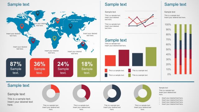
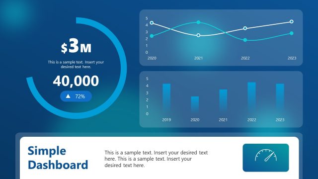
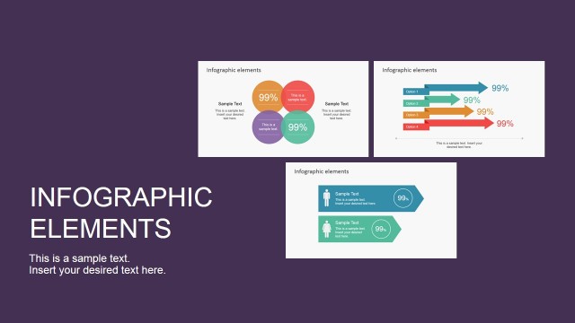
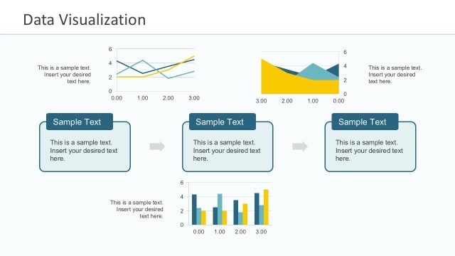
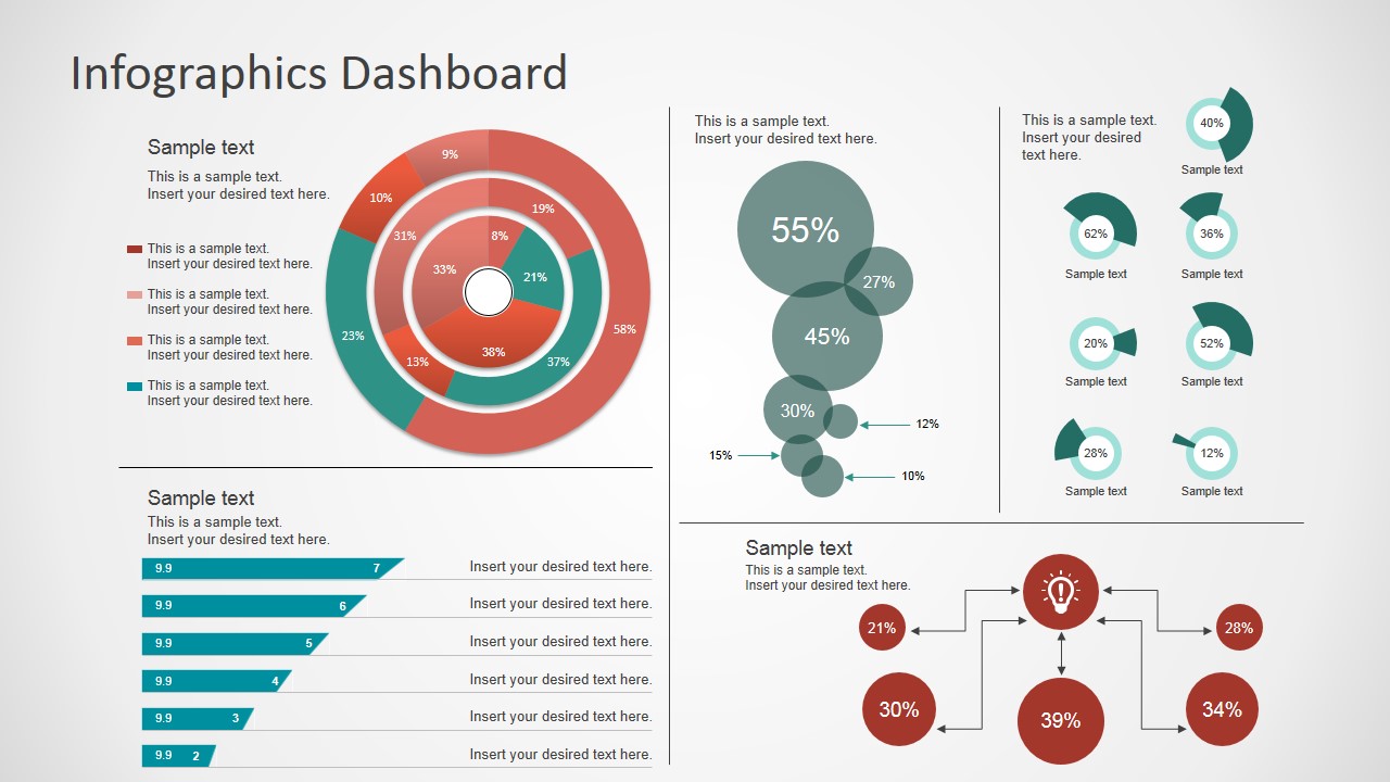
Simple Infographics Dashboard is a presentation toolkit that you can use to create infographics in Microsoft PowerPoint. It contains a collection of re-usable PowerPoint shapes to make a business infographic easily by aligning shapes and editing the text in Microsoft PowerPoint.
What’s inside this template
Example presentation scenarios
- A business analyst can use the concentric donut chart and percentage bubbles to brief executives on KPI distribution and supporting metric values.
- A project manager can present a team status update by placing progress values in the funnel bars and using the connected metric nodes to show related workstreams.
- A consultant can use the dashboard panels to summarize assessment findings for a client, combining headline percentages with short explanatory labels.
- A marketing or sales manager can replace the sample values with campaign or pipeline indicators and use the legend text to explain segment performance.
Features
- 100% editable presentation template
- Compatible with Microsoft PowerPoint and Google Slides
- 16:9 aspect ratio slides
- Scalable vector shapes, icons and illustrations
- AI-Ready for Microsoft Copilot and Claude
- Instant access and download
Frequently asked questions
Q: How should I present this KPI dashboard without making the slide feel crowded?
A: Start with the largest concentric donut chart as the main takeaway, then move to the right-side percentage bubbles for supporting indicators. Use the horizontal funnel bars only for ranked or staged metrics. Keep each label short, because the layout already carries several visual comparisons on one page.
Q: Who is this dashboard template best suited for?
A: This template fits presenters who need a concise metric snapshot rather than a long report. Analysts, managers, and consultants can use it for executive updates, client reviews, or team briefings where percentages, trend-like indicators, and short explanations must be read quickly in one view.
Q: Why does the layout mix donut rings, bubbles, funnel bars, and connected nodes?
A: The mixed visual language separates metric roles. The donut rings work for composition, the bubbles highlight standalone percentages, the funnel bars imply ranking or progression, and the connected nodes suggest cause, flow, or dependency. This helps the audience scan a dense dashboard without treating every number as the same type of message.

Simple Infographics Dashboard for PowerPoint
2-slide dashboard presentation template with KPI donut charts, percentage bubbles, and infographic panels
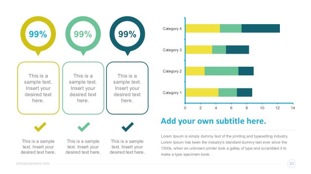
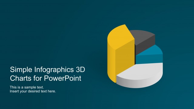
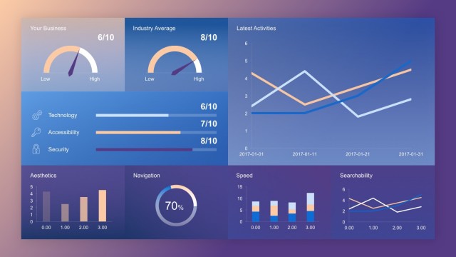
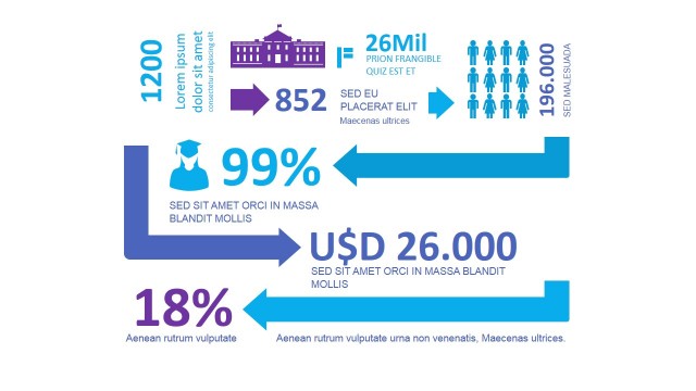
Simple Infographics Dashboard for PowerPoint is a 2-slide 16:9 infographic dashboard presentation template for summarizing KPI-style metrics. The visible slides combine a concentric donut chart, percentage bubble indicators, horizontal funnel bars, legend text, and a process-style metric network for business presenters using Microsoft PowerPoint or Google Slides.
- Category
- Data & Charts
- Rating


 Loading...
- Aspect ratio
- 16:9
- Item ID
- 7065-01
- Colors
 Microsoft PowerPoint
  Microsoft Copilot
  Claude for PowerPoint
 Other formats supported
Subscribe today and get immediate
access to download our PowerPoint templates.