Animated Infographics PowerPoint Template – The Infographics term if the combination of the words Information and Graphics. It is described as the visual representation of information, data or knowledge. With the democratization of information, large amount of data has became available to the general consumers audience. Infographics have become one of the most popular design practice in the digital world. The big data trend, combined with business analytics and business intelligence has pushed public speakers, executives and corporate employees to get used to present facts and conclusions extracted from data analysis. This has always been a weakness of traditional presenters, that tend to represent data through analytical tools as Charts. Even though the first step of data abstraction, from table format to chart format, is understood by a broad audience, the more traditional consumer audience finds it uninteresting.
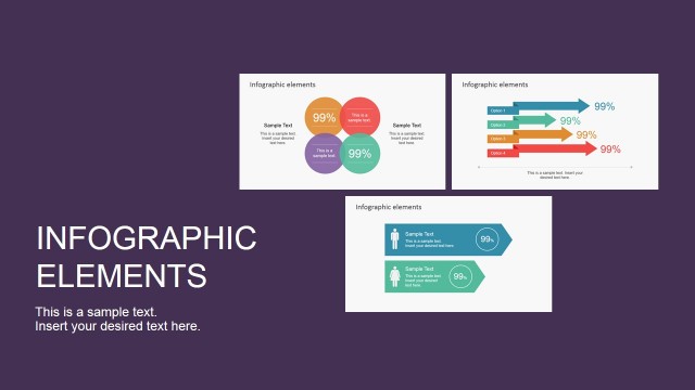
PowerPoint Infographics are a powerful tool to describe conclusions of data analysis with a professional and engaging look and feel. The Animated Infographics PowerPoint Template provides a set of traditional infographic elements as Charts, Number Labels, Arrows, PowerPoint Demographic Icons,etc. The most highlighting property of this presentations is the animations included. All the Infographic elements are animated. The animations are created with PowerPoint animations, allowing the user to fully customize their behaviour as length time, effects, entrance and even synchronization. The user can replace the infographic elements of the PowerPoint Template with any of our Editable Infographic Elements PowerPoint Gallery.
The Slideshow consists for 5 main scenes:
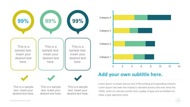
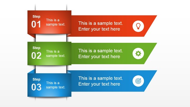
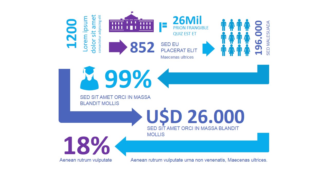
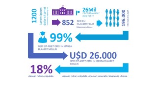
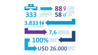
- Scene 1: Three level infographic elements. It starts describing number labels and referencing them to a PowerPoint Icon. The animation is created with a zig zag effect, moving to the bottom of the slide. Each animation can be individually configured in order to let the user configure properties as timing and appearance effect.
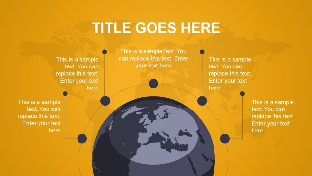
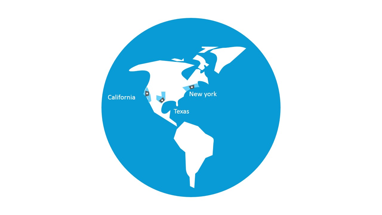
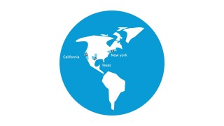
- Scene 2: Americas Map in The World. The scene consists of a world map showing the americas, and pulsing certain locations.
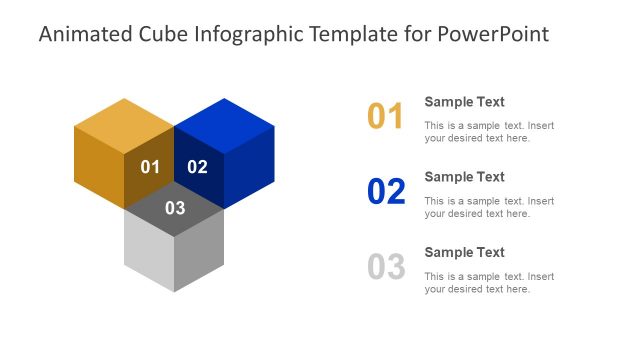
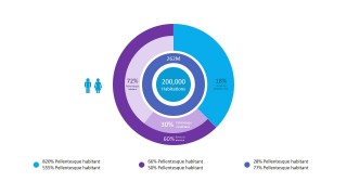
- Scene 3: Three Core Levels Pie Chart. The animations presents a core diagram (three layers) where each layer and its elements are constructed one at a time.
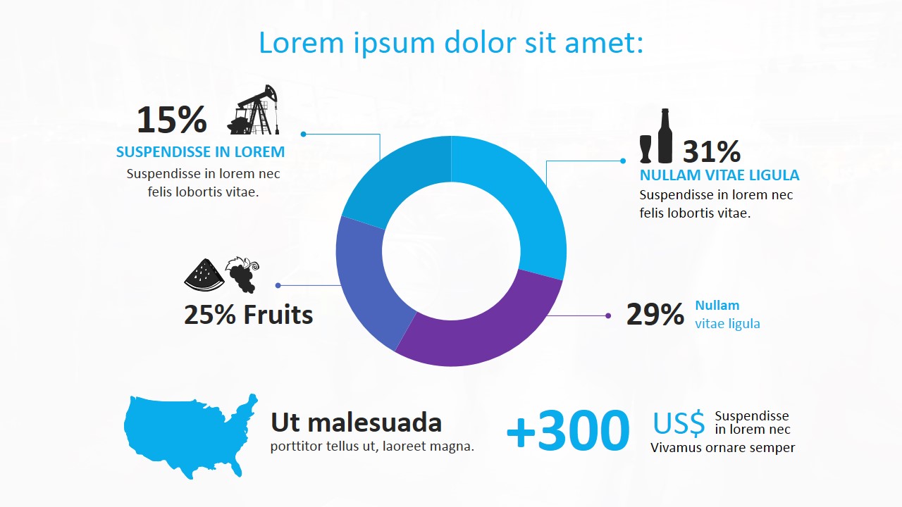
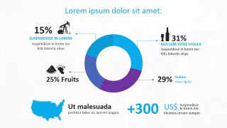
- Scene 4: Animated Donut Chart. The donut chart appears with a circular fade effect and each series description (decorated with PowerPoint Icons) appears in synch.
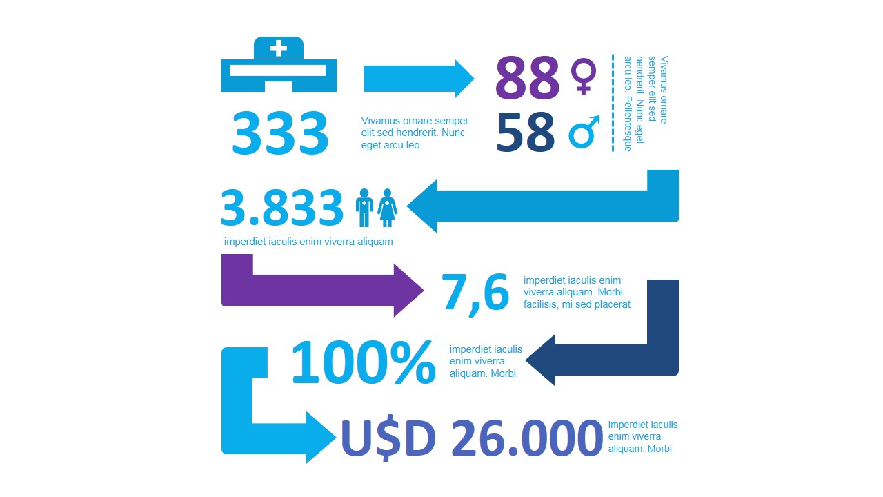
- Scene 5: Similar to the first scene this Infographic Dashboard provides four animated levels.
Impress your audience with this professional Animated Infographics PowerPoint Template. The user can include only slides, or sections of the animations in its own presentations. More important, the user can replicate the best design practices of animation following the template as a guideline.
If you want to see the final effect, play the following video:
What’s inside this template
Example presentation scenarios
- A business analyst can use the arrow-based KPI dashboard to summarize headline numbers, percentages, and currency values for an executive update.
- A marketing presenter can use the Americas map slide to show regional focus, market locations, or campaign coverage across named areas.
- A consultant can use the donut chart and concentric pie chart slides to compare category shares, audience segments, or portfolio composition.
- An operations manager can use the vertical metrics dashboard to report counts, ratios, and directional changes with large numbers and supporting icons.
Features
- 100% editable presentation template
- Compatible with Microsoft PowerPoint and Google Slides
- 16:9 aspect ratio slides
- Scalable vector shapes, icons and illustrations
- AI-Ready for Microsoft Copilot and Claude
- Instant access and download
Frequently asked questions
Q: How should a presenter use this template to make metric-heavy information easier to follow?
A: Start with the largest number or percentage on each slide and explain what decision it supports. The arrow dashboards work best when each arrow carries one message, not several. Use the map for location context, then use the donut or concentric chart slides to explain composition or share of total.
Q: Who is this template best suited for in a business presentation?
A: This template fits presenters who need to brief non-technical audiences on data conclusions without showing raw tables. Analysts, consultants, marketers, and managers can use the dashboards, map, and circular charts to present market coverage, demographic splits, operational counts, or performance highlights in a short executive-style format.
Q: Why do the arrows, map, and circular charts improve the way the information is understood?
A: The visual metaphors separate different types of meaning. Arrows imply movement or flow, the map gives geographic context, and the donut and concentric pie charts show parts of a whole. This helps the audience interpret the data relationship before reading every label, which is useful for fast briefing situations.

Animated Infographics PowerPoint Template
5-slide infographic presentation template with dashboard metrics, Americas map, donut chart, and arrow callouts
Animated Infographics PowerPoint Template is a 5-slide set for turning metrics into visual summaries. It includes arrow-based KPI dashboards, an Americas map, a concentric pie chart, and a donut chart with callouts for business presenters. The template is built for Microsoft PowerPoint and Google Slides, with chart data editable as an Excel spreadsheet in PowerPoint.
- Category
- Data & Charts
- Rating


 Loading...
- Aspect ratio
- 16:9, 4:3
- Item ID
- 0029-01
- Colors
 Microsoft PowerPoint
  Microsoft Copilot
  Claude for PowerPoint
 Other formats supported
Subscribe today and get immediate
access to download our PowerPoint templates.