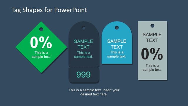
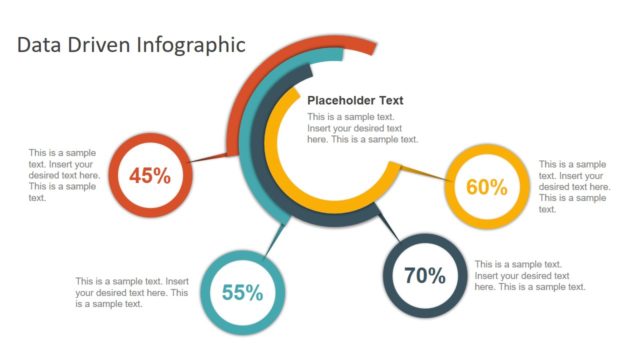
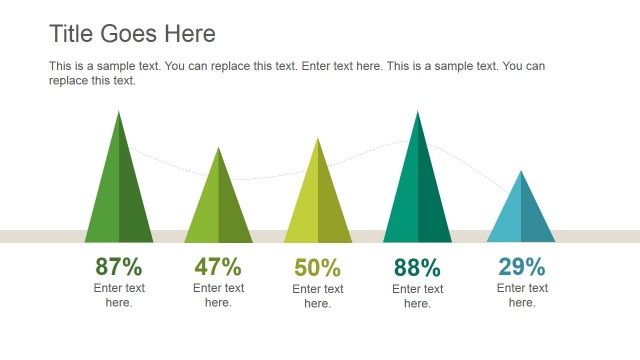
Data Infographic Flat Elements for PowerPoint – This professional PowerPoint presentation is a gallery of Flat Infographic Data Elements and Chart ideal for creating Infographics and Data Presentations.
The word infographic is a derivation of the words Information Graphics, and it is used to describe the use of graphic visual representations of information, data and knowledge in order to present fast and clear. Using visual representations of data the presenter triggers the audience cognition towards information and enhances their ability to identify pattern and trends. Infographics became a mass communication tool and they have evolved to require little knowledge from the audience.
This PowerPoint Template provides PowerPoint Icons, PowerPoint Charts and PowerPoint Shapes to create visually appealing Infographics with little effort and represent demographic information or to make a Headcount Full-Time Employee (FTE) Analysis.
Creating Infographics is ideal for communicating quick marketing and sales facts in order to engage customers. Also applied internally in organizations, infographics help to communicate operational information that needs to be quickly understood for decision making or optimization. Another example of proper utilization of infographics is to create complex conclusions over data for information that is of social importance, for examples, healthcare , ecology or pollution.
What’s inside this template
Example presentation scenarios
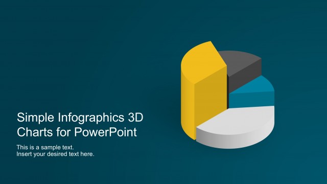
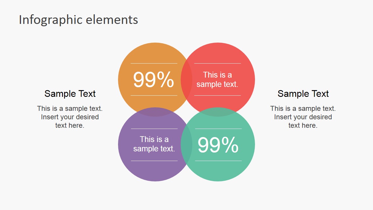
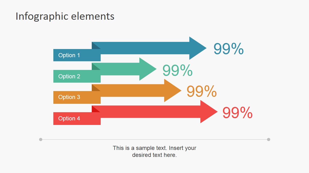
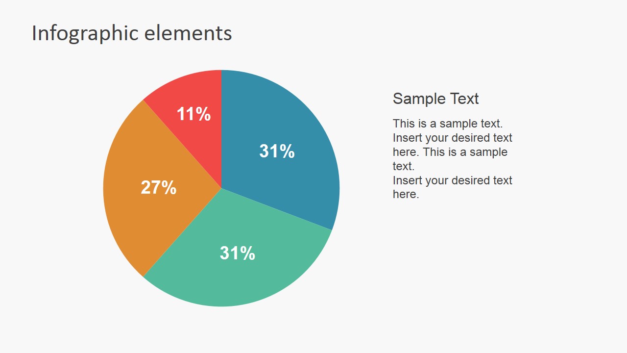
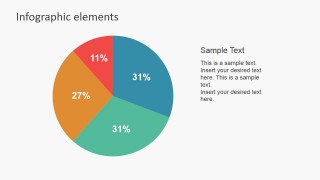
- A marketing manager can present campaign reach or audience mix by using the pie chart, percentage circles, and horizontal arrow comparison layouts to turn core facts into quick visual takeaways.
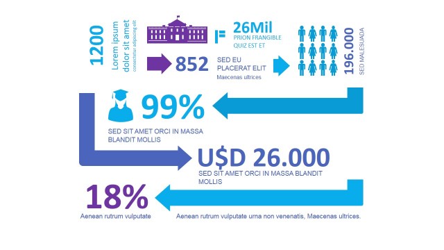
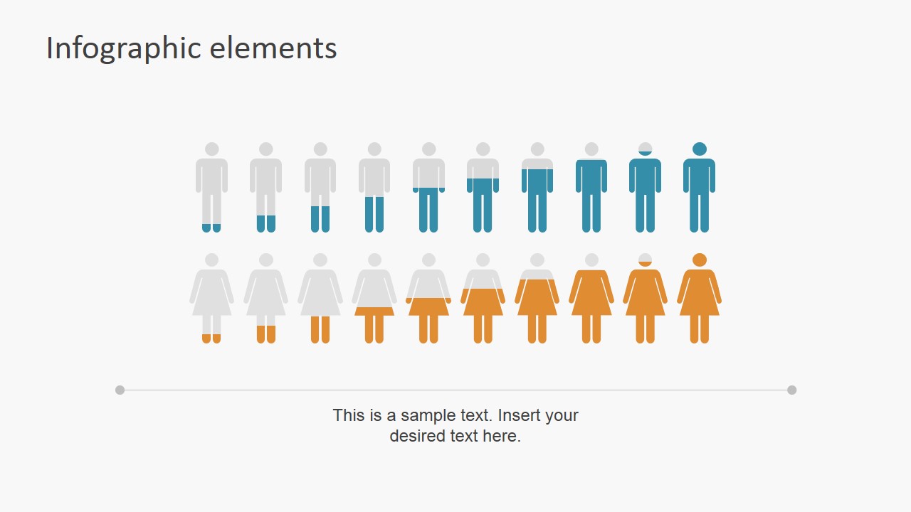
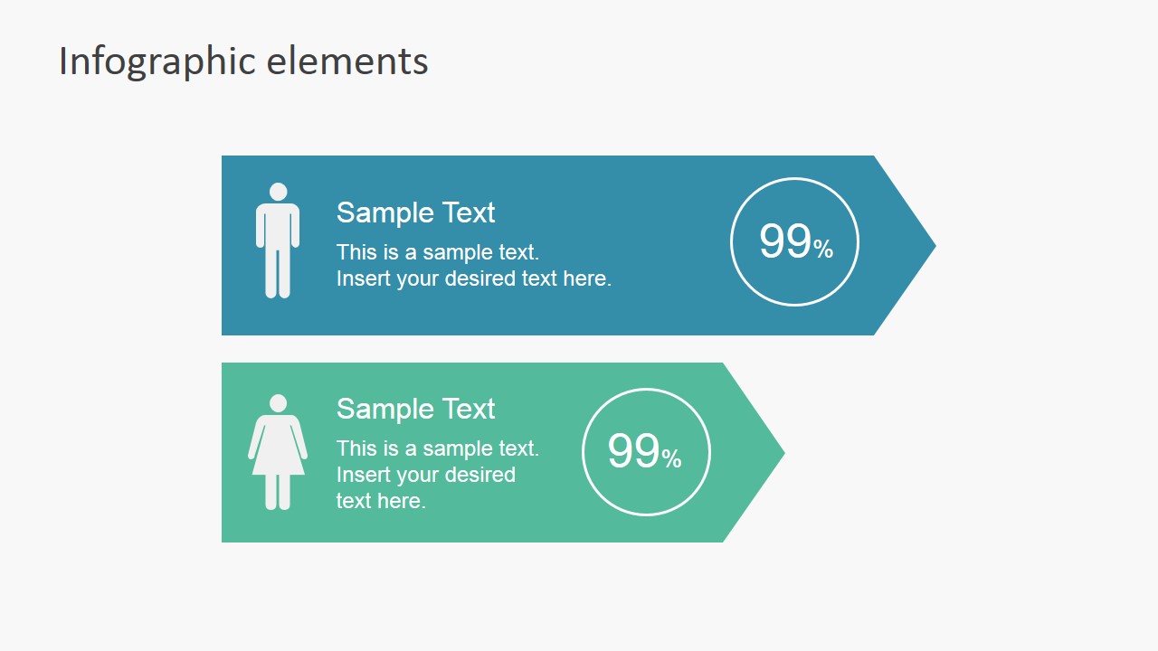
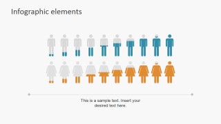
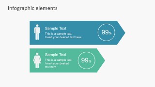
- An HR analyst can explain workforce composition with the demographic headcount row and male-female ribbon cards, making staff counts and ratios easier for leaders to scan.
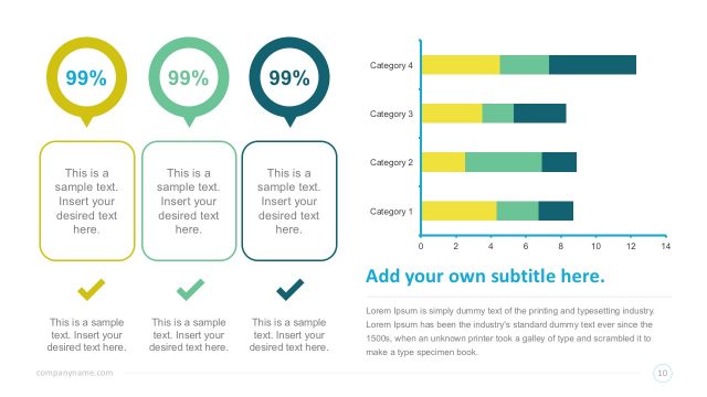
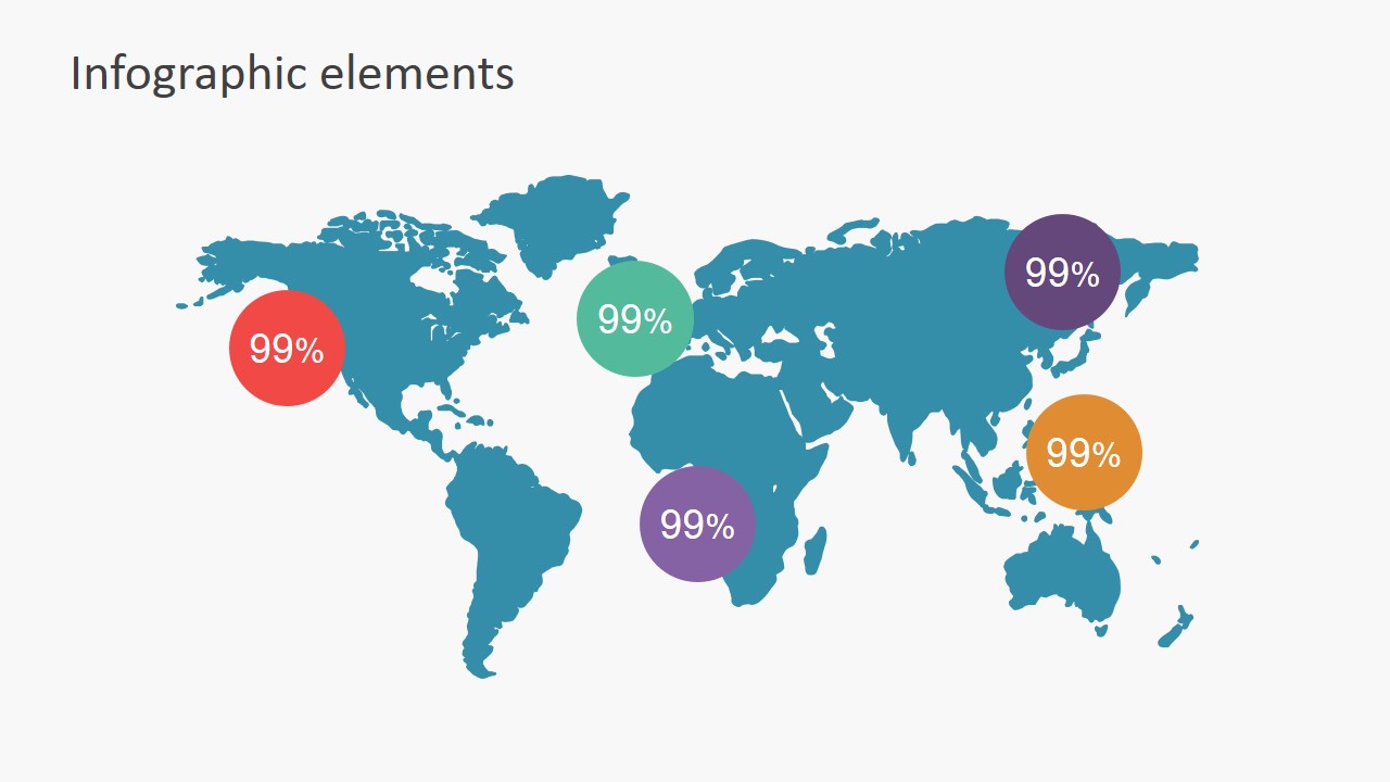
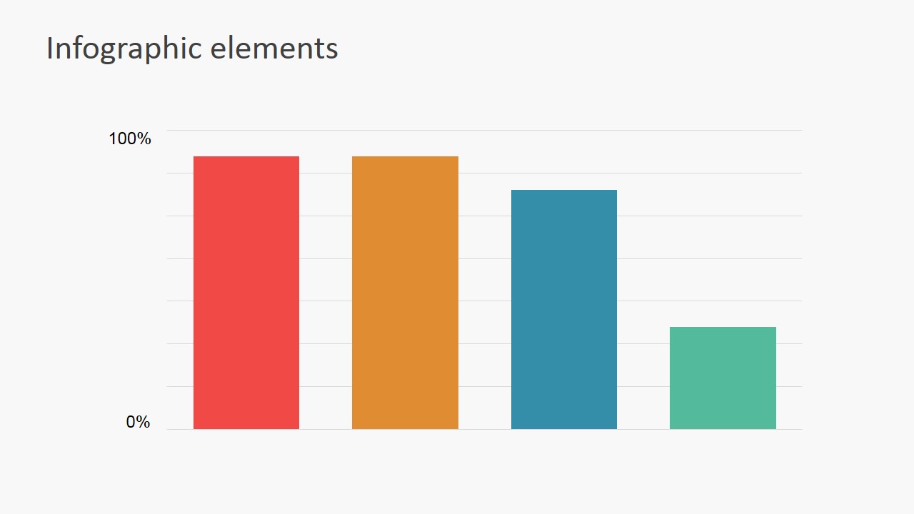
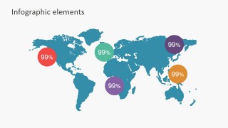
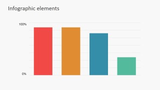
- A sales operations presenter can summarize regional performance with the world map percentage markers and compare product lines with the column chart or colored arrow options.
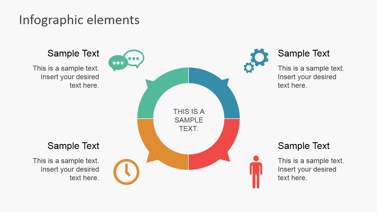
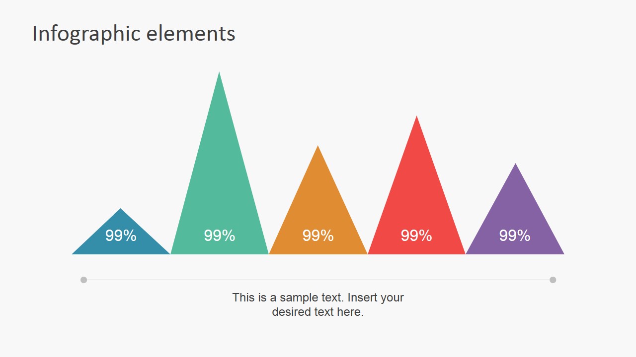
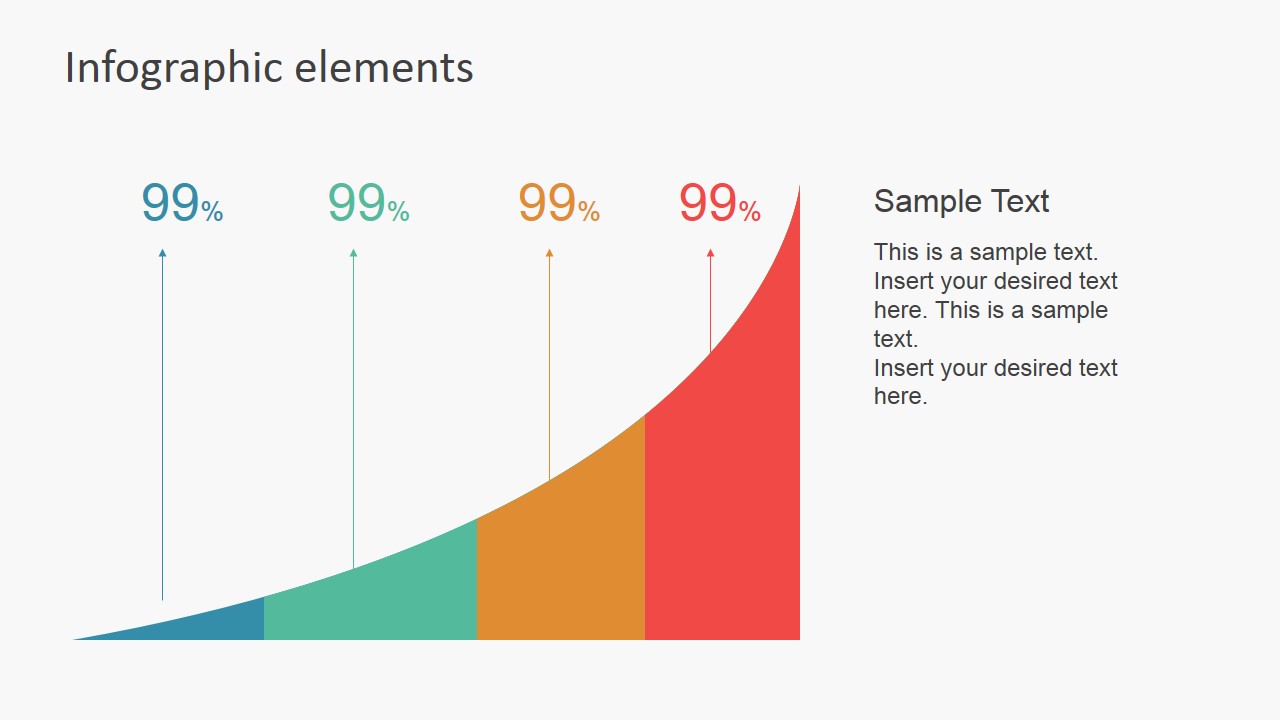
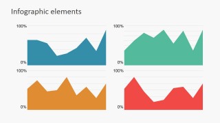
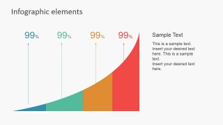
- A consultant can build an executive data snapshot by combining the area chart panels, rising area chart, and circular segmented infographic to show trends, drivers, and metric groupings.
Features
- 100% editable presentation template
- Compatible with Microsoft PowerPoint and Google Slides
- 16:9 aspect ratio slides
- Scalable vector shapes, icons and illustrations
- AI-Ready for Microsoft Copilot and Claude
- Instant access and download
Frequently asked questions
Q: How should a presenter choose which infographic element to use for a data point?
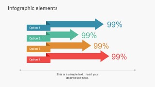
A: Match the layout to the decision the audience must make. Use the column chart or arrow comparison for ranking options, the pie chart for part-to-whole relationships, the world map for geographic spread, and the headcount icons for demographic composition. Avoid placing unrelated metrics together just because they share a percentage format.
Q: Who benefits most from this template in a business presentation?
A: This template fits presenters who need to explain numbers quickly to a nontechnical audience. Marketing, HR, sales, operations, and consulting teams can use the flat icons, chart panels, map markers, and percentage callouts to make factual updates easier to scan during short meetings or executive briefings.
Q: Why do the flat shapes and percentage metaphors work well for data communication?
A: The design turns abstract numbers into recognizable visual metaphors: people icons for headcount, arrows for comparison, map pins for geography, circles for proportional emphasis, and rising areas for growth. These metaphors reduce interpretation effort because the audience can infer the meaning of each metric before reading the full text.
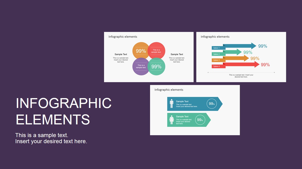


Data Infographic Flat Elements for PowerPoint
13-slide data infographic presentation template with pie charts, maps, and demographic icon layouts
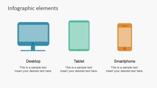
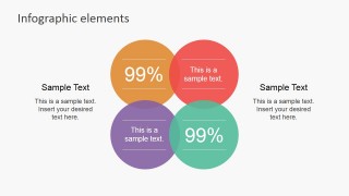
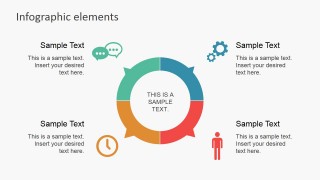
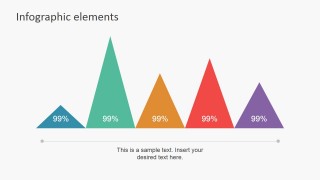
Data Infographic Flat Elements for PowerPoint is a 13-slide chart and infographic element deck for analysts and business presenters building data presentations in Microsoft PowerPoint and Google Slides. It includes device icons, percentage circles, arrow comparisons, demographic headcount rows, a world map, pie chart, column chart, area charts, pyramid markers, and circular labels.
- Category
- Data & Charts
- Rating


 Loading...
- Aspect ratio
- 16:9, 4:3
- Item ID
- 6898-01
- Colors
 Microsoft PowerPoint
  Microsoft Copilot
  Claude for PowerPoint
 Other formats supported
Subscribe today and get immediate
access to download our PowerPoint templates.