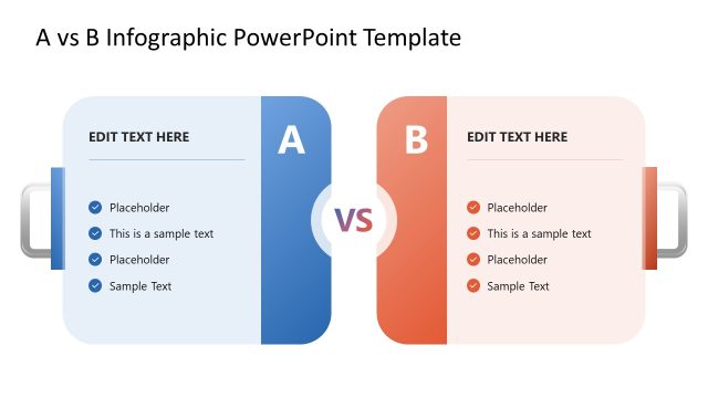
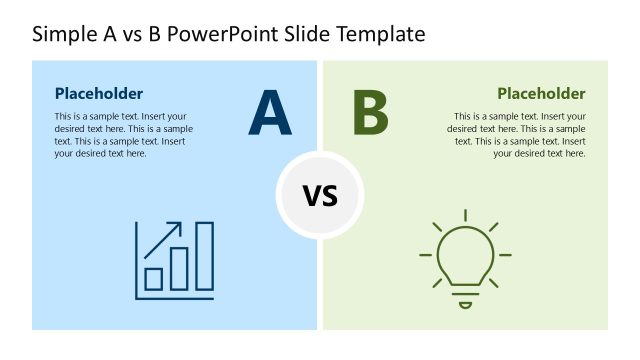
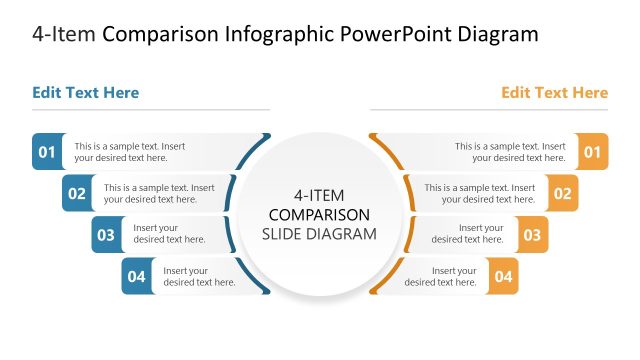
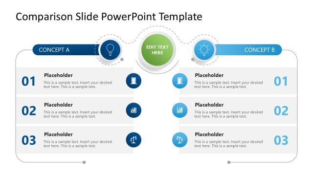
Compare two competing options in a visually attractive and structured format with our Scale A vs B Comparison Infographic PowerPoint Template. In business decision presentations, HR directors compare the performance of two employees or a team using this A vs B diagram. This helps them evaluate which party will provide the greatest benefits for the next endeavor or strategic initiative. Performance marketing experts visualize the sales comparison between two products or campaigns to see which ad target is more impactful. In a supplier review meeting presentation, the procurement manager compares two shortlisted vendors using a scale diagram to aid the selection process. A business consultant uses the comparison layout to outline the two market-entry approaches in executive presentations.
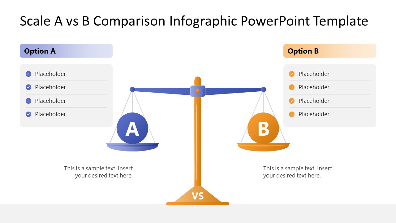
The Scale A vs B Comparison Infographic PowerPoint Template features a balance scale, with the left plate for option A and the right for option B. On both sides, we have provided columns with multiple rows to present the bullet points. The first shows all the data in one view, while professionals can use the second and third slides to discuss which option, A or B, is better and why. These slides showcase one side lower than the other, clearly illustrating the significance or value. Furthermore, all the elements are 100% editable, and users can also customize the layout in Google Slides. In addition, we have a large collection of comparison diagram templates. So visit the collection and select the one that perfectly matches your theme. Download the scale A vs B comparison infographic template and use it in your strategy presentations to showcase similarities or differences effectively.
What’s inside this template
Example presentation scenarios
- A procurement manager can compare two shortlisted vendors by listing selection criteria in the Option A and Option B bullet panels and showing the preferred vendor with the weighted scale slide.
- A marketing manager can present two campaigns or product offers by using the balanced scale first, then moving to the heavier Option A or Option B slide to explain which one performed better.
- An HR leader can evaluate two employees, teams, or role candidates by mapping strengths to the side panels and using the scale metaphor to make the recommendation easy to follow.
- A business consultant can compare two strategic paths for executives by placing decision factors in the bullet rows and using the tilted balance to show the advised direction.
Features
- 100% editable presentation template
- Compatible with Microsoft PowerPoint and Google Slides
- 16:9 aspect ratio slides
- Scalable vector shapes, icons and illustrations
- AI-Ready for Microsoft Copilot and Claude
- Instant access and download
Frequently asked questions
Q: How should a presenter structure the comparison so the recommendation is clear?
A: Start with the balanced scale slide to define the two options and list the evaluation criteria. Then use either the Option A weighted slide or the Option B weighted slide to show the conclusion. Keep each bullet panel to short decision factors, and use the text under the scale plates for the reason the selected option carries more weight.
Q: Who benefits most from this A vs B scale comparison format?
A: This template fits presenters who need to make a two-choice recommendation without building a large analysis deck. Procurement, HR, marketing, product, and consulting teams can use it when the audience already understands the context and mainly needs a structured view of tradeoffs, criteria, and the preferred option.
Q: Why does the balance scale metaphor work for executive decisions?
A: The balance scale turns abstract criteria into a familiar visual judgment: equal weight means open comparison, while a lowered side implies the stronger case. Because the deck includes both neutral and tilted versions, the presenter can separate evidence from conclusion and guide the audience from evaluation to recommendation.


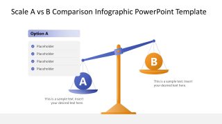

Scale A vs B Comparison Infographic PowerPoint Template
3-slide presentation template for A vs B scale comparisons, option scoring, and decision briefings
This 3-slide A vs B comparison infographic presentation template uses a balance scale metaphor to compare two options. It includes a balanced scale layout, an Option A weighted layout, an Option B weighted layout, and side bullet panels for criteria. It is for decision makers using Microsoft PowerPoint or Google Slides.
- Category
- Multi-purpose
- Rating

 Loading...
- Aspect ratio
- 16:9
- Item ID
- 23667-01
- Colors
 Microsoft PowerPoint
  Microsoft Copilot
  Claude for PowerPoint
 Other formats supported
Subscribe today and get immediate
access to download our PowerPoint templates.