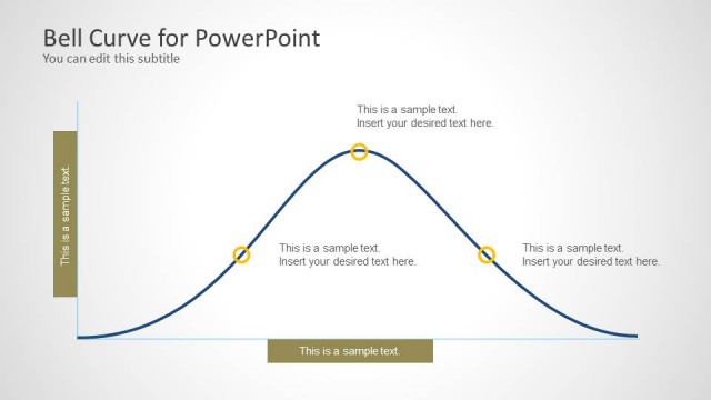
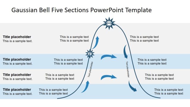
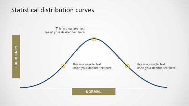
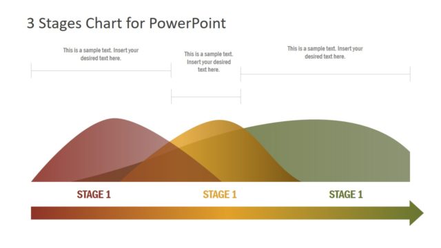
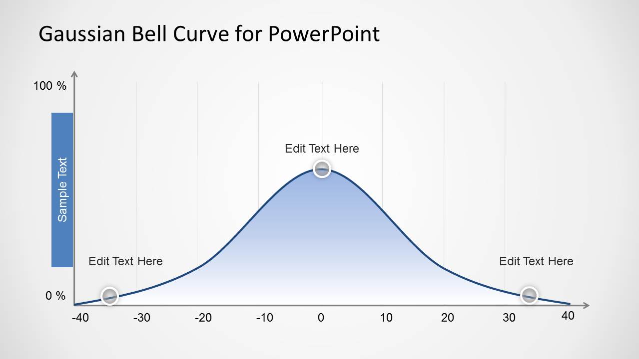
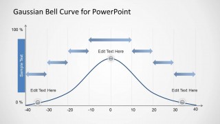
Gaussian Bell Curve Template for PowerPoint is a simple graph representing a Gaussian function that you can use in PowerPoint presentations. The Gauss styled curve for PowerPoint presentations can be used in presentations on statistics or probability but also to represent business or modeling Gaussian distributions in finance PowerPoint presentations.
What’s inside this template
Example presentation scenarios
- A statistics instructor can use the shaded bell curve to explain mean-centered distribution behavior and point out the tails, peak, and axis values.
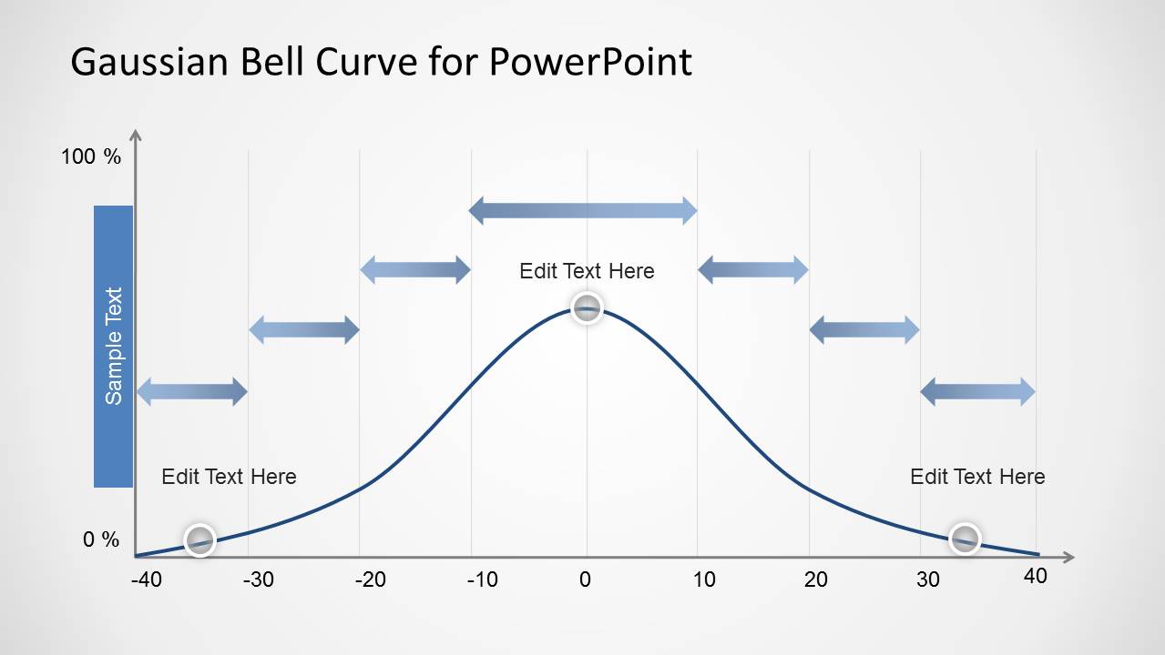
- A finance analyst can use the interval arrow slide to present risk ranges, model uncertainty, or confidence interval bands around a central estimate.
- A quality manager can use the curve and editable callouts to discuss process variation, acceptable limits, and outlier zones during an operations review.
- A consultant can use the labeled curve to simplify probability concepts for business stakeholders before showing detailed quantitative findings.
Features
- 100% editable presentation template
- Compatible with Microsoft PowerPoint and Google Slides
- Scalable vector shapes, icons and illustrations
- AI-Ready for Microsoft Copilot and Claude
- Instant access and download
Frequently asked questions
Q: How should a presenter explain the bell curve without overwhelming a nontechnical audience?
A: Start with the plain shape: low probability at the tails, highest concentration near the center, and gradual decline on both sides. Use Slide 1 for the basic idea before introducing intervals. Keep each callout tied to one concept, such as average, lower tail, or upper tail, so the audience does not read the diagram as a dense chart.
Q: Who is this template best suited for?
A: This template is best for presenters who need one clear visual for a distribution concept rather than a full analytics report. Analysts, instructors, finance teams, and quality managers can use it when the main message depends on explaining normal variation, probability, confidence intervals, or risk ranges around a central value.
Q: Why does the second slide use arrows above the curve?
A: The arrows turn the bell curve into a range explanation instead of only a shape explanation. They help viewers see that segments across the horizontal axis can represent intervals, bands, or confidence ranges. This reduces ambiguity because the audience can connect each span to a specific part of the distribution.
Gaussian Bell Curve Template for PowerPoint
2-slide PowerPoint template for Gaussian bell curves, probability distributions, and confidence interval annotations
The Gaussian Bell Curve Template for PowerPoint is a 2-slide PowerPoint template for presenting normal distribution concepts. It includes a shaded Gaussian bell curve, an axis-based probability graph, and a second curve with horizontal interval arrows. It is intended for statistics, probability, finance, quality, and modeling presentations.


 Loading...
 Microsoft PowerPoint
  Microsoft Copilot
  Claude for PowerPoint
 Other formats supported
Subscribe today and get immediate
access to download our PowerPoint templates.