Coronavirus Flattening the Curve PowerPoint Template
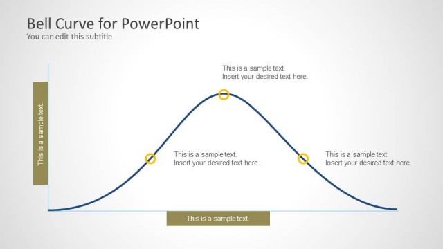
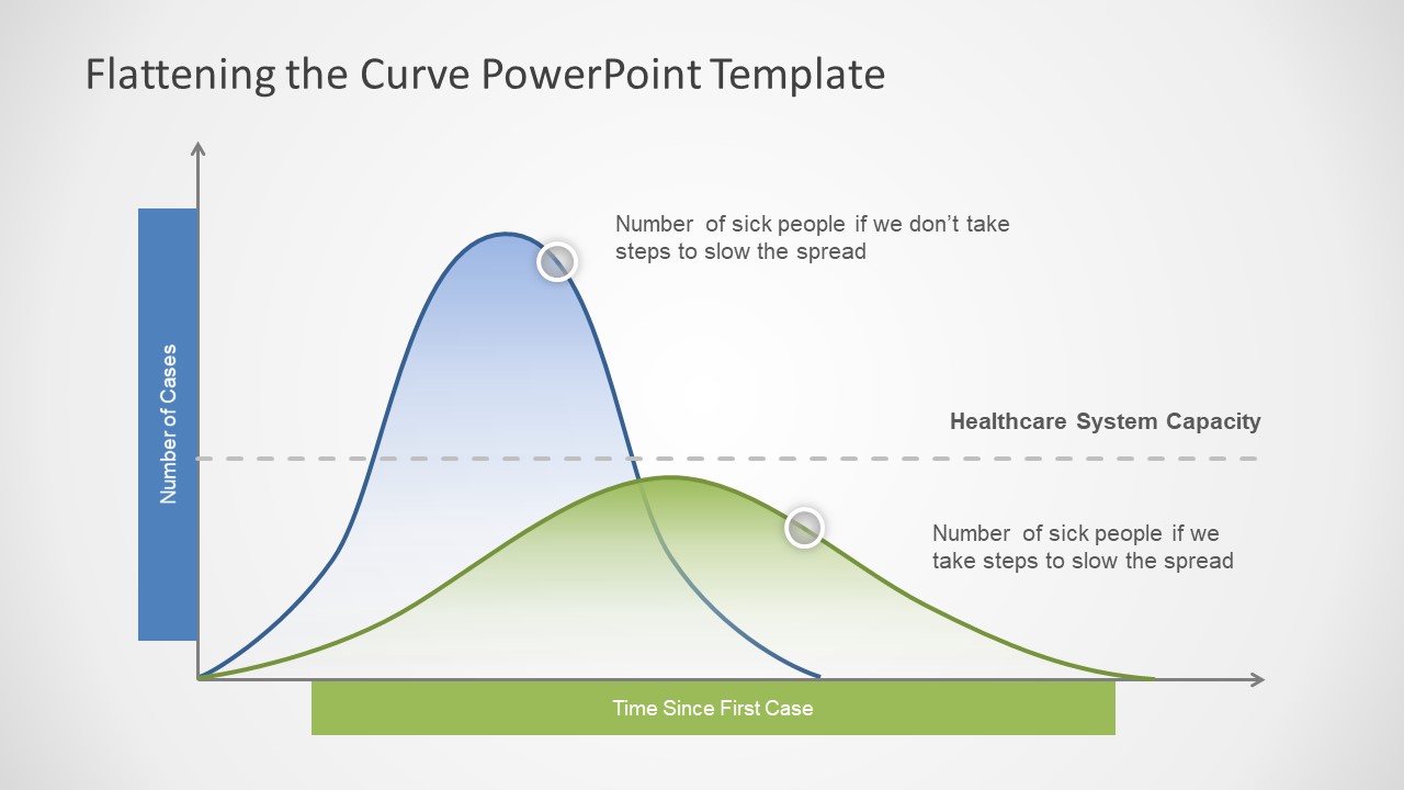
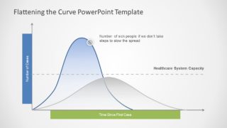
The Coronavirus Flattening the Curve PowerPoint Template presents two bell curve charts for global statistics. This chart will assist professionals to visually demonstrate data and frequency of Coronavirus stats worldwide. The novel Coronavirus outbreak called COVID-19 has been declared a pandemic by World’s Health Organization in 2020. The two bell curves in chart could help display a spread of disease in various statistical reports. For example, a review of earlier and new cases, number of people tested positive in country vs. the world or comparison of recovery and death toll. Further, bell curve is a normal distribution data chart that highlights variables in probability and statistics. It measures the frequency of data set over a period of time. The PowerPoint graph will enable professionals to capture important factors of COVID-19 in a professional presentation.
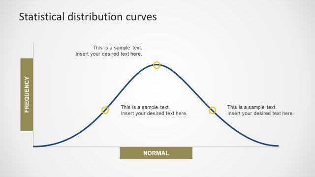
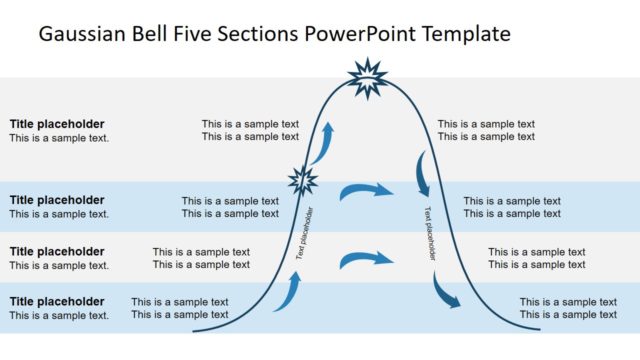
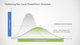
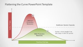
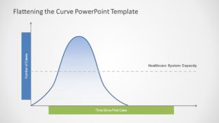
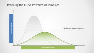
The curve PowerPoint template contains 6 versions of the editable graph data charts featuring Gaussian or Normal distribution diagram. These slides can help describe the spread of virus and prevention measures in single view of graph. For example, spike in the number of cases, preventive measures, healthcare system capacity, and global protective measures. This Corona template is useful for accommodating a number of comparison charts. Because it is a custom-design PowerPoint chart with options to modify shapes and other elements. For instance, users can reshape the bell curve by selecting Edit Shape option in formatting menu. Moreover, users can change colors and text placeholders according to their presentation requirements.
The Coronavirus Flattening the Curve PowerPoint Template can also help display low levels of disease spread due to preventive measures. It will help produce an engaging presentation using bell curve to contain spread of virus. This use of 2 bell curves are graphics promoting precautionary measures to flatten the curve.
The last two slides also have a Morph effect, this is very helpful to demonstrate the transition between the curve without the proactive measures to the curve with protective measures.


You must be logged in to download this file.
DOWNLOAD- Category
- Data & Charts
- Rating

 Loading...
- Size
- 16x9
- Item ID
- 20445-01
- Colors
Subscribe today and get immediate
access to download our PowerPoint templates.