Editable Donut Charts Material PowerPoint Diagram
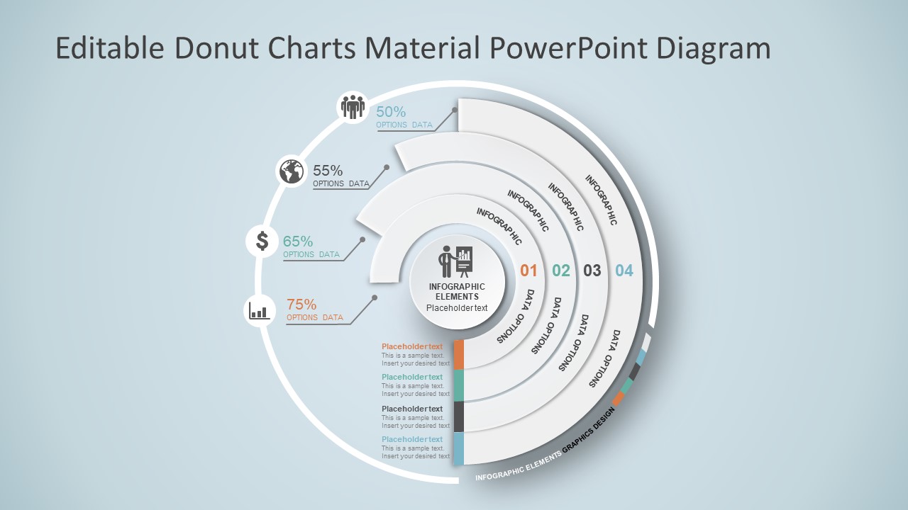
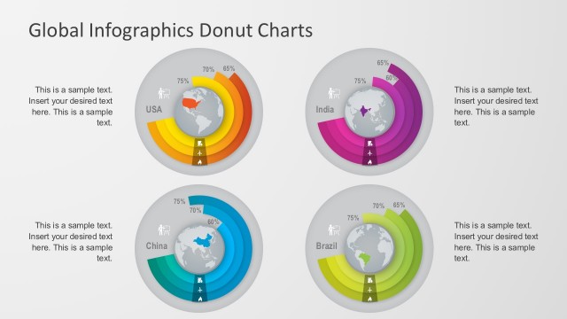
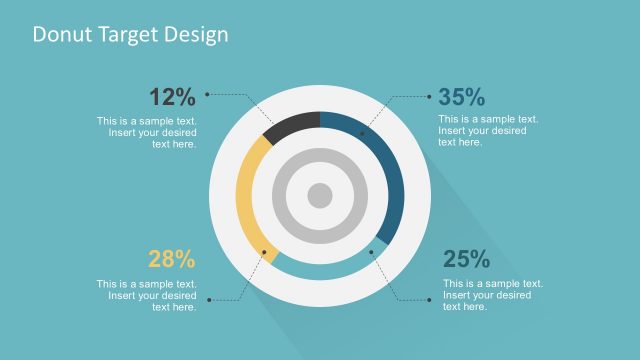
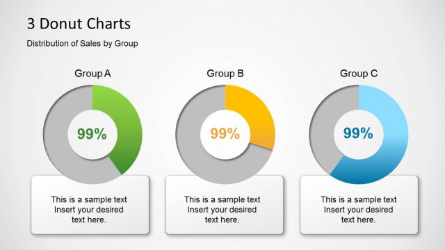
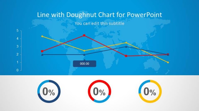
The Editable Donut Charts Material PowerPoint Diagram is an infographic template of a multi-level donut. This is a one slide PowerPoint chart showing four stages in the shape of concentric semi-circles. Whereas, the circular shape in the middle illustrates a core functionality or element. This donut chart shows various attributes, their percentage and values in multiple levels or group. These levels are useful in demonstrating complex data in simple and understandable graphics. For example, compare the sales and likability of four products of the company, use this material donut chart. It can show the most desirable product in a higher percentage. Or use this template to explain global statistics in learning presentation. Such as demographics of a country, continent or this world.
The Editable Donut Charts Material PowerPoint Diagram is like pie-chart and an empty center. Where pie-chart displays the segments of one whole, the donut can support multiple statistics at once. This special diagram of material donut chart shows an icon of businessman delivering a presentation in the middle. Further, it enables the use of percentage values to display data calculations. The editable donut chart shows different colors for each concentric semi-circle in the start as a label. Users can modify and color the complete donut so the audience can easily identify each chart. Furthermore, material PowerPoint diagram contains infographic icons apart from colors and numbers to represent each donut chart.
Alternatively, download an appealing 3D cylinder design PowerPoint diagram or check out the data-driven flat infographic charts. For more information check our articles about how to make a presentation graph, data presentations and chart vs. graph.
