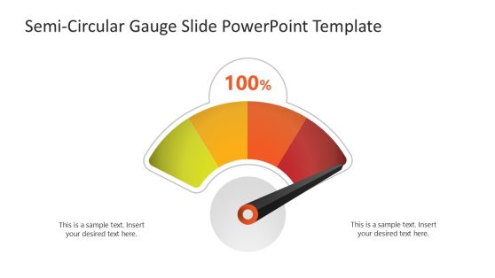
Dial-up Gauge Infographic PowerPoint Template
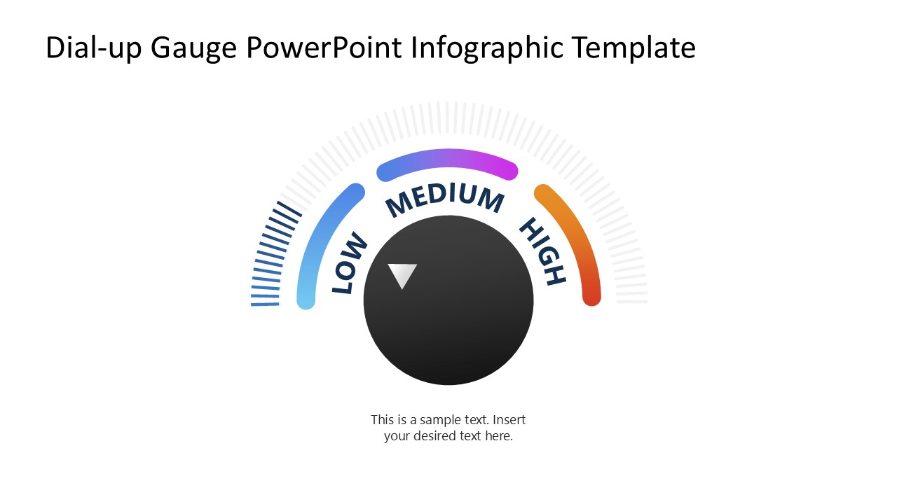
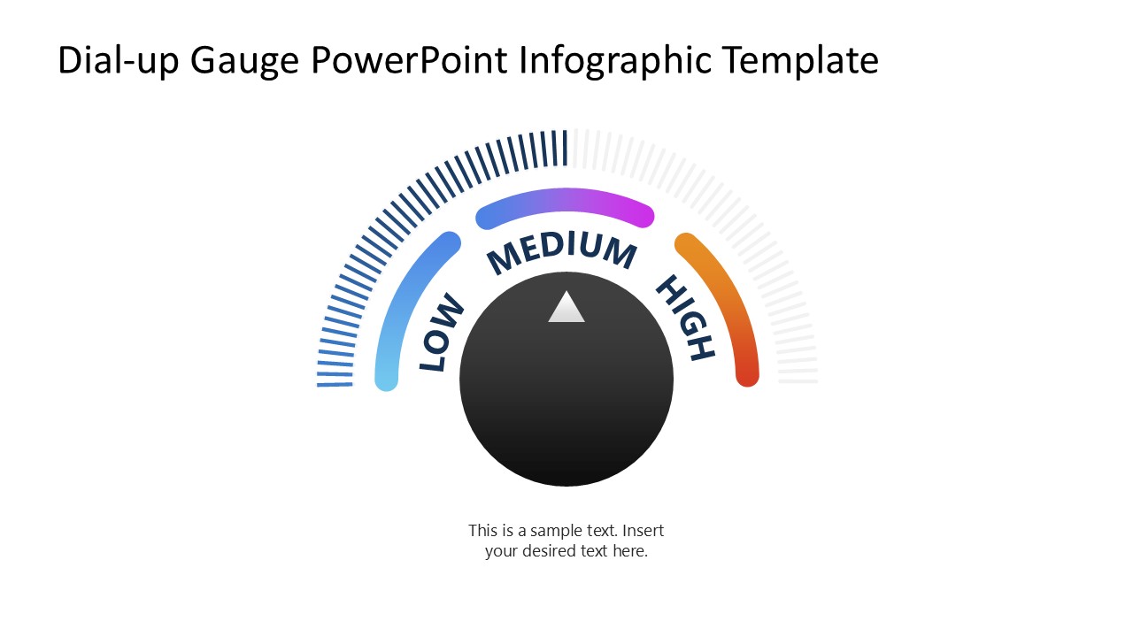
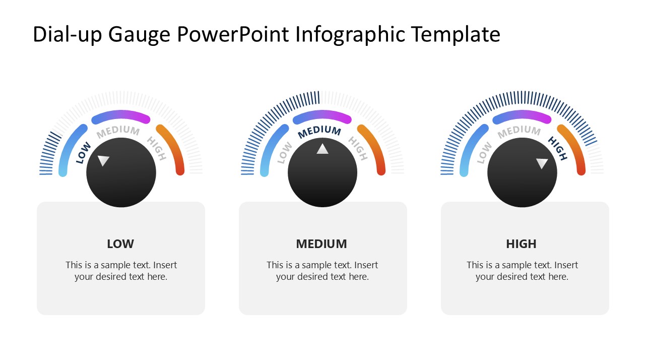
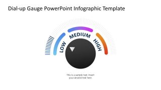
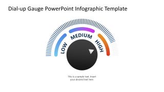
Download our editable Dial-up Gauge Infographic PowerPoint Template to visualize the performance of various KPIs in the leadership meetings. The PPT layout features a semicircular gauge diagram with segmented arcs to represent low, medium, or high levels. The arcs have a gradient color that transitions from blue to purple and then to orange, with levels from low to high. In the center, a large circular block features an arrow shape to indicate the exact value.
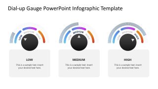
The first three slides each show one gauge diagram: the first shows the low level, the second the medium level, and the third the high level. The last slide shows all three shapes in one place. We have designed this layout with editable PPT features that project managers can adjust as needed. They can change the colors, number of arcs, text fonts, and other graphical elements used in the design to fit their needs perfectly.
The Dial-up Gauge Infographic PowerPoint Template has a minimal layout witha modern design. It has many use cases:
- Business analysts can use the gauge diagram to depict multiple key performance indicators (KPIs), targets, or quarterly goals hitting specific performance levels.
- The template allows Project managers to showcase low, medium, or high risk levels in a simple, non-technical way to the board members. They can also effectively use this template to describe the project’s health in the supply chain, budget, and workflow.
- Data experts can use this gauge diagram to showcase customer satisfaction levels across three stages based on surveys or reviews.
Moreover, professionals can also use the dial-up gauge infographic template layout in other high-level decision-making discussions. Download the gauge infographic template and personalize it with any PowerPoint version. Alternatively, download other gauge PPT templates and slides, ready for Microsoft PowerPoint, Canvas and Google Slides.


You must be logged in to download this file.
DOWNLOAD- Category
- Diagrams
- Rating

 Loading...
- Size
- 16x9
- Item ID
- 23499-01
- Colors
Subscribe today and get immediate
access to download our PowerPoint templates.