Slide 2 of 4 from Bar Chart Template for PowerPoint
6195-01-bar-chart-2
Grouped Bar Chart for Financial Projections
- Chart
- Bar Vertical
- Financial Summary Slide
- 16:9
- 100% Editable
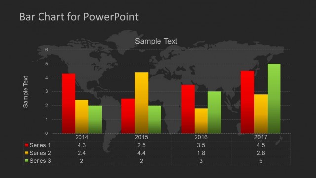
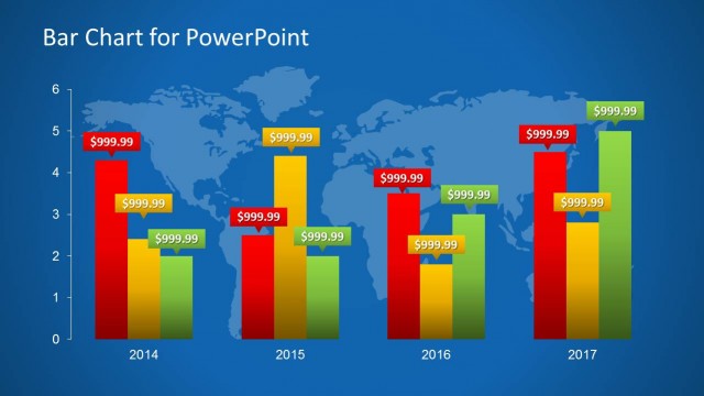
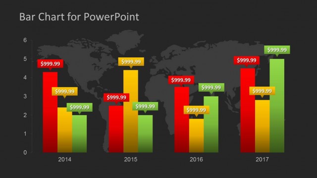
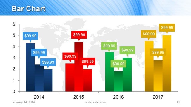
The Grouped Bar Chart with World Map Background slide from the Bar Chart Template for PowerPoint offers a clear visual tool for financial reporting and performance analysis. This slide template features editable shapes and vector icons, making it suitable for business presentations and management slide decks that require detailed comparison of multi-year financial data.
What’s on This Slide
The layout features a grouped bar chart positioned centrally against a blue world map background. The chart displays three series of vertical bars, each in distinct colors: red, yellow, and green. The x-axis lists years from 2014 to 2017, while the y-axis shows numerical values from 0 to 6. Each bar is labeled with sample text indicating series values. Text placeholders are present at the top for the title and at the bottom for data labels, aligned centrally. The overall composition emphasizes the chart, with a clear visual hierarchy.
How to Use It
This layout serves as a grouped bar chart, ideal for comparing financial data across multiple years. It fits within a presentation sequence following introductory slides, effectively illustrating trends or projections. Suitable for business contexts such as financial reporting, management presentations, or performance analysis, this layout allows for clear visual comparisons of data series. It can be used to highlight growth, revenue changes, or other key metrics over time, making it versatile for various financial discussions.
Text Placeholders & Capacity
Keep your copy within these limits so it fits without resizing. Node labels can hold around 10 characters each.
| Placeholder | Count | Max characters (approx.) |
|---|---|---|
| Slide title | 1 | 30 |
| Item heading | 3 | 10 |
| Item body | 3 | 10 |
| Chart title | 1 | 30 |
Slide Keywords
Download unlimited PowerPoint templates, charts and graphics for your presentations with our annual plan.
DOWNLOADReturn to Bar Chart Template for PowerPoint.