3D Data Comparison Columns Infographic PowerPoint Template
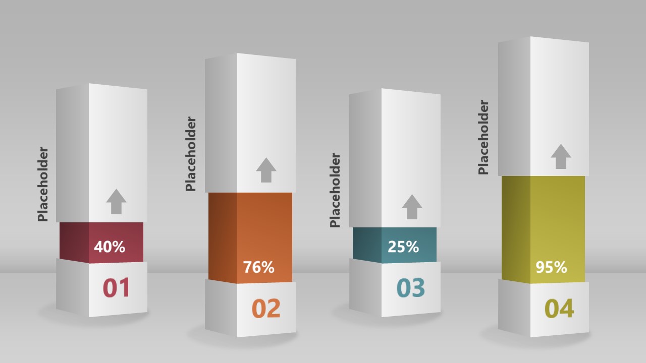
Edit our creative 3D Data Comparison Columns Infographic PowerPoint Template to showcase the comparison between various data points engagingly. Professionals often discuss connections between multiple business segments, examine similarities and differences, and discuss the relationship between processes in the meetings. We created this template to help them effectively share these analogies or observations with their team members. Project managers can download this template to depict the percentage impact of the individual milestones on the project completion.
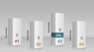
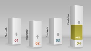
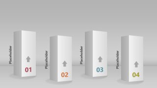
The 3D Data Comparison Columns Infographic PowerPoint Template has six slides with a similar diagram with variations to show specific data points. In the first slide, we have four columns with a 3D appearance. They are placed in a zigzag manner like one is on the front while the other is behind the front line. All the columns have a greyish-white palette with a bold numerical digit at the base, showing the step number. We have also provided vertically placed text placeholders along the side of the columns so that users can mention the relevant details in a brief format. In the following slide, the column splits from a pint and swipes up where a colored segment appears from the inside with a percentage value written on it. The degree of openness and size of the colored segment corresponds to its percentage value. The stunning animations make the template more impactful and capture the audience’s attention.
Our template also has 100% editable PowerPoint features, which users can also customize with Google Slides and Keynote. Presenters can change the shapes, colors, and fonts used in the template based on their requirements. They can also repurpose the design to present their preferred topics. Download this template and customize it to display business correlations now! Alternatively, check our collection of comparison PPT templates and infographic templates for PowerPoint.
