Data Visualization
Create stunning presentations with the help of visual science and data visualization. Use graphical representation of information and data in your presentations and learn how to include visual elements like charts, graphs, and maps effectively, to deliver a message and engage your audience.
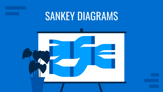
Sankey Diagrams (Quick Guide for Presenters)
Learn how to read Sankey Diagrams and how to design them for your presentations.
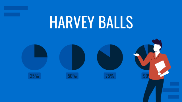
All About Using Harvey Balls in Presentations
Among the many tools in the arsenal of the modern presenter, Harvey Balls have a special place. In this article we will tell you all about using Harvey Balls.
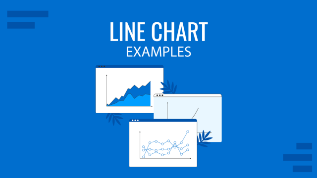
Line Chart Examples: A Guide to Complex Data Representation
Discover professional line chart examples, creation tips, and ideas to effectively analyze and present your data trends.
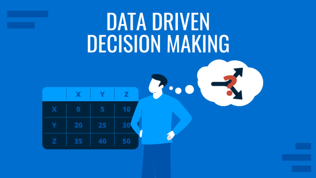
Data-Driven Decision Making: Presenting the Process Behind Informed Choices
Discover how to harness data for informed decision-making and create impactful presentations. A detailed guide + templates on DDDM presentation slides.
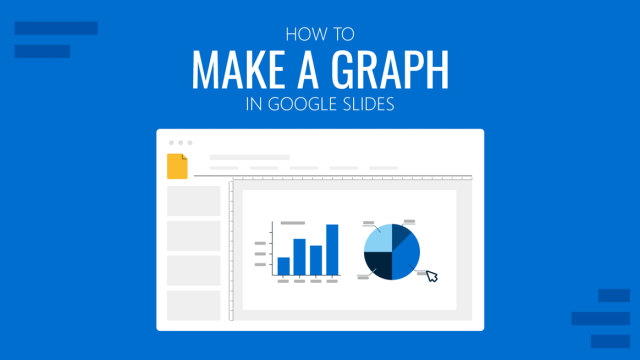
How To Make a Graph on Google Slides
Creating quality graphics is an essential aspect of designing data presentations. Learn how to make a graph in Google Slides with this guide.
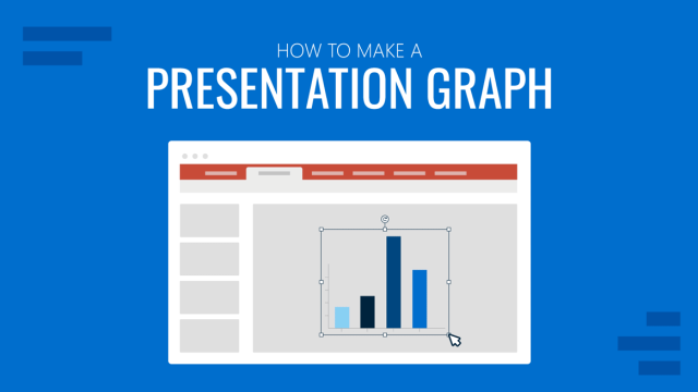
How to Make a Presentation Graph
Detailed step-by-step instructions to master the art of how to make a presentation graph in PowerPoint and Google Slides. Check it out!
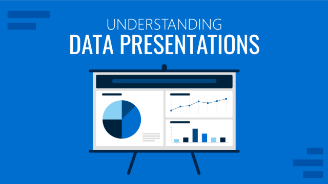
Understanding Data Presentations (Guide + Examples)
Elevate the quality of your message by learning how to work in data presentations effectively. Insights, examples, and PPT templates here.
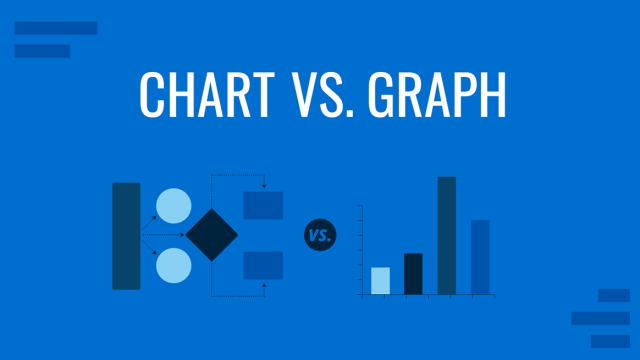
Chart vs. Graph: Understanding the Graphical Representation of Data
How many times did you use chart and graph exchangeably as if they were synonyms? In this article, we will explain the difference between graph vs. chart for accurate graphical data representation.
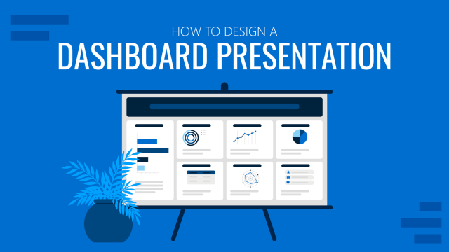
How to Design a Dashboard Presentation: A Step-by-Step Guide
Take a step further in your professional presentation skills by learning what a dashboard presentation is and how to properly design one in PowerPoint. A detailed step-by-step guide is here!
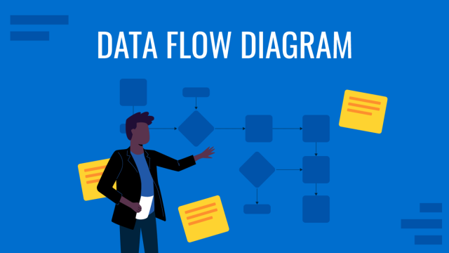
Data Flow Diagram Demystified: What They Are and How to Use Them
Master the art of Data Flow Diagrams with our in-depth guide! Discover the steps to create, interpret, and leverage DFDs to optimize processes.
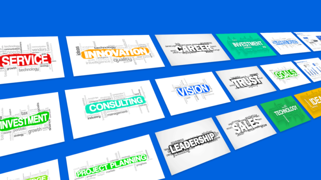
Using Word Clouds in Presentations (to Increase Audience Engagement)
Did you know that our eyes are the most powerful medium for processing information? We need far less time to extract meaning from an image, than from a piece of text. Arguably, that’s the main reason why everyone loves a good PowerPoint presentation. It breaks down the key information in an easy-to-digest manner and complements […]