Creating a compelling risk and mitigation slide is a critical skill for professionals tasked with communicating potential challenges and solutions in a clear, concise, and visually engaging manner. Whether you’re preparing a presentation for stakeholders, project managers, or executives, this slide serves as a cornerstone for demonstrating foresight, planning, and control over uncertainties.
This article dives deep into the process of designing a risks and mitigations slide, offering actionable steps, frameworks, and risk mitigation strategies examples to ensure your PowerPoint presentation resonates with your audience.
Table of Contents
- What is a Risk and Mitigation Slide?
- Step 1: Identify and Categorize Risks
- Step 2: Assess Risk Level Using a Risk Matrix
- Step 3: Develop Risk Mitigation Strategies
- Step 4: Structure Your Slide for Clarity
- Step 5: Visualize Data with a Risk Matrix
- Step 6: Tailor Mitigation Examples to Your Context
- Step 7: Integrate Risk Reports for Depth
- Common Pitfalls to Avoid
- Recommended Risk and Mitigation PPT Templates
- FAQs
- Conclusion
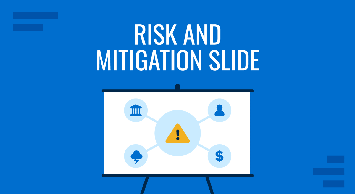
What is a Risk and Mitigation Slide?
A risk and mitigation slide is more than just a list of potential problems and fixes—it’s a strategic tool that showcases your ability to anticipate and address obstacles proactively. The goal is to instill confidence by illustrating that risks are identified and managed effectively through well-thought-out mitigation strategies. This slide typically appears in project updates, business proposals, or risk reports, where decision-makers need a snapshot of challenges and solutions without wading through dense details.
To excel, focus on clarity, prioritization, and visual impact. The slide should answer three key questions: What could go wrong? How severe is it? And what are we doing about it?
Step 1: Identify and Categorize Risks
The foundation of any risk and mitigation slide is a comprehensive risk identification process. Start by brainstorming potential risks specific to your project, initiative, or business context, leveraging risk management techniques. Risks can stem from various sources—financial, operational, technical, legal, or external factors like market shifts or regulatory changes.
This step requires a mix of creativity and analysis. Gather your team—project managers, engineers, financial analysts, or whoever has skin in the game—and run a risk workshop. Ask probing questions: What’s the worst-case scenario? What’s kept us up at night on past projects? For example, in a construction project, you might identify risks like “equipment failure” or “permit delays.” In a tech venture, “software bugs” or “vendor dependency” might top the list. Don’t stop at the obvious—dig into second-order risks, like how a supplier delay could cascade into missed deadlines or reputational damage.
Once you’ve got a raw list, categorize them for clarity. Common buckets include:
- Strategic Risks: Competitive pressures, misaligned objectives, or shifts in market demand that could undermine your goals.
- Operational Risks: Supply chain disruptions, resource shortages, or process inefficiencies that threaten execution.
- Technical Risks: System failures, cybersecurity breaches, or integration challenges that could halt progress.
- Financial Risks: Budget overruns, currency fluctuations, or funding cuts that strain resources.
- External Risks: Regulatory changes, natural disasters, or geopolitical instability beyond your control.
Categorization isn’t just about tidiness—it helps your audience process the information faster and see the breadth of your planning. For a complex project, you might even use a mind map during this phase, later distilling it into a concise slide. The output here is a prioritized shortlist of risks that matter most, setting the stage for the next steps.
Step 2: Assess Risk Level Using a Risk Matrix
To elevate your risks and mitigations slide, incorporate a risk matrix. This visual tool plots risks based on two dimensions: likelihood (probability of occurrence) and impact (severity if it occurs), easily crafted using risk assessment templates. A typical risk matrix uses a 3×3 or 5×5 grid, with axes ranging from low to high.
Here’s how to implement it:
- Assign Likelihood: Rate each risk as Rare (1%), Unlikely (10%), Possible (30%), Likely (60%), or Almost Certain (90%). Use historical data, expert input, or industry benchmarks to ground your estimates.
- Determine Impact: Classify the consequence as Negligible (minor inconvenience), Minor (slight delay), Moderate (noticeable disruption), Major (significant setback), or Catastrophic (project failure). Consider cost, time, and reputation.
- Calculate Risk Level: Combine the two ratings to determine the overall risk level (e.g., Low, Medium, High, or Critical). A 5×5 matrix might score “Possible” (3) and “Major” (4) as a 12—High risk.

For instance, a “system outage” might be “Likely” with a “Major” impact, landing it in the “High” risk zone. This methodical approach adds credibility and helps prioritize which risks to highlight on your slide. Our article on risk analysis and risk management can give you further insights on how to best depict this information.
Let’s flesh this out with an example. Imagine you’re launching a mobile app. A risk like “server overload” might be “Possible” (new apps often face unexpected traffic) with a “Moderate” impact (users might retry later), scoring it as Medium. Conversely, a “data breach” could be “Unlikely” but “Catastrophic,” pushing it to High or Critical depending on your matrix. The beauty of the risk matrix is its flexibility—you can adjust thresholds based on your project’s tolerance. For a startup, a $10,000 loss might be Major; for a multinational, it’s Negligible. This step isn’t just about numbers—it’s about translating gut feelings into a defensible framework that justifies your slide’s focus.
Step 3: Develop Risk Mitigation Strategies
With risks assessed, shift focus to mitigation. A strong risk and mitigation slide pairs each risk with a specific, actionable strategy, as often supported by risk management templates. Avoid vague responses like “monitor closely”—instead, provide concrete plans that demonstrate control.
Here are some risk mitigation examples:
- Risk: Budget overrun due to unexpected costs.
- Mitigation: Implement a contingency fund (e.g., 15% of the budget) and enforce monthly cost reviews with automated tracking tools.
- Risk: Delay in product launch due to supplier issues.
- Mitigation: Diversify suppliers across regions and establish penalty clauses in contracts to incentivize timely delivery.
- Risk: Data breach from weak cybersecurity.
- Mitigation: Deploy multi-factor authentication, conduct quarterly penetration tests, and train staff on phishing detection.
These risk mitigation strategies examples show specificity and proactivity, which are essential for a persuasive slide. But don’t stop at one-size-fits-all solutions—tailor them to your context. In a pharmaceutical project, a risk like “clinical trial failure” might be mitigated by “running parallel studies with multiple cohorts.” In retail, “inventory shortages” could be tackled with “real-time stock monitoring and expedited reorder protocols.”
The process here involves three layers: avoidance (can you eliminate the risk?), reduction (can you lessen its impact?), and contingency (what’s your backup plan?). For example, to avoid “key staff departure,” offer retention incentives; to reduce its impact, cross-train team members; as a contingency, maintain a talent pipeline. This depth shows you’ve thought beyond surface-level fixes, making your risk and mitigation approach robust and credible.
Step 4: Structure Your Slide for Clarity
When deciding how to present risks in PowerPoint, working with the proper presentation structure is vital. A cluttered or text-heavy slide will lose your audience’s attention. Instead, use a clean layout that balances information and visuals—which you can check on our guide on how to make a presentation. As an example, here’s a proven format:
Slide Title
Keep it direct: “Risks and Mitigations Overview” or “Key Risks and Responses.” Avoid jargon-heavy titles like “Risk Amelioration Synopsis”—clarity trumps cleverness.
Content Layout
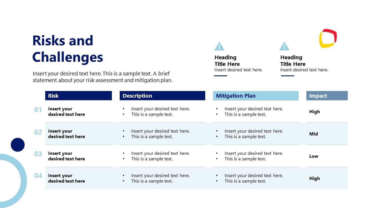
- Columns or Table: Create two or three columns titled “Risk,” “Risk Level,” and “Mitigation.”
- Bullet Points: If space is tight, list risks as bullets with sub-bullets for mitigations
Visual Cues
Use color coding (e.g., red for High risk, yellow for Medium, green for Low) to draw attention to risk levels. Incorporate icons (e.g., a warning triangle for risks, a shield for mitigations) to enhance readability or save time by working with risk PowerPoint templates.
This structure ensures your risk and mitigation slide is digestible and professional. For a live demo, reveal rows one by one to pace the discussion. If you’re sharing it in a report, ensure fonts are at least 18pt for legibility. Test it on different screens—a projector might wash out subtle colors, so stick to high-contrast schemes (e.g., black text on white, bold red for Critical risks).
Step 5: Visualize Data with a Risk Matrix
To make your slide stand out, integrate a risk matrix directly into the design. Place it alongside your risk list or on a dedicated follow-up slide. Use PowerPoint’s charting tools or shapes to create a grid, then plot your risks as dots or markers to make an engaging presentation slide.
For example:
- X-axis: Likelihood (Rare to Almost Certain).
- Y-axis: Impact (Negligible to Catastrophic).
- Plot points: “Regulatory Fine” might sit top-right (Critical), while “Minor Delay” sits bottom-left (Low).
Label each point with a number (e.g., R1, R2) tied to your risk list. This visual reinforces your analysis and breaks the monotony of text. Customize it—add gradients (green to red) or resize dots by severity. In a tech project, you might plot “API Failure” as High and “UI Glitch” as Medium, giving stakeholders a quick grasp of priorities. If your matrix feels cramped, use a 5×5 grid for granularity or a 3×3 for simplicity. The key is alignment—ensure your plotted risks match the risk levels in your table or list, avoiding discrepancies that could undermine trust.
Step 6: Tailor Mitigation Examples to Your Context
Generic mitigations can weaken your slide’s impact. Customize your risk mitigation examples to reflect your industry or project:
- Construction: Risk of weather delays mitigated by scheduling buffer weeks and securing indoor alternatives.
- Software Development: Risk of bugs mitigated by automated testing suites and phased rollouts.
- Marketing: Risk of campaign underperformance mitigated by A/B testing ad creatives and real-time analytics.
Contextual relevance shows you’ve done your homework. For a healthcare project, “patient data leak” might pair with “HIPAA-compliant encryption and staff audits.” In manufacturing, “machine breakdown” could link to “preventive maintenance schedules and spare parts inventory.” Don’t just list mitigations—explain their feasibility briefly in notes or verbally (e.g., “Buffer weeks worked in our last project, reducing delays by 20%”). This specificity turns your risks and mitigations slide into a tailored story, not a generic checklist.
Step 7: Integrate Risk Reports for Depth
If your presentation builds on existing risk reports, reference them subtly. Add a footnote: “Based on Q1 Risk Assessment Report” or a chart showing risk trends (e.g., “High risks dropped 30% since last quarter”). This ties your slide to a broader analysis without overwhelming viewers.
For example, in a quarterly update, you might include a mini-graph of risk frequency over time, sourced from your risk reports. Or mention, “Our mitigation for supplier delays aligns with findings from the 2024 Vendor Audit.” This context shows your slide isn’t a one-off—it’s part of a systematic approach. Keep it light—too much data here shifts focus from the slide’s core message.
Common Pitfalls to Avoid
Overloading with Too Many Risks
One of the deadliest sins is cramming your slide with an exhaustive list of risks—10, 15, or more—turning it into a wall of text that overwhelms rather than informs. Decision-makers don’t need to see every possible hiccup; they want the critical few that could truly derail your project. For instance, in a product launch presentation, listing “server crash,” “supplier delay,” “budget overrun,” “staff burnout,” “marketing flop,” “legal snag,” “customer backlash,” “tech glitch,” “weather delay,” and “competitor sabotage” buries the audience in noise. By the fifth item, they’ve tuned out.
Solution: Cap your list at 5-7 high-impact risks, prioritized by risk level. Use your risk matrix to filter out Low or Negligible risks unless they’re strategically relevant (e.g., a low-probability regulatory fine with catastrophic cost). If you must address more, move secondary risks to an appendix slide or verbal discussion.
Using Jargon Without Context
Technical terms like “scope creep,” “black swan event,” or “force majeure” might impress peers but alienate stakeholders unfamiliar with the lingo. Imagine presenting to a mixed audience—engineers get “scope creep,” but the CFO hears gibberish and loses trust. This disconnect muddies your risks and mitigations slide, making it feel elitist or unclear.
Solution: Spell out jargon in plain language. Instead of “scope creep,” say “unplanned feature additions that stretch timelines.” Pair “black swan event” with “rare, unpredictable disruption.” Keep it accessible—your slide isn’t a test of their vocabulary but a tool for shared understanding.
Skipping Prioritization
Listing risks in random order—say, alphabetically or by when they popped into your head—confuses urgency. If “Minor UI Bug” (Low) precedes “Data Breach” (Critical), your audience might misjudge what matters most. This lack of hierarchy weakens the slide’s ability to guide decision-making, a core purpose of how to present risks in PowerPoint.
Solution: Order risks by risk level (Critical to Low) or impact, using your risk matrix as a guide. Visually reinforce this with size or color—Critical risks in bold red, Low in smaller gray font. For example, “Server Failure (High)” tops the list, while “Printer Jam (Low)” sits at the bottom.
Inconsistent Formatting
A slide with mismatched fonts, erratic colors, or uneven spacing looks sloppy and distracts from the message. Picture a table where “Risk” is in Arial 20pt, “Risk Level” in Calibri 16pt, and “Mitigation” in Times New Roman 12pt—your audience spends more time decoding the design than the content. This undermines the professionalism of your risk and mitigation slide.
Solution: Standardize—pick one font (e.g., Calibri), a readable size (18-24pt), and a cohesive color scheme (e.g., red-yellow-green for risk levels). Use templates or grids in PowerPoint to align elements. Consistency signals attention to detail, boosting trust.
Underestimating Mitigation Feasibility
Listing ambitious mitigations without evidence of practicality invites doubt. Claiming “Hire 50 new staff” to mitigate “Resource Shortage” sounds great until someone asks, “In this labor market?” Unrealistic plans weaken your risk and mitigation credibility.
Solution: Ground mitigations in reality—cite resources, timelines, or past success. For “Resource Shortage,” try “Cross-train existing staff within 30 days, proven in Q2 pilot.” If unsure, admit it: “Exploring vendor partnerships, details by next review.” Transparency beats bravado.
Omitting a Call to Action
Ending your slide with just risks and mitigations, without guiding next steps, leaves the audience hanging. They might wonder, “Okay, now what?” This gap can stall decisions, especially in risk reports needing approval or input.
Solution: Add a subtle prompt—e.g., “Recommend budget approval for contingency fund” or “Request feedback on mitigation priorities by Friday.” Tie it to your risk level priorities to keep momentum.
Recommended Risk and Mitigation PPT Templates
In this section, we list down our selection of risk and mitigation PowerPoint templates. All designs included are 100% editable with any PowerPoint version and can also be used as Google Slides templates.
1. Risk Assessment Matrix PPT Template
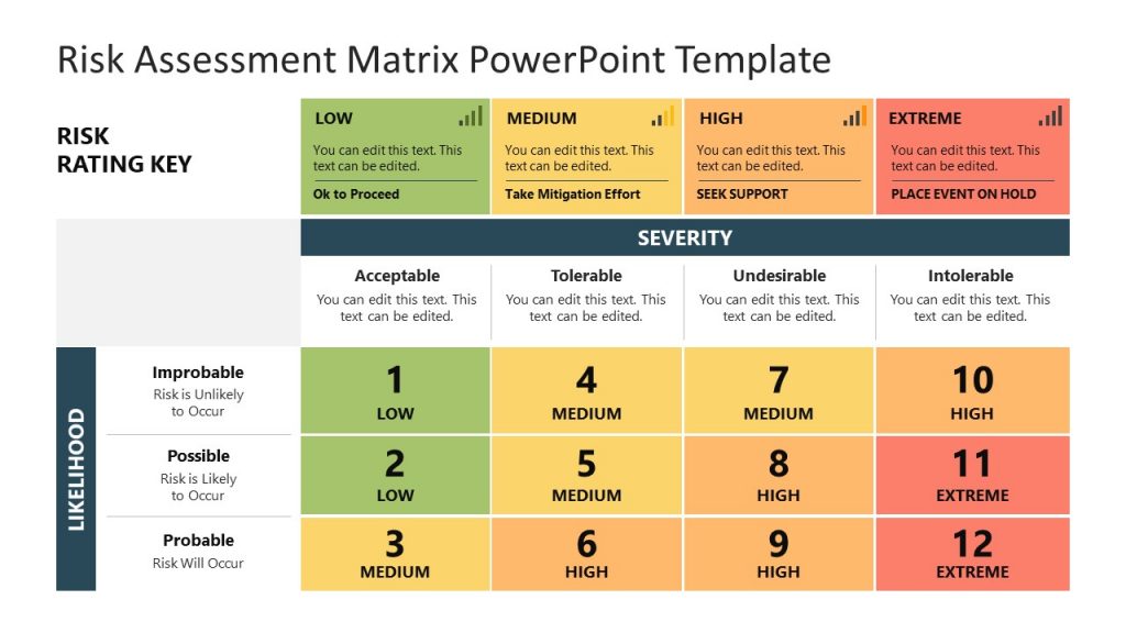
The Risk Assessment Matrix PowerPoint template is a 3×4 grid that evaluates risks by likelihood (Improbable, Possible, Probable) and severity (Acceptable, Tolerable, Undesirable, and Intolerable). It assigns numerical ratings from 1 to 12, color-coded as Low (green), Medium (yellow), High (orange), and Extreme (red). A risk rating key at the top suggests actions: “Ok to Proceed” for Low, “Take Mitigation Effort” for Medium, “Seek Support” for High, and “Place Event on Hold” for Extreme. This risk assessment PPT template is ideal for project management, safety planning, or business risk analysis, helping teams prioritize and address risks effectively.
2. Risk and Mitigation Analysis Diagram PPT Template
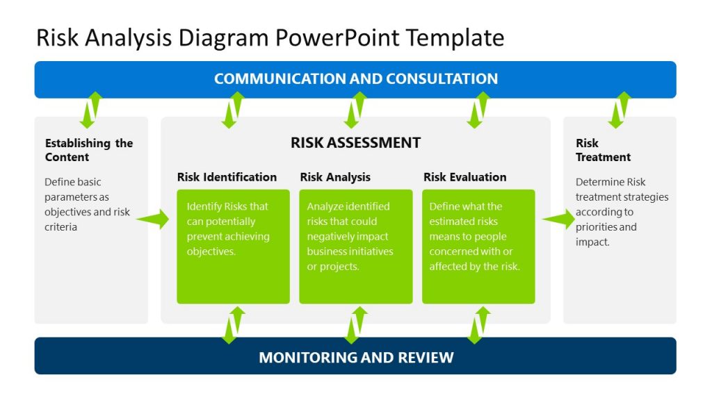
This risk and mitigation PowerPoint template outlines a five-step risk management process: Establishing the Context, Risk Identification, Risk Analysis, Risk Evaluation, and Risk Treatment. It emphasizes Communication and Consultation throughout, with Monitoring and Review at the base. Each step is color-coded in green, with arrows showing the workflow. This slide layout is useful for project managers, safety officers, or business leaders to identify, assess, and mitigate risks systematically. It can be applied in project planning, operational risk management, or strategic decision-making, ensuring teams address potential issues proactively while maintaining stakeholder engagement and continuous oversight.
3. Quarterly Report Risk and Mitigation PowerPoint Template
Our Quarterly Report PowerPoint Template is a structured tool for presenting business performance, including financials and risks, to stakeholders. It supports risk identification by highlighting operational or financial challenges in quarterly data and analyzing their likelihood and impact using integrated charts. Risk evaluation prioritizes issues like revenue dips, while mitigation strategies—such as cost reduction or market expansion—are outlined in actionable slides. This risk and mitigation template for PowerPoint is ideal for executives during board meetings, ensuring clear communication of risks and solutions. Its editable design saves time, allowing focus on strategic risk management and stakeholder engagement.
4. 5x5 Risk Matrix PowerPoint Template
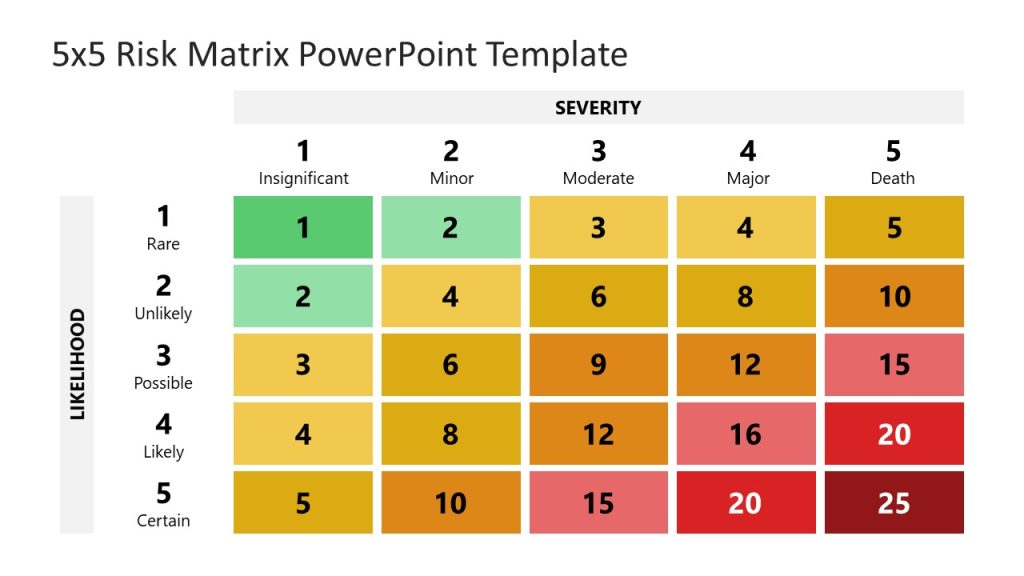
Our 5×5 Risk Matrix PowerPoint Template is a tool for assessing risks by plotting their likelihood and severity on a 5×5 grid, with ratings from Very Low to Very High. It supports risk identification by categorizing potential threats, analysis by evaluating their probability and impact, and evaluation by prioritizing risks using a color-coded system (green to red). Mitigation strategies can be developed by focusing on high-priority risks, such as resource allocation or contingency planning. Ideal for project managers or risk analysts, this editable risk template enhances presentations on risk management in industries like finance, IT, or construction, ensuring clear communication with stakeholders.
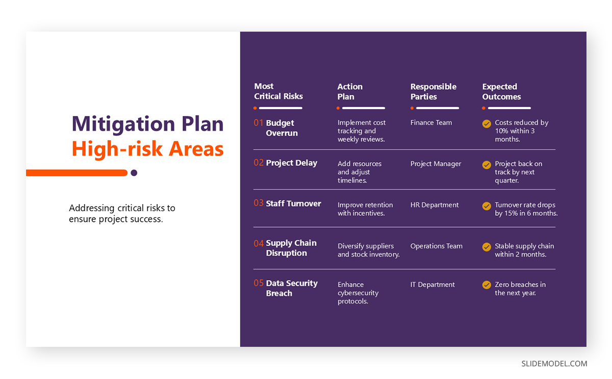
5. Mitigation Plan PowerPoint Template
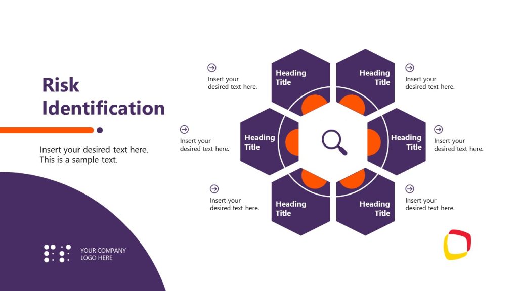
The Mitigation Plan Presentation Template is a visually engaging tool to outline risk management strategies. It supports risk identification through a hexagon diagram, categorizing risks by type, followed by analysis using a key assessment matrix to evaluate severity. Risk evaluation prioritizes risks, while mitigation strategies—accept, avoid, control, transfer, or monitor—are detailed in dedicated slides with charts. Ideal for corporate or government professionals, this editable risk and mitigation template aids in presenting risk mitigation plans during executive sessions, ensuring proactive handling of threats like financial or operational risks, with a focus on clear communication and strategic planning.
FAQs
Can I use a pie chart instead of a risk matrix for my slide?
While a pie chart can visually represent proportions, it’s not ideal for a risk and mitigation slide. It excels at showing static distributions—like budget allocations—but struggles to convey the dual dimensions of likelihood and impact critical to a risk matrix. For example, plotting “Server Crash” as 25% of a pie doesn’t clarify if it’s likely or severe. Stick to a matrix for precision; if you must use a pie chart, limit it to summarizing mitigated vs. active risks in a follow-up slide.
How do I handle confidential risks on a slide without exposing sensitive details?
Confidentiality is tricky when presenting to mixed audiences. Use generic placeholders like “Operational Challenge” or “Strategic Concern” instead of “Pending Lawsuit” or “Trade Secret Leak.” For a cybersecurity project, you might list “System Vulnerability” rather than “Unpatched Firewall Exploit.” Reserve specifics for verbal elaboration with trusted stakeholders or a separate, restricted risk report. This keeps your slide professional while protecting sensitive data.
Should I include mitigated risks that are now resolved on my slide?
It depends on your goal. Including resolved risks—like “Vendor Dispute: Settled via new contract”—can showcase your team’s effectiveness, reinforcing trust in your risk mitigation strategies examples. In a quarterly update, this proves progress. However, if space is tight or the audience wants only active threats, skip them or move them to a “Wins” slide. Don’t clutter your core risks and mitigations slide with history unless it adds strategic value.
Is it okay to use screenshots of risk software directly on my slide?
Yes, but simplify ruthlessly. A raw screenshot from tools like Jira or RiskWatch might overwhelm with menus and tiny text. Crop it to highlight key data—like a risk matrix or priority list—and enlarge critical sections. For a construction update, zoom in on “Equipment Failure” stats, ditching irrelevant tabs. Annotate with arrows or circles if needed. The goal is clarity, not a software demo—keep it tied to your risks and mitigations slide narrative.
Should I include risk owners on the slide to assign accountability?
Yes, if accountability drives action—add a “Owner” column like “J. Smith” or “IT Team” next to each risk. In a merger presentation, “Integration Delay: High, mitigated by phased rollout, owned by Ops Lead” clarifies who’s on point. It’s vital for risk reports with distributed teams. But skip it if owners are obvious (e.g., solo presenter) or sensitive (e.g., naming execs risks blame games). Keep it functional, not punitive.
Conclusion
Crafting a risk and mitigation slide is an art that combines strategic thinking, data visualization, and concise communication. By identifying risks, assessing their risk level with a risk matrix, pairing them with tailored mitigations, and presenting them effectively in PowerPoint, you create a slide that informs and persuades. Whether for risk reports or standalone updates, this approach ensures your audience walks away confident in your ability to navigate uncertainty.