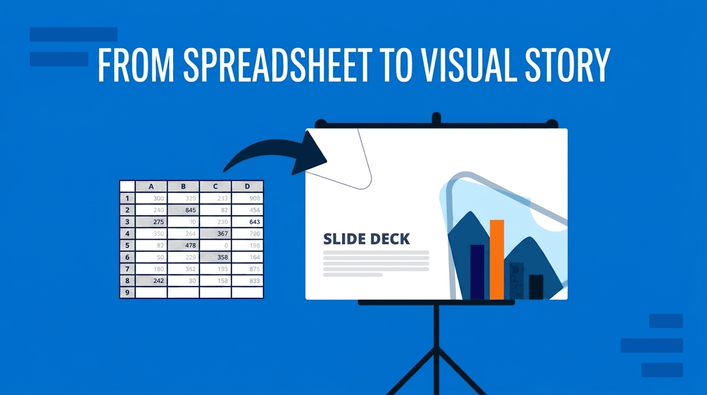
You have a spreadsheet, like sales numbers, survey results, KPIs, a financial model, and you need to present it so people actually get the point, instead of drowning them in cells. The instinct is to copy the sheet onto a slide and talk through it. That is exactly what makes an audience glaze over. This guide gives you a repeatable, five-step method for turning raw spreadsheet data into a visual story your audience follows, remembers, and acts on.
Key Takeaways
- A spreadsheet is built for exploring data; a presentation is built for explaining it — the two need different formats.
- Start from the message, not the data: decide the one thing each slide should make the audience understand.
- Reduce the raw sheet to only the rows and columns that support that message before you visualize anything.
- Match the visual to the message — a trend wants a line chart, a headline result wants one big number.
- Show one message per slide, strip the clutter, and use a takeaway headline so the point is unmissable.
Why You Can’t Just Paste the Spreadsheet in a Presentation?
A spreadsheet is built for exploring data; a presentation is built for explaining it. Those are two different jobs. In a spreadsheet you keep every row and column because you might need any of them. On a slide, every extra number competes with your point and makes it harder to find.
Data-visualization expert Cole Nussbaumer Knaflic (author of Storytelling with Data book) calls this the difference between exploratory and explanatory analysis. Exploratory is the messy work of finding what is interesting in the data (that belongs in the spreadsheet), while explanatory is showing your audience the specific thing you found (that belongs on the slide). When you paste the whole sheet into the slide, you hand the audience your exploratory work and ask them to do the explaining themselves. Most won’t.
The fix is a deliberate translation from one to the other. That is what the method below does: it takes you from a wall of cells to a slide that says one clear thing.
The Spreadsheet-to-Story Method
The Spreadsheet-to-Story Method is five steps that move you from raw data to a finished, presentable story. Run every dataset through them in order.
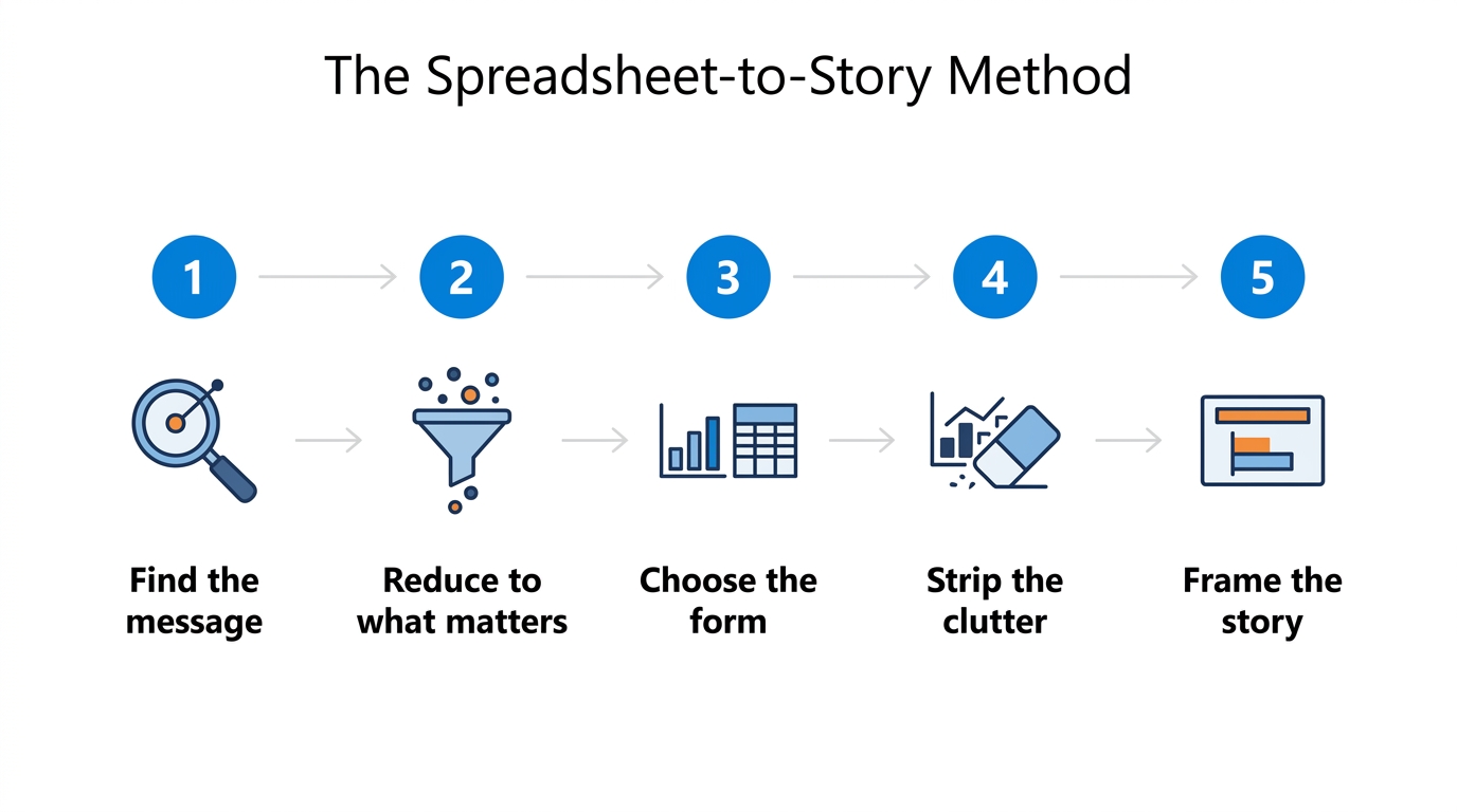
- Find the message — decide the single takeaway.
- Reduce to what matters — cut the data down to what supports it.
- Choose the form — pick the chart, table, or number that shows it best.
- Strip the clutter — remove everything that isn’t the point.
- Frame the story — add a takeaway headline and sequence your slides.
The rest of this guide walks through each step.
Step 1: Find the Message
Before you open any chart template or tool, answer one question: what is the single thing this data should make my audience understand? Not “here is the Q3 sales data” (that is a topic, not a message). A message is “Q3 sales grew 18%, driven almost entirely by the new enterprise plan.”
A useful test is to finish the sentence “The point of this slide is that…” out loud. If you can’t finish it in one clear statement, you are not ready to build the slide (you are still exploring). Each slide should carry exactly one message. Remember to follow one topic per slide. If your data supports three insights, that is three slides, not one crowded one.
This is the heart of data storytelling, and it is worth understanding the mindset before you design anything. For the broader principles of why narrative makes data stick, see our guide on data storytelling.
Step 2: Reduce to What Matters
Once you know the message, most of your spreadsheet becomes irrelevant (and that is a good thing). This is the step almost everyone skips, and it is where the real transformation happens: you cut the data down to only the rows and columns that support your point, ultimately, turning a spreadsheet into a visual story.
Practical ways to reduce:
- Filter to the relevant rows. Presenting this quarter’s results? Drop the other three quarters unless the comparison is the point.
- Aggregate detail into totals. Forty product SKUs become five categories. Daily figures become monthly. The audience needs the pattern, not every data point.
- Cut supporting columns. Keep the one or two metrics that carry the message; move the rest to an appendix or backup slide.
- Round the numbers. “$1.8M” lands faster than “$1,834,271.44,” and no one in the room is auditing your slide. This is especially useful when presenting KPI slides.
If a number does not help the audience understand your message, it does not belong on the slide. Reducing is not dumbing down, and it will respect your audience’s attention.
Step 3: Choose the Form
Now decide how to show what’s left. The form should follow the message (and not your habit of always reaching for a bar chart or line chart). Start from what your message is about, then pick the visual that shows that relationship most directly.
| Your message is about… | Best form |
|---|---|
| A trend or change over time | Line chart |
| A comparison between items | Bar or column chart |
| Parts of a whole | Stacked bar or donut chart |
| A relationship between two variables | Scatter plot |
| A single headline result | One big number |
| Precise values people need to look up | Table |
A few forms are easy to underuse. One big number (“18% growth” set large on a clean slide) is often the most powerful choice for a headline result. And a table presentation is the right call when the audience genuinely needs to read exact values or compare across several dimensions.
For a deeper decision framework across every chart family, see our guide to choosing the right chart, and browse worked examples in our data presentation types guide.
Step 4: Strip the Clutter
Default charts arrive cluttered. Every gridline, border, and stray label is visual noise that competes with your message. Edward Tufte’s principle of the data-ink ratio is the guide here: maximize the ink that shows real data, and remove the rest.
Run every chart through this checklist:
- Remove gridlines, or fade them to a light gray.
- Delete the chart border and background fill.
- Drop the legend if you can label the data directly.
- Cut decimal places the audience won’t use.
- Remove 3-D effects, shadows, and gradients entirely.
- Label the data points that matter instead of every one.
The goal, as dashboard-design expert Stephen Few argues, is that nothing on the slide is there for decoration. Every element earns its place in the visual hierarchy by helping the audience understand the data. When you strip the clutter, the signal you worked to find in Steps 1 and 2 finally stands out.
Step 5: Frame the Story
A clean chart still isn’t a story. The final step frames it so the audience can’t miss the point.
- Write a takeaway headline. State the takeaway, not the topic. “Enterprise plan drove 80% of Q3 growth” beats “Q3 Sales by Product Line.” The headline does the interpreting so the audience doesn’t have to.
- Use one highlight color. Make everything neutral gray except the one bar, line, or number that carries your message. Color is how you point without a laser pointer, and one of the presentation techniques you can use in your favor here.
- Annotate the insight. A short callout “new plan launched here” turns a chart into an explanation.
- Sequence your slides into an arc. Set up the context, reveal the insight, then show what it means or what to do next. One message per slide, building toward a conclusion.
For narrative structures you can borrow to sequence a full deck, see our guide to storytelling techniques.
Getting Your Data into PowerPoint
Once you know what to show, getting it onto the slide is the easy part. You can paste your spreadsheet data as a native table, paste it as a picture, or link it so it updates when the source file changes. For the full walkthrough of each method, see our guide on how to insert an Excel sheet into PowerPoint.
To speed up Steps 1 and 2, presentation AI tools can help you summarize a large spreadsheet or suggest which cut of the data is most interesting before you build anything (a useful starting point, though the judgment about your message stays yours). And to skip the formatting work in Steps 3 and 4, start from professionally designed data and chart templates that are already decluttered and on-brand.
Common Mistakes
- Pasting the whole spreadsheet. The number-one error (it hands the audience your exploratory work).
- One slide, many messages. If a slide needs three charts, it needs three slides.
- Decoration over clarity. 3D pie charts, fancy styles and gradients may not impress the audience and hide the data.
- A topic headline instead of a takeaway. “Revenue” tells the audience nothing; “Revenue doubled after launch” tells them everything.
- Rainbow color. Coloring every category equally means nothing stands out. Highlight one thing at a time.
Frequently Asked Questions
How do you turn spreadsheet data into a presentation?
Decide the single message the data supports, reduce the spreadsheet to only the rows and columns that back it up, choose the visual that shows that message best (a chart, a table, or one big number), strip away clutter, and add a takeaway headline. Show one message per slide.
How much data should one slide?
One message. A slide can contain a chart with many data points, but it should make a single point. If you are explaining more than one insight, split it across multiple slides rather than crowding everything onto one.
Should I use a table or a chart to present data?
Use a chart when your message is about a pattern (a trend, comparison, or proportion) because charts show relationships at a glance. Use a table when the audience needs to read or compare exact values across several dimensions. When in doubt, a chart usually communicates faster.
How do you present a lot of data without overwhelming people?
Aggregate detail into totals or categories, show the summary on the slide, and move the granular data to an appendix or backup slides. Reveal information progressively across slides instead of all at once, and highlight only the numbers that matter to your message.
How do you present Microsoft Excel or Google Sheets data effectively?
The tool doesn’t change the method: find your message, reduce the data, choose the right visual, strip the clutter, and frame it with a takeaway headline. Excel and Google Sheets both let you paste data as an editable table, a picture, or a linked object once you know what to show.
Final Words
The difference between a data dump and a data story is not the tool or the chart type (it is the decision about what you are trying to say). Run your spreadsheet through the five steps every time: find the message, reduce to what matters, choose the form, strip the clutter, and frame the story. Do that, and your audience stops squinting at cells and starts nodding at your point. When you are ready to build, start from SlideModel’s data and chart templates or generate a first draft with the AI Presentation Maker.