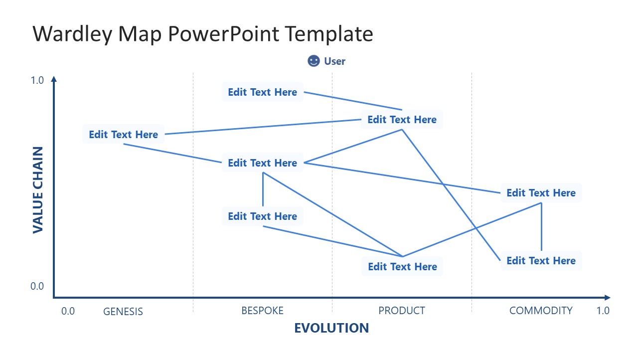
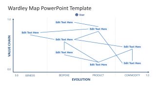
Wardley Map PowerPoint Template
Map your organization’s value chain against the evolutionary stages of its individual components with our editable Wardley Map PowerPoint Template. A Wardley map is a strategic business intelligence technique developed by Simon Wardley that tells about business components, decision-making, and market maturity. This helps stakeholders identify the capability gaps, investment priorities, and market dependencies in a single view in decision-making presentations. The main purpose of a Wardley map is to identify who our customers are and what they need from us. The value chain depends on multiple factors that collectively contribute to customer satisfaction and business success. All the components move through four evolutionary stages:
- Genesis: New, uncertain, and unique idea that’s completely new in the market.
- Custom Built (Bespoke): Understanding the situation more and customizing the idea for the specific use case.
- Product: The idea is available in the market as a defined product or service
- Commodity: The product or service is more of a utility than a simple product, i.e., a ubiquitous solution
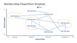
The Wardley Map PowerPoint Template comprises two slides, each with the same two-axis chart, featuring components such as a value chain, user needs, and evolution stages. The horizontal axis represents the evolution of components (Genesis, Bespoke, Product, Commodity), while the vertical axis shows the value chain. Chief strategy officers use the structured canvas to map capabilities from genesis to commodity. This helps stakeholders see competitive positioning and analyze build-versus-buy decisions effectively. Product developers at a SaaS company in their client presentations use the Wardley map to discuss the genesis position of their AI feature. Thus, suggesting the case for continued R&D investment.
Additionally, you can easily adjust the nodes, lines, and axes drawn on the slide to communicate your ideas effectively. Moreover, we allow users to modify colors and other PPT elements as needed. Download the Wardey map PPT template for presentation and bring clarity to your capability planning and competitive positioning conversations.

You must be logged in to download this file.
DOWNLOAD- Category
- Data & Charts
- Rating

 Loading...
- Size
- 16x9
- Item ID
- 94201-01
- Colors
Subscribe today and get immediate
access to download our PowerPoint templates.