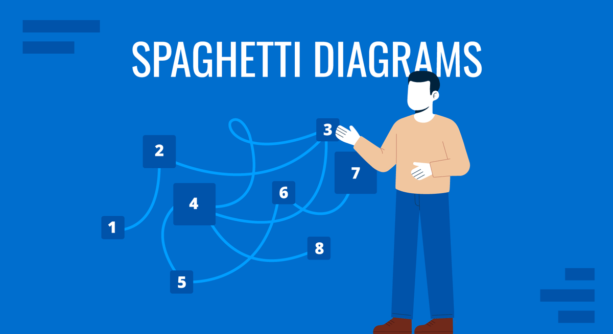
A spaghetti diagram maps the physical movement of people, materials, or information across a workspace by drawing lines that trace each path taken during a process. The name comes from what the finished diagram typically looks like: a tangle of overlapping lines resembling pasta in a bowl. Despite the visual chaos, that tangle is the point. It reveals exactly how much unnecessary movement exists in a workflow and where the real inefficiencies are hiding.
For business and operations professionals, spaghetti diagrams occupy a specific but valuable role in process analysis. They are not used to explain a concept or model a system abstractly. They record what actually happens on the floor, in the office, or in the clinical setting, and make inefficiencies visible in a way that spreadsheets and narrative reports rarely can.
What Is a Spaghetti Diagram?
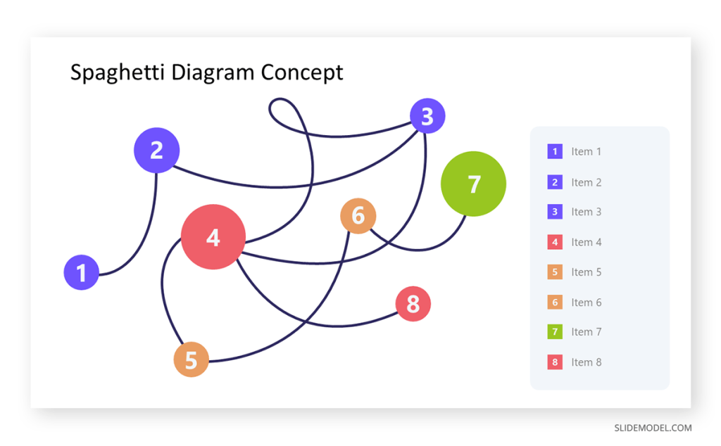
A spaghetti diagram is a visual tool rooted in lean manufacturing, originally used to document the physical paths that workers and materials take during production. The method is straightforward: begin with a floor plan or layout of the space, then draw lines that follow the observed movement. Each pass through an area adds a new line. Over time, the diagram fills with overlapping paths that expose redundant back-and-forth motion, long travel distances, and bottlenecks that no one had formally acknowledged.
The technique requires direct observation rather than assumption. An analyst or team member follows a person, item, or document through its entire process and records the path taken, not the path intended. This distinction matters because planned workflows rarely match what happens in practice. Equipment may be placed inconveniently, steps occur out of sequence, or shared resources create detours. A spaghetti diagram captures these deviations as visual evidence, making them far harder to dismiss during a process review.
In terms of what the diagram encodes, the number of line crossings indicates how often different process paths interfere with each other. The total cumulative length reflects the overall travel distance. Dense clusters reveal areas of concentrated movement, while zones with few lines may indicate underused space or misplaced resources. Each of these variables has direct implications for the redesign of the workspace or routing logic.
Where and How Spaghetti Diagrams Are Used
Spaghetti diagrams appear in a range of professional contexts wherever physical movement or information routing contributes to process inefficiency. Manufacturing and logistics environments were the original domain, where reducing unnecessary floor movement directly cuts labor costs and cycle time. Healthcare facilities have adopted methods to map how nurses, physicians, and patients move through wards or emergency departments, often discovering that clinicians spend a significant share of their shifts traveling rather than providing direct care. Office environments use them to trace how documents, approvals, or physical items move between desks and departments before a task is completed.
In presentations, spaghetti diagrams are most effective in process improvement proposals and operational reviews. When incorporated into a process improvement plan, a before-and-after pair of diagrams builds a compelling visual argument for a proposed change. A tangled pre-improvement diagram followed by a cleaner post-redesign version communicates the impact of rearranging workstations or changing routing rules more clearly than any table of metrics. Executive audiences who may resist detailed data often respond quickly to the visual contrast between the two states.
Lean management programs, including methodologies grounded in kata for lean management, regularly incorporate spaghetti diagrams as part of the current-state analysis. The diagram provides a shared reference point for cross-functional teams discussing where waste occurs, and it pairs naturally with value stream maps and time-motion studies. For teams preparing this type of analysis for a slide deck, the 8-item spaghetti diagram slide template provides a structured starting point in PowerPoint.
Practical Examples
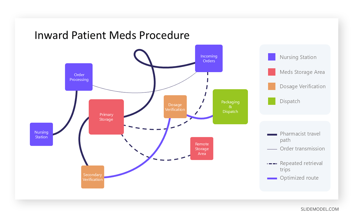
Consider a hospital pharmacy preparing medications for inpatient wards. Staff receive orders from nursing stations, retrieve medication from storage, verify dosage, package, and dispatch. A spaghetti diagram of this workflow might reveal that pharmacists walk back and forth between the order station and the storage area dozens of times per hour because frequently requested medications are stored far from the order-processing area. The visual evidence supports a straightforward fix: relocating the most-used medications to a position adjacent to the order station reduces travel distance and frees up time for higher-value tasks.
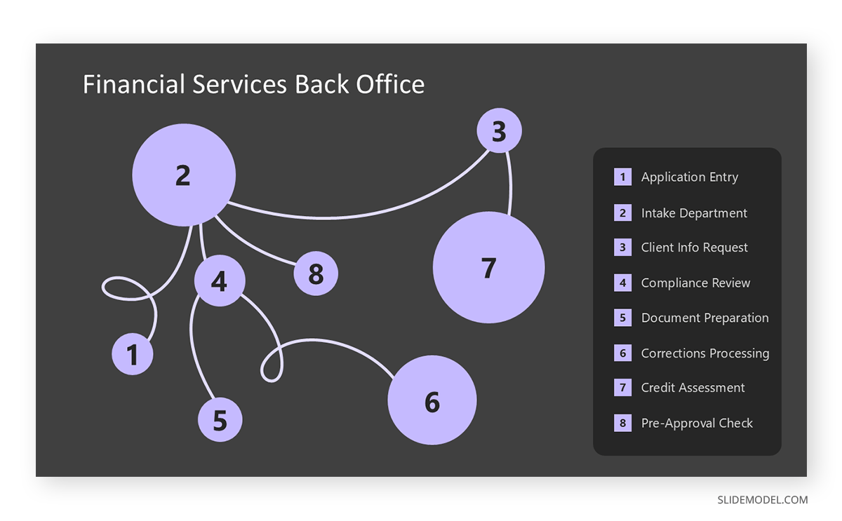
In a financial services back office, document routing offers a comparable use case. A loan application might travel from intake to compliance review, then back to intake for additional information, then forward to credit assessment, and back again for corrections. Drawing this path for a representative sample of applications often exposes approval bottlenecks that no one has formally mapped. Presenting this diagram in a workflow redesign meeting gives every stakeholder a shared, concrete picture of where delays originate and what a realigned process would need to address.
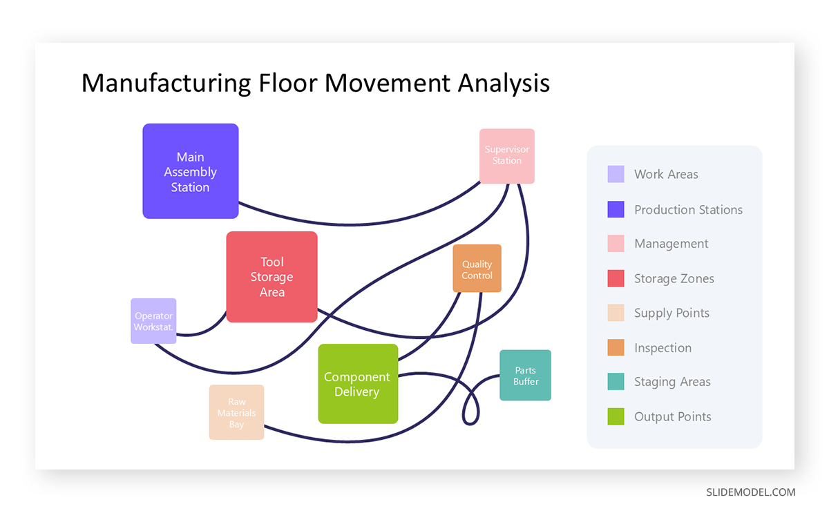
Manufacturing environments offer perhaps the most direct application. A production line where operators routinely walk long distances to retrieve tools, consult supervisors, or deliver components may look functional on paper but reveals significant accumulated inefficiency when drawn as a spaghetti diagram. The cumulative distance covered in a single shift often surprises management teams and provides clear justification for redesigning the physical layout.
Alternatives to Spaghetti Diagrams
Spaghetti diagrams work well when movement is the central variable, but other visualization methods handle different kinds of complexity more effectively. For teams running quality failure analysis, FMEA (Failure Mode and Effects Analysis) addresses the consequences of process failures rather than movement patterns. For grouping and categorizing qualitative observations from multiple team members, affinity diagrams offer a more suitable structure. The right tool depends on whether the question concerns movement, failure risk, or idea organization.
When the data involves repeated measurements across many individuals over time, the term “spaghetti plot” takes on an entirely different meaning. In statistics, a spaghetti plot displays each subject’s trajectory as a separate line across time. With large datasets, these lines overlap, making the chart unreadable. Lasagna plots address this limitation directly. Introduced in a 2010 paper in the journal Epidemiology, lasagna plots assign each subject a horizontal row and use color intensity to encode outcome values rather than vertical position. The result is a layered, heatmap-style chart that preserves individual-level data without the visual clutter from overlapping lines. Lasagna plots are particularly well-suited to longitudinal studies with missing data, since missing values simply appear as the background color, eliminating the need for special handling. For researchers or analysts presenting cohort data in academic or clinical settings, the lasagna plot is a useful and underused alternative worth considering.
Final Words
A spaghetti diagram does something few analytical tools manage: it makes the invisible visible. Wasted movement, inefficient routing, and congested workspaces exist in most organizations, but they rarely appear in reports or dashboards. Tracing actual paths and placing them on a layout diagram converts lived experience into documented evidence, which changes how teams and decision-makers engage with a problem. Used in the right presentation context, particularly alongside before-and-after comparisons or improvement proposals, a spaghetti diagram can be one of the most persuasive visual tools available for operations and process work.