Upward Curves for PowerPoint
Produce quality presentations with Upward Curves for PowerPoint and its stunning visuals. The PowerPoint template is in a cool color scheme and neat layout. It is a simple and comprehensive tool. The diagram minimizes textual content which makes the presentation entertaining. This way, the user can capture the audience’s attention and make them engaged to the discussion.
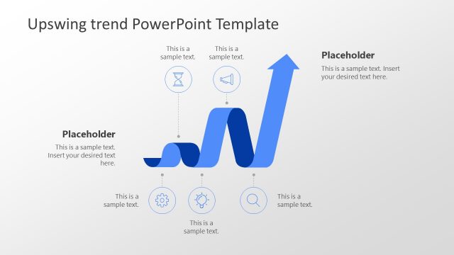
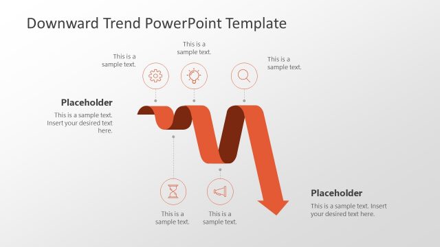
The PowerPoint template is ideal for representing increasing trends. It has a collection of an upward slope in different steepness. This can be used literally to display frequencies. It can be used to illustrate a linear graph with an increasing value. It is of a generic design. Any information that constructs an upward trending curve can be applied to this particular Office template. The graph can be personalized by the user through PowerPoint shapes menu. Features such as the text placeholders, colors and fonts can be modified. The presenter can opt to copy and paste the objects to supplement a bigger report.
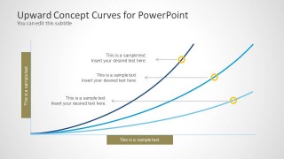
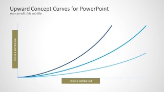
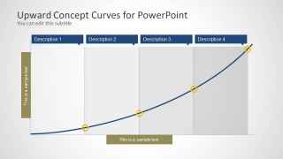
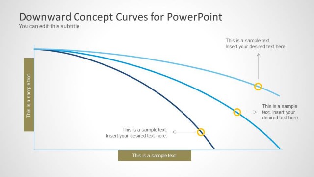
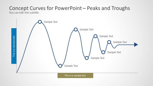
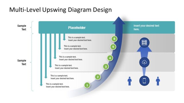
In the first slide, there are 3 curves shown. Each has a variation of height and steepness. They have corresponding text boxes where the user can elaborate some details about the concept. The 2nd slide has a similar diagram, eliminating the text placeholders. The 3rd one divides the curve into 4 main points. They are namely Description 1, Description 2, Description 3, and Description 4. They are arranged in an ascending order from bottom to top. Finally, the last slide divides the entire graph into 4 parts with the same labels. The division creates a vertical grid against the trend.
Upward curves symbolize an increasing pace. It can metaphor concepts relative to progress, growth, innovation, among others. It can mean that the strategy or the business is getting stronger. It refers to positive change.
The powerful and efficient Upward Curves for PowerPoint can enhance any high standard presentation. Look into Curves and Lines PowerPoint Template from the SlideModel gallery.


