Statistics PowerPoint Templates & Presentation Slides
Download Statistics PPT templates and presentation slides to communicate statistics to an audience. Our 100% editable statistics templates are fully compatible with PowerPoint and Google Slides.
These attractive-looking Statistics Templates can help you prepare slides for presentations illustrating your data without complications. Check these statistics slide templates for PowerPoint presentations, including lines, graphs, icons, shapes, and other aesthetics to illustrate your slides with powerful graphics.
Featured Templates
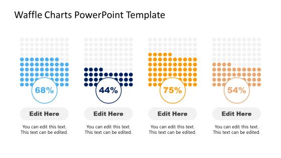
Waffle Charts PowerPoint Template

Statistical Bias PowerPoint Templates

Analytics Dashboard PowerPoint Template
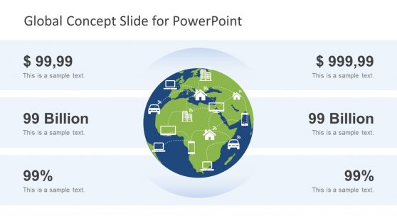
Global Concept Slide for PowerPoint
Latest Templates

Cross-Training PowerPoint Template

Medical Journal Club PowerPoint Template

Personal Executive Dashboard PowerPoint Template

Volleyball PowerPoint Template


Business Statistics Infographic Template for PowerPoint
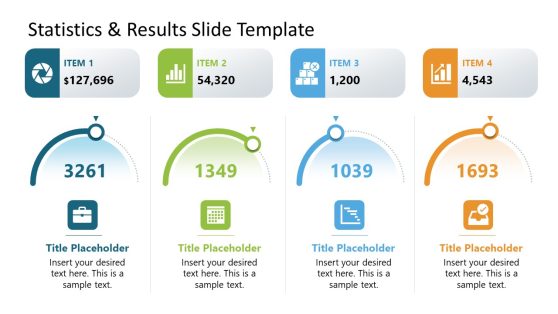
Statistics & Results PowerPoint Template

Social Media Analysis PowerPoint Template
Data Driven Fan Chart PowerPoint Template


Coronavirus Flattening the Curve PowerPoint Template

Long Tail PowerPoint Template
Whether you are a researcher, a business professional, an educator, or a student, these statistics templates for PowerPoint and Google slides are a great method for representing numbers. They feature bar graphs, pie charts, line plots, and scatter plots. You can pick the one that looks best for your project, customize its content, and complete a professional presentation in just minutes.
Additionally, these versatile presentation templates for statistics allow us to change their theme, regardless of whether you work in PowerPoint, Google Slides, or Apple Keynote. These time-saver tools for data representation are a must-have. Go through our extensive statistic template collection and complete your projects today!
What is a Stats Slide?
A “Stats Slide” is a slide within a presentation that visually presents statistical data, often in graphs, charts, tables, or other graphical representations. It conveys quantitative information, such as numbers, percentages, trends, comparisons, and other data-related insights, to the audience.
How do You Present Statistics in Slides?
To present statistics in slides effectively, follow these steps:
- Choose the right visuals, which include bar charts, line graphs, pie charts, and tables.
- Make it simple and focus your slide on the most relevant and important information; you don’t need to use all the data.
- Use clear labels and titles that convey the main message of the data.
- Explain the data by giving a piece of background information.
- Be consistent about the design theme throughout your presentation.
- Use your organization color(s) or thoughtfully choose color(s) to avoid excessive use of color that can distract from the main message.
- Avoid overwhelming the slide with too much text; use short, impactful bullet points to highlight key insights.
- Keep it Visually stunning.
- Make sure you cite sources where you get those statistics to maintain credibility.
What is the Purpose of a Statistics Slide?
The purpose of a statistics slide is to provide a clear and concise representation of complex data. It helps the presenter communicate key information quickly and effectively, making the data more understandable and memorable for the audience.
How to Show Statistics in PPT?
To show statistics in a PowerPoint (PPT) presentation:
- Create a new slide by clicking the “New Slide” button or pressing Ctrl + N.
- Select a slide layout that accommodates the statistics you want to present.
- If presenting numerical data, choose the “Chart or Graph” option, select the appropriate chart type (bar, line, pie, et cetera), and input your data into the chart.
- Customize the chart’s appearance, labels, colors, and other elements to make it stunning and informative.
- Add titles, labels, and necessary text to explain the data’s significance.
- Adjust fonts, colors, and layout as needed.
- Preview the slide to ensure the data is correctly presented and easily understood.
- Practice Delivery
Using statistics slides effectively can enhance your presentation by making complex data accessible and engaging to your audience.