Waffle Charts PowerPoint Template
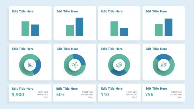
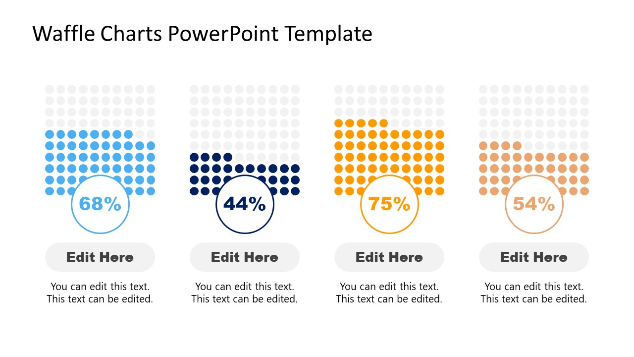
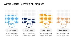
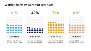
The Waffle Charts PowerPoint Template presents seven custom diagrams to present statistical data. As an alternative to the round-shaped pie chart, waffle chart (also known as square-ified pie) displays smaller color-coded units. It is purposed to showcase progress towards a target as completion percentage. The grid of colored cells represents a percentage. You can present more than one category or put together more than one waffle chart for multiple comparisons. A waffle chart usually consists of 100 small units arranged in 10-by-10 rows and columns. The PowerPoint template presents various bars, square, and circular layouts featuring the concept of waffle charts. Similar to a pie chart template, the waffle chart templates display colored portions, visualizing the percentage of different variables. These diagrams make the presentation engaging with impressive visuals and a clear comparison of portion size.
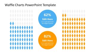
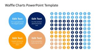
The Waffle Chart PowerPoint Template contains two diagram templates for 4 category comparisons. You can use slides with text on top or bottom of the waffle chart to present your information. These charts contain a block of 100 circular icons each with progress represented in different colors. Waffle chart templates include more diagrams and icons to enhance the visual representation of data. You can present gender statistics, for example, use two waffle charts slide with human silhouette icons. By using different colors, you can explain a survey on two types of human groups.
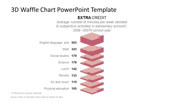
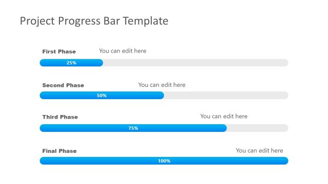
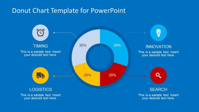
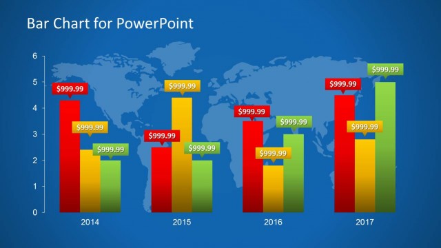
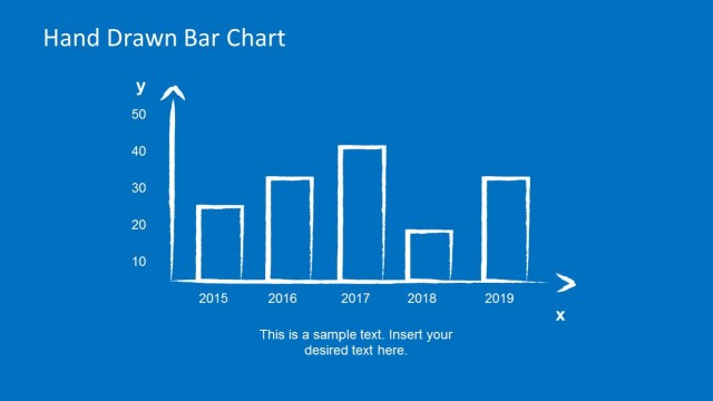
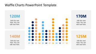
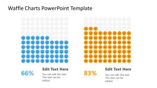
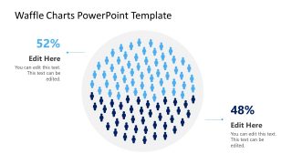
You can present an annual report of progress using the bar chart template design of the Waffle chart template. This template can be a good addition to reporting dashboard templates. You can group and resize the chart to manage space n dashboard slides. There is another waffle chart design with layers of squares. The circular diagram on the other hand is a presentation of population data. You can apply more colors to discuss more than two target market analysis strategies. For more information, we have created an article about data presentations.


You must be logged in to download this file.
DOWNLOAD- Category
- Data & Charts
- Rating


 Loading...
- Size
- 16x9
- Item ID
- 21147-01
- Colors
Subscribe today and get immediate
access to download our PowerPoint templates.