Donut Chart Templates for PowerPoint
Start every data-driven presentation with slides that do more than show numbers, they tell a story. Our donut chart PowerPoint templates are designed to turn raw metrics into clean, compelling visuals. Whether you’re reporting marketing KPIs, showing budget allocations, or comparing departmental performance, these slides are designed to help you communicate your message more effectively and efficiently.
With professional layouts and fully editable elements, you can present data in a way that resonates across teams and stakeholders.
Featured Templates
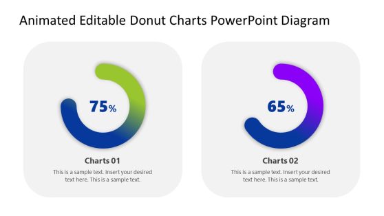
Animated Editable Donut Charts PowerPoint Diagram
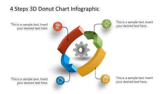
4 Stages 3D Donut Chart Infographic
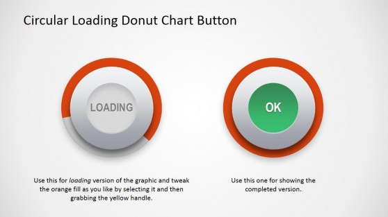
Circular Donut Chart Button for PowerPoint
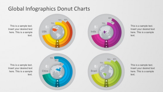
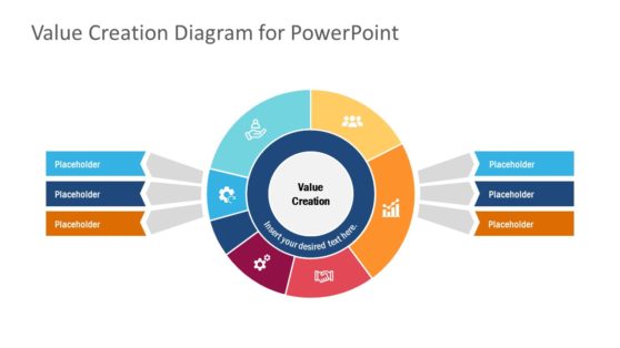
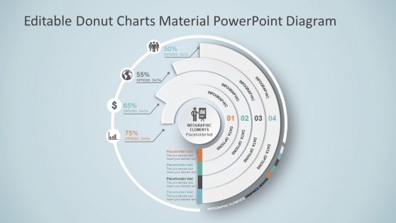
Global Infographics Donut Chart
Latest Templates
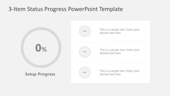
3-Item Status Progress PowerPoint Template
Financial Chart Slides PowerPoint Template

Ultimate Business Pitch Deck PowerPoint Template
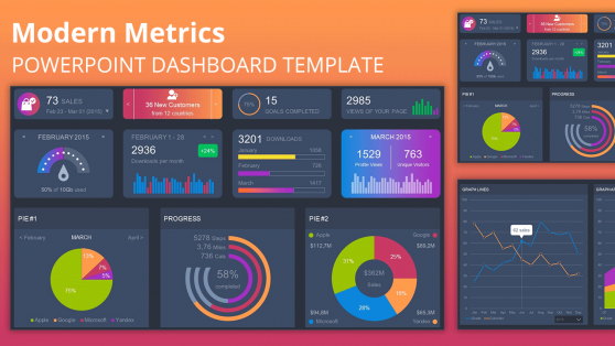
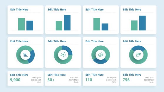
Modern Metrics PowerPoint Dashboard
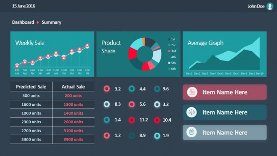
Flat Sales Dashboard PowerPoint Templates
What are Donut Chart PowerPoint Templates?
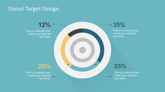
Donut charts simplify the way we communicate portions, ratios, and part-to-whole relationships. Unlike traditional pie charts, their center ring creates space for annotations or key figures, making them a versatile choice for corporate, academic, or strategic presentations.
Each donut chart PPT template in our collection is tailored for presenters who want to highlight segmentation or contribution in a visually engaging format.
Built for Business, Analytics, Marketing, and Beyond
Our donut PPT templates are used across industries. In sales, these visuals show revenue breakdowns, customer segments, or quota performance. Marketing teams use them to present campaign ROI, demographic splits, or web traffic sources. Finance professionals rely on the donut chart in PPT layouts for expense distribution, budget allocation, and margin comparisons.
For HR, donut presentation templates visualize headcount distribution, training completion rates, and departmental representation. Product teams display feature usage or survey results in client decks. Analysts and consultants use the structure to show comparative ratios or process distributions in stakeholder briefings.
Because they work for part-to-whole visuals, the use cases extend to education, healthcare, retail, and logistics. Teachers present test score breakdowns. Hospital admins use them for patient demographics or departmental load. Retail teams track store revenue share. Operations leaders highlight warehouse output by location. Wherever proportions matter, donut charts deliver.
Because templates are editable, these same slides can be reused across departments, campaigns, or reporting cycles. Users can modify labels, values, and chart series without affecting the layout, allowing for the standardization of reporting visuals across organizations.
Data-Focused Customization That Saves Time
Each donut chart template is designed for fast editing. Charts are linked to editable data fields so that once you enter figures, the visual adjusts accordingly. You can label sections, resize elements, adjust legends, or add descriptive callouts to enhance clarity. Multi-series donut slides enable you to display comparative metrics (e.g., Year 1 vs. Year 2) on a single canvas.
What makes a donut chart PPT template better than a pie chart?
A donut chart PPT template includes a center space for labels or percentages, offering better readability and visual hierarchy.
What can I include in a PowerPoint donut chart template?
You can input proportions for budgets, sales, customers, or any dataset representing part-to-whole relationships.
Can a donut chart template be used to show trends over time?
While primarily for static proportions, you can use multiple donuts across slides to simulate time-based comparisons.
Is a donut presentation appropriate for formal business settings?
Yes. Our donut presentation templates are designed with professional color palettes and clean formatting.
Are these donut PPT template files compatible with Google Slides?
Yes. You can upload and edit each donut PPT template in Google Slides without losing structure.
Can I adjust colors in a donut chart template to match my brand?
Yes. Each donut chart template allows full customization of colors, fonts, and chart elements.