Slide 2 of 4 from Supply & Demand Curve for PowerPoint
6072-02-concept-supply-demand-curves-2
Economic Supply & Demand Curve for PowerPoint
- Diagram
- Other
- Context Slide
- 16:9
- 100% Editable
The Economic Supply & Demand Curve slide from the Supply & Demand Curve for PowerPoint template offers a clear visual tool for illustrating market equilibrium. This slide template is ideal for economic presentations and business presentations focused on pricing strategies, featuring editable shapes and vector icons to customize supply and demand curves effectively.
What’s on This Slide
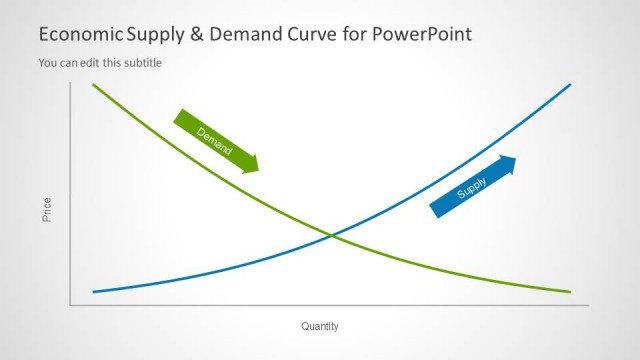
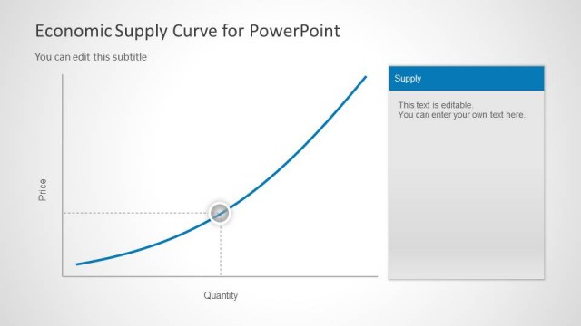
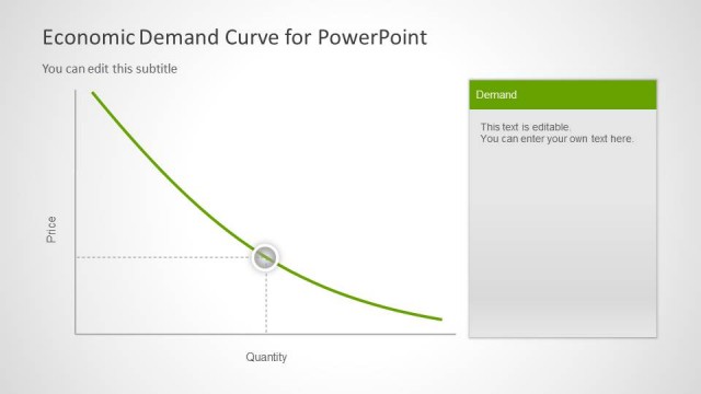
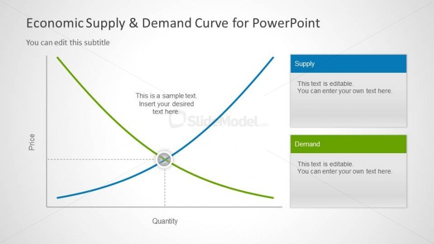
The layout features a supply and demand curve chart with two intersecting lines, one representing supply in blue and the other representing demand in green. The x-axis is labeled 'Quantity' while the y-axis is labeled 'Price'. A central point indicates equilibrium. To the right, there are two editable text boxes for 'Supply' and 'Demand', each with a colored header matching their respective curves. A subtitle placeholder is positioned above the chart, with a title placeholder at the top. The background is light with a subtle gradient.
How to Use It
This layout serves as a visual representation of supply and demand dynamics in economics. It fits well in presentations discussing market analysis, pricing strategies, or economic principles. It can be used to illustrate how changes in supply and demand affect market equilibrium. This slide is particularly useful in educational contexts or business meetings focused on market research and product development strategies.
Text Placeholders & Capacity
Keep your copy within these limits so it fits without resizing. Text boxes can accommodate multiple lines of text.
| Placeholder | Count | Max characters (approx.) |
|---|---|---|
| Slide title | 1 | 40 |
| Subtitle | 1 | 60 |
| Item heading | 2 | 30 |
| Item body | 2 | 50 |
Slide Keywords
Download unlimited PowerPoint templates, charts and graphics for your presentations with our annual plan.
DOWNLOADReturn to Supply & Demand Curve for PowerPoint.