Slide 1 of 4 from Supply & Demand Curve for PowerPoint
6072-02-concept-supply-demand-curves-1
Economic Supply & Demand Curve for PowerPoint
- Chart
- Other
- Concept Explanation Slide
- 16:9
- 100% Editable
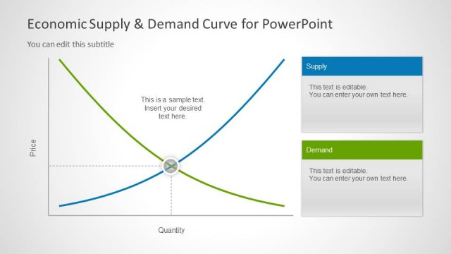
The Economic Supply & Demand Curve slide from the Supply & Demand Curve for PowerPoint template provides a clear visualization of market equilibrium using editable shapes and vector icons. Designed for economic presentations, this slide template effectively supports explanations of pricing strategies and market dynamics within business presentations and financial education contexts.
What’s on This Slide
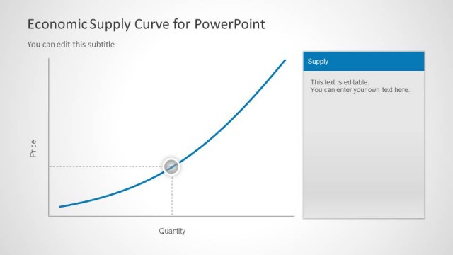
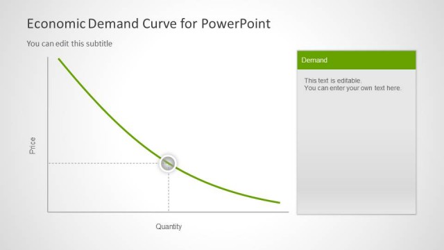
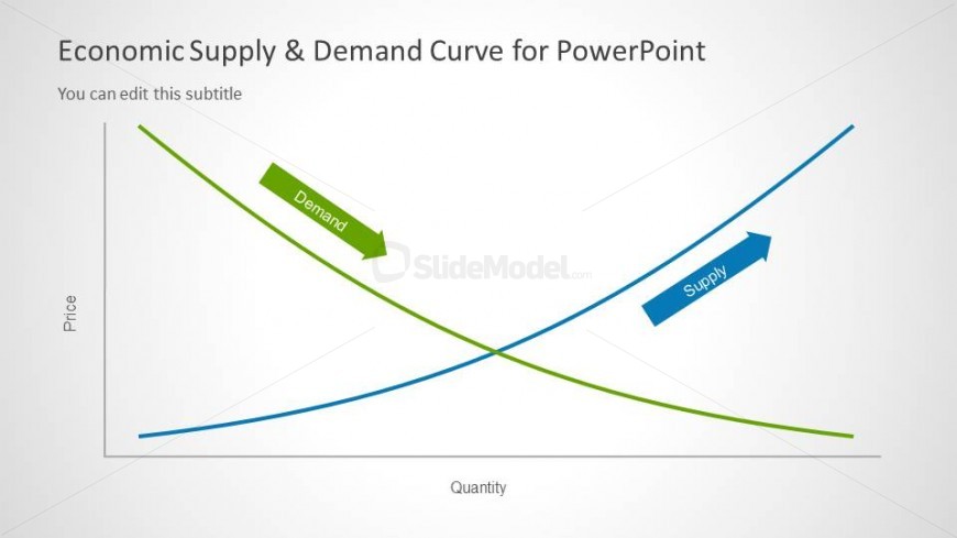
The slide features a graph displaying the economic supply and demand curves. The demand curve is represented by a green line that slopes downward from left to right, while the supply curve is shown as a blue line that slopes upward. Both curves intersect, indicating the equilibrium point. The vertical axis is labeled 'Price,' and the horizontal axis is labeled 'Quantity.' There are text placeholders for a title and subtitle at the top, with the title aligned left and the subtitle positioned below it. The overall layout is clean and straightforward.
How to Use It
This layout serves to illustrate the relationship between supply and demand in an economic context. It fits well in presentations discussing market dynamics, pricing strategies, or economic principles. This slide can be used to explain concepts in economics, financial analysis, or market research. It is effective for visualizing how changes in supply and demand affect pricing and quantity in a market scenario, making it suitable for educational or professional settings.
Text Placeholders & Capacity
Keep your copy within these limits so it fits without resizing. Title and subtitle slots can hold roughly 5-8 words each.
| Placeholder | Count | Max characters (approx.) |
|---|---|---|
| Slide title | 1 | 40 |
| Subtitle | 1 | 40 |
| Item heading | 2 | 10 |
Slide Keywords
Download unlimited PowerPoint templates, charts and graphics for your presentations with our annual plan.
DOWNLOADReturn to Supply & Demand Curve for PowerPoint.