Spheres with Editable Fill Levels is a multi-purpose template, suitable for a variety of topics ranging from presentations about chemistry, mathematics, business and even for making diagrams to elaborate a specific topic with the aid of spheres with different levels of liquid.
You can use the different editable slides in this template to generate timelines, sequential slides with specific types of scientific data, comparison slides and more.
What’s inside this template
Example presentation scenarios
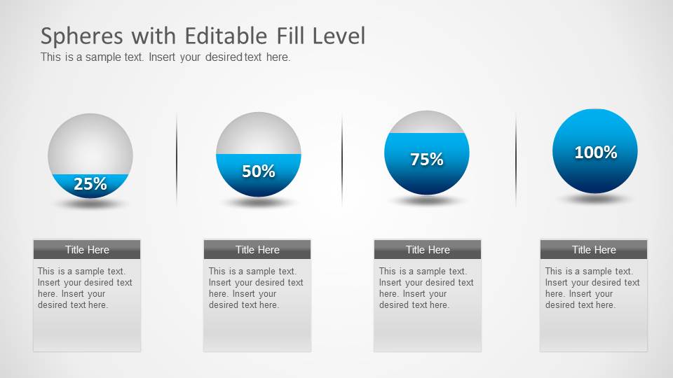
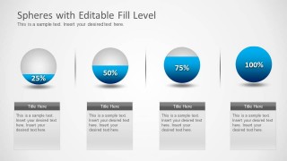
- A chemistry instructor can use the fill-level spheres to explain concentration or volume differences, supported by the 25%, 50%, 75%, and 100% sequence on Slide 1.
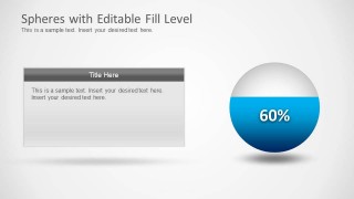
- A project manager can present completion status for one workstream using the large 60% sphere and text panel on Slide 2.
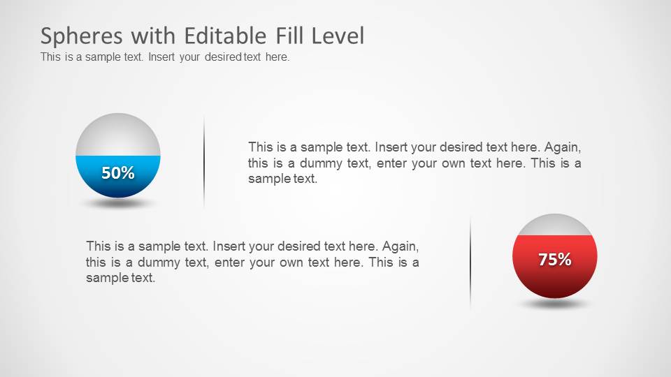
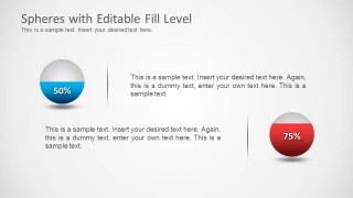
- An operations analyst can compare two capacity levels or inventory states with the 50% versus 75% callout layout on Slide 3.
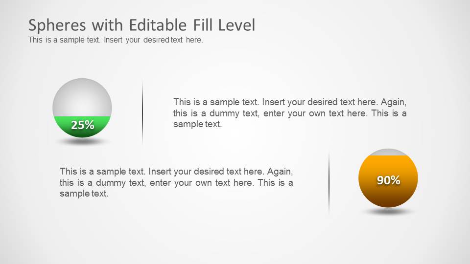
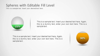
- A business presenter can show before-and-after improvement or target progress using the 25% and 90% sphere comparison on Slide 4.
Features
- 100% editable presentation template
- Compatible with Microsoft PowerPoint and Google Slides
- Scalable vector shapes, icons and illustrations
- AI-Ready for Microsoft Copilot and Claude
- Instant access and download
Frequently asked questions
Q: How should a presenter explain percentage changes with these spheres?
A: Start with the visual level before discussing details. Use Slide 1 when the audience needs a staged comparison, then move to a single sphere layout for the main metric. Keep the percentage label prominent and use the adjacent text box only for interpretation, such as cause, implication, or next action.
Q: Who is this template best suited for?
A: This template fits presenters who need to make measured levels easy to understand without a dense chart. Science educators can show liquid or concentration concepts, while project managers and analysts can show progress, capacity, or status. It works best when the story has a few clear percentage points rather than a large data set.
Q: Why use liquid-filled spheres instead of standard bars?
A: The liquid sphere metaphor makes fill, volume, or completion feel tangible. The round shapes also create a focal point, especially on the single 60% slide and the two-item comparison slides. This helps audiences read the message quickly before they process the supporting paragraph text.

Spheres with Editable Fill Levels
4-slide presentation template with editable percentage spheres, liquid fill levels, and comparison callouts
Spheres with Editable Fill Levels is a 4-slide diagram template for showing percentages as liquid-filled spheres. It includes a four-step percentage row, a single large 60% sphere with text panel, and two comparison callout layouts. Built with editable PowerPoint shapes, it suits science, chemistry, progress, capacity, or business status explanations.


 Loading...
 Microsoft PowerPoint
  Microsoft Copilot
  Claude for PowerPoint
 Other formats supported
Subscribe today and get immediate
access to download our PowerPoint templates.