Slide 1 of 3 from Blue Data-Driven Chart Concept for PowerPoint
8042-02-data-driven-chart-concept-blue-1
Data Dashboard with Line Chart for Presentations
- Chart
- Combo Chart
- Dashboard Slide
- 16:9
- 100% Editable
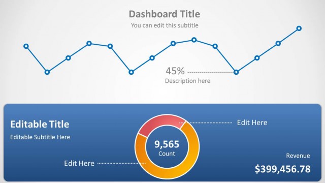
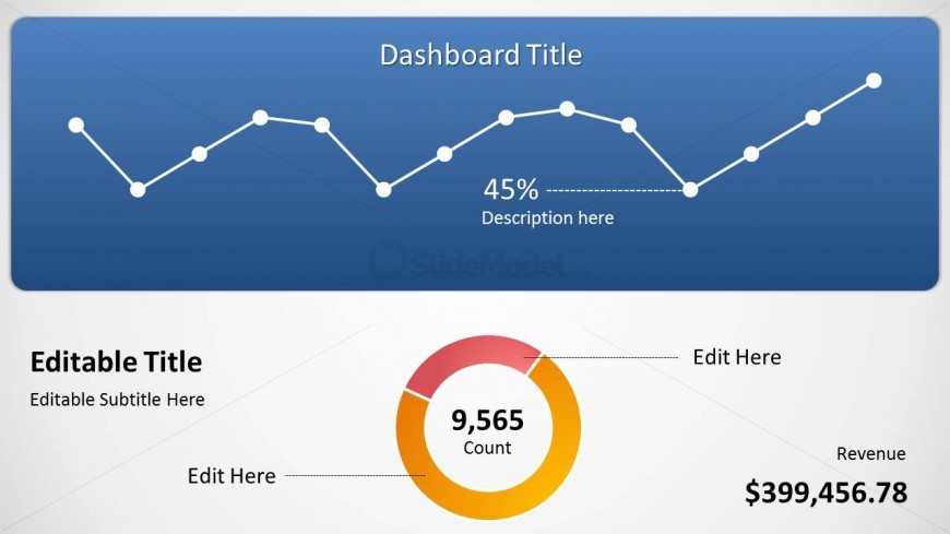
The Data Dashboard with Line Chart slide from the Blue Data-Driven Chart Concept for PowerPoint template offers a clear layout for presenting financial performance and KPI trends. This slide combines editable shapes and vector icons to visualize data effectively, making it suitable for business presentations and corporate slide decks focused on data analysis and reporting.
What’s on This Slide
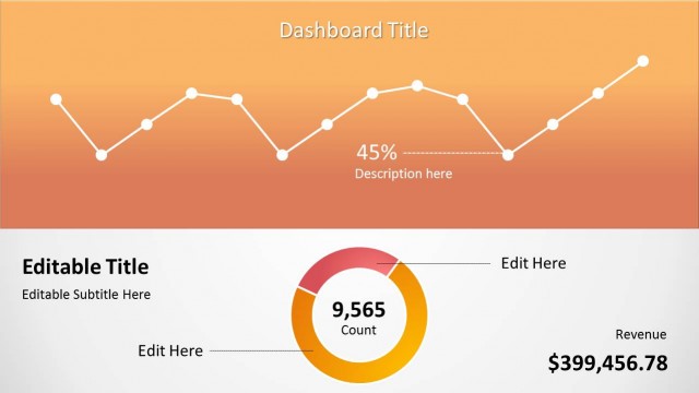
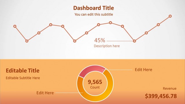
The layout features a top section with a blue background containing a line chart, displaying data points connected by a line. Above the chart, there is a title placeholder aligned center. Below the chart, a circular doughnut chart is present, with a count label in the center and a revenue label positioned to the right. Text placeholders for an editable title and subtitle are located in the lower section, with a clear visual hierarchy. The overall composition separates the line chart and doughnut chart, creating distinct areas for data presentation.
How to Use It
This layout serves as a data dashboard, combining a line chart and a doughnut chart for visualizing key metrics. It fits well in a presentation sequence where data trends and performance indicators are discussed. This structure is suitable for business analysts and managers presenting data insights, financial performance, or project metrics. It can effectively summarize complex data in a visually engaging manner, making it ideal for reporting and strategic discussions.
Text Placeholders & Capacity
Keep your copy within these limits so it fits without resizing. Body slots are tight, roughly 8 words each.
| Placeholder | Count | Max characters (approx.) |
|---|---|---|
| Slide title | 1 | 30 |
| Item heading | 1 | 10 |
| Item body | 1 | 50 |
| Item body | 1 | 50 |
| Footer | 1 | 20 |
Slide Keywords
Download unlimited PowerPoint templates, charts and graphics for your presentations with our annual plan.
DOWNLOAD