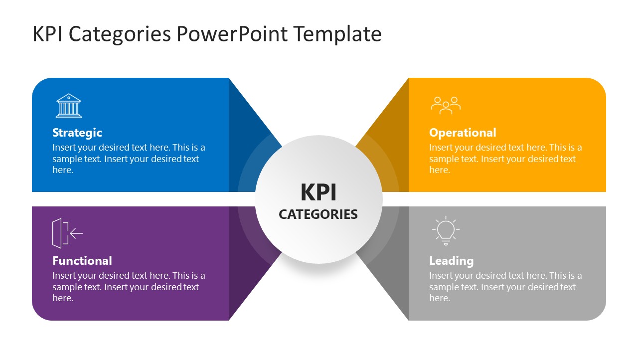
Organize and present various business metrics at your meetups with our editable KPI Categories PowerPoint Template. KPI stands for Key Performance Indicator. These are quantifiable metrics that companies define to track and evaluate their progress towards specific objectives. There are different categories of KPIs based on the business component, i.e., Strategic, Operational, Functional, and Leading. KPIs can be financial (growth, profit, loss) or non-financial (employee turnover rate, customer retention rate, innovation speed, on-time delivery rate, and ESG metrics). Professionals track KPIs to ensure their activities align with their strategies and deliver optimal performance. This helps teams achieve their goals faster. Users can edit our compelling layout to present different evaluation criteria or the company’s performance in each category.
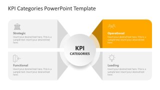
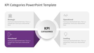
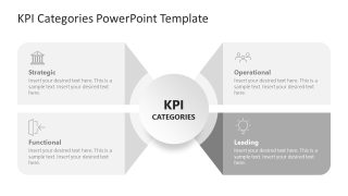
The KPI Categories PowerPoint Template has a four-quadrant diagram with a central shape to highlight the title. The shapes are arranged around the central circle in a unique pattern, creating a 3D effect. Each block is specific to one KPI category. You can insert custom text in placeholder sections to write details about the KPIs. There is a relevant infographic icon that allows users to visualize their thoughts. After the first slide, there are multiple slides with the same diagram, but with a focus effect, i.e., you can highlight one point at a time with a colored effect. This helps users effectively grasp the knowledge presented. Moreover, professionals can change the format or arrangement of elements on slides to suit their needs or preferences. Download the KPI categories quadrants diagram slide and check other matrix templates to showcase business concepts!
What’s inside this template
Example presentation scenarios
- A strategy manager can use the full four-quadrant KPI diagram to align executives on how strategic, operational, functional, and leading indicators differ before a planning cycle.
- An operations leader can use the Operational focus slide to explain which metrics support day-to-day process control, service delivery, or operational excellence targets.
- A consultant can use the Functional and Strategic focus slides to guide a client workshop that separates department-level measures from enterprise-level performance indicators.
- A performance analyst can use the Leading focus slide to introduce forward-looking metrics and show how they complement the other KPI categories in the central framework.
Features
- 100% editable presentation template
- Compatible with Microsoft PowerPoint
- 16:9 aspect ratio slides
- Scalable vector shapes, icons and illustrations
- AI-Ready for Microsoft Copilot and Claude
- Instant access and download
Frequently asked questions
Q: How should I present the KPI categories without making the diagram feel repetitive?
A: Start with Slide 1 to define the complete four-part framework, then use Slides 2 through 5 only for the categories that need discussion. Treat each focus slide as a short explanation of purpose, owner, and example metrics. This keeps the repeated diagram structure useful because the audience always knows where the current category fits.
Q: Who is this template best suited for in a performance management discussion?
A: This template fits managers, consultants, and operations leaders who need to explain KPI logic before showing numbers. It is most useful when the audience must understand why indicators are grouped as strategic, operational, functional, or leading. The format works well for planning meetings, KPI selection workshops, and management training sessions.
Q: Why does the diagram place KPI Categories in the center?
A: The center circle works as a hub metaphor: KPI Categories is the shared idea, and each surrounding block becomes one connected lens for performance measurement. The muted focus slides reinforce that relationship by keeping the whole model visible while drawing attention to one category at a time. This reduces context switching for the audience.


KPI Categories PowerPoint Template
5-slide presentation template for KPI categories, quadrant diagrams, and management strategy discussions
KPI Categories PowerPoint Template is a 5-slide 16:9 presentation diagram for explaining strategic, operational, functional, and leading KPI groups. It includes a four-quadrant category matrix, central KPI hub, and individual focus-highlight versions for each quadrant. It is made for managers, operations leaders, and strategy teams using Microsoft PowerPoint.
- Category
- Strategy
- Rating

 Loading...
- Aspect ratio
- 16:9
- Item ID
- 23616-01
- Colors
 Microsoft PowerPoint
  Microsoft Copilot
  Claude for PowerPoint
 Other formats supported
Subscribe today and get immediate
access to download our PowerPoint templates.